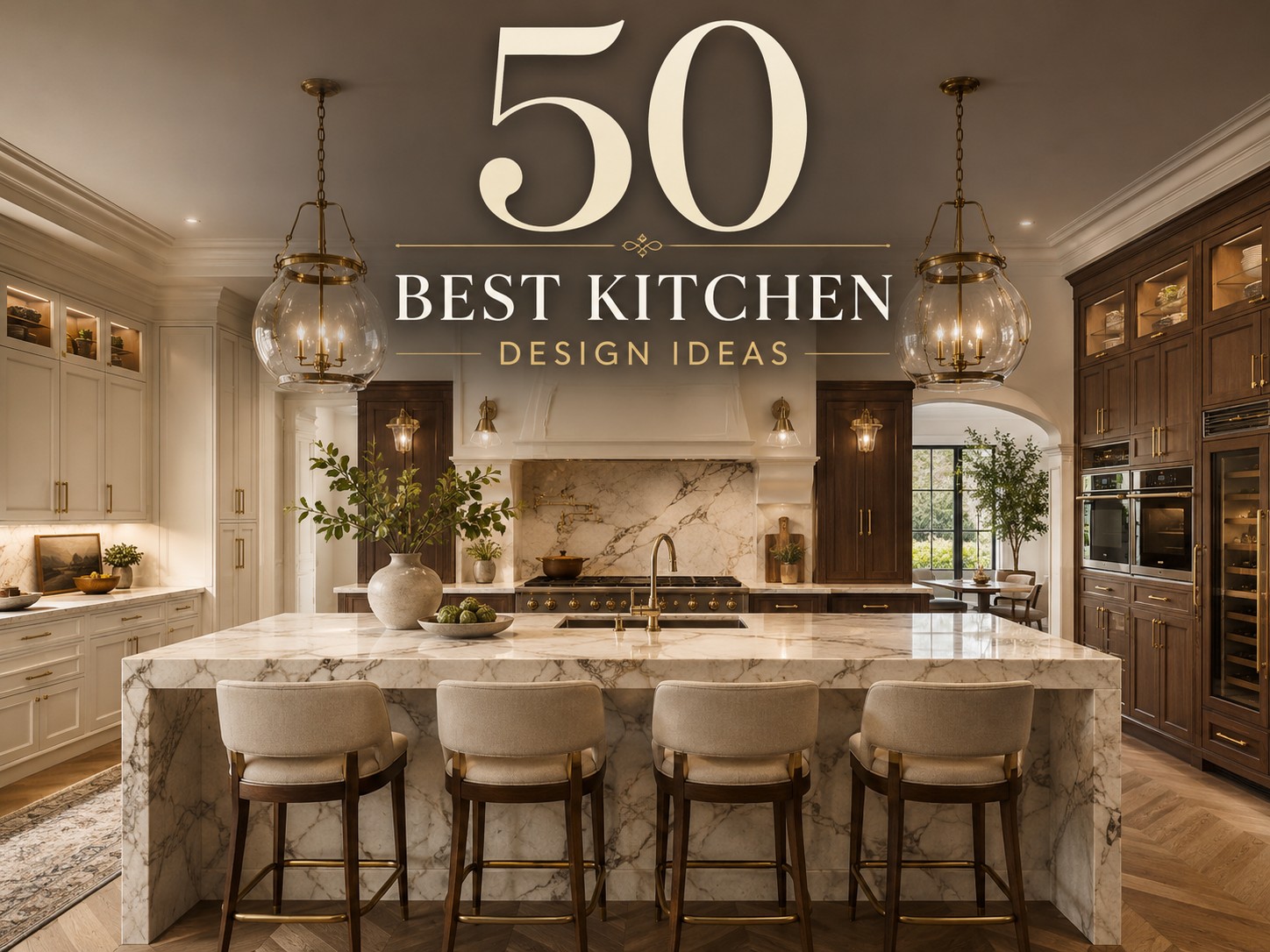
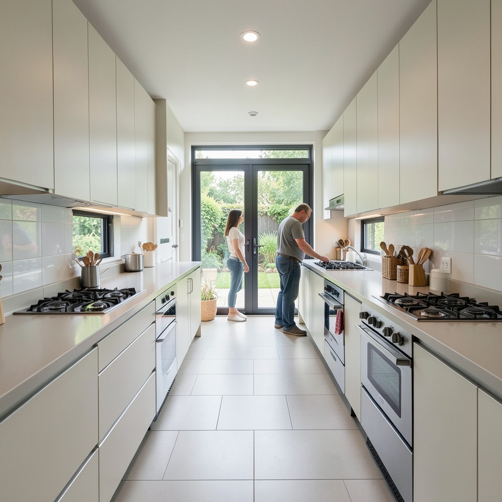
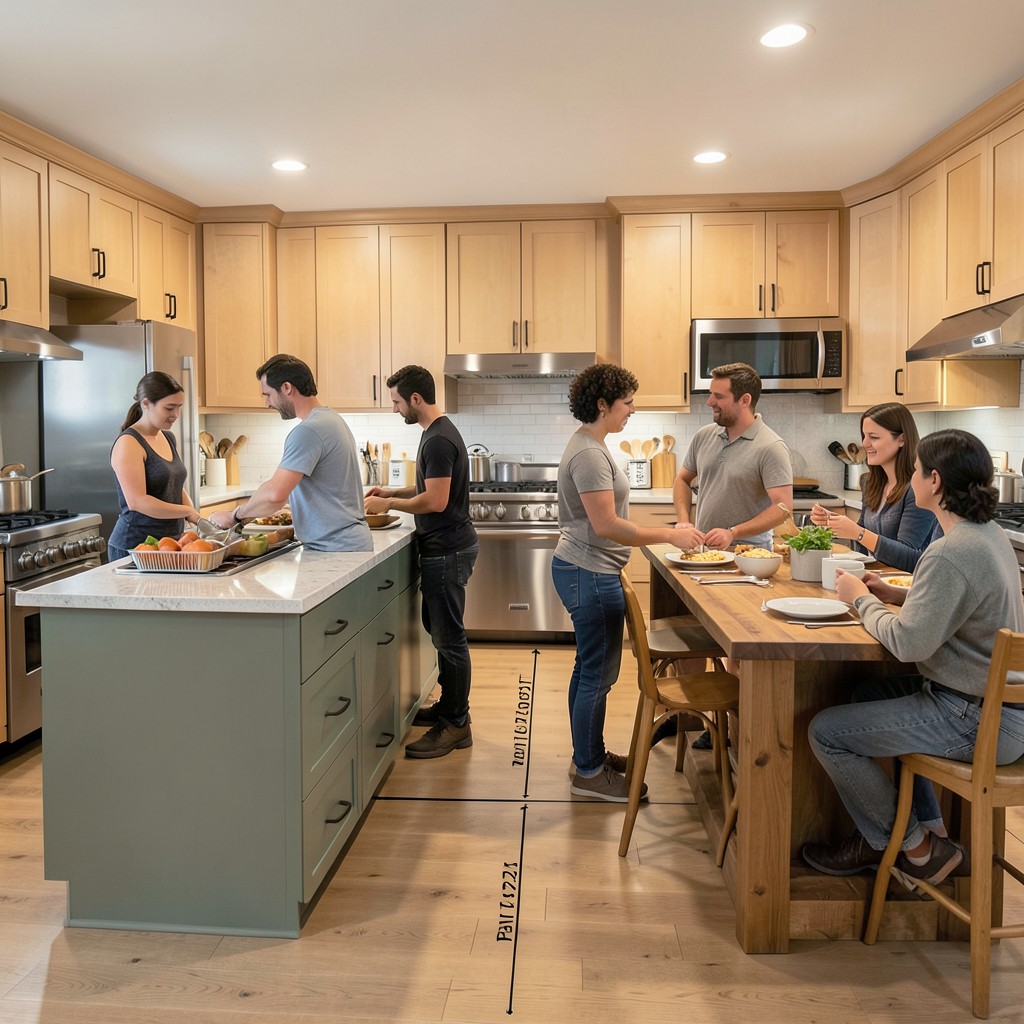
The kitchen does not just feed you — it shapes how you live, how you gather, and how your home feels from the inside out. Walk into a well-designed kitchen and something shifts before you even open a cabinet. The proportions feel right, the light lands where it should, and the whole room communicates that someone thought carefully about every square inch. Walk into a poorly designed one and you feel that too, even if you cannot name exactly what is wrong. That gap between a kitchen that works and one that genuinely satisfies is what design is for.
Most people approach kitchen design from the wrong end. They start with a cabinet color or a countertop sample and build outward from there. The kitchens that actually hold up — the ones that still feel good ten years in — start with understanding how the space gets used, then layer aesthetics on top of that foundation. Function is not the enemy of beauty. It is the reason beauty in a kitchen lasts.
This collection of kitchen design ideas covers the full range: from bold architectural decisions to the quiet, considered details that most people only notice when they are missing. Some of these ideas will work in a compact apartment kitchen. Others are built for large open-plan spaces. All of them are worth understanding, because knowing what a great kitchen looks like makes you sharper about the choices you make in your own.
You will find ideas here that push against convention — kitchens that use color where most people reach for white, layouts that break the standard triangle, materials that age in ways smooth surfaces never will. You will also find ideas that feel familiar but are presented with a depth that makes them actionable rather than decorative. The goal is not to inspire you in a vague, scroll-and-forget way. The goal is to give you a clear picture of what each idea actually demands, what it delivers, and whether it fits the life you are building.
These fifty ideas are not a ranked list. A double island is not objectively better than a well-executed galley kitchen — it just answers a different set of problems. Read through with your own space in mind, but stay open to ideas that feel distant from your current thinking. Some of the best kitchen decisions happen when a homeowner saw something they did not expect to love and realized, almost immediately, that it was exactly right.
Design is a conversation between what you have, what you need, and what you are drawn to. The kitchen is the room where that conversation matters most, because it is the room you return to more than any other. Get it right and every meal, every morning, every gathering feels different. These fifty ideas are your starting point — not a prescription, but a toolkit. Use them to build something that is unmistakably yours.
1. Open Shelving With Intentional Curation
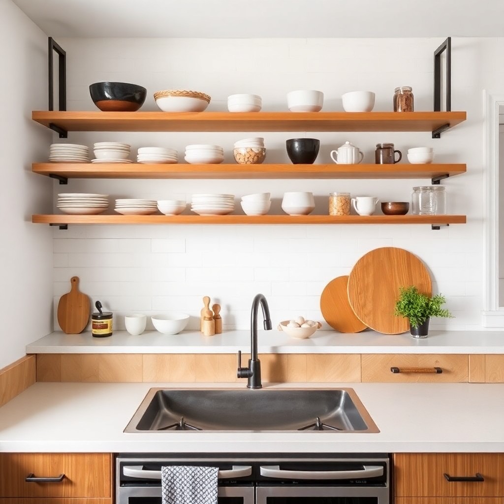
Open shelving gets a bad reputation mostly because people install it and then forget that it demands a different relationship with your stuff. Closed cabinets are forgiving — they hide everything behind a flat front. Open shelves put every bowl, every cutting board, and every half-used jar on display, which means the design lives or dies on what you choose to keep visible. When it works, open shelving transforms a kitchen wall into something that feels genuinely personal. When it fails, it just looks like organized clutter with better lighting.
The key is restraint. You do not fill open shelves — you edit them. Think in thirds: one third functional items you reach for daily, one third objects with visual weight like ceramics or wooden boards, one third negative space that lets everything breathe. That empty space is not wasted. It is what makes the shelf feel curated rather than stuffed. Natural wood shelves work particularly well because the grain adds warmth without competing with what sits on them. Floating shelves in a matte black steel bracket read more contemporary and hold their own in kitchens that lean industrial or minimal.
Placement matters as much as content. A single run of open shelves above a window works differently than shelves flanking a range hood on either side. The latter frames a focal point and creates a kind of built-in composition. The former uses height without interrupting sightlines. Neither is wrong, but both decisions are different and they need to be made deliberately. Open shelving is not a budget shortcut — it is a design commitment, and the kitchens that carry it well are the ones where the homeowner understood that from the start.
2. A Statement Range Hood as the Kitchen’s Focal Point
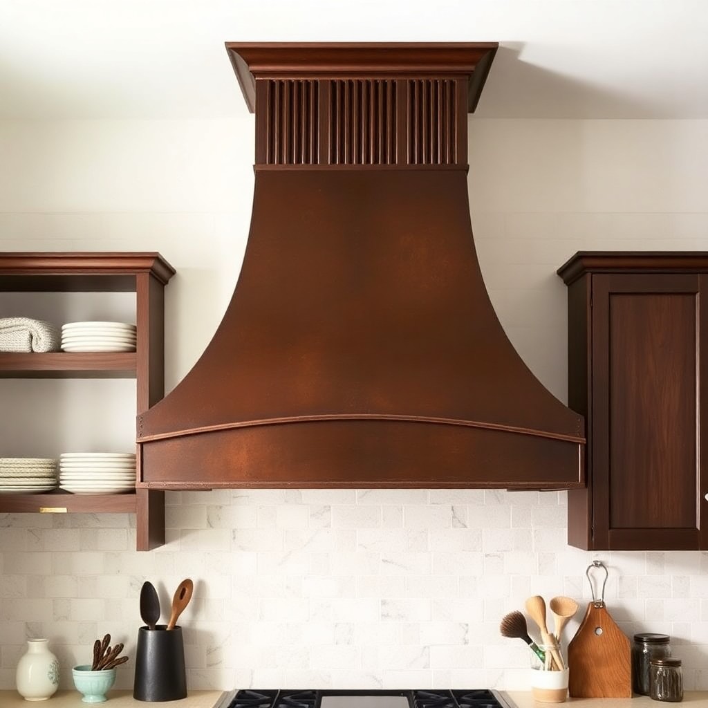
Most range hoods disappear into the kitchen. They sit above the cooktop doing their job quietly, matching the cabinets around them, asking nothing of the eye. That is a missed opportunity in a room where vertical space above the cooking zone is naturally where attention travels. A statement hood — whether it is a plastered arch shape, a hammered copper dome, or a fluted wood canopy — turns that dead zone into the room’s defining moment. It earns the eye’s attention without competing with anything else in the space.
The shape of the hood determines the feeling of the whole kitchen. An arched plaster hood softens a sharp, modern cabinet layout and introduces an almost Mediterranean warmth that no tile or paint color can replicate on its own. A boxy stainless steel hood with exposed rivets doubles down on an industrial direction and works best when the rest of the kitchen has the restraint to let it lead. The mistake most people make is choosing a hood that fights the room’s direction rather than committing to it. Pick a hood that extends the design language you have already established, then let it be the loudest voice in that language.
Custom hoods do cost more. That is the honest caveat. But because the hood is a fixed architectural element — not furniture, not an appliance you swap out — the investment holds over the life of the kitchen. It is also the single element most likely to make a kitchen feel designed rather than assembled. Even in a modest kitchen with standard cabinets and laminate counters, a beautifully proportioned custom hood shifts the entire reading of the space. That ratio of impact to investment is hard to beat anywhere else in the room.
3. Two-Tone Cabinet Color Blocking
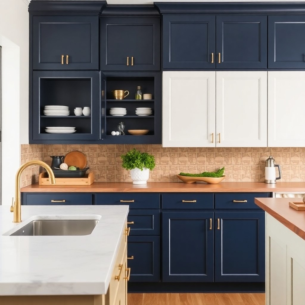
Painting all your cabinets one color is the safe choice. It is also the choice that produces the most forgettable kitchens. Two-tone cabinetry — upper cabinets in one color, lower cabinets in another, or island cabinets in a contrasting finish — introduces depth and visual rhythm that a single-color scheme simply cannot generate. The kitchen reads as more considered, more deliberate, and more layered, even when the colors themselves are relatively quiet.
The combinations that work best are not always the most obvious ones. Navy lowers with warm white uppers is a popular pairing for good reason — the contrast is strong enough to register but gentle enough that neither color dominates. A more unexpected approach is pairing two muted tones: sage green lowers with a warm putty upper, for instance. The tension between them is subtle but present, and that subtlety is what prevents the kitchen from feeling like a color exercise rather than a real room. Avoid combining two saturated colors — that is where two-tone cabinetry tips into chaos.
Hardware is the detail that holds two-tone schemes together. Brushed brass pulls read as a deliberate connector between contrasting cabinet tones. Matte black hardware works when the scheme leans cooler. The hardware does not need to match the cabinets — it needs to bridge them. Think of it as punctuation: the right choice makes the whole sentence readable, and the wrong one makes the reader stop and wonder what you were trying to say.
4. Waterfall Countertop Edge Detail
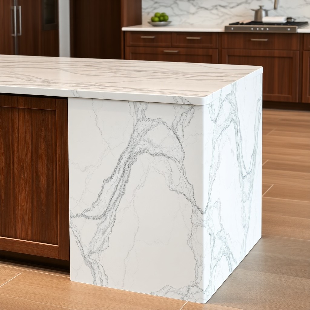
A waterfall countertop continues the counter surface material straight down the side of the island or cabinet run, all the way to the floor. The effect is architectural — it turns a functional surface into something that reads closer to sculpture than furniture. On an island, a waterfall edge on one or both sides eliminates the visual break between the counter and the base, giving the whole piece a monolithic weight that changes how the room feels around it.
Marble and quartzite are the materials most associated with this detail, and for good reason. When the natural veining of the stone continues through the corner and down the side, matching the pattern at the joint, the result is called bookmatching — and it is one of the most genuinely impressive things you can do in a kitchen without changing its layout. Engineered quartz and porcelain slabs work for the same effect at a lower cost, though the veining is not as organic and the bookmatching is less dramatic. The right choice depends on how much of the kitchen’s identity you want to build around this single detail.
What most people miss about waterfall edges is that they demand the rest of the kitchen step back. A waterfall countertop on an island that also has a statement hood, two-tone cabinets, and patterned tile is fighting for attention it cannot win. The waterfall works because of what surrounds it — restrained cabinetry, a clean backsplash, stools with slim profiles. Give it room to be the thing people notice first and it will reward you every single time someone walks into the room.
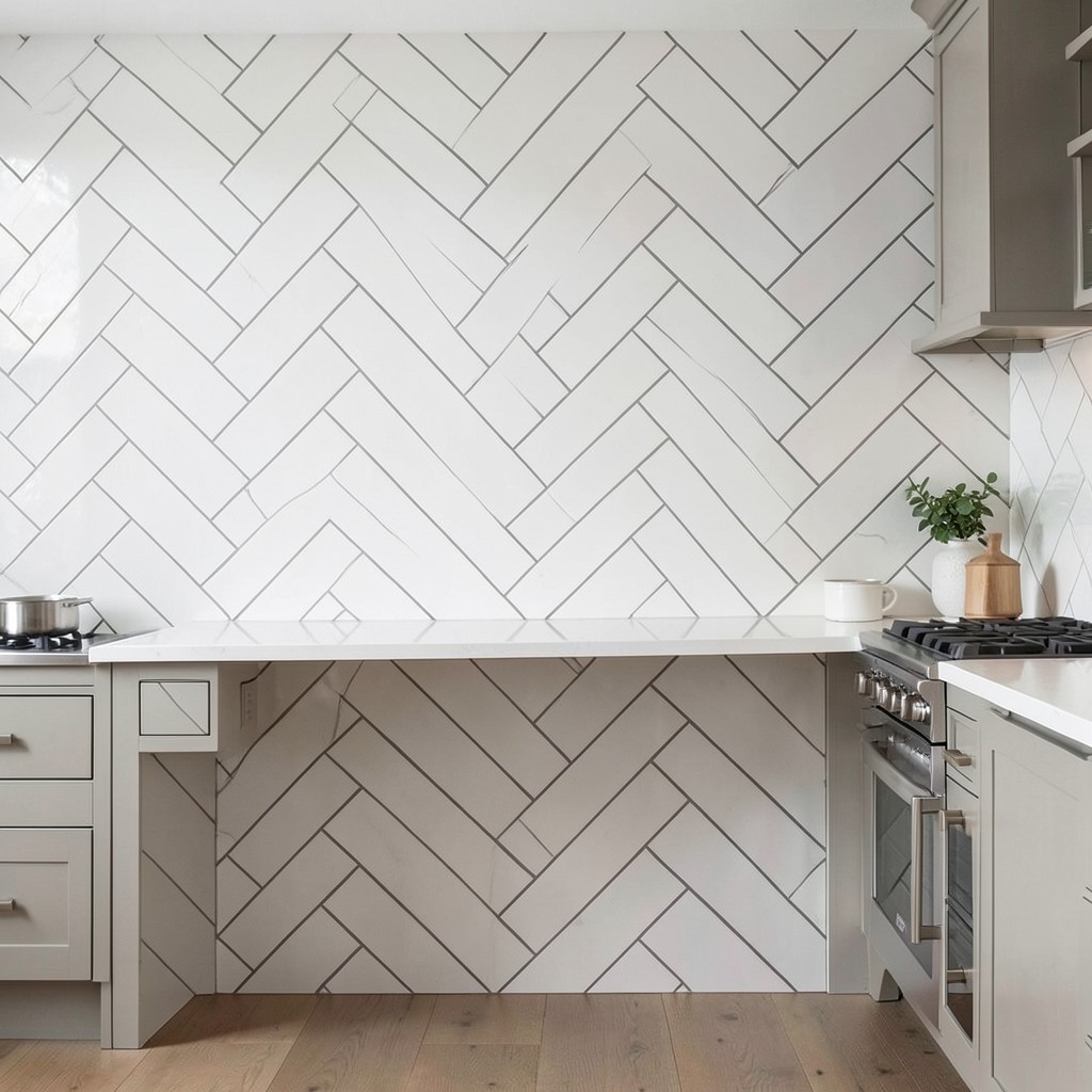
5. Full-Height Backsplash Tile
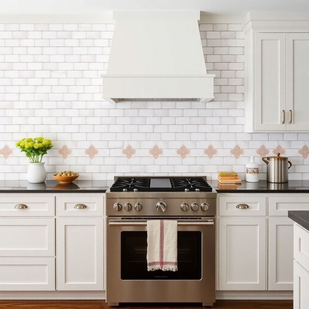
A backsplash that runs from counter to ceiling does something to a kitchen that a standard four-inch tile band simply cannot. It fills the wall with intention. There is no awkward painted gap between the top of the tile and the bottom of the upper cabinets, no visual interruption where the design seems to give up. The tile becomes the wall, and that completeness gives the kitchen a backbone it was missing before.
The choice of tile matters enormously here because full-height means a lot of surface. A highly patterned tile — Moroccan fish scale, bold geometric, hand-painted ceramic — works in a kitchen with otherwise plain cabinetry. The tile becomes the artwork and the room does not need anything else to compete with it. A more textural tile — glossy subway in a running bond, ribbed ceramic in an earthy tone, zellige with its imperfect surface — adds richness without demanding attention. The second category is harder to get wrong and easier to live with over time.
Grout color is a decision most people underestimate. White grout with white tile creates an almost seamless surface. Dark grout with the same white tile creates a grid pattern that doubles the visual energy of the installation. Neither is wrong, but they produce completely different kitchens. Make that choice consciously, not by default, because once the tile is set, the grout is what you are living with.
6. Integrated Appliances for a Seamless Kitchen Look
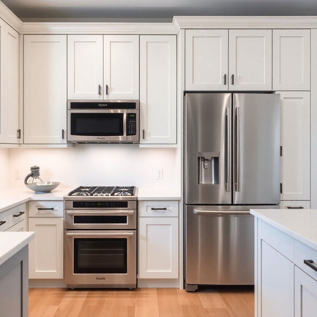
When appliances blend into the cabinetry — refrigerator panels matching the cabinet doors, dishwasher fronts indistinguishable from drawer faces, microwave tucked inside a built-in column — the kitchen stops looking like a collection of machines and starts reading as a unified whole. That seamlessness is not just aesthetic. It changes the spatial experience of the room. Without the visual interruption of stainless steel faces and black glass panels breaking up the cabinet run, the eye moves through the space more smoothly.
Panel-ready appliances make this possible. Most major refrigerator brands offer panel-ready models at the professional tier. The panels are custom-made by your cabinet maker to match your cabinet doors exactly — same finish, same hardware, same reveal gaps. The result is a refrigerator that reads as a tall cabinet until you open it. The same principle applies to dishwashers, warming drawers, and compact refrigerators. Each integration removes one more visual interruption from the room.
The practical consideration worth knowing: panel-ready appliances typically cost more than their standard counterparts. And if you ever need to replace the appliance, the new model may have slightly different dimensions, requiring new panels. That is a real inconvenience. But in kitchens where the design priority is coherence above all else — and particularly in open-plan spaces where the kitchen is visible from every living area — integrated appliances deliver a quality of finish that no amount of styling can replicate.
7. Unlacquered Brass Hardware
Unlacquered brass is the hardware choice that divides rooms into before and after. The “before” is a kitchen with satin nickel or brushed chrome pulls that are perfectly fine and completely neutral. The “after” is the same kitchen with warm, golden, slightly imperfect unlacquered brass hardware that makes every cabinet feel chosen rather than defaulted to. The material has weight — visual weight — and it reads as a deliberate design decision in a way that silver-toned metals rarely do.
What makes unlacquered brass specifically interesting is what it does over time. Unlike lacquered brass, which is sealed and stays permanently bright, unlacquered brass develops a patina. High-touch areas darken slightly; lower-traffic spots hold their golden tone. The hardware becomes a record of use — which sounds like a selling point in a design magazine and feels like one in person. It ages the way good leather ages: not worse, just more itself. In a kitchen with new cabinets and pristine counters, that patina introduces the kind of earned quality that new materials rarely carry.
The pairing matters. Unlacquered brass lands hardest in kitchens with white, cream, or soft green cabinetry — the warm metal pulls color out of those tones that cooler hardware suppresses. It also works against dark charcoal and navy, where the contrast between the deep background and warm metal is sharp enough to read from across the room. The one combination to avoid is unlacquered brass with cool gray cabinets — the yellow of the metal fights the blue undertone of the gray and neither wins.
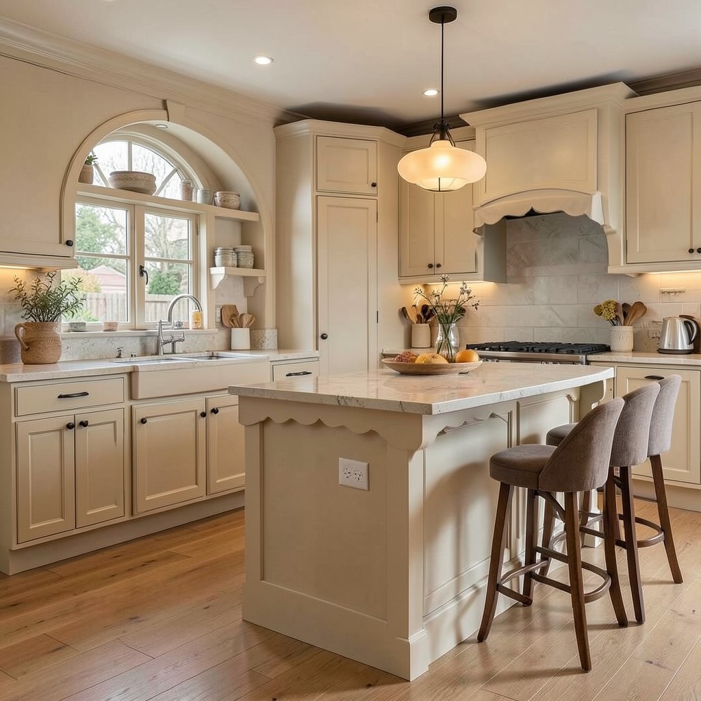
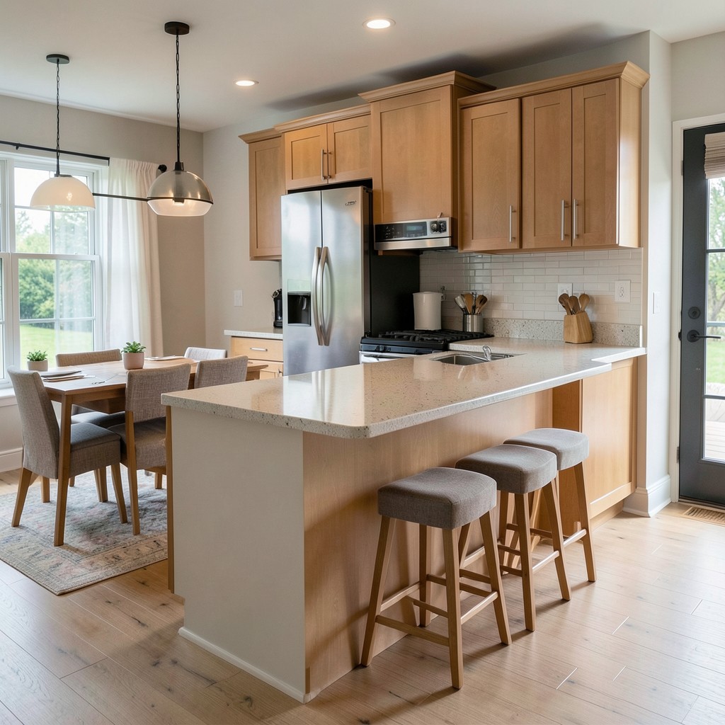
8. A Kitchen Island With Seating on Two Sides
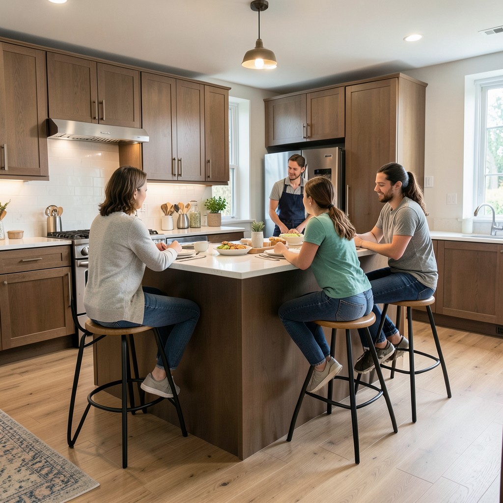
Most kitchen islands offer seating on one side — the side that faces away from the cooking zone. That works. But an island designed for seating on two sides changes the social geometry of the kitchen entirely. People can sit across from each other, face the cook from multiple angles, and the island becomes less of a serving counter and more of a table that happens to be attached to the kitchen. That shift in social function is worth more than any cabinet upgrade.
The size requirement is real. To seat people comfortably on two sides without cramping the cooking end, you need an island that is at minimum forty-two inches wide and long enough to provide knee clearance on both seating sides plus working space in between. That means most islands designed for two-sided seating run at least seven feet long. In smaller kitchens, that footprint is not available. But in open-plan spaces where the island serves as the primary eating surface for everyday meals — not the dining table — this configuration eliminates the need for a separate breakfast area entirely.
The countertop height on the seating side matters. Standard counter height at thirty-six inches works with counter-height stools and creates a more casual, lower-slung seating experience. Bar height at forty-two inches requires bar stools and elevates the seating so people at the island are slightly above eye level with someone standing in the kitchen. Both work. The difference is whether you want the island to feel like a table or a bar, and that is a choice about how your household actually eats.
9. Matte Black Fixtures and Fittings
Matte black faucets, cabinet hardware, light fixtures, and window frames do something in a kitchen that polished chrome never quite manages: they hold the room together. Chrome reflects light and draws attention to itself. Matte black absorbs light and directs attention to the materials around it — the grain in the wood, the texture in the tile, the color depth in the cabinetry. It is the difference between a faucet that performs and one that conducts.
The finish works across a wider range of kitchen styles than most people expect. In an industrial kitchen with exposed brick and concrete counters, matte black fixtures feel native. In a white Shaker kitchen, they add exactly the contrast needed to prevent the space from reading as a dental office. Against warm wood cabinetry, matte black has a Japanese-inspired austerity that reads as considered and calm. The material is durable — it does not show water spots the way polished metals do — which is a practical advantage in a room where water contact is constant.
The one risk with matte black is going too heavy. When the faucet, all hardware, the pendant lights, the window frames, and the range are all matte black, the room starts to feel heavy rather than sharp. The fix is to treat matte black as the punctuation, not the prose. Two or three applications in a kitchen deliver maximum impact. Every application beyond that starts to compete with itself, and the sharpness that makes the finish compelling begins to flatten into something that just reads as dark.
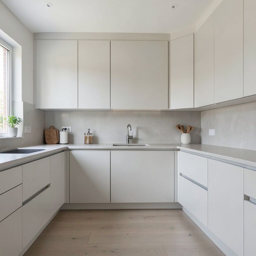
10. Concrete Countertops
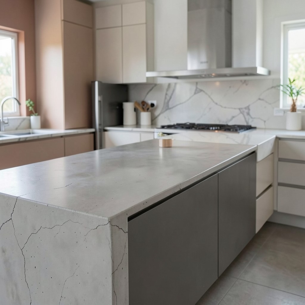
Concrete countertops occupy a design space that no other material fills quite the same way. They are not polished or perfect — they carry slight color variation, subtle texture, and the kind of material honesty that stone and engineered surfaces do not always offer. A concrete counter in a kitchen signals that the designer was not chasing luxury finishes. They were chasing character, and character is harder to fake and harder to lose than shine.
The practical reality of concrete counters deserves straight talk. They require sealing, typically once a year, to prevent staining. They can crack over time, particularly in sections spanning long distances without proper reinforcement beneath. They are heavy — significantly heavier than most countertop materials — and existing cabinet structures sometimes need reinforcement to carry the load. None of these are dealbreakers. They are maintenance requirements that owners of concrete counters largely accept as part of the material’s honest relationship with use. Hairline cracks that develop over years are, to most concrete owners, part of what makes the surface interesting rather than a failure.
Color is a variable that concrete offers and stone does not. A concrete counter can be tinted during the casting process — warm grey, charcoal, off-white, even a muted terracotta — giving the kitchen a bespoke surface that is unique to that specific pour. No two concrete counters are identical. That individuality is the point. In a market where half of all kitchens have the same three quartz patterns from the same three manufacturers, a concrete counter is a quiet declaration that this kitchen was made, not assembled.
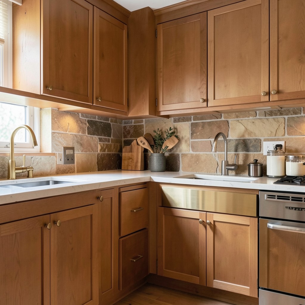
11. Warm Wood Cabinetry
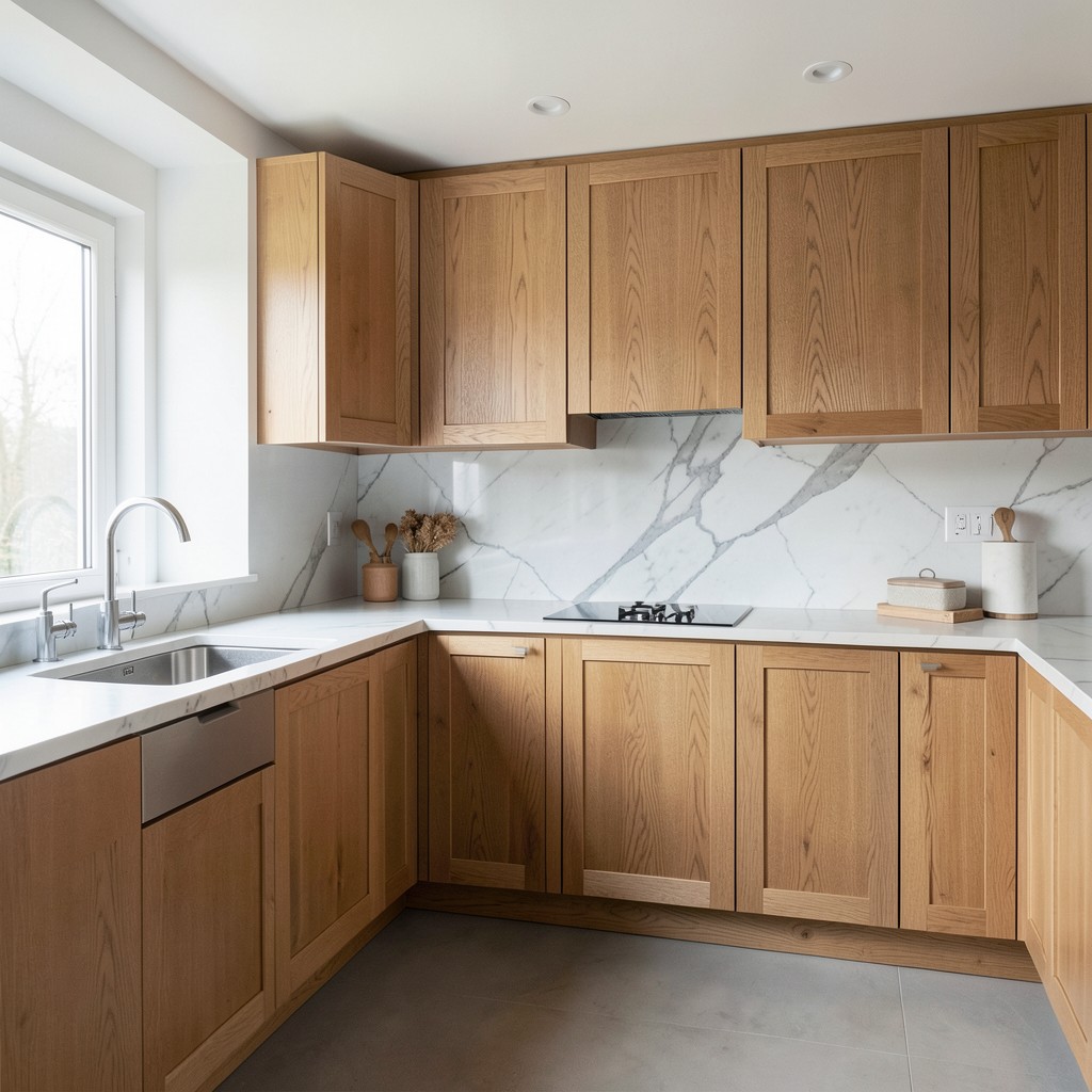
White kitchens dominated interior design for a long time — and while they remain popular, warm wood cabinetry has reclaimed serious ground as homeowners grow tired of spaces that feel more clinical than comfortable. A kitchen built around natural wood tones carries a different temperature. It feels settled, grounded, and alive in a way that painted cabinetry rarely achieves, particularly in spaces that receive natural light from multiple directions. The wood does not just sit in the room — it responds to it.
The species and finish determine everything. White oak with a lightly brushed finish brings out the grain without adding any artificiality, producing a tone that sits between honey and warm grey depending on the light. Walnut is richer and darker — it works in kitchens with substantial natural light and fails in rooms that already feel dim. Rift-sawn oak has a linear, almost meditative grain pattern that suits more contemporary cabinetry profiles without feeling rustic. The finish matters as much as the species: a heavy lacquer over beautiful wood defeats the purpose entirely. The wood should look like wood.
Pairing warm wood cabinetry with the right countertop is where most decisions succeed or fail. White marble against warm walnut is a classic contrast that never becomes tired because the warmth and the coolness balance each other perfectly. A honed concrete counter against white oak leans more elemental and suits kitchens with a quiet, Scandinavian restraint. What does not work is pairing warm wood with a heavily veined, high-drama stone — both elements compete for the same emotional register and neither wins.
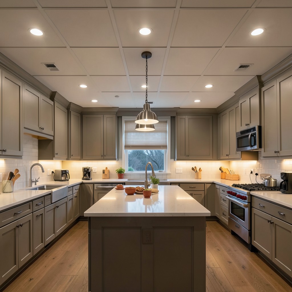
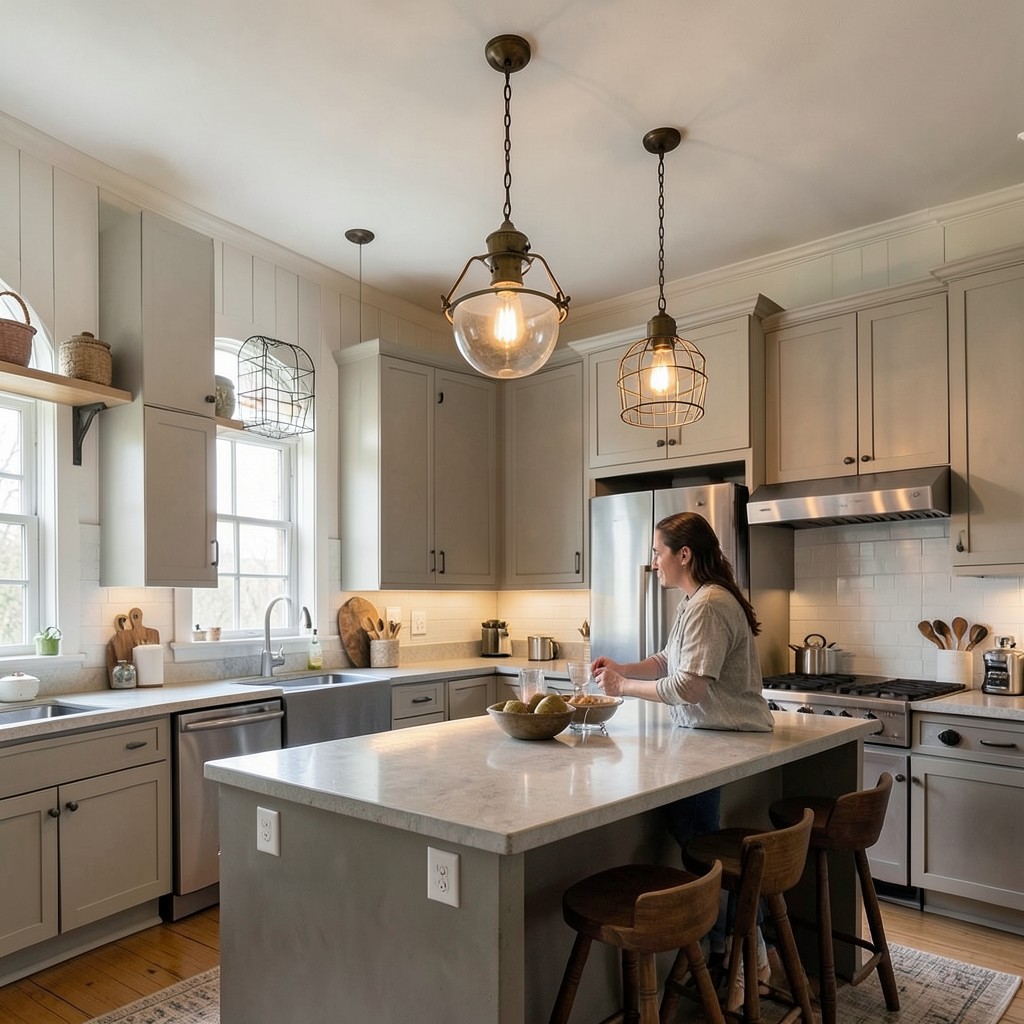
12. Under-Cabinet Lighting
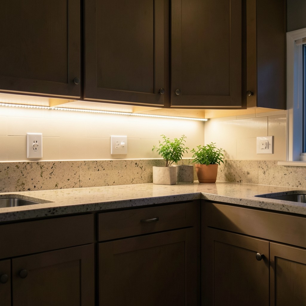
Lighting under upper cabinets is one of the most impactful upgrades a kitchen can receive relative to its cost. It floods the countertop work surface with direct light, eliminates the shadow cast by the upper cabinet base, and adds a warm glow that changes the feeling of the kitchen at night more than almost any other single change. Yet it consistently appears on lists of things homeowners wish they had done during construction rather than trying to retrofit afterward.
LED strip lighting is the most common approach and the most flexible. It can be installed in a recessed channel routed into the underside of the upper cabinet for a completely hidden source, or surface-mounted in a narrow aluminum profile that sits flush against the cabinet bottom. The recessed approach looks cleaner but requires more work during installation. The surface-mounted approach is simpler to add after the fact and is nearly invisible once installed. Color temperature matters: bulbs in the range of 2700K to 3000K produce a warm white light that flatters food and complements most kitchen finishes. Cooler temperatures read as harsh under the intimate scale of cabinet lighting.
The detail that separates a professional installation from a DIY one is wiring management and switch control. Under-cabinet lights that run off the same circuit as the overhead fixtures miss the point — the reason to have them is to use them independently, as mood lighting when the overheads are off. A separate switch, or better yet a dimmer on its own circuit, gives you complete control over the light layer and transforms the kitchen’s evening character. That flexibility is what makes under-cabinet lighting feel considered rather than merely functional.
13. A Dedicated Coffee Station
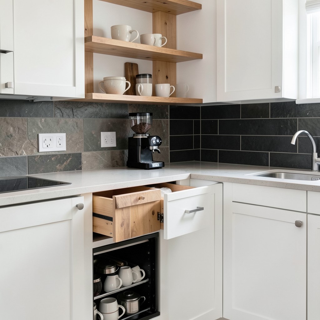
A coffee station built into the kitchen — not a corner of the counter claimed by a machine, but an intentionally designed space for coffee preparation — does two things at once. It removes the visual clutter of loose machines, cords, pods, and filters from the main work surfaces, and it creates a morning ritual space with its own logic and its own pleasure. The difference between a coffee machine sitting on a counter and a coffee station is the difference between a tool stored on a shelf and a tool given a home.
The design can be as simple or as involved as the kitchen allows. At its most minimal, a coffee station is a section of counter with a dedicated outlet, a drawer for pods or beans, and a shelf above for mugs. At its most resolved, it is a pull-out drawer with a built-in grinder, a countertop espresso machine recessed into the cabinetry at the right height, a warming drawer below for cups, and a small sink beside it so you never have to cross the kitchen to rinse anything. The point is not complexity — it is intention. Even the minimal version communicates that coffee was considered in the design of this kitchen, not squeezed in afterward.
Material choices for the coffee station can differ from the rest of the kitchen as a way of distinguishing the zone. A butcher block insert in a stone-countered kitchen, or a section of dark tile against white cabinetry, marks the station visually without requiring signage. That visual boundary tells every person who walks into the kitchen where the coffee lives without anyone having to say a word.
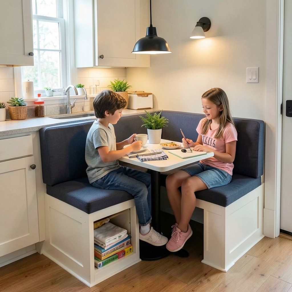
14. Kitchen Banquette Seating
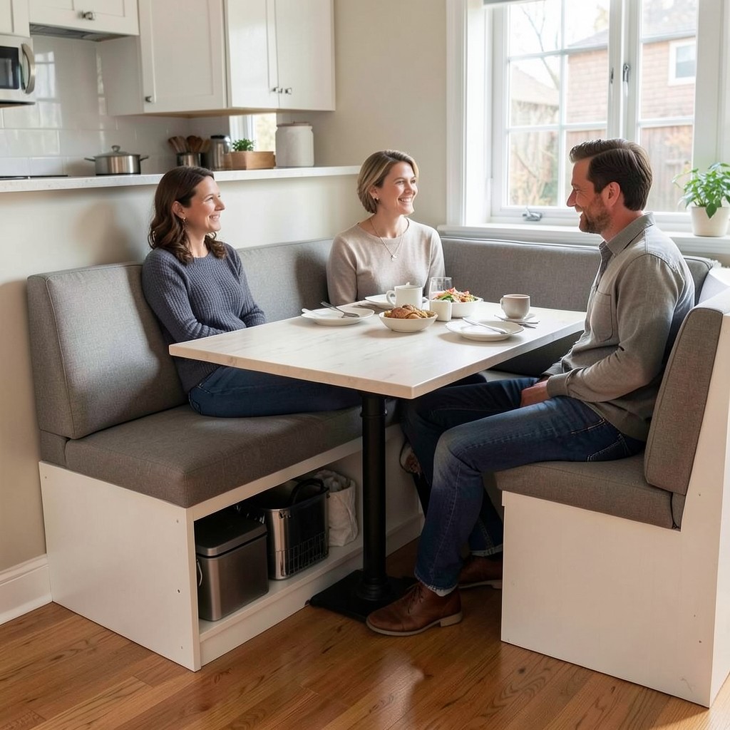
A banquette — upholstered bench seating built into a corner or along a wall, paired with a table — solves the dining problem in kitchens that do not have room for a full dining table and chair arrangement. Chairs require pull-out space. A banquette requires none. People slide in from the open end and the seating footprint drops to roughly half what a chair arrangement demands. In smaller kitchens or open-plan spaces where the eating area is carved out of the kitchen zone itself, that space recovery is meaningful.
The design of a well-built banquette involves more than the bench. The table height, the seat depth, the back height, and the relationship between the cushion firmness and the length of a typical meal all matter. A seat that is comfortable for a twenty-minute breakfast can become punishing after an hour of dinner. Back support matters more than most designers account for — a backless banquette looks cleaner but limits how long people actually want to sit at it. A low back at about fifteen inches above the seat surface gives enough support for longer meals without making the bench read as heavy.
Storage underneath the banquette is an option that too many kitchens skip. Hinged bench tops open to reveal a compartment that handles overflow from the kitchen — bulky appliances, extra table linens, seasonal items that do not deserve prime cabinet real estate. It is not the most accessible storage in the house, but for items used a few times per year, it is storage that did not previously exist. In a kitchen where every square foot has to earn its keep, that bonus capacity is worth designing in from the start.
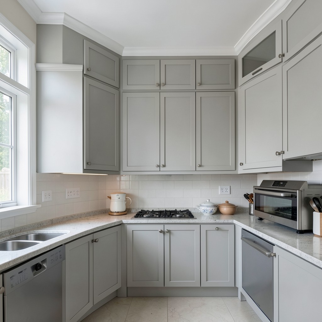
15. Dramatic Dark Cabinet Colors
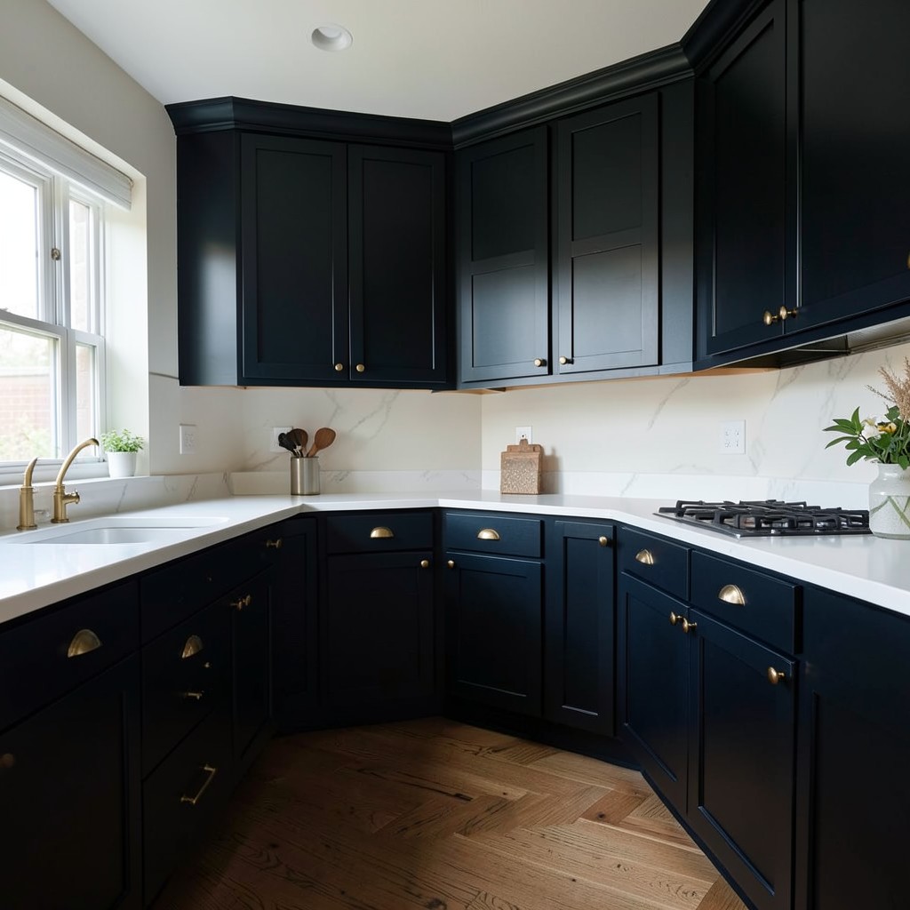
Dark cabinetry has a specific kind of courage behind it. Walking away from white or light wood and committing to deep navy, forest green, charcoal, or even near-black requires trusting that the room has enough light and enough contrast to carry it. When it works, a dark kitchen feels like nowhere else in the house — settled, serious, and genuinely beautiful in a way that lighter kitchens rarely achieve. When it fails, it just feels like a room that forgot to turn the lights on.
The key variable is light. Dark cabinetry in a kitchen with generous natural light from a south or west-facing window reads as rich and warm. The same cabinetry in a north-facing kitchen without supplemental lighting reads as dim and oppressive. Before committing to a dark color, spend time in the kitchen at different hours of the day and observe honestly what the light does. If the room already struggles in the afternoon, dark cabinets will make that problem worse, not more interesting.
Contrast is what dark cabinets need to sing. White or very light countertops against deep cabinet tones create a clarity that prevents the kitchen from reading as heavy. Brass or warm-toned hardware catches light against the dark background in a way that silver hardware does not. And lighter walls — or no upper cabinets at all, replaced with open shelving — prevent the sense of enclosure that dark lower and upper cabinets together can create. Give the dark surfaces room and they reward you. Crowd them and the room becomes a cave.
16. Sage Green Cabinetry
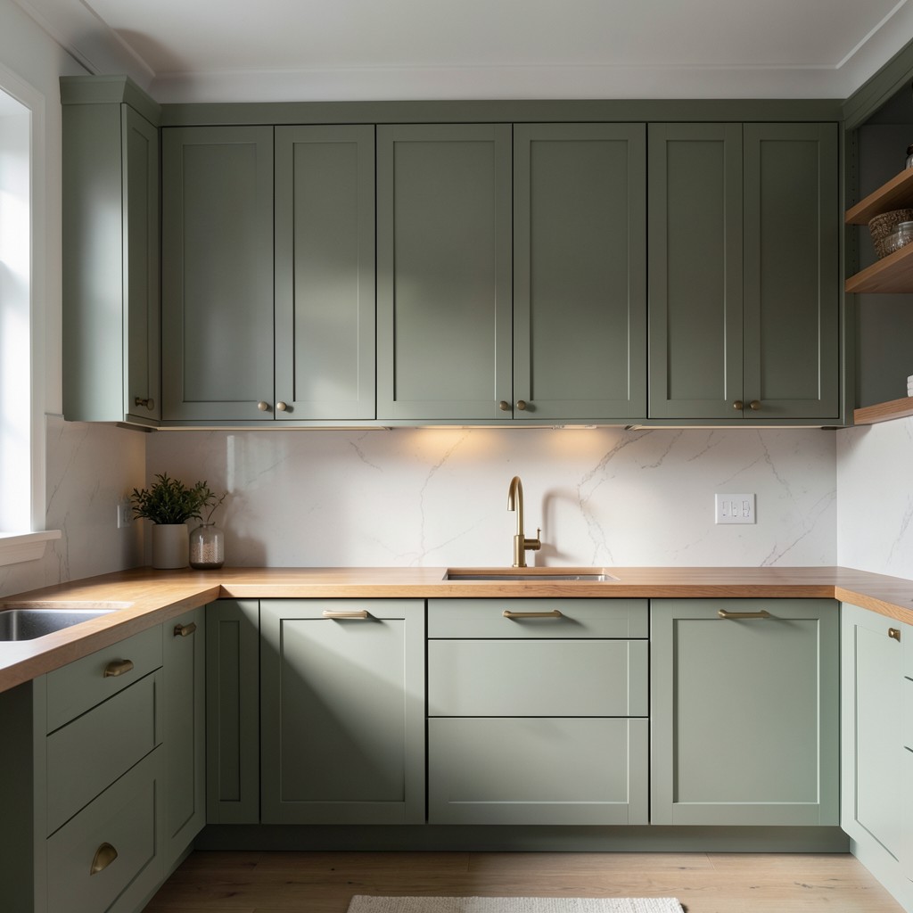
Sage green has earned its place as the most enduring alternative to white in the cabinet color conversation — not because it is fashionable, but because it does something that most cabinet colors cannot. It reads as both neutral and colorful at the same time. In natural light, sage pulls toward grey and sits quietly in the room. In warm evening light, the green becomes more present, adding softness without drama. That flexibility is rare, and it is exactly why sage green works in such a wide range of kitchen styles.
The specific tone of green matters more than the word “sage” suggests. There is a range from almost-grey with a faint green whisper all the way to a soft, unambiguous green that sits closer to eucalyptus. The cooler, greyer end of the range suits more contemporary cabinetry — flat-front doors, minimal hardware, stone countertops. The warmer, more botanical end works with traditional Shaker profiles and brass hardware. Both are beautiful. They just produce different rooms, and knowing which direction you are heading before you commit to a specific paint or stain color saves you from a very expensive correction.
Sage green against natural wood shelving or a wood countertop is one of the more quietly satisfying combinations in kitchen design. The green and the wood tone each other down slightly, producing a palette that feels completely organic. Aged brass hardware amplifies the botanical quality. White walls above the cabinet line keep the room from feeling like a forest floor. That balance — green, wood, brass, white — is not a formula but a starting point, and most kitchens that carry it well have made deliberate adjustments from there based on their specific light and proportions.
17. Handleless Cabinet Doors
A kitchen built entirely around handleless cabinet doors — where drawers and doors are opened by pushing, pulling on a recessed grip channel, or using a tip-on mechanism — reads as architectural rather than decorative. The face of every cabinet is an unbroken plane. No hardware interrupts the surface. The kitchen feels like a room that was carved rather than assembled, and that quality — that sense of deliberate subtraction — is precisely what makes handleless design feel modern in a way that does not date quickly.
The mechanism matters practically. Push-to-open systems work well for lower cabinets and deep drawers where there is physical mass to push against. For upper cabinets that are lighter and sit at chest or head height, a recessed J-pull or finger channel gives you something to grip without requiring hardware. Tip-on systems — where a light tap releases the door — are the most seamless visually but require proper calibration to function reliably over time. All three approaches work. The choice depends on how frequently the cabinet is used and how much tactile feedback the user needs from the opening action.
What handleless cabinets demand above all else is precision in installation. With traditional hardware, slight misalignments between doors disappear behind the visual mass of knobs and pulls. With handleless doors, every gap, every slight variation in door height, and every misaligned reveal is visible from across the room. The design is unforgiving in the way that the best design usually is — it requires the execution to match the ambition. Done correctly, handleless cabinetry is among the most quietly impressive things a kitchen can do.
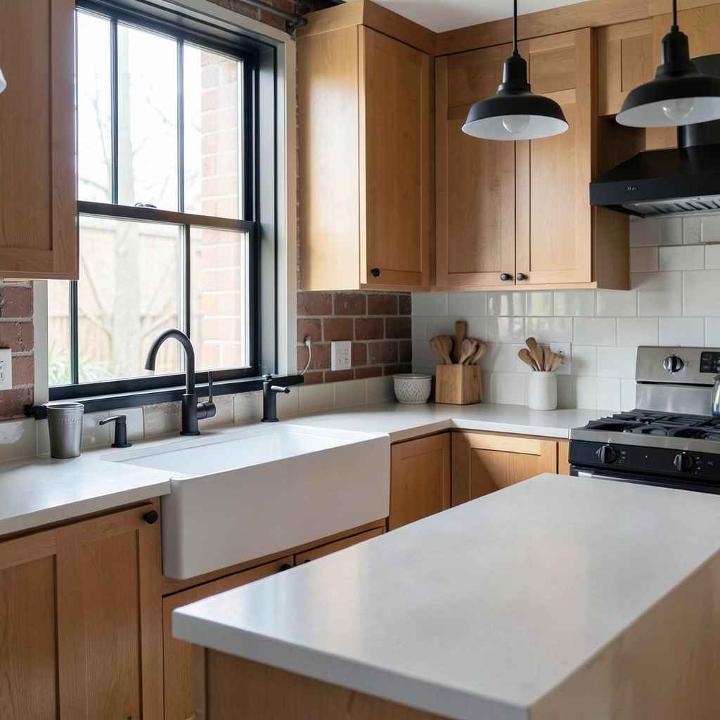
18. Exposed Brick Wall in the Kitchen
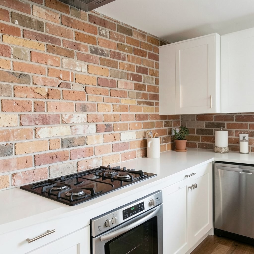
An exposed brick wall in a kitchen does something that no applied texture or printed wallpaper can replicate: it introduces history into a room built for function. The irregularity of the surface, the variation in brick color across a single wall, the depth created by the mortar joints — all of it reads as genuinely made, not manufactured. In a room full of precision-cut surfaces, that imperfection is not a flaw. It is the most interesting surface in the space.
The approach to finishing an exposed brick wall affects how it reads within the kitchen. Bare, unsealed brick in its natural state has the warmest, most raw quality — but it sheds dust and is difficult to keep clean near cooking zones. A clear sealer preserves the look while making the surface wipeable without changing its color appreciably. Limewashing the brick — applying a diluted paint that soaks into the surface without coating it — softens the tones while keeping the texture fully visible. Whitewashed brick goes furthest toward neutralizing the color and works particularly well in kitchens that need the brightness but want to keep the texture.
Positioning matters. A brick wall works best as the backdrop to a cooking zone rather than a preparation zone. The cooktop against brick creates a visual anchor that gives the kitchen a clear center of gravity. Brick behind a refrigerator or dishwasher wastes the texture on an area where appliances will block most of it. The wall needs visibility to earn its place in the design — and when it has it, the kitchen has a quality that no other material choice in the room can match.
19. A Pot Filler Above the Stove
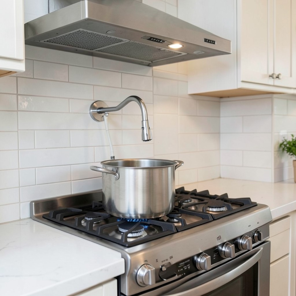
A pot filler is a wall-mounted faucet installed directly above the cooktop, on a swing arm that extends over the burners and folds flat against the wall when not in use. Its purpose is simple: you fill large pots at the stove instead of carrying them from the sink. Anyone who has moved a full stockpot of water from one side of the kitchen to the other understands immediately why this exists. The practical value is real, and it is one of those details that feels like a small luxury until you have it — and then feels like a basic necessity.
The design value extends beyond function. A well-chosen pot filler in the right finish — polished nickel, matte black, unlacquered brass, brushed chrome — adds a detail to the cooking zone that nothing else occupies. Most of the cooktop wall is hood, tile, and cabinet. The pot filler introduces a piece of functional hardware at eye level that has genuine visual character. It reads as serious and considered, the kind of detail that signals the kitchen was designed for someone who actually cooks.
The installation requirement is worth understanding before committing. The water supply line must run inside the wall behind the installation point, which is straightforward in new construction and significantly more involved in a renovation. Access to the wall cavity, the location of existing plumbing, and the tile or backsplash material all affect the complexity of the job. In a gut renovation, adding a pot filler is simple. In a kitchen refresh where the tile is staying, it requires cutting into a finished wall. Know what you are signing up for — but for those who cook seriously, it is almost always worth it.
20. Recessed Ceiling Lighting Grid
The overhead lighting in most kitchens is an afterthought — a single flush-mount fixture in the center of the ceiling, or a string of recessed downlights positioned without much logic. The result is a room that is either overlit in the center and shadowed at the edges, or uniformly bright in a way that flattens every surface and removes any sense of atmosphere. A recessed lighting grid — a planned arrangement of downlights that considers the function of each zone below it — produces a completely different experience.
The principle behind a good lighting grid is that different tasks require different light. The area above the sink needs a downlight close enough to the wall to cast light onto the basin rather than creating a shadow between the fixture and the work surface. The island needs coverage across its entire length, which may require two or three fixtures rather than one centered above it. The perimeter counters along the walls are best served by under-cabinet lighting rather than overhead fixtures, since any ceiling-mounted light above a countertop will be blocked by the person standing at it. Planning for each of these zones separately, then designing the ceiling fixture layout to serve them, is how kitchens achieve real lighting rather than just brightness.
Dimmer switches tied to separate circuits for different zones are the operational layer that makes a well-designed grid genuinely useful. Bright task lighting while cooking, lowered overhead with pendants on for dining, just the island pendants and under-cabinet lights on for a quiet evening in the kitchen — these are experiences that a single-circuit ceiling grid cannot produce, no matter how well the fixtures are positioned.
21. Vertical Shiplap or Paneling Behind Open Shelves
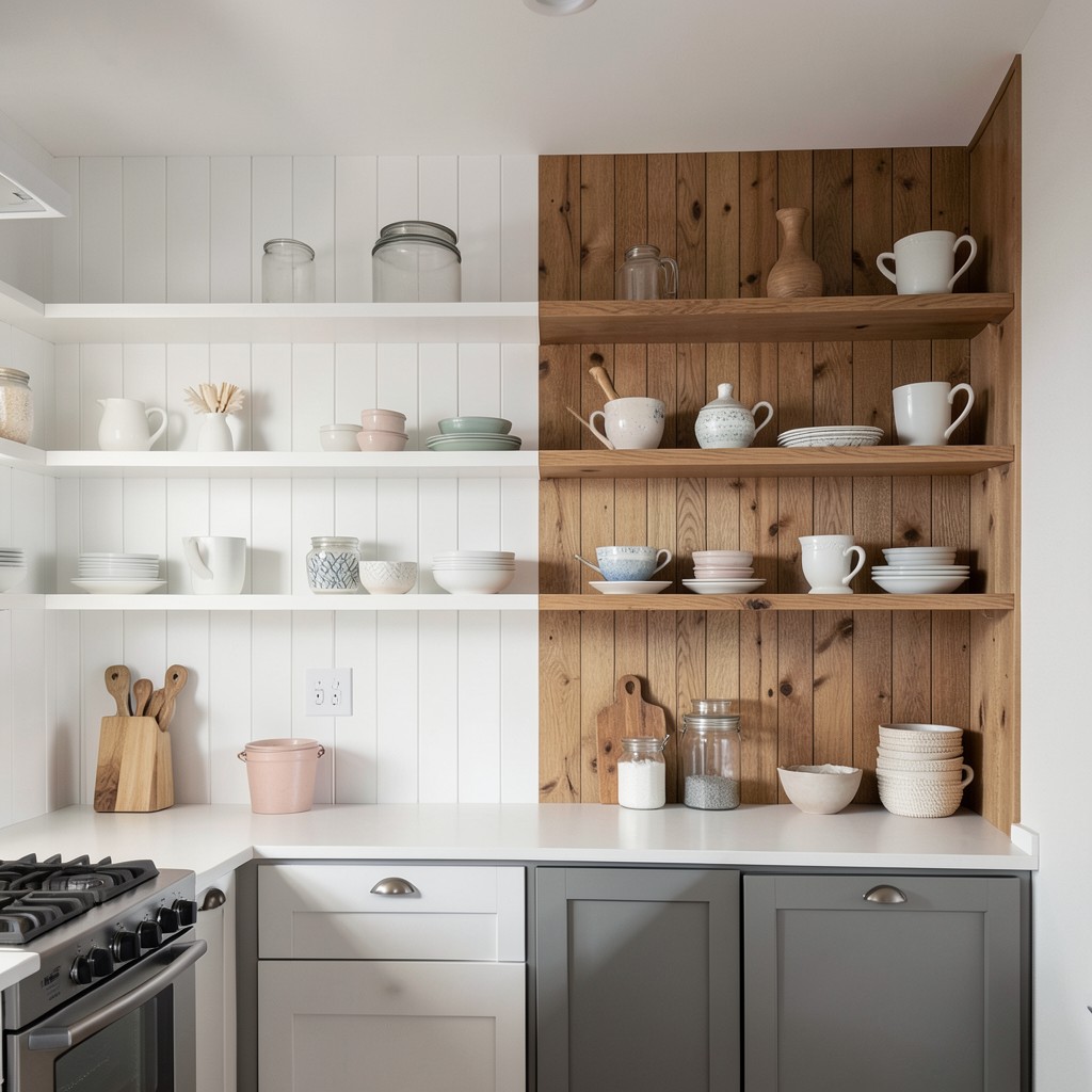
Wall paneling installed vertically behind open shelving adds a layer of texture and architectural depth that plain painted drywall simply does not offer. The vertical orientation of shiplap or board-and-batten draws the eye upward, making ceilings feel higher and the kitchen feel taller than its actual dimensions suggest. It also creates a backdrop that makes everything placed in front of it — shelves, objects, ceramics — read with more definition and intention.
The choice between painted paneling and natural wood finish determines the room’s temperature entirely. Painted white shiplap behind open shelves reads as coastal, clean, and slightly casual — it suits farmhouse and transitional kitchens without feeling nostalgic or overdone when the rest of the design stays contemporary. Natural wood paneling — particularly in an oil finish that shows the grain clearly — introduces warmth that painted versions cannot match and works best in kitchens already committed to a wood-forward or Scandinavian design direction.
The detail that most installations miss is the transition between the paneled wall section and the adjacent flat wall. A simple trim piece or a shadow gap at the edge of the paneling creates a clean termination that makes the paneled section look intentional rather than unfinished. Without that edge detail, even excellent paneling reads as though it stopped before it was supposed to. The finish is in the margins, and this particular margin is one of the most visible in the entire kitchen.
22. Freestanding Furniture Pieces in the Kitchen
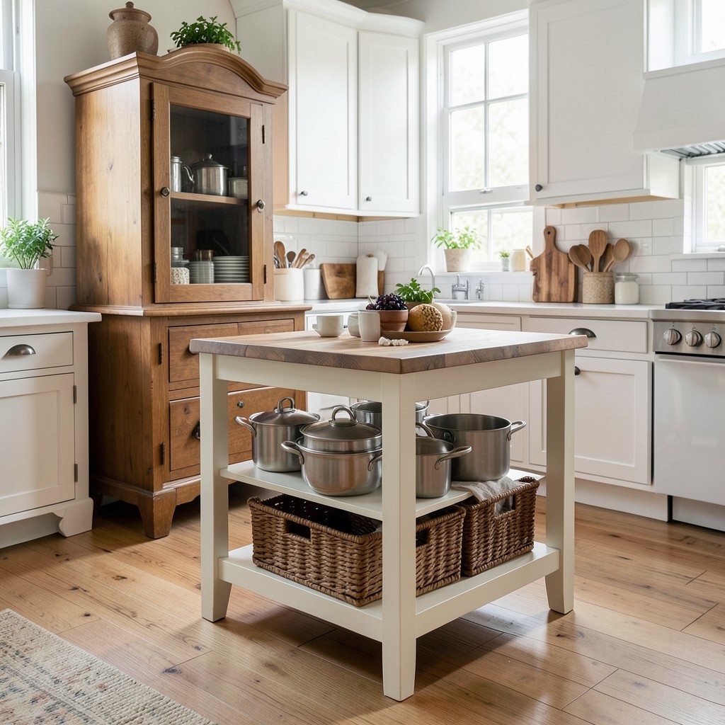
A kitchen that incorporates a freestanding piece of furniture — a vintage armoire repurposed as a pantry, a butcher block island on legs rather than a built-in base, a painted dresser used for storing linens and serving pieces — has a warmth and personality that fully built-in kitchens rarely achieve. The built-in kitchen is the standard now, and the standard reads as such. A freestanding element breaks from that standard and communicates that the kitchen was assembled over time, with consideration, by someone with a specific point of view.
The freestanding island on legs is the most practical expression of this idea. An island that sits on four legs rather than a solid cabinet base looks lighter in the room — visually, the kitchen floor continues beneath it, which prevents the island from feeling like a wall dividing the space. Add a lower shelf between the legs for storing heavy pots or baskets, and the piece reads as furniture without sacrificing any utility. The only practical consideration is that the open base collects whatever falls or rolls under it, which requires a more honest relationship with the kitchen floor than a solid base island demands.
The key to making freestanding pieces work is integration without matching. The goal is not to buy a piece that looks identical to the cabinetry — that just produces a confused-looking kitchen where the built-in and freestanding elements fight each other. The goal is a piece that works within the color palette and material language of the room while being clearly its own thing. A warm wood dresser in a white kitchen is readable. A white-painted dresser in a white kitchen disappears. The freestanding piece earns its place by being distinctly itself.
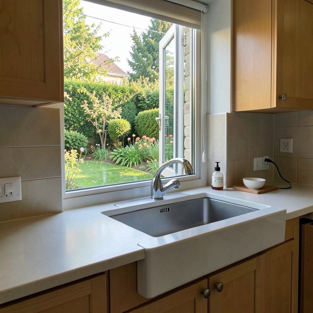
23. Oversized Kitchen Window Above the Sink
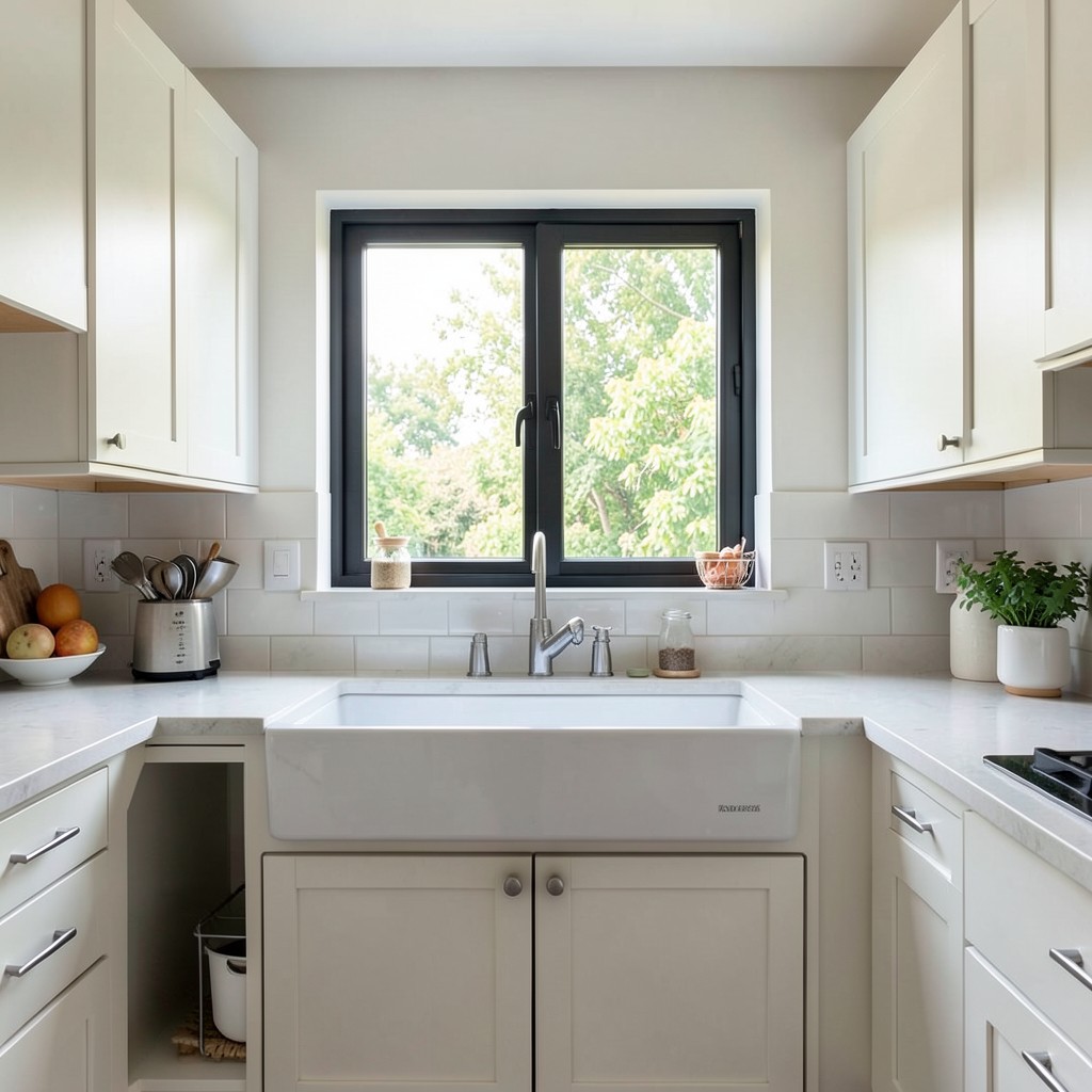
A large window above the kitchen sink is one of those design decisions that improves every single moment spent standing at that counter. Washing dishes, prepping vegetables, filling glasses — these are repetitive tasks that benefit enormously from a view, from natural light, and from the simple psychological relief of looking out rather than at a tiled wall. An undersized window above a sink is a missed opportunity that no amount of styling can compensate for.
The ideal window here is as wide as the sink cabinet allows and as tall as the space between the counter and the upper cabinet or ceiling permits. In kitchens without upper cabinets on that wall, the window can run from counter height to ceiling — a dramatic proportion that floods the sink area with light and makes the kitchen feel connected to the exterior in a way that changes the experience of standing there. In kitchens where upper cabinets flank the window on either side, the window height is constrained but the width can still span the full cabinet run, which delivers a significant portion of the spatial benefit.
Window style matters for how the kitchen feels from outside as much as from inside. A simple, clean casement window with minimal frame — particularly in a dark frame color that recedes visually — emphasizes the view and the light rather than the window itself. Divided lights or decorative grilles add character but reduce the view area and can read as fussy in contemporary kitchens. The right choice depends on the architectural language of the house, but the working principle is consistent: maximize the opening, minimize the frame, and let the outside in.
24. Scalloped or Arched Cabinet Details
Kitchens that incorporate a scalloped edge, an arched lower cabinet base, or an arched doorway into the kitchen zone have a softness and warmth that straight-line cabinetry cannot produce. The arch is one of those design elements that has existed across centuries of architecture and decoration precisely because the human eye responds to it in a way it does not respond to a right angle. It reads as handmade, considered, and — this is the word that keeps appearing when people describe it in real rooms — beautiful.
The application does not need to be extensive to register. A scalloped valance across the front of the open shelving section, an arched toe-kick detail on a kitchen island, or a curved end panel on a run of base cabinets introduces the element without redesigning the entire room. These are additions that a skilled carpenter can fabricate from standard cabinet components, which means they are accessible even in kitchens where fully custom cabinetry is not in the budget. The return on visual investment is disproportionately high.
Arched cabinet details work best when they are paired with other soft or curved elements in the room — a round dining table rather than a rectangular one, curved bar stools, a pendant light with an organic rather than geometric silhouette. The softness of the arch communicates something about the room that rigid geometry cannot, and reinforcing that communication through other rounded forms creates a kitchen that feels genuinely cohesive rather than one that simply has an arch in it.
25. Zellige Tile Backsplash
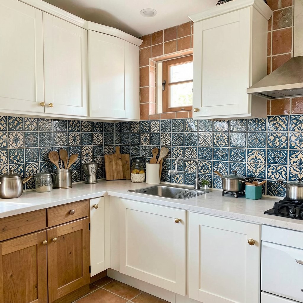
Zellige is a hand-cut Moroccan ceramic tile with a glazed surface that is deliberately imperfect — each tile varies slightly in color, depth, and surface texture, which means a wall covered in zellige shimmers rather than simply reflecting light. The effect is unlike any machine-made tile. Running your hand across it, you feel the variation between tiles. Standing back from it, you see how the light catches each surface at a different angle, producing a depth that flat, uniform tiles cannot replicate.
The color palette of zellige is where most of its design impact comes from. Creamy off-white zellige in a kitchen with warm wood and brass hardware produces a surface that looks antique in the best possible sense — the glaze variation introduces age and richness that no new material achieves without effort. A deep teal or cobalt zellige becomes the kitchen’s centerpiece — everything else in the room should recede to let it lead. Terracotta-toned zellige against white cabinetry introduces warmth that painted walls cannot match and shifts the feeling of the whole kitchen toward something more Mediterranean and unhurried.
The practical consideration with zellige is the grout joint. Because the tiles vary in size by a few millimeters on each edge, the installation requires slightly wider and more forgiving grout joints than machine-made tile. A skilled tile setter who has worked with zellige before manages this naturally. An installer who has not can struggle to produce a clean result. The material rewards experience, which is worth considering when selecting who installs it — the cost of the tile is significant enough that a poor installation is an expensive mistake.
26. Butler’s Pantry as Kitchen Extension
A butler’s pantry — a dedicated prep and storage room positioned between the kitchen and dining area — solves one of the most persistent problems in high-use kitchens: where do the things that you need regularly but do not want visible go? The answer is a room that holds overflow pantry goods, the second refrigerator, the wine storage, the good china, the countertop appliances used weekly rather than daily, and the prep surface you need when cooking for more than four people. It removes the clutter from the main kitchen and lets that space function with a clarity it otherwise cannot maintain.
The design of the butler’s pantry matters more than most people realize when planning it. A narrow room with cabinets on one wall and no counter space misses the point entirely — the prep counter is as important as the storage. A pantry with countertop space, an under-counter refrigerator, a small sink, and a run of both open and closed storage handles the overflow cooking tasks that push a main kitchen into chaos: icing a cake, assembling a charcuterie board, cooling freshly baked goods without taking up the main counter for hours.
Lighting in a butler’s pantry is consistently underdone. People install a single overhead fixture and wonder why the pantry always feels like a closet. Under-shelf lighting, a small pendant or two, and a switch at both the kitchen and dining room entrance to the pantry make it feel like a real room rather than a storage room with aspirations. That quality of finish is what separates a butler’s pantry that gets used from one that becomes a place where things get put when there is no other option.
27. Kitchen with No Upper Cabinets
Removing upper cabinets from a kitchen and replacing them with open shelving, wall paneling, windows, or simply nothing produces a spatial transformation that is almost startling. The room opens vertically in a way that even high ceilings do not fully achieve when they are flanked by wall cabinets at eye level. The kitchen breathes differently without upper cabinets. It feels less like a working room and more like a room that works — a distinction that is subtle to explain but immediately felt.
The storage question is real. Upper cabinets hold a significant volume of kitchenware, and removing them requires honest thinking about where that volume goes. A deeper pantry cabinet, a well-organized base cabinet system with deep drawers rather than shelves, and a commitment to keeping only what is actually used in the kitchen are the practical responses. Many homeowners who make this change discover, in the process, that their upper cabinets contained items they had not touched in years — and the removal prompts a useful reckoning with what the kitchen actually needs to contain.
The design benefit of going upper-cabinet-free extends beyond the kitchen itself. In open-plan homes where the kitchen shares visual space with a living or dining area, removing the upper cabinet wall means the kitchen does not read as a separate room — it reads as part of the larger space. The sightlines open, the walls feel taller, and the gathering area around the kitchen expands both physically and perceptually. For homes designed around connection rather than compartmentalization, that openness is worth every shelving reorganization it requires.
28. Mixed Metal Finishes
The rule that all metals in a kitchen must match is a rule worth breaking carefully. Mixed metal finishes — brass hardware alongside a chrome faucet, brushed nickel light fixtures next to a matte black pot filler — can produce a kitchen that feels collected and layered rather than coordinated to the point of sterility. The key word in that sentence is carefully. Mixed metals work when the mixing is intentional. When it happens because decisions were made at different times without reference to each other, it just reads as inconsistent.
The approach that works most reliably is to establish one dominant metal and introduce a secondary metal sparingly. Brushed brass as the dominant finish on cabinet hardware, with a brushed chrome faucet as the single contrasting metal, produces a room that reads as warm with one cool note — a composition that is much more interesting than all-brass or all-chrome. The secondary metal appears in one or two places only; if it starts appearing in three or four, it challenges the primary finish for dominance and the mix loses its intentionality.
Warm metals play together more naturally than warm and cool metals. Brass, gold, copper, and bronze occupy similar color temperatures and mix without creating tension. Pairing any of these with chrome or brushed nickel — both of which lean cool — requires more care. The contrast can work, but it needs the rest of the kitchen to bridge the gap: warm wood tones, a warm wall color, stone with warm undertones. The metals do not exist in isolation, and the materials around them either make the mix land or make it fight.
29. Ceiling-Height Cabinetry
Cabinet runs that extend all the way to the ceiling — no gap, no shelf on top, no crown molding stopping short — produce a kitchen with a formality and completeness that standard cabinet height cannot match. The wall reads as continuous from floor to ceiling, which eliminates the dust-collecting horizontal ledge above the cabinets, prevents the visual fragmentation created by that awkward upper zone, and makes the kitchen feel taller regardless of the actual ceiling height.
The proportional challenge of ceiling-height cabinetry is that the upper portion — anything above about seven and a half feet — becomes genuinely difficult to access without a step stool. The design response is to treat those upper cabinets differently from the ones at accessible height. Upper sections can hold items used seasonally, extra serving ware, or large appliances that come out a few times per year. They are not everyday storage — they are managed overflow, and designing them for infrequent access rather than daily retrieval removes the practical objection without compromising the visual benefit.
The door profile at ceiling height matters more than at standard cabinet height because it is a larger visual surface. A flat-front door at eight or nine feet tall becomes a significant architectural plane. Any imperfection in the door — a slight bow, an uneven finish, a gap that opens at the top — is visible from across the room. This is not an argument against ceiling-height cabinets; it is an argument for ensuring that the cabinet maker and installer are capable of the precision the format demands. The rewards are significant. So are the consequences of a careless execution.
30. A Kitchen Garden Window
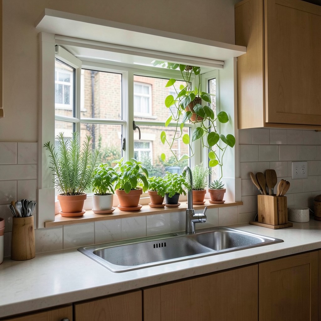
A garden window — a box-shaped window that projects outward from the exterior wall, creating a small sill with glazing on three sides and overhead — gives the kitchen a dedicated space for growing herbs, displaying small plants, and catching light that a flat window cannot match. The projection creates a micro-climate of sorts: warmer than a standard sill in winter because the glass surrounds the plants on three sides, and brighter because light enters from above and both sides simultaneously.
The practical case for a kitchen garden window is strongest where the kitchen has limited natural light or where the view outside is not compelling. A garden window turns the window itself into the view — the rosemary, the basil, the trailing pothos, the small succulent collection become the focal point rather than whatever lies beyond the glass. In an urban kitchen where the window faces a neighboring building, this is genuinely useful design rather than decorative gardening.
Sizing matters. A garden window that is too small looks like an architectural afterthought rather than a designed element — minimum width of about thirty-six inches is needed for the structure to read as intentional. A wider garden window, running to forty-eight or sixty inches, becomes a genuine feature wall in the kitchen, particularly when it is positioned above the sink and the light from three sides illuminates the preparation area throughout the morning. The plants inside become as much a part of the kitchen’s character as any material or finish.
31. Bold Pattern Floor Tiles
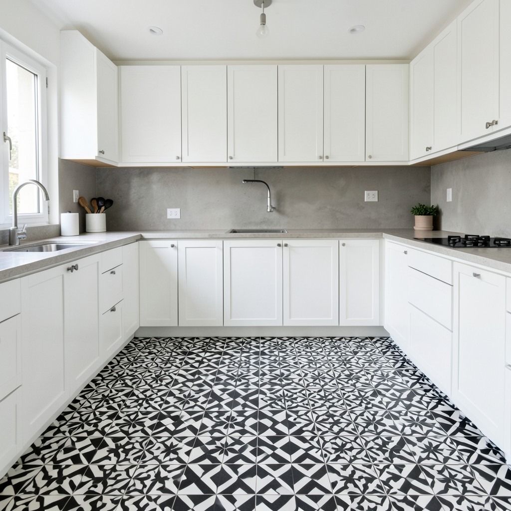
The kitchen floor is the largest continuous surface in the room, and using it as a design opportunity rather than a background material produces a kitchen with a foundation — literal and visual — that everything else can rest on. A bold patterned floor tile — encaustic cement tiles in a traditional Spanish or Portuguese geometric, a black-and-white checkerboard in large format, or a hexagonal mosaic with a graphic two-tone arrangement — anchors the kitchen and gives it character from the ground up.
The counterintuitive reality of bold pattern floors is that they simplify the rest of the design rather than complicating it. When the floor is doing significant visual work, the cabinets, walls, and countertops can afford to be quieter. A kitchen with plain white cabinetry, a simple stone counter, and no backsplash tile can carry enormous personality if the floor has the right pattern. The floor does the work, and the rest of the room provides the breathing room around it. This inversion of the usual design hierarchy — where the cabinetry is usually the room’s primary statement — produces kitchens that feel genuinely different from the norm.
Practical durability matters on a kitchen floor in ways it does not on a wall. Encaustic cement tiles are porous and require sealing before use and regular resealing over time. Glazed ceramic patterned tiles are easier to maintain and hold their color longer. Porcelain format tiles with a printed pattern are the most durable option but sacrifice some of the artisanal character of hand-made cement tiles. The right choice depends on how heavily the kitchen is used and how much ongoing maintenance the homeowner is willing to accept as part of owning a beautiful floor.
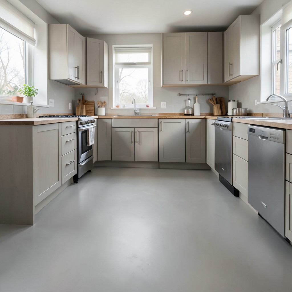
32. The Galley Kitchen Done Properly
The galley kitchen — two parallel runs of cabinetry facing each other, with a single corridor between them — has a reputation for feeling cramped and utilitarian. That reputation is earned by galley kitchens that were designed without thinking about what makes the format work. A galley kitchen designed correctly is one of the most efficient and satisfying cooking spaces available, because every surface, appliance, and storage point is within arm’s reach without requiring movement across a room.
The width of the corridor determines everything. A galley narrower than forty-two inches feels claustrophobic and prevents two people from working in the kitchen simultaneously. At forty-eight inches, two people can pass each other and work side by side. At fifty-four to sixty inches, the galley becomes genuinely comfortable for multiple users, and the kitchen stops reading as a narrow corridor and starts reading as an efficient work space. If the width is constrained by the existing room dimensions, every other design decision should maximize the sense of openness: no upper cabinets on one side, light colors, a window or glass door at one end to introduce depth and terminate the corridor with something to look at.
The light at the end of a galley kitchen is the detail that most transforms the format. A galley that terminates in a wall feels like a dead end — functional but visually closed. A galley that terminates in a large window, a glass door to a garden, or even a mirror that doubles the perceived depth of the room feels like a designed space rather than a leftover one. That terminus deserves deliberate thought, because it is what every person standing at the far end of the kitchen looks at while they work.
33. Handmade Ceramic Knobs and Pulls
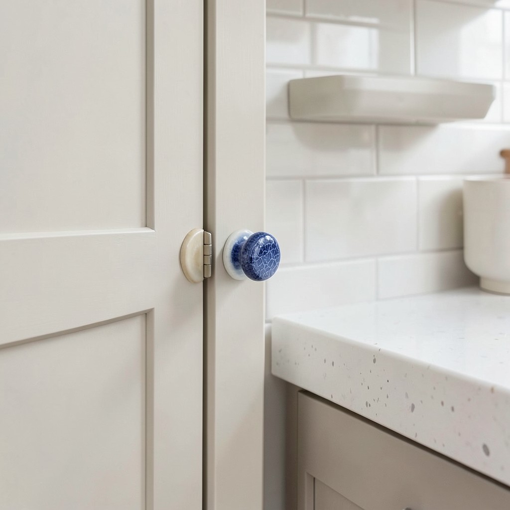
Hardware stores are full of cabinet hardware. Most of it is identical, manufactured in the same few finishes, in the same few profiles, across dozens of brands. Choosing a handmade ceramic knob or pull — made by a ceramicist, unique in the way all hand-thrown work is unique — introduces a material honesty and individual character that manufactured hardware cannot replicate. Each piece varies slightly in size, in the depth of the glaze, in the precise shape where the clay was pressed or pulled. That variation is the point.
The design impact of handmade ceramic hardware is strongest in kitchens that are otherwise composed of precise, machine-made surfaces. Lacquered cabinetry, engineered stone counters, and uniform subway tile create a kitchen that is clean and efficient — and handmade hardware is the element that introduces humanity into that precision. The slight imperfection of a hand-glazed knob against a perfectly flat cabinet door creates a tension that reads as warmth, and warmth is the one quality that precise, machine-made kitchens most frequently lack.
Color and glaze selection extends the design work. A salt-glaze ceramic pull in a warm white or off-cream suits kitchens with a quiet, organic direction. A deep cobalt glaze with a crackle finish introduces a jewel-like intensity that punches well above the hardware’s actual size. An earthy, unglazed stoneware knob works against linen or putty cabinetry in kitchens that lean toward natural materials throughout. The range of options from ceramicists working specifically for cabinet hardware applications is wider than most homeowners expect, and spending time finding the right piece is time that shows in the finished kitchen.
34. A Dedicated Baking Zone
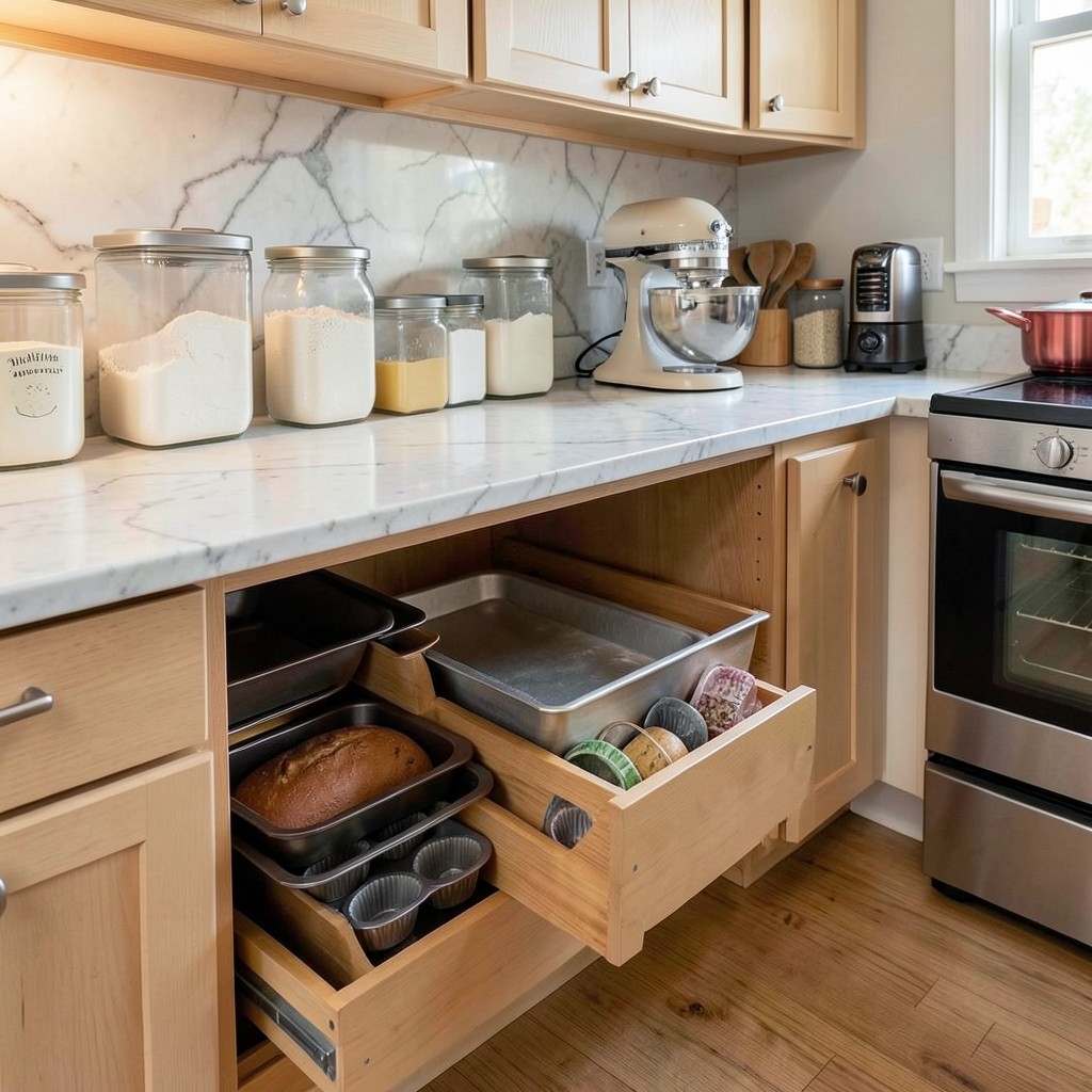
A baking zone within the kitchen — a designated section of counter at a slightly lower height than standard, with dedicated storage for baking equipment, a marble or honed stone surface ideal for pastry work, and a nearby oven positioned for direct transfer — solves the problem of baking in a kitchen designed only for cooking. Standard counter height of thirty-six inches is optimized for standing and chopping. It is too high for rolling dough, which requires downward pressure that is difficult to apply from that elevation. A counter lowered to thirty-two or thirty-four inches in the baking zone makes the physical work of baking significantly more comfortable.
The storage in a baking zone should be organized around the actual workflow of baking rather than the generic logic of kitchen storage. Flour, sugar, and other dry goods at counter height in wide, airtight containers — not buried in a lower cabinet. Stand mixer at counter level rather than stored in an appliance garage or on a lower shelf. Baking sheets, loaf pans, and muffin tins in a deep drawer with a vertical divider so each pan is accessible individually rather than stacked in a pile where the bottom one requires removing everything above it.
The surface material in a baking zone is a design decision with practical stakes. Marble is the traditional choice because it stays cool — which matters for pastry work where butter must not soften prematurely. Honed granite has similar thermal properties and slightly more durability against staining. A thick butcher block section works for bread baking but holds oils and odors that interfere with delicate pastry work. For serious bakers, marble is the answer. It is not low-maintenance, but neither is baking.
35. Blackened Steel Frame Cabinet Doors
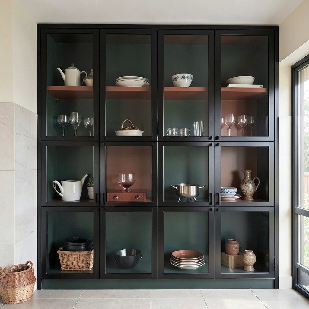
Glass-front cabinet doors with a blackened steel or iron frame — the frame fabricated from thin steel sections, often with true divided lites or a single pane — bring an industrial refinement to kitchen cabinetry that wood-framed glass doors cannot match. The steel is thin enough to be almost architectural rather than structural-looking, and the blackened finish absorbs light rather than reflecting it, which makes the glass panel read as a clean void rather than a reflective surface.
The effect is strongest on upper cabinets or on a dedicated display cabinet where the interior is intentionally curated. Shelving painted in a deep, contrasting color inside the cabinet — deep green, charcoal, or even a warm terracotta — visible through the glass frame creates a composition within the cabinet that is as designed as anything else in the room. The objects displayed on those shelves — glassware, ceramics, collected pieces — become part of the kitchen’s design rather than just its function.
The material requires a skilled fabricator. Blackened steel frames for cabinet doors are not a stock item at any kitchen retailer — they are custom-made, which means finding a metalworker who can produce them to the tight tolerances that cabinet installation demands. The reveal between the frame and the cabinet opening, the alignment of the glass, and the hinge system all require precision. The cost reflects that. But in a kitchen where upper cabinetry is a prominent design element, steel frame doors do something that wood simply cannot, and the investment buys a detail that reads as completely original in almost any residential kitchen.
36. The Kitchen Peninsula
A peninsula — a cabinet run that extends from a wall on three sides, leaving one end open to the room — does the work of an island in a kitchen that does not have the floor space for a freestanding structure. It provides additional counter surface, creates a seating opportunity at the open end, and draws a functional boundary between the kitchen and an adjacent dining or living area without requiring the clearance on all four sides that a true island demands. In smaller homes and apartments, the peninsula is not a second-best alternative to an island — it is the correct answer for the space.
The proportions of the peninsula determine whether it functions as a working counter, a seating zone, or both simultaneously. A peninsula that extends far enough from the wall to allow comfortable knee clearance on the seating side — at minimum fifteen inches of knee space below the counter overhang — turns the outside edge into a functional breakfast bar. Below that, stools sit awkwardly and people avoid using the space. The counter length matters too: a peninsula shorter than four feet rarely provides enough surface to be genuinely useful as a work counter and simultaneously seat more than one person. At five to six feet, the peninsula starts earning its position in the room by doing two things well at once.
The connection point where the peninsula meets the perimeter cabinets is the structural and aesthetic decision most people overlook until they see the finished result. A hard corner where the peninsula meets the wall creates a boxy, enclosed kitchen entrance that can feel restrictive. A curved end on the peninsula, or a deliberate gap between the peninsula and the perimeter counter at the point of connection, softens that transition and keeps the kitchen feeling open even when the peninsula is substantial. That end condition — how the peninsula begins and how it terminates — is what distinguishes a peninsula that feels designed from one that simply fills a space.
37. Textured Plaster Walls
Painted drywall has one significant limitation as a kitchen wall finish: it is completely flat. A wall that catches no light, holds no shadow, and reveals no material depth reads as nothing more than a background — a surface that exists to separate one space from another. Textured plaster introduces a third dimension to the wall that changes how light moves through the room. A troweled plaster surface in a warm white or cream catches morning light differently than afternoon light, and the subtlety of that movement makes the kitchen feel alive in a way that flat-painted walls simply do not.
The application technique determines the texture’s character and its relationship to the rest of the kitchen design. A fine Venetian plaster, polished to a slight sheen, reads as refined and suits kitchens with marble countertops and tailored cabinetry. A coarser troweled finish with visible sweep marks introduces more rusticity and works well against natural wood cabinetry or exposed brick. A limewash plaster — applied in layers that build subtle color variation across the surface — has a warmth and depth that no single-pass paint application achieves, and it photographs beautifully while feeling even better in person.
The kitchen-specific consideration with plaster walls is moisture and cleaning. Plaster near cooking zones needs to be sealed to withstand the humidity and occasional grease splatter that is simply part of cooking. Most professional plaster finishes intended for residential interiors come with sealing recommendations, and following them precisely preserves the texture without changing its appearance. The area directly adjacent to the cooktop should still be tiled or clad in a harder surface — plaster as an accent wall away from the cooking zone, paired with tile at the business end of the kitchen, gives you both the textural beauty and the practical protection the room requires.
38. A Built-In Breakfast Nook With Storage
A breakfast nook built directly into the kitchen — not an adjacent dining room, but a seating area that is physically part of the kitchen zone itself — changes how the kitchen is used at every hour of the day, not just at mealtimes. The nook becomes the place where someone sits with coffee while another person cooks, where children do homework while dinner is prepared, where a laptop opens for the afternoon work session that does not require a dedicated office. It pulls life into the kitchen rather than confining the kitchen to a purely functional role.
The built-in quality is what gives the nook its character. Banquette seating with upholstered cushions, a fixed table that belongs to the space, and lighting positioned specifically for that corner — a pendant hung low over the table, or a wall sconce at seated eye level — creates an intimacy that a free-standing table and chairs cannot generate. The furniture in a built-in nook is the room; in a free-standing arrangement, the furniture is in the room. That difference in integration is felt immediately and consistently.
Storage under the bench seating is the practical detail that makes a built-in nook genuinely earn its footprint. Hinged seat tops or drawers built into the base of the bench provide a volume of storage for items that belong near the kitchen but do not need to be in it — extra table linens, seasonal serveware, children’s craft supplies, the items that every household accumulates and struggles to place logically. That storage does not make the nook more beautiful. It makes the rest of the kitchen cleaner, and a cleaner kitchen always reads as a more beautiful one.
39. Soapstone Countertops
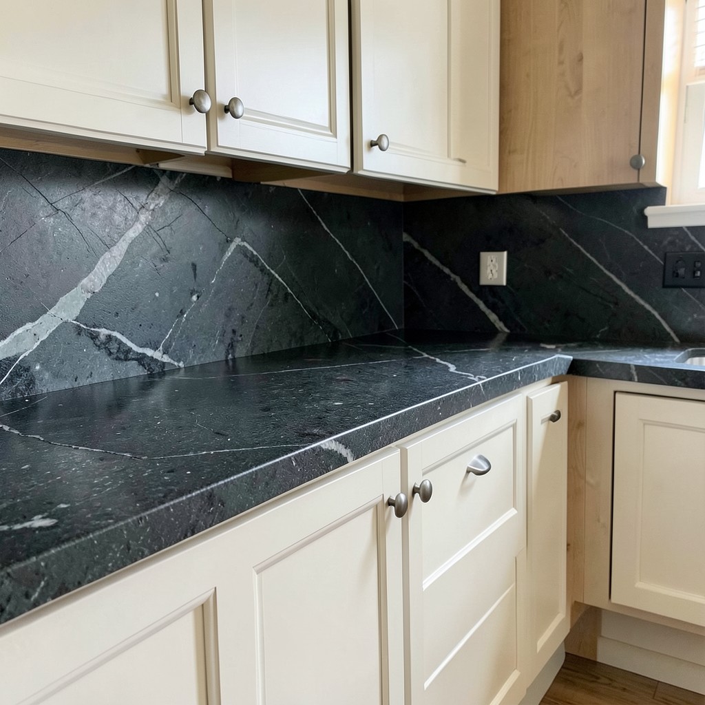
Soapstone is a countertop material that most homeowners encounter once and immediately wonder why more kitchens do not use it. The surface is dense, non-porous without any sealing required, completely heat-resistant, and immune to acidic foods that stain marble and etch limestone. From a practical standpoint, it is one of the most forgiving natural stone countertop options available. From a design standpoint, its dark grey-green tone with soft white veining produces a counter surface that reads as genuinely distinguished — quiet and serious in a way that manufactured surfaces do not achieve.
The characteristic that surprises most first-time soapstone owners is how the material changes with use. Untreated soapstone is a medium grey. When oiled with mineral oil — a simple process done periodically during the first year or so of ownership — the stone darkens dramatically to a deep charcoal or near-black. That deepening is permanent; each oiling enriches the tone a little further until the stone reaches its full depth. Light scratches that occur during normal use blend into the patina rather than standing out as damage, and a light sanding restores any area that develops more significant marks. The material genuinely improves with age.
The pairing of soapstone with white or cream cabinetry is the combination most often used because the dark counter against the light cabinet creates a contrast that is bold without being aggressive. Against warm wood cabinetry, soapstone introduces a grounding darkness that prevents the room from feeling too light or Scandinavian. Against dark cabinetry, soapstone is more complex — the tones can merge unless the stone has enough veining variation to distinguish the counter surface from the cabinet face. Know your light conditions before committing to this combination.
40. The Double Island
Two islands in a kitchen — one configured for food preparation and the second for seating, casual dining, or secondary prep — is a layout that only works in kitchens with significant square footage, but in those kitchens, it solves every problem a single island creates by trying to do too much at once. A prep island keeps the cooking activity contained and away from guests. A seating island faces the room and invites people to sit, eat, and engage without being in the working kitchen at all. The two zones coexist without conflict.
The design relationship between the two islands matters as much as the presence of both. Islands that match exactly — same counter material, same cabinet finish, same hardware — read as a pair and feel formal. Islands with contrast — one in a painted finish, one in natural wood; one with a stone counter, one with butcher block — read as having different functions, which is both practically accurate and visually interesting. The contrast reinforces the purpose of each island without requiring a sign above either one.
Clearance between the two islands is the dimension that most double island plans underestimate. Forty-eight inches between the working faces of both islands is a functional minimum that starts to feel crowded when multiple people are working. At sixty inches, two people can work back-to-back comfortably. At seventy-two inches, the space between the islands becomes a genuine circulation zone that handles both kitchen traffic and guest movement without either competing with the other. Plan the clearance generously and the double island layout delivers everything it promises. Shortchange it and the kitchen functions worse than a single well-placed island would.
41. Vintage-Inspired Light Fixtures
A kitchen that takes its overhead lighting seriously treats the light fixture as a design element rather than a utility decision. Vintage-inspired pendant lights — aged brass with a hand-blown glass globe, wrought iron with an Edison-style filament, industrial cage pendants with exposed wiring in a braided fabric sleeve — contribute to the kitchen’s design story in a way that recessed downlights never can. The fixture is visible; it has silhouette, material, and presence; and it sits at the exact eye level where people look when they are seated at an island or standing at the counter.
The key to choosing vintage-inspired fixtures is understanding what “vintage-inspired” actually means for the specific kitchen. A farmhouse kitchen with shiplap walls and open shelving needs a different fixture than an urban loft kitchen with concrete counters and steel cabinet frames. Both can use vintage references, but the reference points are different — the farmhouse kitchen draws from early American industrial design, the loft kitchen from European factory architecture. The fixture should feel native to the kitchen’s design direction rather than imported from a different aesthetic entirely.
Scale is where most pendant light decisions fail. The right pendant for an eight-foot ceiling is too small for a ten-foot ceiling and completely lost under a twelve-foot one. Cluster pendants — groups of three or five individual fixtures hung at slightly varying heights — solve the scale problem in kitchens with high ceilings because the group reads as a single composed element with enough visual mass to anchor the space below it. A single oversized pendant makes a different kind of statement but requires confidence in the size selection that most homeowners underestimate when looking at catalog photos.
42. Micro-Cement Flooring
Micro-cement is a thin-coat surface material applied directly over existing floors or substrates, producing a continuous, seamless surface with no grout lines, no tile joints, and no visual interruption of any kind. The result in a kitchen is a floor that reads as a single plane — which makes the room feel larger, cleaner, and more architecturally resolved than a tiled floor regardless of how good the tile is. The seamlessness is not just aesthetic; it also eliminates the grout lines where dirt, crumbs, and bacteria collect in conventional tile installations.
The color range available in micro-cement is wider than most people expect. Warm sand tones, cool mid-greys, deep charcoals, and off-whites all exist within the palette, and the material can be tinted to almost any custom color with a skilled applicator. The finish can range from matte to a subtle satin, and the texture from perfectly smooth to lightly aggregated depending on the mix. That range of options means micro-cement can work across very different kitchen design directions — from warm and organic to sharp and contemporary — without the material feeling like a default choice.
The practical requirement is professional installation and proper sealing. Micro-cement is applied in multiple thin coats, with each coat requiring curing time before the next is applied. The sealing process after the final coat is what determines the floor’s resistance to staining, moisture, and wear. A properly sealed micro-cement floor in a kitchen handles everything a tiled floor handles. An under-sealed installation stains readily and damages early. The material rewards investment in a skilled applicator and punishes attempts to cut costs at the application or finishing stage.
43. Pull-Out Pantry Cabinets
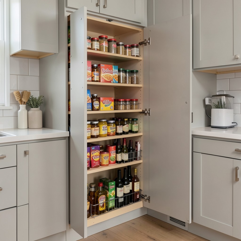
A pull-out pantry — a tall, narrow cabinet fitted with multiple shelves on the door and interior that slides out from its housing to reveal full, all-sides access — solves the problem that conventional deep pantry cabinets create: the back half of the cabinet becomes a dead zone where things disappear and are forgotten. In a standard thirty-inch-deep cabinet, the items at the back require removing everything in front of them to access. A pull-out pantry brings every shelf to you, fully visible and reachable, in a single motion.
The design integration of a pull-out pantry is invisible when done correctly. The door face matches the surrounding cabinetry exactly — same finish, same hardware, same reveal gaps — so the cabinet reads as a standard tall cabinet until someone pulls it open. That moment of reveal, when a narrow cabinet face opens to expose a fully organized, deeply stocked pantry system, is one of the more satisfying things a kitchen can do. It also demonstrates something important about good design: the best functional decisions are often the ones you cannot see from the outside.
The internal organization of a pull-out pantry is where the investment in planning pays dividends over years of daily use. Adjustable shelf heights that accommodate both spice jars and cereal boxes without wasted vertical space above either. A section dedicated to oils and vinegars in bottles that are too tall for standard shelf spacing. Wire baskets rather than solid shelves in sections where visibility across the full depth of the shelf matters. None of these details are expensive. All of them are the difference between a pull-out pantry that gets used as intended and one that slowly fills with whatever fits rather than what belongs there.
44. Herringbone Backsplash Pattern
The herringbone pattern — rectangular tiles set at forty-five degrees to each other in alternating directions — is one of the most enduring tile arrangements in kitchen design for a reason: it generates visual movement and direction without requiring a dramatic tile or color. A simple white subway tile in a herringbone arrangement has three times the visual interest of the same tile in a running bond. The diagonal lines activate the surface, draw the eye across it, and create a sense of energy that flat, horizontal installations simply do not produce.
The tile format affects how the herringbone reads from a distance. Small tiles — two-by-four inch subway tiles — produce a dense, fine-grained herringbone that reads almost as texture from across the room. Larger tiles — four-by-twelve or four-by-sixteen — produce a more graphic, bold herringbone where the individual lines of the pattern are visible even at distance. The larger format suits kitchens with strong, contemporary design directions. The smaller format works in transitional and traditional kitchens where the pattern contributes without dominating.
Grout color in a herringbone installation is amplified relative to other patterns because the diagonal joint lines run in multiple directions and cover more visual territory. A contrasting grout in a herringbone backsplash makes every tile joint a visible part of the pattern — which can be a beautiful effect or an overwhelming one depending on the tile size and the strength of the contrast. A matching or tone-on-tone grout quiets the pattern down and lets the movement of the herringbone read as a surface quality rather than a grid. Decide on the grout before committing to the tile, not after.
45. A Kitchen With a View-Facing Sink
Positioning the kitchen sink so that it faces a meaningful exterior view — a garden, a courtyard, a tree line, a street with character — makes one of the most repetitive tasks in any kitchen feel like something other than a chore. Washing dishes at a sink that faces a blank wall is a task you complete. Washing dishes at a sink that faces a garden in the afternoon light is something closer to a pause. That difference accumulates across thousands of moments over the years, and its effect on how people feel about spending time in the kitchen is more significant than most design decisions that cost considerably more.
The arrangement requires intentional planning around the kitchen’s layout. Plumbing runs dictate where sinks typically land, and repositioning a sink to face a window often means extending supply and drain lines to a wall that did not previously carry them. In a renovation where the walls are opened, this is a straightforward addition. In a minor kitchen refresh, it may be impractical. But in any new kitchen build or significant gut renovation, the question of where the sink faces is worth asking at the very beginning of the process, not after the layout has already been fixed.
Window height matters here in a specific way. A window sill that sits higher than the countertop creates a gap between the counter surface and the glass — and that gap is usually filled with a tile backsplash section that partially blocks the view from a standing position. The ideal window for a view-facing sink has a sill that meets the countertop directly, or comes close enough that no tile section interrupts the sightline. That direct counter-to-glass connection is what makes the sink feel genuinely connected to the outside rather than looking at the outside through a frame within a frame.
46. Integrated Toe-Kick Lighting
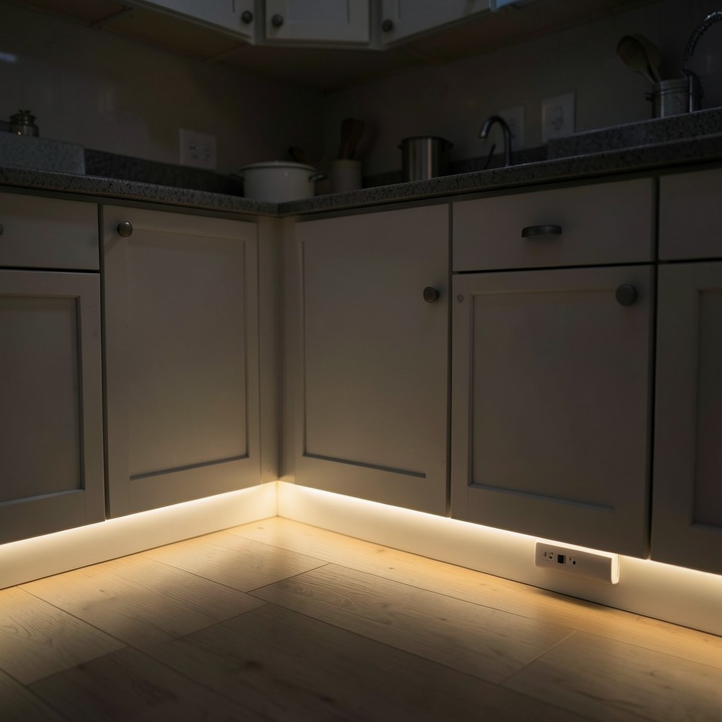
Toe-kick lighting — LED strips installed inside the toe-kick recess at the base of the cabinetry — produces a gentle glow at floor level that floats the cabinetry visually above the floor surface. At night, with the main lights off, toe-kick lighting gives the kitchen a quiet ambient quality that is atmospheric in a way that overhead lighting never achieves. It also serves a genuinely practical purpose: it provides enough light to navigate the kitchen safely at night without turning on overheads that are too bright for the hour.
The color temperature of toe-kick lighting has a larger effect on the room than the same choice in overhead fixtures, because the light source is low, indirect, and used primarily in low-ambient conditions. A warm white at 2200K to 2700K produces a golden glow that reads as inviting and calm — appropriate for a kitchen at ten in the evening. A cooler temperature at 3500K or above reads as clinical at that same hour and defeats the purpose of having a separate low-light source. Warm is almost always the correct choice for this particular lighting layer.
The installation is straightforward in new construction and requires only minor effort in a kitchen that already has toe-kicks in place — the LED strip runs inside the existing recess, powered by a driver tucked inside the nearest base cabinet. Connecting the lights to a separate switch, or to a timer that activates them automatically after a certain hour, removes the friction of having to remember to use them. The light layer only delivers its full value when it is on regularly, and a timer or smart switch ensures that happens without requiring any daily decision from the people who live in the kitchen.
47. A Kitchen With Exposed Ceiling Beams
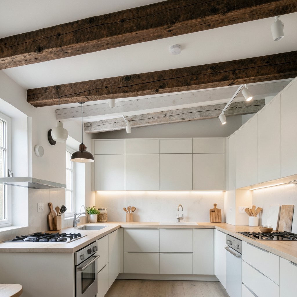
Exposed wooden ceiling beams in a kitchen introduce structural honesty and overhead warmth that a smooth, painted ceiling cannot offer. The beam is doing real work — or reading as though it is — and that quality of structural expression gives the kitchen a depth and age that no surface treatment achieves. Even in new construction where the beams are decorative rather than load-bearing, the visual effect of dark wood overhead against white walls and lighter cabinetry creates a layered, settled quality that makes the room feel as though it has always existed.
Beam color and profile affect the kitchen’s direction significantly. Rough-hewn dark walnut beams above a farmhouse kitchen read as rustic and grounded. Painted white beams in a clean, square profile above a contemporary kitchen read as architectural rather than traditional — a structural rhythm overhead that adds visual interest without warmth or rusticity. Bleached or whitewashed beams against a light ceiling produce a Scandinavian quality that suits kitchens built around natural materials and restraint. The beam is not decorative trim — it is a design statement that sets the register for everything below it.
Pendant lights hung from exposed beams — rather than from a ceiling junction box — introduce a layered lighting arrangement that feels less installed and more composed. The beam becomes both a structural element and a lighting infrastructure point, and the fixtures hung from it read as part of the kitchen’s architecture rather than additions to it. Track lighting clipped to the beam underside achieves a similar effect with more directional flexibility. Both approaches take advantage of an overhead element that most kitchen designs either do not have or do not use to its full potential.
48. A Marble Slab Backsplash
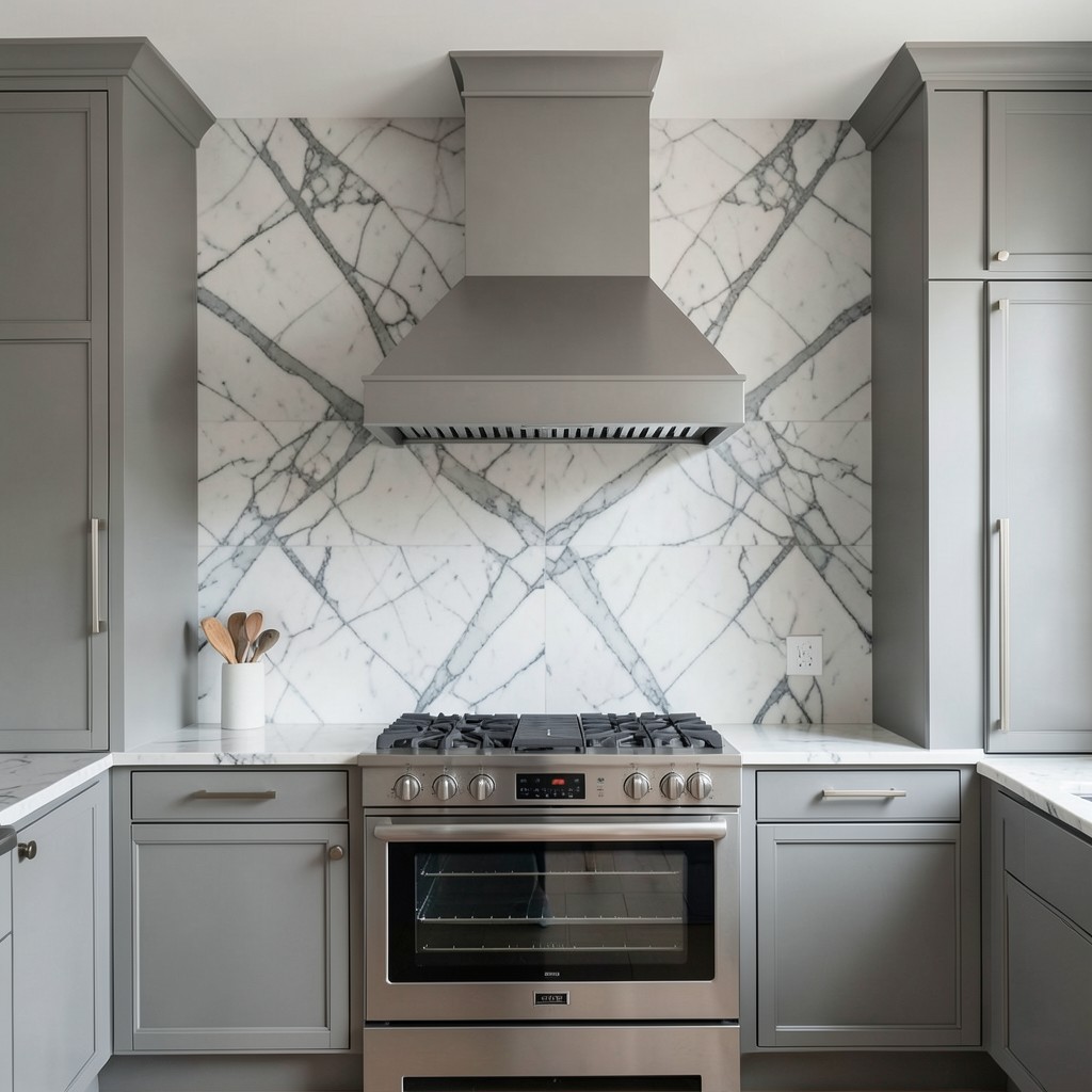
Running a single slab of marble from countertop to ceiling as the backsplash — full slab, no grout joints, no tile pattern — produces a wall surface of extraordinary refinement. The veining of a natural marble slab is unrepeatable; it formed over millions of years under conditions that will never be exactly replicated. Displaying that in a kitchen, at scale, as a continuous surface rather than cutting it into tiles that fragment the pattern, is a design decision that puts material beauty at the center of the room’s identity.
The bookmatched version of this idea — two slabs cut from the same block and opened like a book, so the veining mirrors across the seam — amplifies the effect considerably. The resulting pattern is symmetrical in a way that natural stone never is on its own, and the symmetry reads as almost architectural — more like carved stone than countertop material. On a cooking wall framed by a statement range hood and flanked by tall cabinet runs, a bookmatched marble slab backsplash is the single most visually impactful surface decision available in kitchen design.
The maintenance conversation cannot be avoided. Marble is porous and reactive to acids — citrus juice, wine, vinegar, and coffee all etch the surface if they sit without being wiped. A honed finish conceals etching better than a polished one because the matte surface reads more uniformly. A dedicated backsplash slab that does not serve as a working counter surface faces far less acid exposure than a marble countertop and is significantly more practical than most homeowners expect. Seal it twice yearly, wipe spills promptly, and the slab rewards you with decades of beauty that no man-made surface replicate.
49. Smart Storage in Every Dead Corner
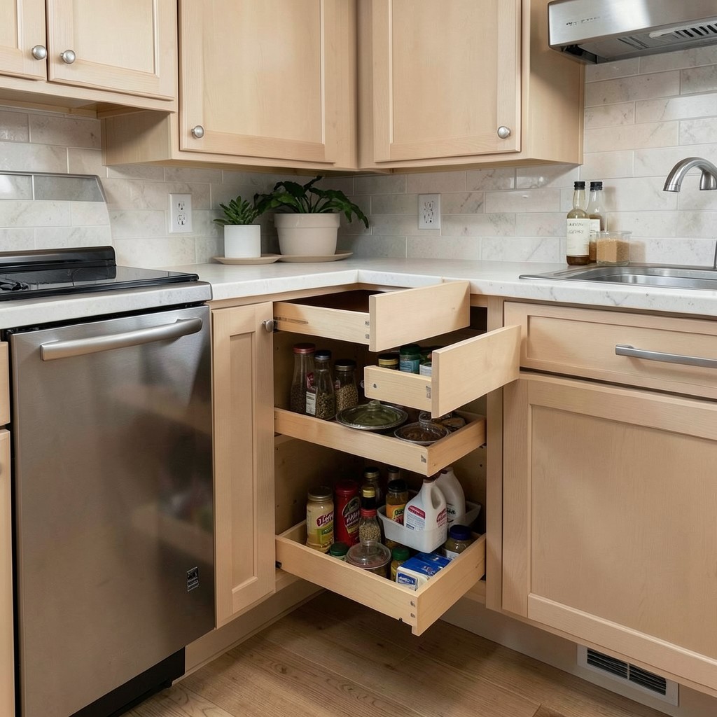
Corner cabinets are the most poorly utilized space in the conventional kitchen. The standard blind corner cabinet requires leaning inside an awkward opening and fishing around for whatever fell toward the back, which means the back half of the corner cabinet is functionally inaccessible and most people stop putting things there after the first year. The kitchen pays a space tax for having corners, and accepting that tax as inevitable is a design failure, not an architectural constraint.
Lazy Susan rotating trays, pull-out corner drawers, and swing-out shelf systems all address the corner problem with different trade-offs. A Lazy Susan is the simplest solution — two circular trays that rotate freely bring everything at either radius to the front with a spin. Pull-out corner drawers require more custom cabinetry but produce the most intuitive access, because drawers are the most natural human interface with a cabinet. The drawer pulls straight out to a right angle from the opening, then extends further to reveal the second section that was previously hidden in the dead zone. Swing-out shelf systems are mechanically elegant but more expensive and require precise installation to function reliably over years of daily use.
The broader principle that corner storage represents applies to every difficult zone in the kitchen. Under-sink cabinets with two doors and no organization become black holes for cleaning products. A simple pull-out bin system or a U-shaped pull-out shelf that accommodates the plumbing obstruction transforms the same space into genuinely functional storage. Narrow gaps between appliances and cabinets — often twelve to eighteen inches wide — can accept slim pull-out pantry units that hold spice collections, oils, and condiments in a footprint that was previously treated as a structural gap. The kitchen that uses every inch does not feel cramped — it feels complete.
50. A Kitchen Designed Around Natural Light
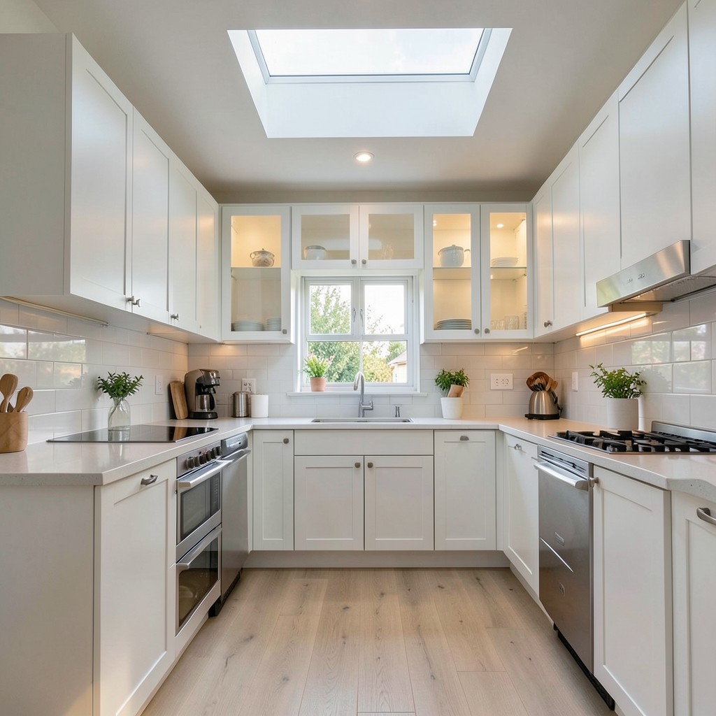
The best kitchen design decision you will ever make costs nothing and cannot be undone: understanding how light moves through the room before making any other choice. Natural light changes everything — cabinet colors that look one way in a showroom read completely differently in the specific light of your kitchen at ten in the morning or four in the afternoon. A white kitchen in a north-facing room without supplemental windows reads cold and flat. The same white kitchen with a skylight overhead reads luminous and warm. The room’s relationship to the sun is the design condition that everything else responds to, and ignoring it produces kitchens that never quite work regardless of how well the individual elements were chosen.
Maximizing natural light is an active design pursuit, not a passive hope. Mirror-finish backsplash tiles reflect light into shadowed corners. Light countertops bounce overhead light back upward and brighten the working surface without requiring a single additional fixture. Removing upper cabinets from the wall that faces the primary window source allows light to travel deeper into the kitchen rather than stopping at the cabinet face. Glass-front cabinet doors on the wall opposite the window carry reflected light into the cabinet interior and prevent the wall from reading as a solid, light-blocking plane. Each decision either opens the room to light or closes it off, and every one of those decisions compounds.
A kitchen where natural light has been considered in every design choice has a quality that is difficult to articulate but immediately recognizable. It does not need to be artificially brightened at midday. At dusk, the transition from natural to artificial light is gentle rather than jarring. Materials reveal their actual colors rather than performing for showroom conditions. The room simply feels right — and feeling right, consistently, at every hour of every day, is the highest standard any kitchen can meet.
Leave a Reply