
Most people have a living room but very few people have truly thought about what they want it to do. That gap — between the room that exists and the room that works — is where most living room disappointment lives. You walk in, glance around, feel something vague and unsatisfying, and then sit on the sofa anyway because that is what the room is there for. The furniture is fine. The paint color is inoffensive. Nothing is actively wrong, and yet the room never quite pulls you in the way a really good living room should.
The living room carries more functional weight than any other room in the house. It is the room where the household relaxes after the working day, where guests are received and entertained, where children play on the floor while adults read on the sofa, where films are watched, arguments are resolved, and the quiet Saturday morning with coffee and nowhere to be becomes one of the small pleasures a well-designed domestic life makes possible. A room asked to do that much deserves more than the furniture collection left over from three apartments ago and a sofa chosen because it fit through the front door.
What makes living room design genuinely difficult is that it is simultaneously the most personal room in the house and the most public one. The living room is where your taste is on full display to every person who visits, and it is also the room where you spend the most daily time in physical contact with the furniture and surfaces you have chosen. A room that looks impressive but is uncomfortable to occupy is a design failure of the most frustrating kind — it performs for guests and fails its owner daily. A room that is physically comfortable but aesthetically bland performs for its occupant but never for the photographs or the guests who sit in it. The living room that succeeds at both — the room that looks the way you want it to look and feels the way you want it to feel — requires genuine design thinking rather than the accumulation of individually inoffensive purchases.
The challenge of the living room is also the challenge of the wrong starting point. Most people begin with the sofa — the largest purchase, the longest commitment, the piece they spend the most money on — and then arrange everything else around it. The sofa becomes the room’s governing constraint before the room’s design direction, the light quality, the color palette, or the spatial organization has been established. The sofa that looked right in the showroom sits in the room and the room organizes itself around a decision made without context, and the results are almost always a room that works from the sofa outward but never quite works as a whole.
The fifty living room design ideas in this collection approach the room from fifty different angles — material, atmospheric, spatial, functional, and aesthetic — and address the full range of what a living room can be when the decisions are made with intention rather than accumulated by default. Some of these ideas are major — the room’s architectural direction, its spatial layout, its primary furniture selection. Others are smaller in physical scale but significant in atmospheric impact — the lighting approach, the textile layering, the plant strategy. All of them are grounded in the understanding that the living room is the room where your daily domestic life has the most room to either thrive or merely persist, and the difference between those two outcomes is entirely in the quality of the decisions you are willing to make about it.
1. A Living Room With a Sectional Sofa as the Anchor
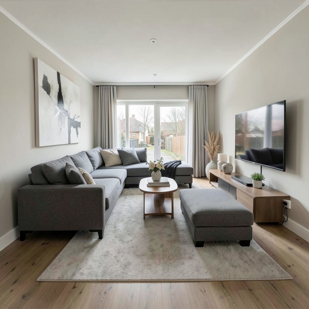
The sectional sofa is the living room furniture piece that most divides opinion among designers, and that division is worth understanding rather than avoiding. The criticism of the sectional is that it dominates rooms, commits rigidly to a single spatial configuration, and tends to fill the available floor space so completely that the room becomes one large piece of furniture with walking paths rather than a composed living environment with zones and variety. Every one of those criticisms is correct — and every one of them applies specifically to a sectional chosen at the wrong scale for the room it occupies. A correctly scaled sectional does none of those things.
The scale of the sectional must be evaluated against the room’s dimensions with a precision that showroom visits do not support. The sectional that fills the floor space of the showroom’s display area may fill your living room with half of its length still in the hallway, and that miscalibration is the source of the domination problem rather than the sectional’s form itself. A sectional whose longest face runs no longer than two-thirds of the wall it faces provides the generous seating capacity that is the sectional’s primary advantage while leaving the floor space between the sofa and the opposite wall at the minimum comfortable circulation width of one hundred and fifty centimeters.
The sectional’s configuration — the placement of the chaise extension — determines how the room’s conversation zone relates to the television position, the fireplace, and the primary circulation path between the room’s entrance and its other exits. A chaise extension that blocks the natural movement path through the room is the configuration problem that produces the furniture-obstacle quality that sectional critics describe. A chaise extension positioned along the room’s longest wall, with its open end toward the room’s center, leaves the primary circulation path clear and directs the conversation zone inward rather than toward the walls.
2. A Living Room With a Gallery Wall as the Focal Point
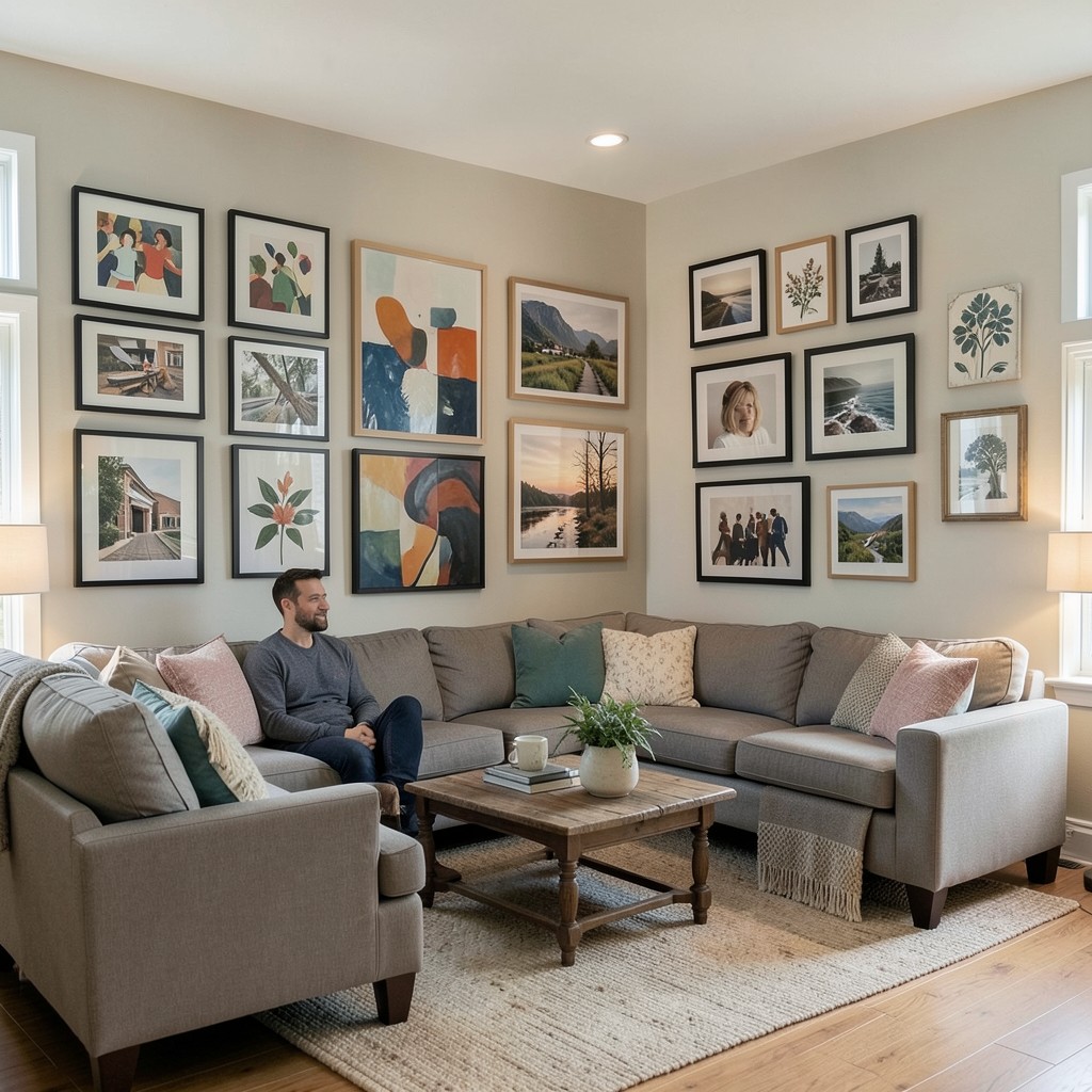
A gallery wall that serves as the living room’s primary focal point — rather than the television, the fireplace, or a single large artwork — is the design choice that most directly communicates the household’s aesthetic identity in the room’s most prominent position. The focal point of a living room is where the eye goes first and returns most often, and a gallery wall at that position makes the household’s visual culture the room’s dominant statement. That is a confident choice, and confidence in a focal point always reads better than timidity.
The wall selected for the gallery must be the wall that the primary seating faces and that is visible from the room’s entrance — these are almost always the same wall in a standard living room layout, and the gallery at that position receives the sustained attention of every person seated in the room and the first impression of every person entering it. A gallery wall on a side wall, visible only from certain seating positions, functions as a secondary interest element rather than a focal point. The distinction matters because the design investment a gallery wall represents is justified by its prominence, and a side-wall gallery that most people in the room cannot see simultaneously wastes that investment.
The gallery wall’s content determines the room’s personality at the most direct level. A collection of abstract prints in a consistent palette communicates aesthetic confidence and design awareness. A personal collection of photographs, travel objects, and meaningful objects communicates warmth and life history. A mix of art and natural objects — pressed botanicals, a small antique mirror, a piece of ceramic wall art alongside printed works — communicates the curious, collected character of someone who finds beauty in unexpected combinations. Choose the direction honestly, commit to it fully, and the gallery wall becomes one of the most powerful design tools available in a living room.
3. A Living Room With a Deep, Comfortable Reading Chair
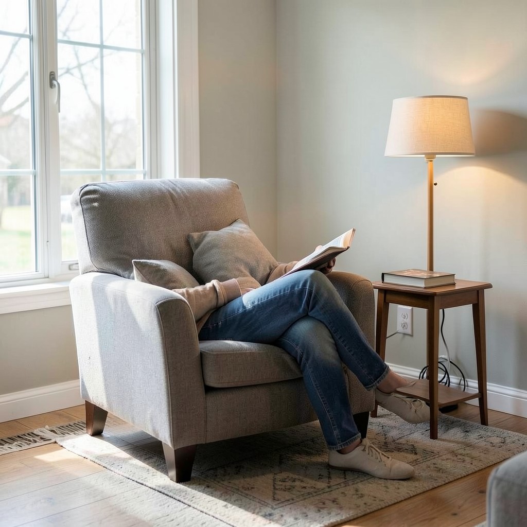
A dedicated reading chair in a living room — a single armchair, positioned in the room’s best natural light, with a floor lamp beside it and a small table within reach — creates a specific zone within the larger room that has its own function, its own atmosphere, and its own relationship to the rest of the space. The reading chair is not just furniture. It is the room’s invitation to be alone together — present in the shared space but occupied in your own world, which is the specific domestic quality that good living room design makes possible and bad living room design destroys by making every seat face the television.
The chair selection for a reading corner is the decision most frequently made on visual criteria without adequate attention to the physical criteria that determine whether the chair will actually be used for reading over the months and years following the purchase. A chair that looks exceptional but provides insufficient back support, that places the seated occupant’s eyes at a height where the floor lamp’s shade is at face level, or that has a seat so deep that a shorter person cannot reach the floor — this chair will be used for decoration rather than occupation within three months of purchase. The reading chair that gets used is the one whose comfort was specified with the same care as its appearance.
The floor lamp beside the reading chair must be chosen for the quality of the reading light it provides rather than as a decorative companion to the chair. A lamp with a directional shade — one that focuses the light downward and slightly forward onto the reading material rather than diffusing it equally in all directions — provides the task light quality that makes reading comfortable for extended periods. The lamp’s height matters: the lower edge of the shade should sit at approximately eye level from the standing position, which positions the light source over the reading material at the correct angle for seated reading.
4. A Living Room With a Velvet Sofa
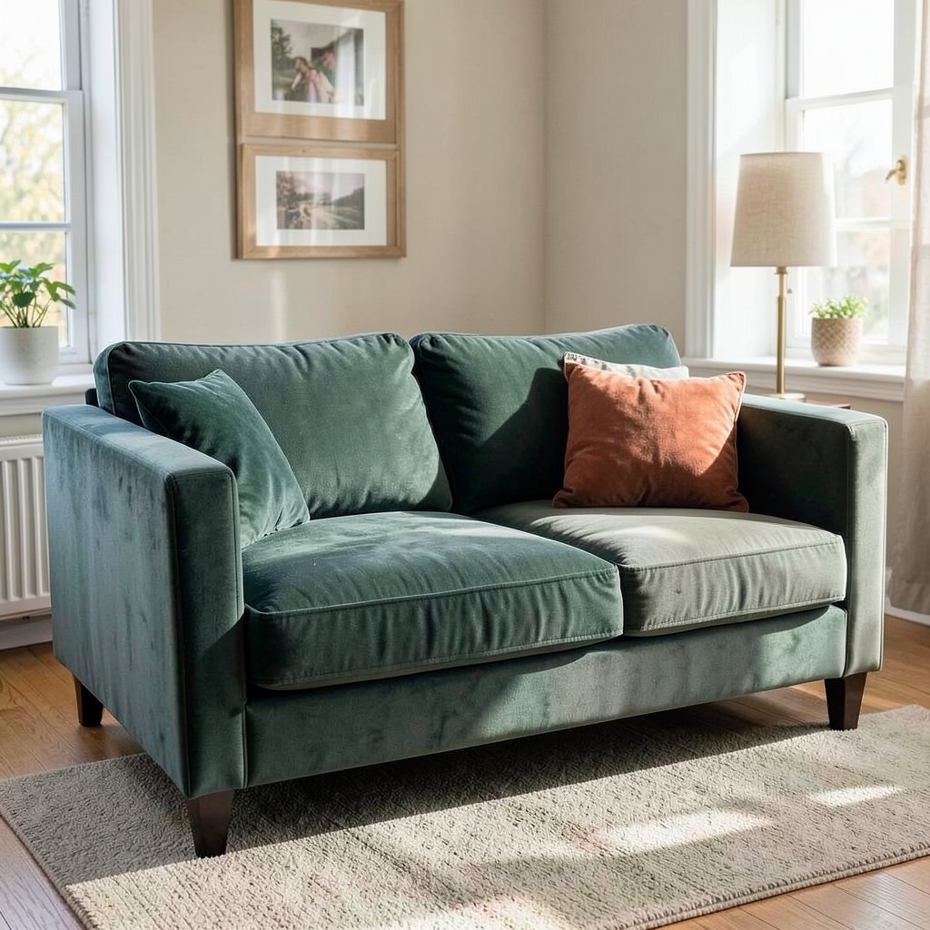
A velvet sofa in a living room produces an atmospheric quality that no other upholstery fabric approaches, and it does so through the specific physics of pile fabric rather than through any applied treatment or finish. The velvet pile catches light directionally — reflecting it from one angle and absorbing it from another — which means the sofa’s apparent color changes as you move around the room and as the room’s light source changes through the day. The sofa that appears deep forest green in morning light reads as a lighter sage in afternoon sun, and both readings are correct because both are the same material responding honestly to its conditions.
The practical concern most people have about velvet — its tendency to show indentation, its apparent fragility, its perceived incompatibility with pets and children — is more exaggerated in popular perception than in daily use. A performance velvet in a synthetic blend handles the demands of a primary household sofa with considerably more resilience than the delicacy associated with the word velvet suggests. The indentation that a velvet sofa shows where it has been sat on repeatedly is not damage — it is the pile’s response to compression, and it reverses when the pile is brushed back with the hand or a soft brush. The velvet sofa that looks worn and unloved is one whose pile has been brushed the wrong way consistently, not one that has been used normally.
The color selection for a velvet sofa in a living room must account for the way the pile desaturates every color relative to the same tone in a flat fabric. A deep cobalt blue in velvet reads as a medium-toned slate blue. A rich terracotta reads as a warm, dusty coral. The desaturation effect means the velvet color selection can be bolder than the equivalent selection in a flat fabric would allow, which is the license the material gives you to choose a sofa in a color you might otherwise find too saturated in a woven or plain weave alternative.
5. A Living Room With a Layered Lighting Scheme
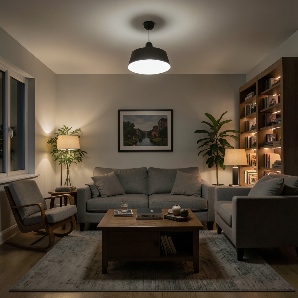
The living room with a single overhead light source is not a designed space — it is a functional space that has not yet been thought about. The flat, directionless quality of overhead-only illumination in a living room removes every shadow, every gradient, and every point of visual interest that a room’s architecture, furniture, and objects contain. It flattens the space rather than revealing it. The living room that is only lit from above is the most common interior lighting failure in residential design, and it costs nothing to fix except the willingness to add more light sources at different levels and with different purposes.
A layered living room lighting scheme has three distinct components: the ambient layer, the task layer, and the accent layer. The ambient layer — typically a central pendant or recessed ceiling lights — provides the room’s baseline illumination and should be on a dimmer to allow its level to be reduced when the other layers take over in the evening. The task layer addresses the specific activities the room supports: a floor lamp beside the reading chair, a table lamp on the side table beside the sofa, a desk lamp if the room contains a work surface. The accent layer is the most atmospheric — the uplight behind a plant, the picture light over a piece of art, the LED strip inside a bookcase that makes the shelved objects glow.
The lamps on the side tables beside the sofa — the most used light sources in most living rooms after the overhead fixture — carry the quality of the room’s atmosphere in the evening hours more than any other individual fitting. A lamp at too high a wattage, in a shade that focuses the light downward and creates a pool of brightness on the table surface with a dark room behind it, produces the harsh, contrasted living room lighting that most households accept as normal without identifying as the source of the discomfort they feel in the room after dark. The correct specification is a lamp whose shade transmits some light upward and outward as well as downward, at a wattage that provides comfortable illumination for reading or conversation without the high-contrast brightness that makes a room feel like a spotlight rather than a home.
6. A Living Room With Exposed Wooden Beams
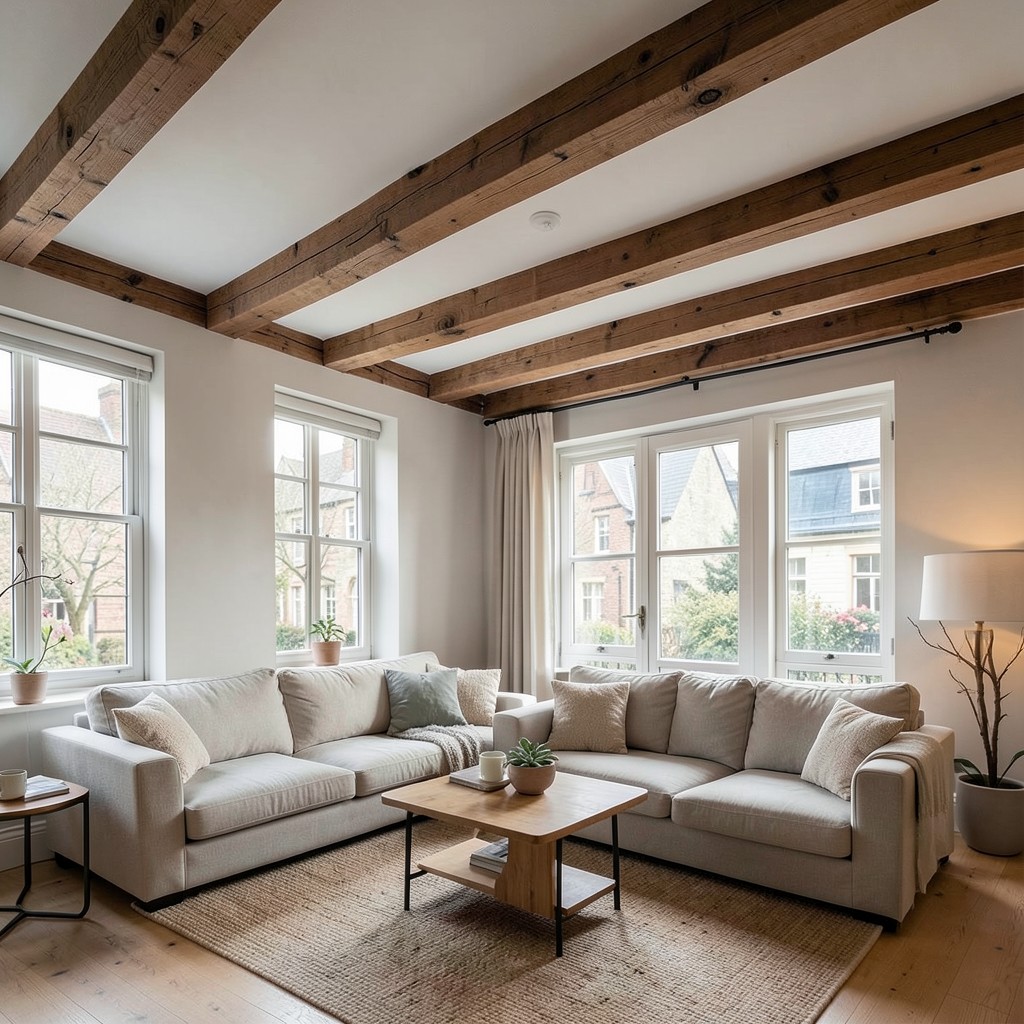
Exposed wooden beams in a living room ceiling — whether genuine structural timbers revealed when a suspended ceiling is removed or applied beams added to an existing flat ceiling to introduce the aesthetic — produce a quality of architectural warmth and material depth that painted plaster ceilings at any finish quality do not provide. The beam brings the ceiling’s structure into the room’s visual field and connects the room to the building’s material reality in a way that a smooth, featureless ceiling surface suppresses. A room with beams knows what kind of building it is in.
The genuine structural beam — revealed when a Victorian or Edwardian suspended ceiling is removed — carries the material history of the building in its surface: the adze marks of the original shaping, the darkening of decades in a hidden space, the occasional mortise or tenon mark where a now-removed structural member was once joined. These are not imperfections. They are the material record of the building’s construction, and treating them as such — cleaning the beam without sanding away the character, oiling the surface to bring out the grain without obscuring the patina — produces a living room element with an authenticity that no applied beam or new timber can replicate.
The applied beam — a hollow timber shell fixed to a flat ceiling to introduce the beam aesthetic in a building whose structure does not provide genuine exposed timbers — is the practical solution for living rooms in standard modern construction where the flat ceiling reflects a construction method that produces no beams worth exposing. Applied beams must be specified at a scale appropriate to the room’s ceiling height and plan dimensions: a beam that is too slim reads as decorative trim rather than structural timber, and a beam that is too heavy for the ceiling height reads as a room divider rather than a ceiling element. The correct proportion is a beam whose cross-section is approximately one-tenth of the ceiling height in its depth dimension.
7. A Living Room With a Statement Rug
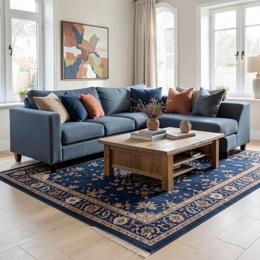
The rug is the living room element with the highest design impact relative to its permanence as an installation — it sits on the floor, it can be replaced when the design direction changes, and it does more to define the room’s seating zone, color palette, and material warmth than almost any other single purchase. A room without a rug is a room whose floor is uniform in all directions, which means the seating area has no physical boundary and the sofa arrangement looks as though it was placed rather than positioned. The rug gives the seating zone its ground plane, and the seating arrangement read against that defined ground looks considered rather than deposited.
The rug size under a living room sofa arrangement follows a rule that most people violate through under-specification: the rug must be large enough for all of the primary seating furniture’s front legs to sit on its surface simultaneously. This means the rug extends beyond the sofa’s front edge by at least thirty centimeters and under the coffee table’s full footprint and then some. A rug that only the coffee table sits on, with the sofa’s feet floating on the bare floor beyond the rug’s edge, reads as the wrong rug in the right position, which is a worse visual outcome than no rug at all because it suggests the correct size was not found rather than that a rug was not wanted.
The rug’s pattern and color is the decision that either anchors the living room’s palette or disrupts it, and the disruption is a more available design option than most people allow themselves. A rug that introduces the room’s most saturated color — the deep blue that the cushion accents pick up, the terracotta that appears in the art on the wall — can carry a tone that would be too dominant on the walls or the sofa in a pattern whose scale distributes the color across the floor rather than concentrating it in one surface. The rug’s pattern works as a distribution mechanism for the colors the room’s other elements can only hold as accents.
8. A Living Room With a Concrete Feature Wall
A concrete feature wall in a living room — whether a microcement application over an existing plaster wall or a genuine board-formed cast concrete surface — brings an industrial material directness into the domestic space that produces the specific tension between hard material and soft domestic life that characterizes the most interesting contemporary interiors. The concrete wall does not soften or decorate. It holds its material identity completely, and the living room around it organizes itself in relationship to that identity rather than ignoring it.
The microcement application is the accessible version of this aesthetic for standard residential walls, and when executed by a skilled applicator it is indistinguishable from genuine cast concrete at the viewing distance of a living room. The microcement is applied in multiple thin coats over an existing plaster or plasterboard substrate, each coat troweled to a specific texture and direction, then sealed with a topcoat that provides the surface durability and the slight sheen of a concrete surface that has been ground and polished. The color range is broad — from pure grey through warm beige to almost-white — and the choice of tone determines whether the wall reads as cool and industrial or warm and residential.
The furniture and textile palette positioned in front of a concrete feature wall must provide the thermal contrast that prevents the room from reading as uniformly hard and cold. A sofa in a warm fabric — a bouclé, a textured linen, a velvet — directly in front of the concrete wall provides the material contrast that activates the wall’s industrial quality through opposition. A low-pile wool rug on the floor between the sofa and the wall adds the softness layer that prevents the hard floor material from amplifying the wall’s hardness. The concrete wall is not the room’s entire character — it is the room’s material anchor, and the living things positioned in front of it are the room’s humanity.
9. A Living Room With a Maximalist Plant Collection
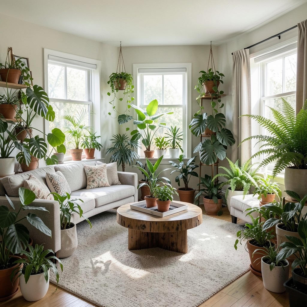
A living room with an abundance of plants — more than restraint suggests is appropriate, more than the design guides recommend, enough that the room has a quality of indoor garden rather than domestic space with botanical accents — produces an environment whose air quality, acoustic softness, and visual life differ measurably from the standard planted-room approach. The maximalist plant living room is the one that leans fully into the biophilic instinct rather than managing it to a level that the room’s other elements can comfortably accommodate.
The plant selection for a maximalist living room collection must cover the full range of the room’s light conditions — the sun-facing window position where the high-light plants thrive, the shaded corner where the low-light species perform, and the middle zones where medium-light generalists fill the gaps between the extremes. A maximalist collection populated entirely with one type of plant — a room full of succulents, or a room full of ferns — reads as a themed collection rather than a living environment. The variety of leaf forms, plant heights, and growth habits that a mixed collection provides is what produces the sense of a living space rather than a botanical exhibition.
The infrastructure for a maximalist plant living room — the watering system, the drainage trays, the feeding schedule, the provision for repotting when plants outgrow their containers — must be genuinely practical rather than aspirationally planned. A maximalist plant collection with inadequate maintenance infrastructure declines from thriving abundance to struggling neglect within one dry summer, and a living room full of struggling plants communicates the opposite of the living, enveloping quality that healthy plants provide. The collection size must be matched to the household’s actual maintenance capacity, and that match requires honesty about how reliably the watering gets done.
10. A Living Room With a Japandi Design Direction
The Japandi living room — the hybrid of Japanese wabi-sabi material acceptance and Scandinavian functional clarity — produces a domestic space with the quality of resolved calm that the two traditions, from their different cultural angles, have each been working toward for centuries. The Japanese contribution is the acceptance of natural imperfection — the timber with visible grain, the ceramic with an irregular rim, the wall with the slight surface variation of natural plaster — as the source of beauty rather than a deviation from it. The Scandinavian contribution is the organization of those materials into forms that serve their function with the minimum of structural and decorative complexity. Together, they produce a living room that is neither sparse nor cluttered, neither cold nor overdecorated.
The furniture palette in a Japandi living room resolves around dark, natural timber — a blackened oak coffee table, a dark walnut sideboard, a sofa in a warm linen in a sand or warm beige tone — and the specific combination of those materials against a wall in a muted natural clay or a warm off-white. The dark timber grounds the room and provides the visual gravity that prevents the pale walls and neutral sofa from reading as an unresolved neutral palette. The warmth of the linen sofa prevents the dark timber from reading as heavy or oppressive, and the off-white walls provide the light that both materials require to read correctly.
The single organic object in each zone of a Japandi living room is the wabi-sabi element that prevents the Scandinavian clarity from tipping into sterile minimalism. A rough-surfaced ceramic vase on the coffee table. A piece of driftwood on the sideboard. A hand-woven basket beneath the side table. These are not decorative objects in the conventional sense — they are material presences that carry the imperfect, organic quality that wabi-sabi identifies as the source of genuine aesthetic interest, and their placement within the clean geometry of the Japandi living room is the design decision that gives the room its specific and unreplicable character.
11. A Living Room With a Built-In Window Seat
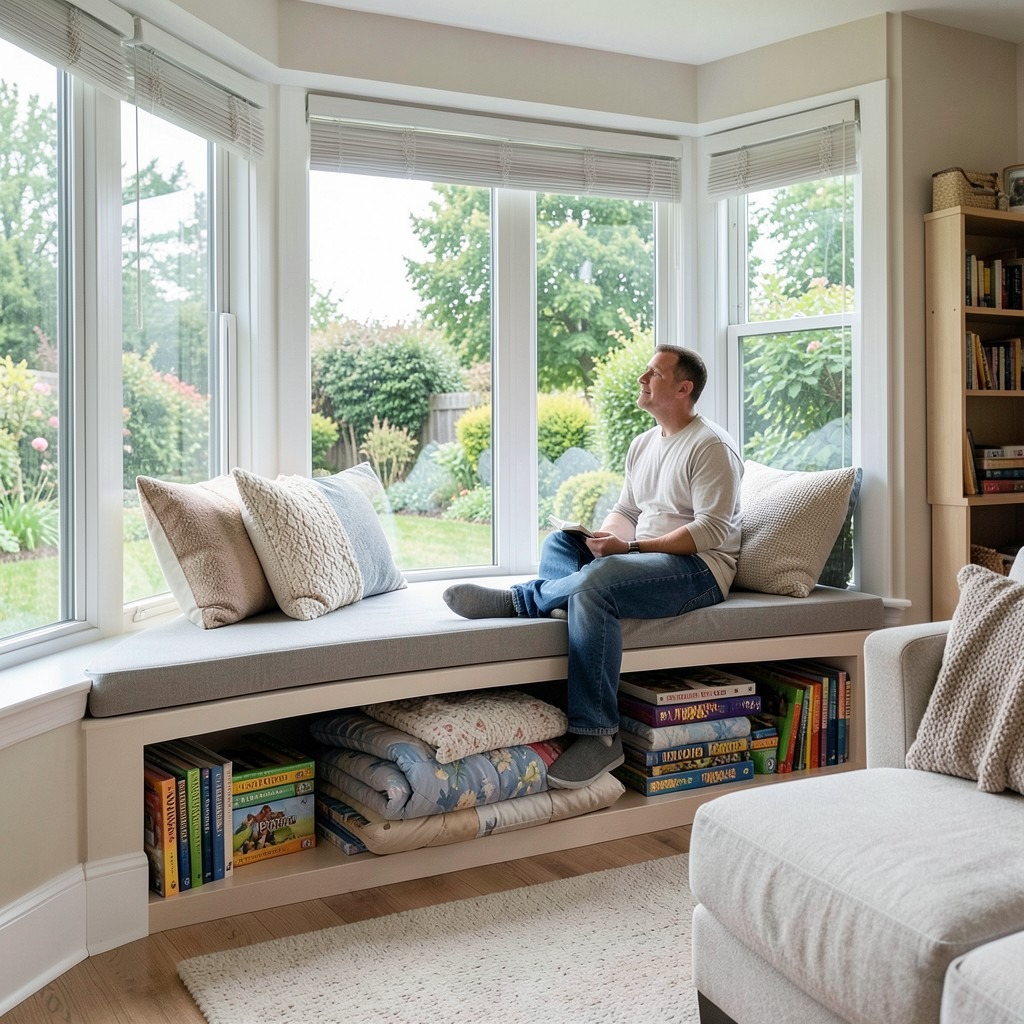
A built-in window seat in a living room — a cushioned platform constructed within the window alcove or below a bay window, providing a seating surface, a reading perch, and storage in the volume beneath the seat — is the architectural intervention that most efficiently converts an underused spatial feature into one of the most desirable spots in the house. The person occupying the window seat has the best natural light in the room, the most direct visual connection to the outdoor environment, and the physical separation from the main seating area that makes the window seat feel like a private zone within the shared room.
The seat height for a built-in window seat must position the occupant at a height where their eye level from a seated position is approximately at the midpoint of the window — the position that provides the broadest view, the most natural light, and the most ergonomically comfortable posture for reading or watching the garden. A seat set too low places the window sill at face level from the seated position, blocking the lower half of the view and requiring the occupant to look upward through the window rather than across it. A seat at forty-five to fifty centimeters height — the standard chair seat height — positions the occupant correctly in most standard residential window configurations.
The storage beneath the window seat — accessed through a hinged lid or through drawers in the seat face — handles the living room’s overflow of throws, cushions, board games, and the range of domestic material that living rooms accumulate without sufficient storage to contain. A window seat at one hundred and fifty centimeters in length with a seat depth of fifty-five centimeters contains a storage volume large enough for two full-sized duvets, a winter throw collection, or the full board game library of a household with children, without that storage occupying a millimeter of the living room’s floor area.
12. A Living Room With a Dramatic Ceiling Treatment
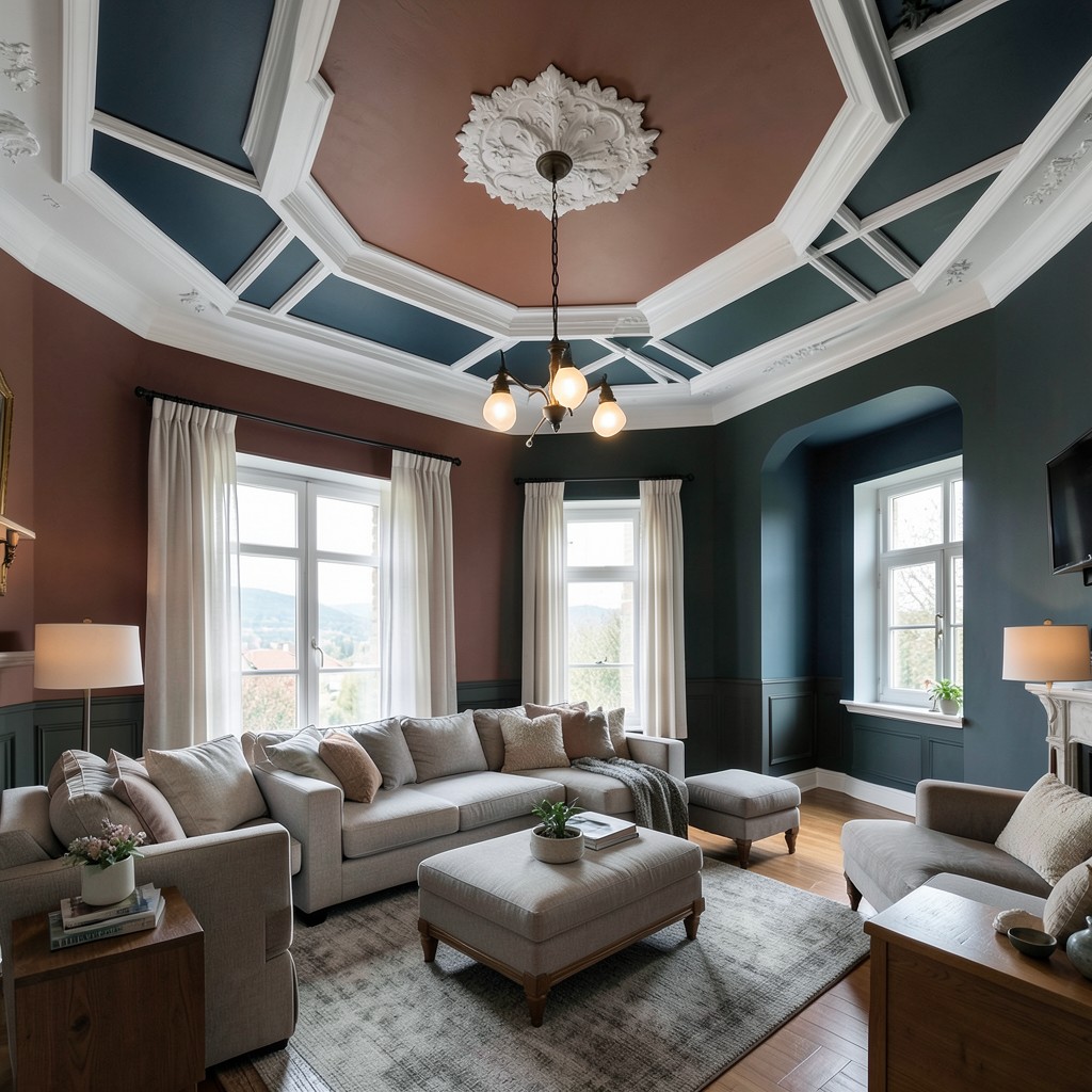
The living room ceiling is the design surface that most people treat as the room’s termination point — the flat, white boundary above which the room ends — rather than as a designed element with the same potential as any other surface in the space. That default treatment costs nothing to challenge and rewards the challenge significantly. A ceiling that has been given thought — in its color, its texture, its architectural detail, or its relationship with the room’s walls — produces a room that reads as designed throughout its volume rather than only from the floor to the picture rail height.
A deep, saturated ceiling color — navy, forest green, terracotta, or a rich charcoal — draws the ceiling downward in perceived height and produces the canopy quality of envelopment that makes a room feel inhabited rather than exposed. The living room with a colored ceiling at standard two-meter-forty height feels more intimate and more considered than the same room with a white ceiling, because the dark ceiling overhead is a designed presence rather than an absence of decision. This effect is counter-intuitive to most people who fear that a dark ceiling will make the room feel smaller — the room does feel more contained, but contained and small are not the same experience.
Decorative plasterwork on the ceiling — applied cornices, a plaster ceiling rose at the pendant’s mounting point, or a coffered arrangement in a period-appropriate profile — introduces architectural detail that the room’s wall and floor treatments cannot provide. Applied decorative plasterwork is available in a lightweight polyurethane version that installs with adhesive and paint over without the weight, the cost, or the plasterer skill requirement of genuine lime plaster ornament. The visual difference between the two materials at ceiling height — viewed from a normal standing or seated position — is indiscernible to any eye that is not specifically looking for it.
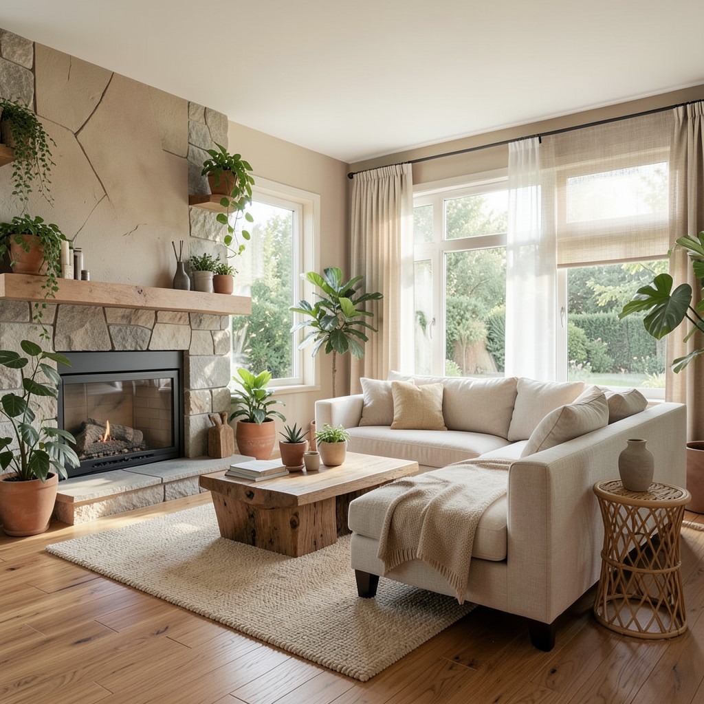
13. A Living Room With a Fireplace as the Focal Point
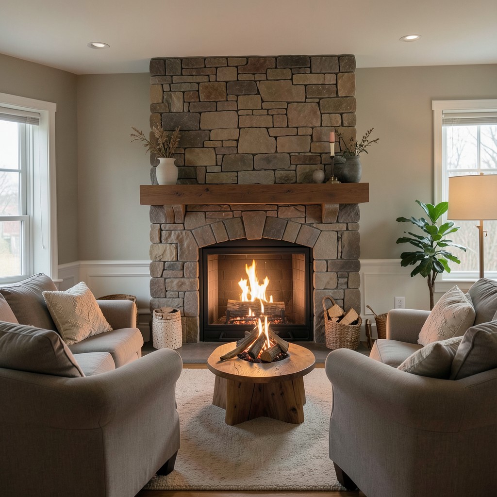
The fireplace is the original living room focal point — the feature around which every other furniture and design decision once organized itself before television displaced it as the room’s primary gathering point — and the living room that restores the fireplace to its dominant position produces a quality of domestic warmth and social focus that no screen can match. The hearth is not a nostalgic concept. It is a specific atmospheric technology for producing the quality of gathering that human beings have organized their domestic environments around since the first sheltered fire, and its power in a contemporary living room is undiminished by the screens and devices that compete with it.
The fireplace surround is the architectural element that determines whether the fireplace reads as an incidental feature or as the room’s primary architectural statement. A surround at the correct scale for the chimney breast and the room’s proportions — whose mantel shelf sits at a height that provides both a display surface and a visual termination for the fire opening below it — commands the room from its position with the authority the focal point requires. A surround that is undersized for the chimney breast reads as tentative; one that is oversized reads as clumsy. The correct proportion, chosen with reference to the room’s ceiling height and the chimney breast’s width, is what makes the fireplace the room’s unambiguous center.
The fire itself — whether a live open fire in a swept chimney, a wood-burning stove, a gas fire with a realistic flame effect, or a bioethanol burner — provides the one living room element that none of the room’s other features can supply: movement. The fire moves. Nothing else in the room does. That movement — the unpredictable, irregular, continuously varying motion of flame — holds human attention in a way that is physiologically different from the attention that a static object or a screen demands, and the living room with a working fire provides a quality of idle, restful attention that is genuinely and physiologically restorative in a way that television is not.
14. A Living Room With a Neutral Color Palette Done Right
Neutral living rooms fail not because neutral colors are wrong but because most of them are the same neutral. A room painted in standard brilliant white with a greige sofa, a grey rug, and taupe cushions is not a neutral palette — it is an indifferent palette whose individual tones were selected for inoffensiveness rather than for their relationships with each other. A genuinely good neutral living room is one where every tone was chosen in deliberate relationship to every other tone, where the warmth of one neutral is balanced by the coolness of another, and where the material variety within the neutral range provides the visual interest that color variation provides in more saturated schemes.
The foundation of a successful neutral living room palette is understanding that neutrals carry strong undertones — and that undertone mixing is the source of most neutral room failures. A warm white wall with a cool grey sofa produces the specific dissonance of two tones that are both neutral but that disagree at the undertone level, reading as colors that do not quite go rather than as tones that resolve into each other. The warm white wall requires a warm neutral sofa — in cream, oatmeal, warm linen, or a soft warm stone — to produce the seamless, restful quality of a genuinely resolved neutral palette.
The material variety in a neutral palette is what rescues it from blandness. A neutral room whose surfaces are all at the same texture level — smooth walls, flat upholstery, polished floor — reads as monotonous regardless of how carefully the tones were chosen. A neutral room whose tones are consistent but whose materials vary dramatically — rough linen cushions against a smooth velvet sofa throw, a woven jute rug against a polished timber floor, a hand-applied plaster wall finish beside a smooth painted cornice — provides the visual interest that varied textures at consistent tones always generate. The eye moves across the surface variations with the same pleasure it takes from color variety, but the atmosphere remains the unified calm of the neutral palette.
15. A Living Room With a Mid-Century Modern Aesthetic
The mid-century modern living room — walnut timber, low-slung furniture with tapered legs, a statement pendant light, a sideboard that substitutes for a television unit, and the general aesthetic language of the post-war design period that produced some of the most humanely proportioned domestic furniture in the history of industrial production — provides a living room with a design foundation deep enough in cultural authority to carry without constant updating and specific enough in its formal language to make every furnishing decision easier than it is in a less defined aesthetic direction. Mid-century modern works because it was designed by people who thought seriously about how humans sit, move, and live.
The sofa in a mid-century modern living room is low — its seat height of thirty-eight to forty-two centimeters sits closer to the floor than a contemporary sofa’s standard forty-five to forty-eight centimeter seat height — and this lower seat height gives the room the proportional quality that the aesthetic requires. Low furniture makes the ceiling feel higher, gives the room a horizontal emphasis that is specific to the period’s design language, and produces the quality of mid-century domestic interiors that photographs communicate but that is felt most directly in the physical experience of sitting in the space. The lower seat produces a reclined posture rather than an upright one, which communicates leisure rather than alertness and makes the living room feel genuinely different from the office.
The timber in a mid-century modern living room should be walnut where the budget permits — its specific warm, chocolate tone with a slightly open grain provides the material character that the aesthetic’s visual language is built around. Where walnut is cost-prohibitive, a dark-stained oak or a teak veneer in the mid-brown range provides the visual direction without the walnut premium. The timber’s finish must be matte or satin — a high-gloss finish on a mid-century piece reads as wrong in a way that experienced eyes perceive immediately even without identifying the source of the dissonance.
16. A Living Room With a Curved Sofa
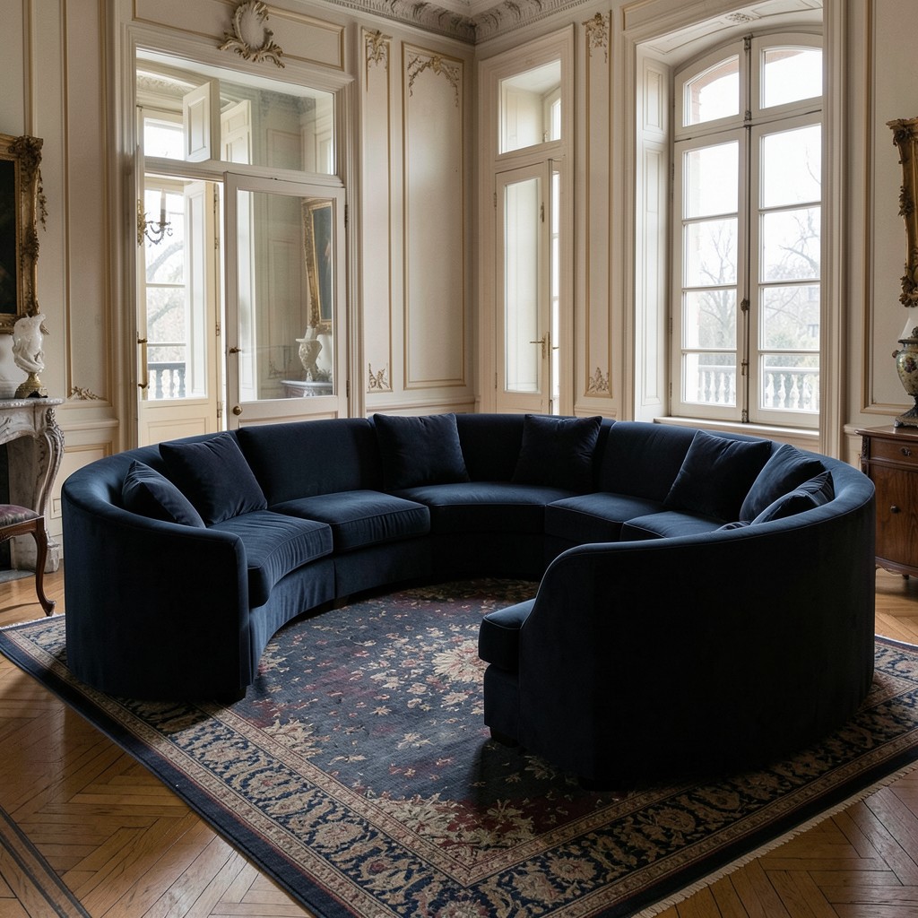
A curved sofa — either a fully circular conversation sofa, a kidney-shaped form, or a standard sofa with a gently curved front face rather than the straight-edge form that most sofas present — introduces the design gesture that living rooms built entirely from rectangular furniture lack: the counter-rhythm of a curved form against the room’s straight walls, doorways, and floor-to-ceiling lines. Every room is a collection of right angles, and a curved sofa introduces the single continuous curve that breaks that geometry and makes the room’s composition more dynamic than the sum of its rectilinear components.
The conversation sofa — a circular or semicircular fully upholstered form that seats four to six in a facing arrangement — is the furniture piece that addresses the living room’s most fundamental social challenge: the difficulty of holding a conversation in a conventional seating arrangement where some seats face each other and others face away. At a circular conversation sofa, every seat faces every other seat, which produces the social engagement quality of a round table applied to living room seating. The form was used in the grand salons of eighteenth-century European houses for exactly this reason, and its social effectiveness has not diminished in the centuries since.
The scale of a curved sofa in a standard living room requires careful floor-plan consideration because the form’s footprint does not align with the room’s walls in the way that a straight-backed sofa does. A curved sofa pushed against a straight wall produces the gap between the sofa’s back curve and the wall surface that either reads as an awkward space requiring management or as the deliberate room-within-a-room separation that the floating placement of a curved sofa can produce when the gap is large enough to be a feature rather than a deficiency.
17. A Living Room With Full-Height Bookshelves
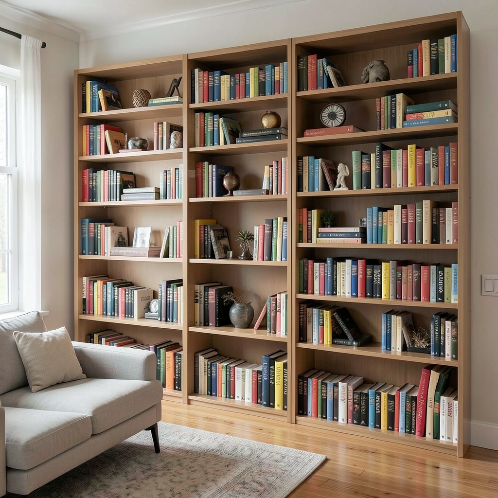
Full-height bookshelves in a living room — shelving that runs from the floor to the ceiling, covering a partial or complete wall surface — produce the one quality that no other living room wall treatment approaches: the sense of a room that takes ideas and objects seriously as elements of domestic life. The wall of books is not a decorative choice. It is a commitment — to reading, to collecting, to the physical presence of accumulated thought in the room where the household relaxes — and that commitment reads in the room with an authority that art or paint or wallpaper cannot match because it implies not just taste but purpose.
The shelf structure for floor-to-ceiling living room shelving should be purpose-built or from a high-quality shelving system — the type whose shelf pins fit into precision-machined holes at consistent intervals and whose shelves deflect minimally under a full load of books. A shelf that sags in the middle under the weight of a single row of hardcovers communicates poor quality regardless of how well the books are styled, and poor structural quality is the one quality that book lovers find impossible to overlook in a bookshelf because they know what the load is and they can see when the shelf is not handling it.
The styling of full-height living room bookshelves must resolve the tension between the bookshelf’s organizational function — a system for finding books — and its decorative function — a designed surface that contributes to the room’s visual quality. A shelf organized by the Dewey decimal principle with no decorative objects produces a library, not a living room feature. A shelf organized by color with decorative objects replacing most of the books produces a display, not a functioning library. The correct balance allows the books to dominate — genuinely present and organized for finding — while incorporating objects at intervals that give the shelf surface visual relief and three-dimensional interest.
18. A Living Room With a Textured Accent Wall
A textured accent wall in a living room — a wall surface treated with a material or finish that produces a tactile quality beyond the flatness of standard paint — changes the room’s visual and atmospheric quality in a way that a painted accent wall of any color does not replicate. Texture catches and holds light differently at different times of day and under different light sources, which means a textured wall produces a surface that is never the same in two successive observations and that provides the visual interest of a complex surface rather than the static quality of a uniform painted plane.
The lime wash application — a traditional technique applying a thinned lime paint to a plaster surface in multiple layers, each slightly different in application direction, producing a surface with the depth and variation of aged stone — provides the most immediately atmospheric textured wall treatment available for a living room without structural work. The lime wash is not a uniform covering. Its slightly cloudy, layered application produces depth rather than opacity, and the wall surface beneath the lime wash remains partially visible through the translucent layers, contributing its own color and texture to the final appearance. A lime-washed wall aged by light and time in a living room becomes more beautiful through the photodegradation that synthetic paint resists, because the lime’s natural chemistry develops a patina rather than degrading.
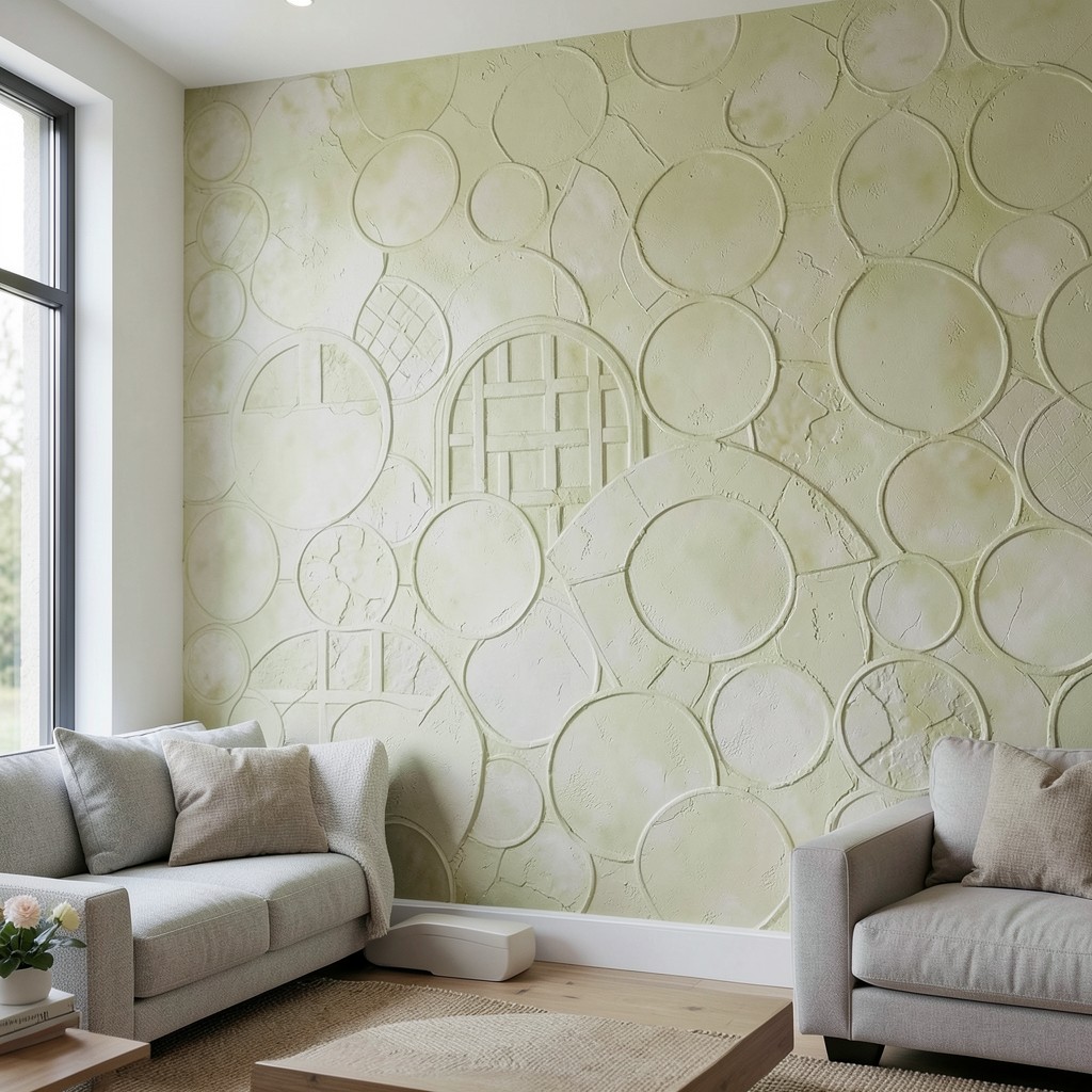
The plaster relief technique — applying a standard interior skim plaster in patterns, geometric forms, or organic textures rather than in the smooth, finished surface that the standard plaster application produces — is the more architectural version of the textured accent wall. Geometric plaster relief — circles, arches, or a basket-weave pattern pressed into a fresh plaster application — produces a surface with the formal quality of carved stone at the cost of a skilled decorator’s labor rather than a stone carver’s. The relief depth — shallow enough to avoid casting harsh shadows under direct light, deep enough to read as texture rather than surface variation — is the specification variable that distinguishes a successful plaster relief wall from one that looks indeterminate.
19. A Living Room With a Monochrome Color Scheme
A monochrome living room — one where every element operates within the constraint of a single color family, varying only in tone, shade, and material rather than in hue — produces the most resolved and the most sophisticated color environment available to a living room, and it is also the approach that most people avoid because the constraint feels more limiting than it actually is. The monochrome room is not a color scheme with one color. It is a color scheme where the full tonal range of one color family — from its lightest possible tone to its deepest — is explored across all the room’s surfaces and materials simultaneously.
A monochrome blue living room operates like this: the walls in a pale grey-blue, the sofa in a mid-tone dusty blue, the curtains in a slightly darker teal-blue linen, the rug in a deep navy with a minimal geometric pattern, the cushions in a range of blues from pale to near-indigo, and the room’s single warm-tone accent — a natural timber side table, a brass lamp base — providing the contrast that the monochrome field requires to breathe. The room reads as entirely blue and yet is full of visual variety, because the tonal range within a single color family is wider than most people appreciate until they see it assembled in a room with genuine intention.
The material variety within a monochrome scheme is the mechanism that prevents the single-color approach from reading as flat. Blue paint, blue velvet, blue printed linen, blue woven wool, and blue glazed ceramic are all blue, but they are profoundly different in the way they behave under light, the way they absorb and reflect color, and the way they engage the eye from varying distances. A room that explores a single color across five different material types provides more visual variety than a room with five different colors on the same surface material, and that counter-intuitive truth is the insight that makes monochrome design a sophisticated choice rather than a timid one.
20. A Living Room With a Freestanding Fireplace
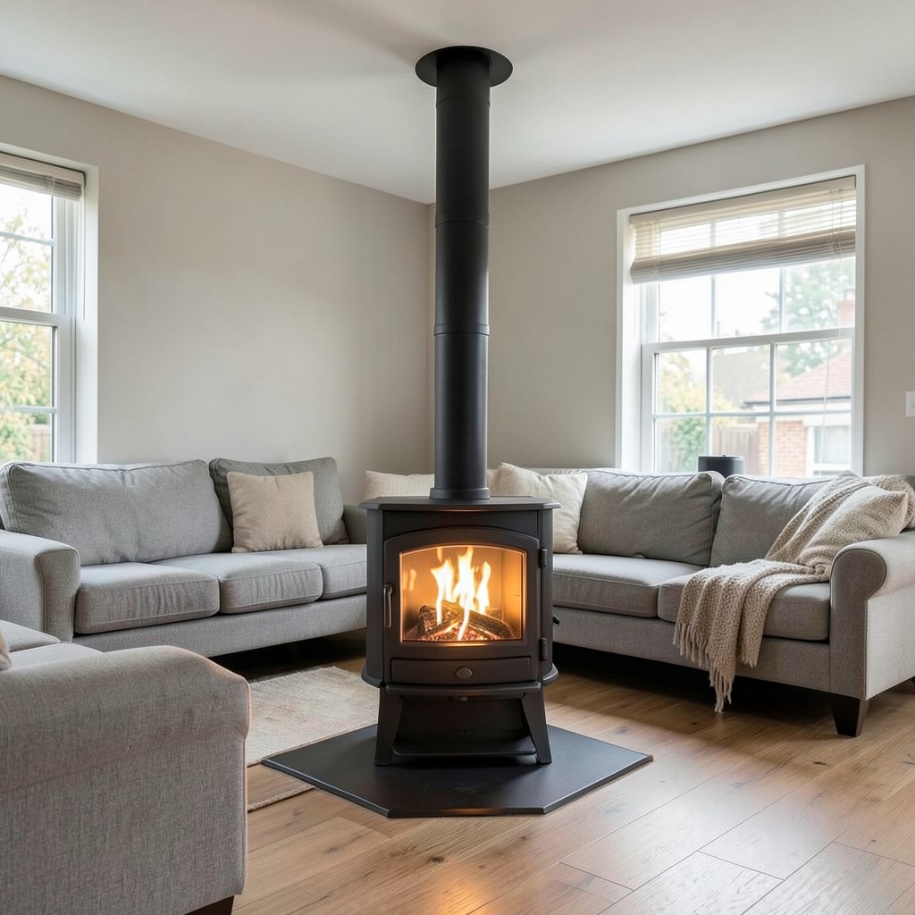
A freestanding fireplace — a wood-burning stove or a freestanding bioethanol burner positioned as a furniture-like object within the living room rather than built into a chimney breast — is the heating and atmospheric solution for a living room that has no chimney and therefore no conventional fireplace option, or for a room where the owner wants the fireplace to be positioned in the center of the floor space rather than against a wall. The freestanding fire is not a compromise version of the built-in alternative. In the right room, it is the superior option.
The wood-burning stove on a floor-mounted hearth pad — required by building regulations to protect the floor from radiant heat at the specified clearance distances — can be positioned at any location in a living room that has an external wall through which the flue pipe can exit or a ceiling through which a twin-wall flue can rise. The flue pipe, visible within the room from the stove top to the ceiling or wall exit point, is not an aesthetic problem to be hidden — it is a design element that communicates the fire’s functional honesty and that suits the industrial or rustic design directions that a freestanding stove most naturally inhabits. A black powder-coated flue pipe running vertically from a cast iron stove to a ceiling penetration reads as an architectural element in its own right.
The bioethanol freestanding burner — a free-standing vessel containing a bioethanol fuel reservoir and a controlled flame opening, requiring no flue and no structural installation — is the freestanding fire solution for rental properties, apartments with no external wall access, or rooms where the building structure does not permit a conventional installation. The flame quality of a good bioethanol burner is genuinely beautiful — the clean, yellow-orange flame in an open vessel produces the same atmospheric quality as a real fire without the combustion byproducts that require flue extraction. The fuel cost per hour of burning is higher than wood, which is the primary operational disadvantage.
21. A Living Room With a Sunken Seating Area
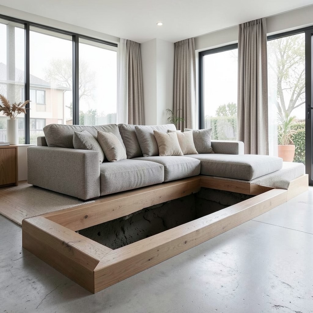
A sunken seating area — a recessed floor zone within the living room, typically one step down from the surrounding floor level, containing the primary seating arrangement as a defined spatial entity within the larger room — is the most architecturally committed living room design decision available, and the one with the most transformative impact on the room’s spatial quality when executed correctly. The sunken seating area does not merely define the living zone. It changes the occupant’s physical relationship with the room, placing the seated person’s eye level below the surrounding floor plane in a quality of enveloped, contained seating that no furniture arrangement on a flat floor achieves.
The step down into the sunken seating area is the structural work that distinguishes this design from any furniture-based approach — it requires either original construction provision or the raising of the surrounding floor level to create the perceived sunken effect in a room with an existing flat concrete or timber floor. Raising the surrounding floor by one step — a platform of fifteen to twenty centimeters installed at the room’s perimeter, leaving the original floor at its existing level as the sunken zone — produces the spatial effect without excavation, which makes the concept applicable as a renovation decision rather than exclusively a new-build provision.
The perimeter of the sunken seating area should be treated as a seating surface in its own right — a built-in bench or a cushioned ledge at the step level that provides additional seating around the primary furniture arrangement and that defines the edge of the sunken zone as an architectural element rather than simply a drop in floor level. A cushioned perimeter at step height also reduces the trip hazard that an unmarked step edge in a living room presents, which is the practical consideration that the architectural ambition of the sunken seating area must address before any design work begins.
22. A Living Room With a Biophilic Design Approach
Biophilic design in a living room — the deliberate incorporation of natural materials, natural light provision, plant life, water elements, and natural pattern into the room’s material and spatial design — is not a trend that will be replaced by the next aesthetic cycle. It is an evidence-based design approach whose foundation is the documented relationship between human beings and the natural environment, and the living room’s specific function — rest, recovery, social connection, the quality of time away from productive obligation — is precisely the context where biophilic design’s benefits are most directly relevant and most consistently felt.
The natural material layer of a biophilic living room addresses every surface and every object: the timber floor with a natural oil finish that preserves the grain’s visibility and the material’s tactile warmth, the stone or clay tile surround at the fireplace, the linen sofa upholstery, the wool rug, the rattan side table, the ceramic pot on the shelf. These are not decorative choices in the conventional sense — they are material selections made with the understanding that physical contact with natural materials produces a sensory response that synthetic alternatives do not, and that the accumulation of natural material contact across the full range of the living room’s surfaces creates an environment that is sensorially richer than any synthetic-material equivalent.
The natural light quality of the biophilic living room is the most consequential provision and the hardest to retrofit. A living room with large windows that admit morning light from the east and admit the full range of daylight quality changes through the day — the bright, high-angle light of midday and the warm, low-angle light of late afternoon — provides the physiological benefits of daylight exposure that confined, poorly lit interiors deny their occupants. The window treatment for a biophilically designed living room prioritizes light admission over privacy management except where both are simultaneously required, using sheer or woven materials that diffuse rather than block, and positioning heavier opaque window treatments on a secondary track that is only deployed when privacy or blackout is specifically needed.
23. A Living Room With an Arched Niche Display
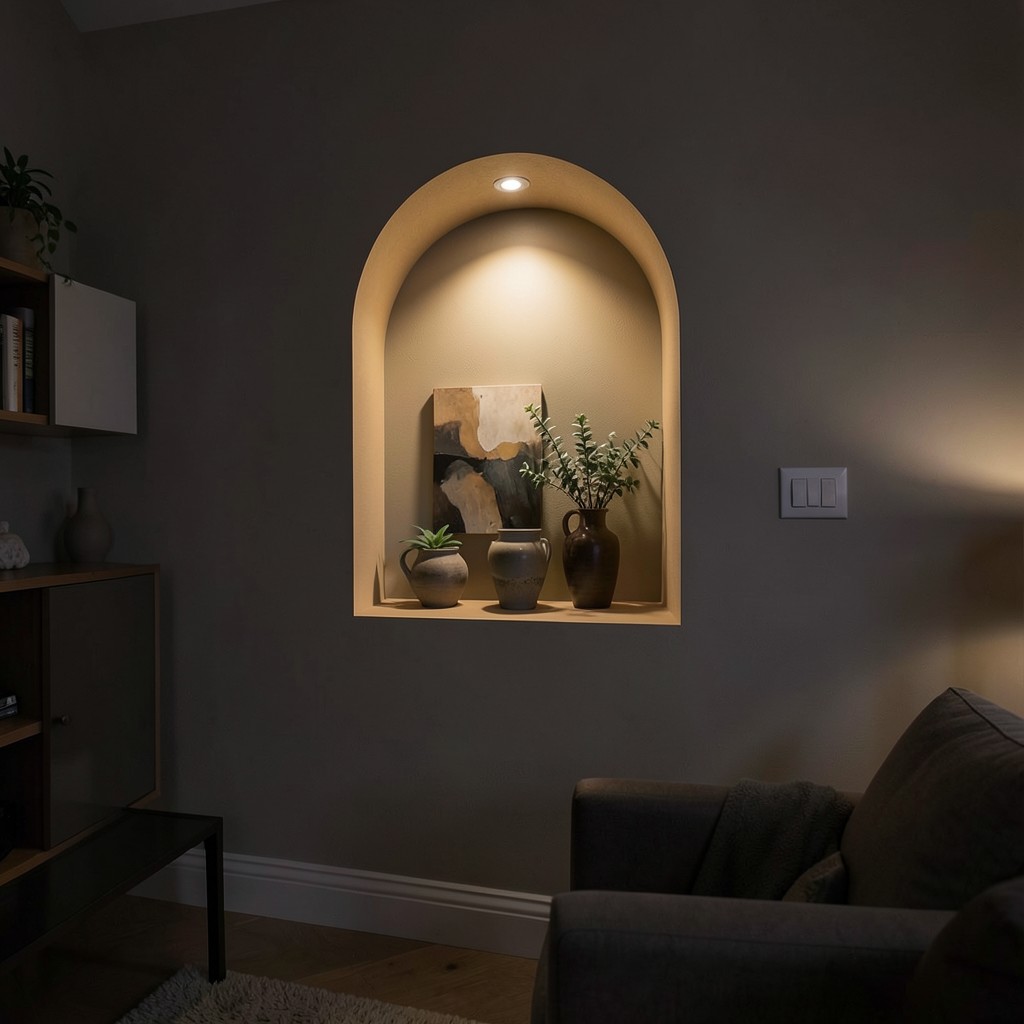
An arched niche in a living room — a recessed cavity in the wall with an arch-headed opening, displaying art, ceramics, plants, or objects within a defined architectural frame — produces a focused display point that the flat wall surface cannot provide regardless of what is placed against it. The arch niche contains its content in the most architectural sense: the object within the niche is not merely placed near the wall but set within a designed cavity whose proportions were determined specifically to frame it. That distinction between placement and containment is the quality that makes the niche display more powerful than the shelf display or the flat-wall gallery at equivalent cost.
The formation of an arched niche in an existing stud-partition wall is a one-day carpentry operation: the cavity is cut between studs at the available depth, the arch head is formed in plywood or MDF, the cavity is lined and skim-plastered, and the niche is painted in the same tone as the surrounding wall or in a contrasting accent color at the niche’s interior surface. The recess depth — limited by the stud cavity depth, typically ninety to one hundred millimeters — is sufficient for flat art, shallow ceramics, and small three-dimensional objects but not for deep sculpture or large three-dimensional pieces that require more depth to sit comfortably within the frame.
The lighting within an arch niche — a small recessed LED spotlight at the arch head, pointing downward into the niche — converts the display cavity from a recess that shadows its content to one that actively illuminates it. The lit niche in a dimly lit evening living room reads as a glowing display case, and the object within it receives the focused, gallery-quality illumination that makes even a modest object read as a carefully considered collection. The niché light switch can be on the same dimmer circuit as the room’s other accent lights, allowing the niche to participate in the room’s layered lighting scheme rather than operating as an isolated feature.
24. A Living Room With a Japandi-Inspired Neutral Palette
The Japandi neutral palette — warmer than Scandinavian white, darker than Japanese rice-paper white, grounded in the earthy tones of natural clay, dried grasses, and the grey-brown of weathered timber — provides a living room with the specific quality of organic calm that both design traditions have identified as the environment most supportive of genuine rest and genuine presence. The Japandi palette is neutral in the sense of balanced rather than in the sense of absent — it is a palette where every tone was chosen for its relationship to the room’s natural materials, its natural light, and the specific quality of warmth without brightness that makes a room feel genuinely relaxing.
The sofa in a Japandi neutral living room occupies the middle of the palette’s tonal range — in a warm oatmeal, a pale sand, or a soft sage — providing the room’s primary surface of visual rest. The darkest tones in the palette — the blackened timber of the coffee table, the deep charcoal of the architectural steel window frame, the near-black of a ceramic piece on the shelf — provide the visual anchors that ground the pale sofa and the off-white walls within the room’s tonal range and prevent the palette from floating toward the unresolved lightness of a room with no dark notes.
The single textile accent in a Japandi neutral living room — a cushion or a throw in a muted sage, a dusty terracotta, or a warm rust — is the palette’s single departure from neutrality and the element that prevents the room from reading as colorless rather than resolved. The accent color must share the palette’s muted, desaturated quality — a sage green with grey in it, a terracotta with brown in it — rather than reading as a bright spot in a quiet room. The Japandi approach to color accent is restraint without absence: the color is present enough to be felt, quiet enough not to be noticed.
25. A Living Room With a Statement Coffee Table
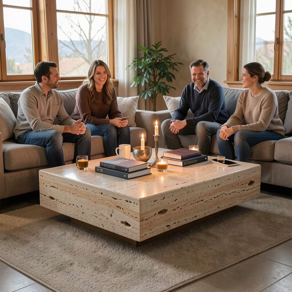
The coffee table is the living room’s most sociable piece of furniture — it sits in the center of the seating arrangement, within reach of every person seated around it, and it holds the drinks, the books, the objects, and the candlelight that the room’s gathering activity generates. The statement coffee table takes this central position seriously. Rather than a functional glass shelf on metal legs that disappears visually beneath the sofa arrangement, the statement coffee table holds the room’s center with the material presence and the formal character of a piece of furniture chosen for the quality it adds to the room’s composition rather than for its structural utility.
The stone coffee table — a solid marble, travertine, or granite slab on a timber or metal base — is the statement piece that carries the most immediate material authority of any coffee table choice. Stone does not apologize for its weight or its surface presence. A travertine coffee table in the center of a warm, natural-material living room connects the floor plane to the room’s geological context — stone drawn from the earth, processed to a flat surface and returned to the domestic environment as the table at the room’s center. The specific visual quality of travertine — its fossils, its voids, its color variation between white and warm amber — is never the same across two slabs, which means the travertine coffee table is a genuinely unique piece regardless of whether it was custom-cut or mass-produced.
The oversized coffee table — one large enough that the standard distance between the sofa’s front edge and the table’s near face (thirty to forty centimeters) leaves the table’s far surface effectively out of reach from the seated position — is the scale error that statement coffee table selections most commonly produce. The table’s footprint must keep the far surface within reach of the seated diner without the occupant having to lean forward at an angle that is uncomfortable for more than thirty seconds. A table whose depth exceeds seventy centimeters in a conventional seating arrangement begins to raise this accessibility problem, regardless of how magnificent it looks in isolation.
26. A Living Room With an Industrial Aesthetic
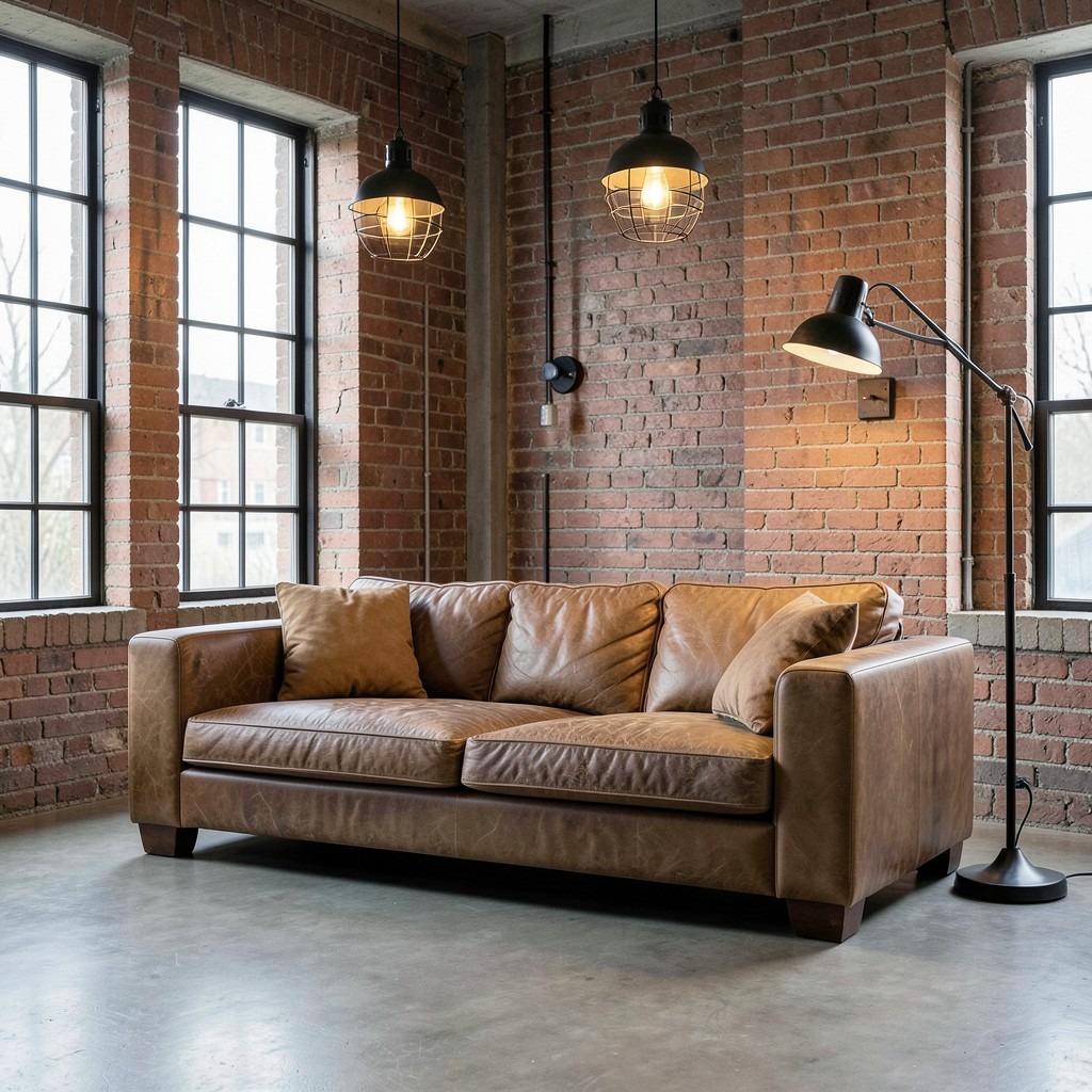
An industrial living room — exposed brick, concrete or polished cement floor, steel window frames, leather or canvas upholstery, factory-style pendant lights with metal cage shades, and the material language of converted commercial spaces applied to a domestic living context — is the design direction that most directly derives its aesthetic from the building’s material reality rather than from an applied decorative program. The industrial living room does not dress its structure in materials that pretend it is something else. It reveals the structure and makes its honesty the room’s primary aesthetic.
The leather sofa in an industrial living room is the furniture choice that most efficiently delivers both the material authenticity and the practical durability that the direction requires. A top-grain leather sofa in a natural, tan, or dark brown develops the patina of use that leather acquires with time — the slight darkening along the arm surfaces where hands rest most frequently, the surface markings of years of normal contact — and this aging behavior is not a deterioration in the industrial aesthetic. It is the material’s biography becoming visible, which is the specific quality the industrial direction values as evidence of authentic use rather than manufactured appearance.
The lighting in an industrial living room must maintain the material directness of the direction without the decorative complexity that chandelier-style fixtures introduce. A cage pendant in a matte black finish, a wall-mounted articulating arm lamp in an aged steel finish, and a floor lamp with an industrial-style shade in a powder-coated metal provide the functional, material-honest light source quality that the direction requires. Decorative crystal, fabric shades, or polished finishes introduce a softness that works against the industrial direction’s specific quality of material assertiveness, and the lighting is the detail that most quickly undermines an otherwise consistent industrial living room if the fixture choices were made from a non-industrial aesthetic library.
27. A Living Room With a Coastal Design Direction
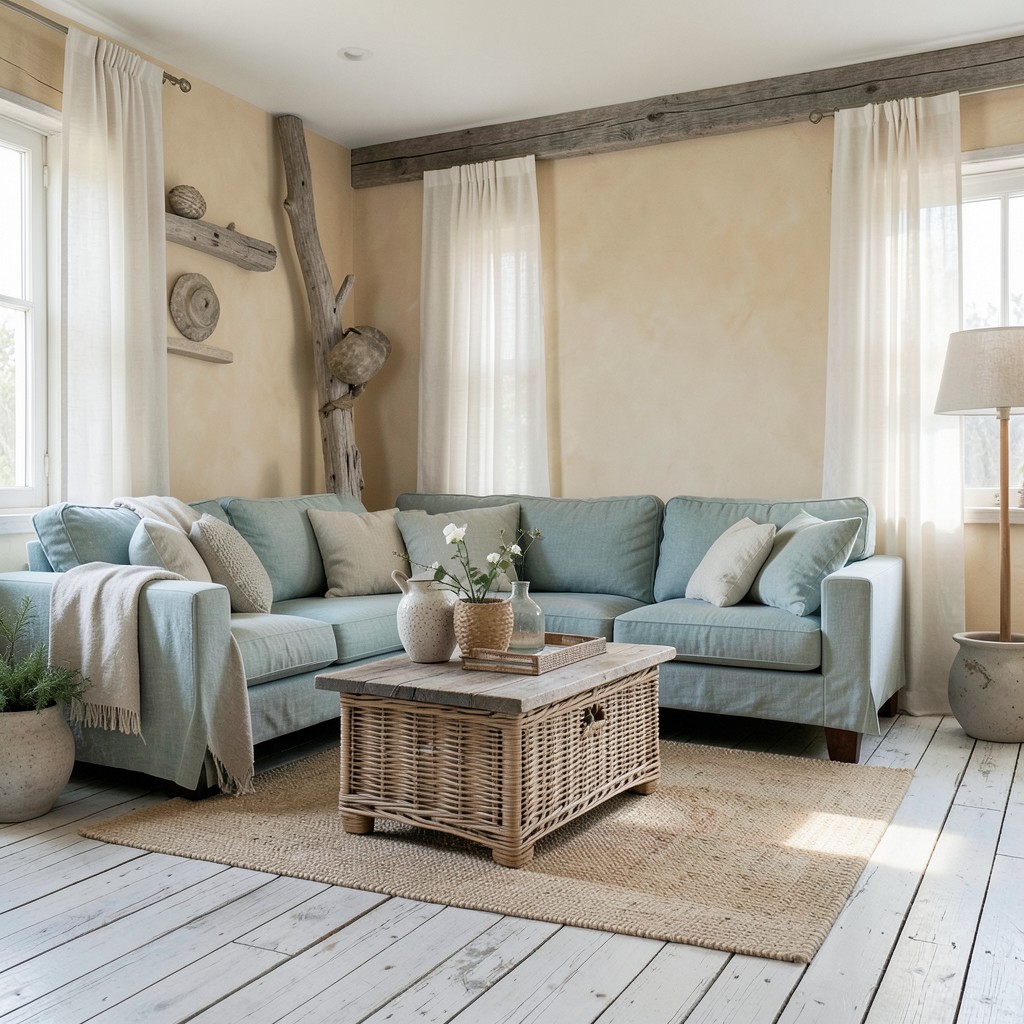
A coastal living room — the specific combination of natural textures, sun-bleached tones, organic forms, and the material language of seaside environments applied to a domestic interior — produces a living environment with the sensory associations of proximity to water, open sky, and the relaxed quality of days spent without an agenda. The coastal living room does not require proximity to an actual coast to work. It requires a sincere material commitment to the aesthetic’s vocabulary rather than a collection of nautical props and shell prints that parody the direction rather than inhabiting it.
The color palette of a coastal living room begins with sand and water — the warm beiges and pale creams of dry sand, the cool blue-greens of shallow coastal water, the grey of bleached driftwood — and builds the room’s full palette from those reference points rather than from a paint company’s coastal color collection. The sand-tone wall in a warm, slightly chalky finish, the blue-green linen on the sofa in a shade between sage and teal, the grey-white bleached timber floorboards, and the cotton voile curtains that let the daylight in while diffusing its directness — this is the coastal palette built from material observation rather than catalog selection.
The texture of the coastal living room is the dimension that most immediately communicates the direction’s connection to the natural seaside environment. Rough-hewn timber surfaces, woven rattan and seagrass, weathered linen with a visible weave, pebbled ceramic vessels, and the natural erosion quality of sea-worn stone — these textures carry the sensory memory of coastal environments in their material character and produce a room whose surfaces reward touch as much as sight. The coastal living room without this texture layer reads as a blue-and-white room rather than a genuinely coastal one, which is the distinction between an aesthetic applied to a surface and an aesthetic grown from a material understanding.
28. A Living Room With a Maximalist Color Approach
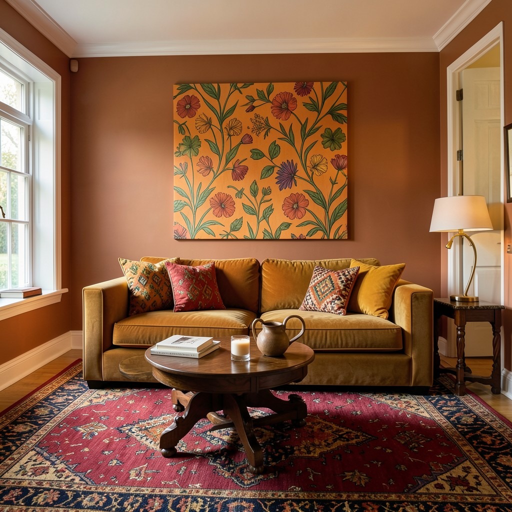
A maximalist color living room — one where every color decision was made with maximum rather than minimum commitment, where the walls are saturated, the sofa is bold, the rug is patterned, and the accessories operate in a range that extends the palette across the full spectrum of the design’s color story — is the living room that communicates the most direct aesthetic confidence of any design direction available. It is also the direction most frequently described as risky, which is only true if the colors were chosen without a governing palette strategy and assembled without reference to their relationships with each other.
The governing palette of a maximalist color living room establishes the color family from which all the room’s tones are drawn — not a restriction on the number of colors used, but a definition of the territory within which all of them must operate. A warm-toned maximalist palette draws from the yellow, orange, red, and warm green range: terracotta walls, an amber velvet sofa, a jewel-toned Persian rug in ruby and gold, printed cushions in paprika, mustard, and olive. Every color is different from every other, and the room contains multiple simultaneous color statements, but they all share the warmth of the amber-red-yellow color family, which provides the visual coherence that allows maximum color without maximum chaos.
The scale of pattern within a maximalist color living room must be managed to prevent the simultaneous presence of multiple patterns from producing a visual noise level that makes the room uncomfortable to inhabit for extended periods. The rule that most experienced maximalist designers apply is that patterns at very different scales coexist more comfortably than patterns at similar scales: a large-scale botanical on the wall behind a sofa with a small-scale geometric print cushion and a medium-scale woven kilim rug produces a three-pattern room where each pattern reads at its own scale level without competing directly with the others for visual attention.
29. A Living Room With a Terrazzo Floor
Terrazzo in a living room floor — the composite of stone chips in a cement or resin matrix, ground smooth and sealed to reveal the pattern of embedded fragments in a continuous, seamless surface — carries centuries of public and domestic application without ever looking dated, because its aesthetic is entirely dependent on the material’s own natural composition rather than on any imposed stylistic convention. The terrazzo floor is not a trend. It is a permanent material decision, and the living room that commits to it commits to a surface whose quality deepens with maintenance rather than diminishing with use.
The chip color and matrix combination selected for a living room terrazzo must be resolved as a complete composition before the material is poured, because the installation is irreversible in the way that tile or timber floor installations are not. A warm cream matrix with chips of pale ivory, honey amber, and occasional veined marble produces a terrazzo that reads as warm and organic under both natural and evening light — the kind of floor that makes every piece of furniture placed on it look better for the company. A white matrix with black, grey, and white chips produces a more architectural, graphic reading that suits a living room whose design direction leans toward a strong geometric aesthetic.
The dividing strips in a terrazzo living room floor — typically in brass, which weathers to an aged gold that suits natural material palettes — define the sections of the pour and also provide the opportunity to design a compositional element within the floor itself. A brass border strip running parallel to the sofa arrangement at the room’s perimeter, framing the central terrazzo field, gives the floor the architectural precision of a designed plane rather than a poured material that simply filled the space. That difference between the material that fills a room and the material that is designed for a room is one that the eye feels before the mind articulates it.
30. A Living Room With a Curved Accent Wall
A curved wall in a living room — whether a genuinely structural arc formed in masonry or a curved plasterboard partition introduced as a feature element within an existing rectangular plan — breaks the orthogonal geometry of the standard room in a way whose impact is disproportionate to the scale of the intervention. The single curved wall in a room of straight lines commands attention not through size but through contrast. Every other surface in the room confirms the right angle; this one refuses it, and that refusal is where the room’s visual energy concentrates.
The curved plasterboard wall is the practical method for introducing the arc into an existing living room without structural modification. A new partition of curved plasterboard, formed over a timber or metal stud frame bent to the desired radius, can be positioned as a feature element behind the primary sofa, as a screen between the living and the dining area, or as the back wall of a built-in shelving alcove whose arch form the curve creates. The radius must be generous enough to read as an intentional arc rather than as a wall that was built slightly crooked — a radius of under two meters produces a curve too tight to be mistaken for anything else, while anything over five meters in a standard room begins to flatten toward imperceptibility.
The surface treatment of a curved living room wall should reinforce its distinction from the flat walls around it. A different paint color, a lime wash or plaster texture, or a clay plaster application on the curved surface only draws the eye to the arc’s form and rewards the closer inspection that the texture provides. A curved wall in the same paint finish as the flat walls around it reads as architectural rather than textural — present as form but not as surface character — which is a valid choice for an architectural living room direction but misses the opportunity to make the curved wall a multi-sensory feature rather than a purely visual one.
31. A Living Room With a Moroccan-Inspired Design
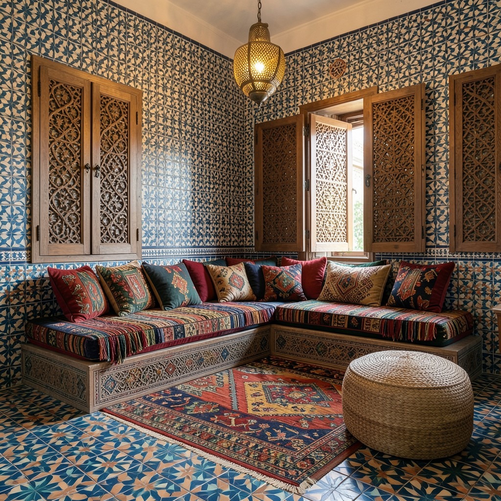
A Moroccan-influenced living room — geometric tilework, hammered brass lanterns, richly colored textiles in deep jewel tones, carved wooden screens, and the layered, abundant quality of an aesthetic tradition that has never endorsed restraint as a design virtue — produces an environment whose sensory richness and material depth exceed almost any other design direction available in a residential living room context. The Moroccan aesthetic is not minimal. It does not apologize for that. And the living room that commits to it stops apologizing too.
The floor or wall tile in a Moroccan-influenced living room — zellige handmade ceramic tile in a geometric pattern, encaustic cement tile in a traditional star-and-cross motif, or a hand-painted ceramic tile in the specific turquoise, cobalt, and terracotta color range of Moroccan architectural tradition — provides the most immediate and most culturally specific signal of the design direction. Zellige tile, made from hand-cut irregular ceramic pieces fitted into geometric patterns, produces a surface whose slight variation in tile thickness, color saturation, and reflectivity across the face gives the patterned wall or floor surface a handmade quality that machine-produced tile cannot approach at any degree of technical precision.
The textile layer in a Moroccan living room — the low seating cushions on a Moroccan-style sofa platform, the kilim rug, the embroidered throw, the woven pouf — provides the room’s physical comfort and its color depth simultaneously. The Moroccan living room sofa is often a built-in bench platform — the banquette equivalent — with floor-level cushions stacked generously enough to provide back support without a raised sofa frame. This lower seating position brings the room’s occupants physically closer to the tiled floor and the rug surface, which increases the tactile engagement with those materials and produces the specific quality of immersive, ground-level comfort that Moroccan domestic interiors have refined across centuries.
32. A Living Room With Smart Home Technology Integration
A living room integrated with smart home technology — controllable lighting scenes, motorized window treatments, a sound system distributed through the room’s architecture rather than from visible speakers, and a climate control system that responds to occupancy and preference rather than requiring manual adjustment — provides a living environment whose comfort and atmosphere can be calibrated to the moment without the physical management of multiple independent systems. The technology serves the room’s quality of experience rather than announcing its own presence, and that invisibility is the design standard against which all smart home living room integration should be evaluated.
The lighting control system is the smart home investment with the most immediate and most daily atmospheric impact in a living room. A system that stores pre-set scenes — a bright scene for mid-morning activities, a warm scene for evening relaxation, a low-light scene for film watching — and activates them from a single button press, a voice command, or a scheduled time-trigger removes the friction of manually adjusting multiple fixtures individually every time the room’s function changes. The scene that sets the room for an evening gathering in one action versus the sequence of walking to each lamp, adjusting each dimmer individually, and still not quite achieving the right balance — these are not equivalent experiences, and the gap between them compounds across every day the living room is used.
The concealed speaker system — ceiling-mounted or in-wall drivers that distribute sound through the room’s architecture rather than through visible floor-standing or bookshelf units — is the audio provision that most living rooms want and most living rooms do not plan for at the point of construction or renovation when the walls and ceiling are accessible. Retrofitting in-wall speakers requires opening the wall, which means the decision is cheaper and less disruptive at the renovation stage than afterward. The acoustic quality of a distributed in-ceiling system in a domestic living room is not the audiophile standard of high-performance bookshelf or floor-standing speakers in an optimized listening environment — but for background music, podcast listening, and television audio enhancement, the ceiling-distributed system provides a quality of sound that fills the room evenly and comes from nowhere in particular, which is the domestic audio quality most living rooms actually need.
33. A Living Room With a Library Ladder
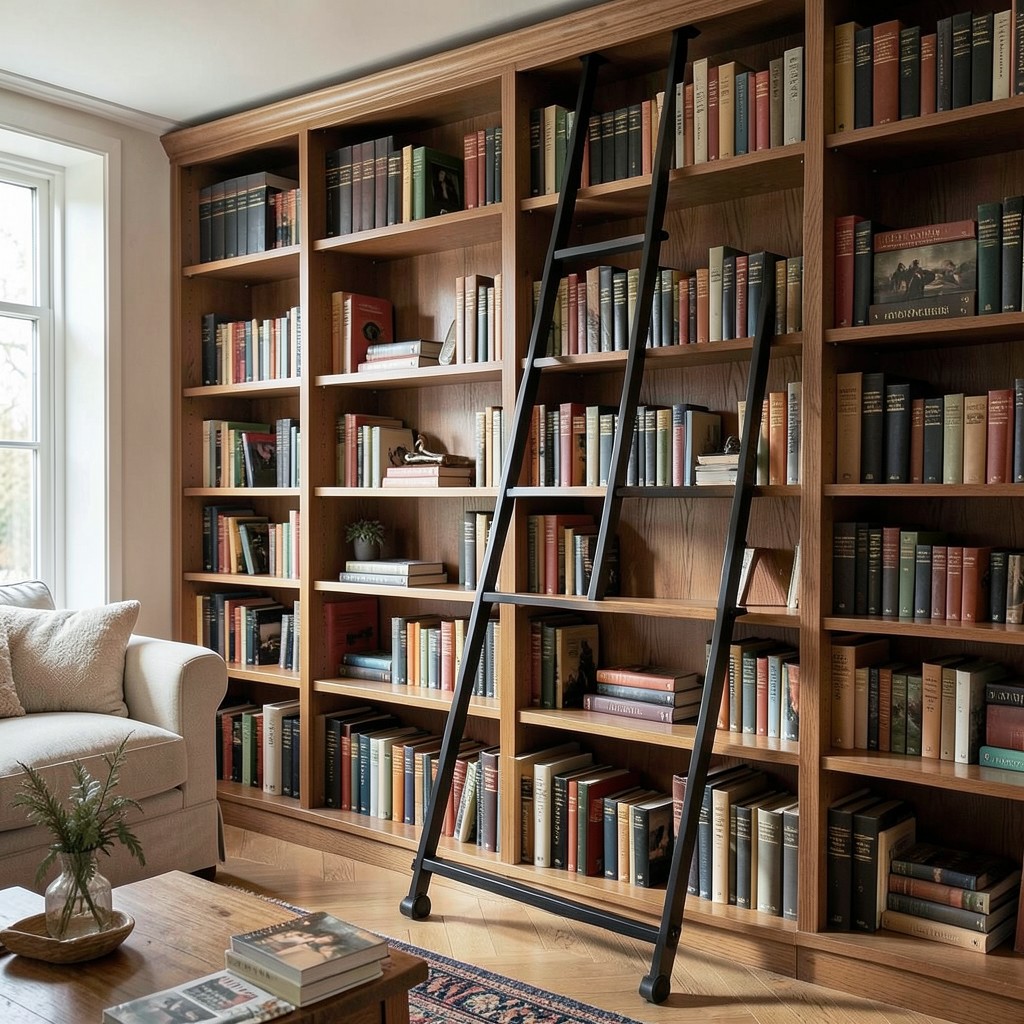
A library ladder in a living room — a rolling or sliding ladder on a floor-fixed or ceiling-fixed rail, providing access to the upper sections of full-height bookshelves — is the design element that most efficiently communicates both the seriousness of the household’s relationship with books and the architectural ambition of the room’s storage design. The library ladder is functional as a means of reaching the top shelf. It is also the piece of living room furniture that most directly references the private libraries of the great houses and the reading rooms of the public library tradition, and that reference carries cultural weight that most living room furniture cannot claim.
The ladder rail system must be specified for the precise shelf run it serves — a floor-fixed rail that remains at a fixed position relative to the shelves, or a ceiling-fixed rail that aligns the ladder with the shelf front face across the full width of the shelf installation. The floor-fixed rail produces a more stable ladder that can bear greater lateral load — useful if the ladder is used as a seating perch as well as a shelf-access tool. The ceiling-fixed rail positions the ladder flush with the shelf front, which allows the ladder to run smoothly across shelves whose base extends to the floor without the floor rail creating a tripping obstacle at the shelf base.
The ladder material should be specified in relationship with the shelf material rather than as an independent accessory. A solid oak ladder on oak shelves reads as a designed unity. A blackened steel ladder on oak shelves reads as the industrial-domestic material contrast that suits a more contemporary shelf design. A painted ladder — in the same tone as the shelving unit or in a contrasting accent color — produces a different reading again, treating the ladder as a colorful functional element rather than a material extension of the shelving system. Each of these choices is defensible, and the decision reveals the household’s design priorities more directly than most living room choices do.
34. A Living Room With a Skylight
A skylight in a living room — a roof glazing installation that admits natural light from directly above — changes the quality of the room’s daylight in a way that no additional window in a wall surface replicates. Overhead light from a skylight has a different directional quality from the side-entering light of a wall window: it illuminates the room’s horizontal surfaces — the floor, the coffee table, the sofa’s upholstered planes — rather than the vertical ones, which is the lighting direction that most closely resembles the outdoor experience of natural light falling from an open sky. The living room with a skylight feels connected to the weather in a way that wall-windowed rooms do not.
The fixed skylight — a non-opening glazing unit in the roof plane — provides the light quality of overhead natural illumination without the ventilation benefit of the opening equivalent. In a living room, ventilation is less critical than in a kitchen or bathroom, which makes the fixed skylight an acceptable and often less expensive option than the opening roof window for pure light provision. The glazing specification for a living room skylight should address solar gain management specifically — a living room skylight with standard clear glass admits significant heat gain in summer, which in a room primarily used for relaxation rather than task activity produces a heat problem that the glazing specification should prevent rather than the occupant manage with supplementary shading.
The position of the skylight within the living room plan determines which surfaces receive its light and which remain in the directional shadow that skylights, like all point light sources, create around their beam. A skylight positioned above the seating area illuminates the faces of the people sitting in it from above, which is an atmospheric lighting effect well suited to a room used for conversation and gathering. A skylight positioned above the room’s art wall illuminates the art with the overhead light quality of a gallery installation. The positioning decision requires understanding where the light is most needed and most appreciated rather than where the roof structure makes installation easiest.
35. A Living Room With a Statement Staircase
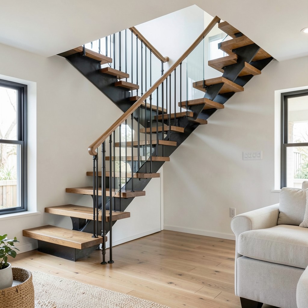
A staircase visible within a living room — either because the living room occupies an open-plan ground floor where the staircase is a shared architectural element, or because a design decision was made to expose a staircase that was previously contained within a hallway partition — is the single largest and most structurally significant design element that a living room can contain. The staircase in the living space is not a piece of furniture. It is architecture, and its material, its profile, and its structural expression determine the room’s character at a scale and permanence that nothing else in the living room approaches.
The open-riser staircase — where the stair treads are supported by open strings or central spine without closed risers between them — provides the visual lightness that allows a staircase in a living room to remain a background architectural element rather than dominating the room with its physical mass. The light passes through the open tread gaps, the room’s space flows visually beneath the staircase, and the vertical movement of the stair structure reads as a graphic element within the room’s composition rather than as a solid partition wall that happens to have steps. The open-riser principle is the staircase design decision that most effectively reconciles the staircase’s necessary physical presence with the living room’s need for open, light-filled space.
The balustrade of a living room staircase is the detail with the most design expression per linear meter of any architectural element in the room. A glass balustrade — toughened glass panels in a frameless or minimal-frame setting — provides the safety enclosure while maintaining maximum visual transparency between the stair zone and the living space. A steel rod balustrade in a blackened or warm brass finish provides the industrial or warm material contrast that suits a more material-rich design direction. A timber balustrade with turned or square-profile balusters provides the traditional quality of a staircase that belongs to the building’s original architectural language. The balustrade material choice is the one staircase decision that can be made or changed independently of the structural work, which makes it the most accessible redesign point for a living room staircase that is otherwise architecturally fixed.
36. A Living Room With a Plaster Art Installation
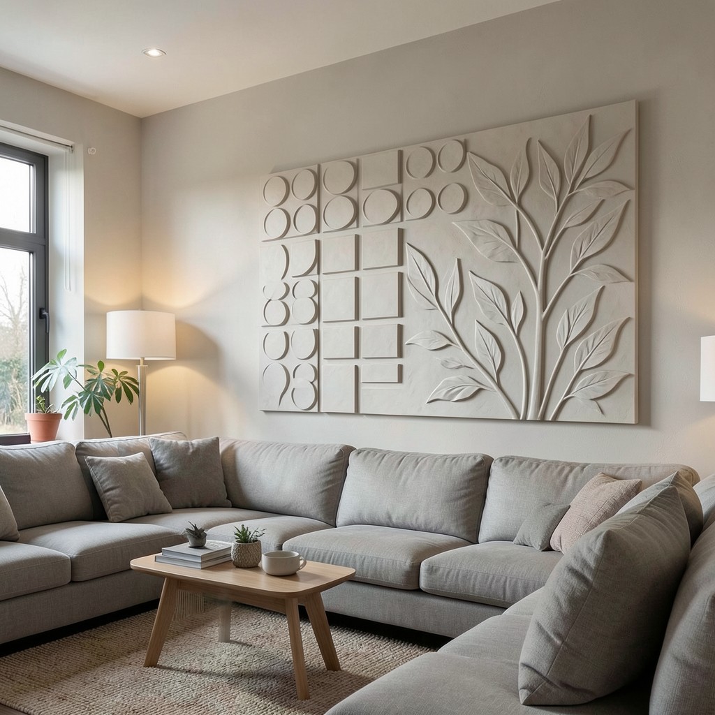
A sculptural plaster relief installation on a living room wall — a piece of three-dimensional wall art worked directly into or applied onto the wall surface, whether a custom commission, a purchased panel, or a DIY application — provides a form of wall treatment whose depth and material quality occupies the visual space between a painting and an architectural feature. The plaster relief is neither fully decorative nor fully structural. It is made from the same material as the wall it occupies but shaped with the intention of a designed object, which produces the specific and rare quality of a wall that is both background and foreground simultaneously.
The DIY plaster relief option — using standard interior skim plaster applied with a palette knife to a primed wall surface in a pre-drawn or freehand pattern — is within the skill range of any household willing to accept a learning curve and a level of surface imperfection that the material’s handmade quality actually validates rather than undermines. A simple geometric pattern — overlapping circles, a grid of squares at varying depths, a series of parallel ridges — applied at a consistent depth of five to ten millimeters produces a tactile surface whose shadow behavior under the living room’s wall-grazing accent light changes the wall’s quality from a flat painted surface to a dimensionally interesting architectural plane.
The professional plaster relief installation — commissioned from a specialist decorative plasterer or sourced as a manufactured panel in a resin-bonded plaster composite — provides the level of detail, consistency, and scale that DIY applications cannot achieve in complex designs. An organic botanical relief in a large panel format — foliage and stems worked in bas-relief at varying depths from the background plane — positioned as a feature panel on the living room’s primary wall provides the wall installation quality of a significant art piece at the specific material character of something made from the same elemental material as the room’s own walls.
37. A Living Room With a Media Wall Done Right
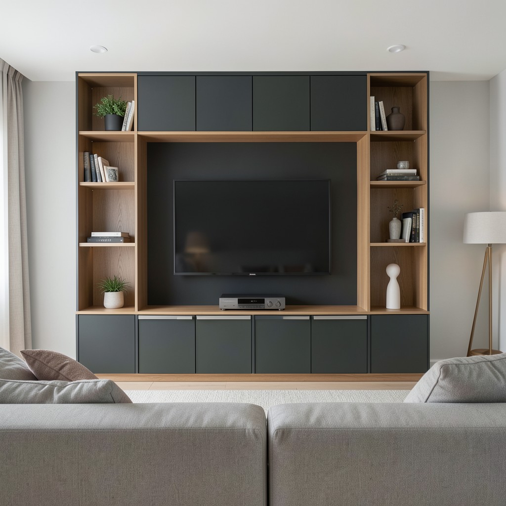
A media wall in a living room — a built-in unit that integrates the television, the audio system, the media storage, and the decorative display within a single composed architectural element — is the design solution that resolves the television’s awkward presence in a living room more effectively than any freestanding alternative. The television mounted on a plain wall with its cables visible and its proportional relationship with the surrounding space unresolved is the most common living room design failure because it is the most tolerated: most households accept it as functional and ignore its aesthetic cost.
The media wall resolves the television’s presence by absorbing it into a larger architectural composition where its rectangular form is one element among several rather than the dominant object in the room’s primary wall position. A media wall that frames the television within a central panel of the full-height unit — flanked by shelving on each side, with cabinet storage below and open display above — produces a wall composition where the television reads as the unit’s center rather than as a black rectangle floating on a plaster surface. When the television is off, it reads as a dark panel within a composed furniture piece rather than as an absent screen in a prominent position.
The material and finish of the media wall communicates the living room’s design direction as directly as the sofa or the floor, and it deserves the same specification attention. A media wall in a painted MDF in a matte deep color — navy, olive, charcoal — with the television panel in the same tone produces the recessive quality that makes the screen disappear when not in use. A media wall in a natural oak veneer with brushed steel handles produces the Scandinavian quality of a functional piece elevated by material quality. The finish decision is the one that most people defer to a cabinetmaker’s recommendation without understanding that it is theirs to make.
38. A Living Room With an Earthy Terracotta Palette
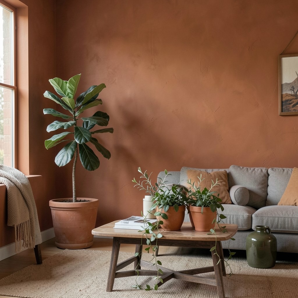
A terracotta palette in a living room — the warm, red-brown tones of fired clay, dried earth, and sun-baked tile applied across the room’s walls, textiles, and ceramic accessories — provides the specific quality of grounded warmth that cooler palettes cannot generate regardless of the light level. Terracotta is not orange and it is not brown. It occupies the specific tonal territory between those two, with a warmth that reads as genuinely mineral — as something that came from the ground rather than from a paint chip collection — and that changes quality through the day as the light’s temperature shifts from the cool clarity of morning to the warm amber of late afternoon.
The wall color in a terracotta living room must be the tone that activates the room’s other warm materials rather than competing with them. A terracotta that is too orange reads as an accent color rather than an atmospheric ground — it claims too much attention for itself and fights with the room’s other warm materials rather than unifying them. A terracotta that leans toward the brown end of its tonal range reads as earthier and more mineral, providing the quality of material depth that the palette’s warmth should feel grounded in rather than decoratively applied to. Testing the specific paint tone on the actual wall surface in the actual room’s light conditions — in both morning and evening light — before committing to the full application is not cautious behavior. It is the only responsible approach to a wall color this specific.
The planting in a terracotta living room — particularly terracotta-colored ceramics planted with olive-grey and soft green foliage — completes the material conversation that the earthy palette begins. A large terracotta pot with a fiddle-leaf fig, a cluster of smaller terracotta vessels with trailing plants on the coffee table, and a single statement ceramic in a dark olive glaze on the sideboard provide the botanical and ceramic layers that the terracotta palette’s earthy character specifically anticipates. The room looks unfinished without them not because design rules require plants but because the palette is asking for the organic material reference that only actual plants or genuine ceramics can supply.
39. A Living Room With a Sunroom Extension
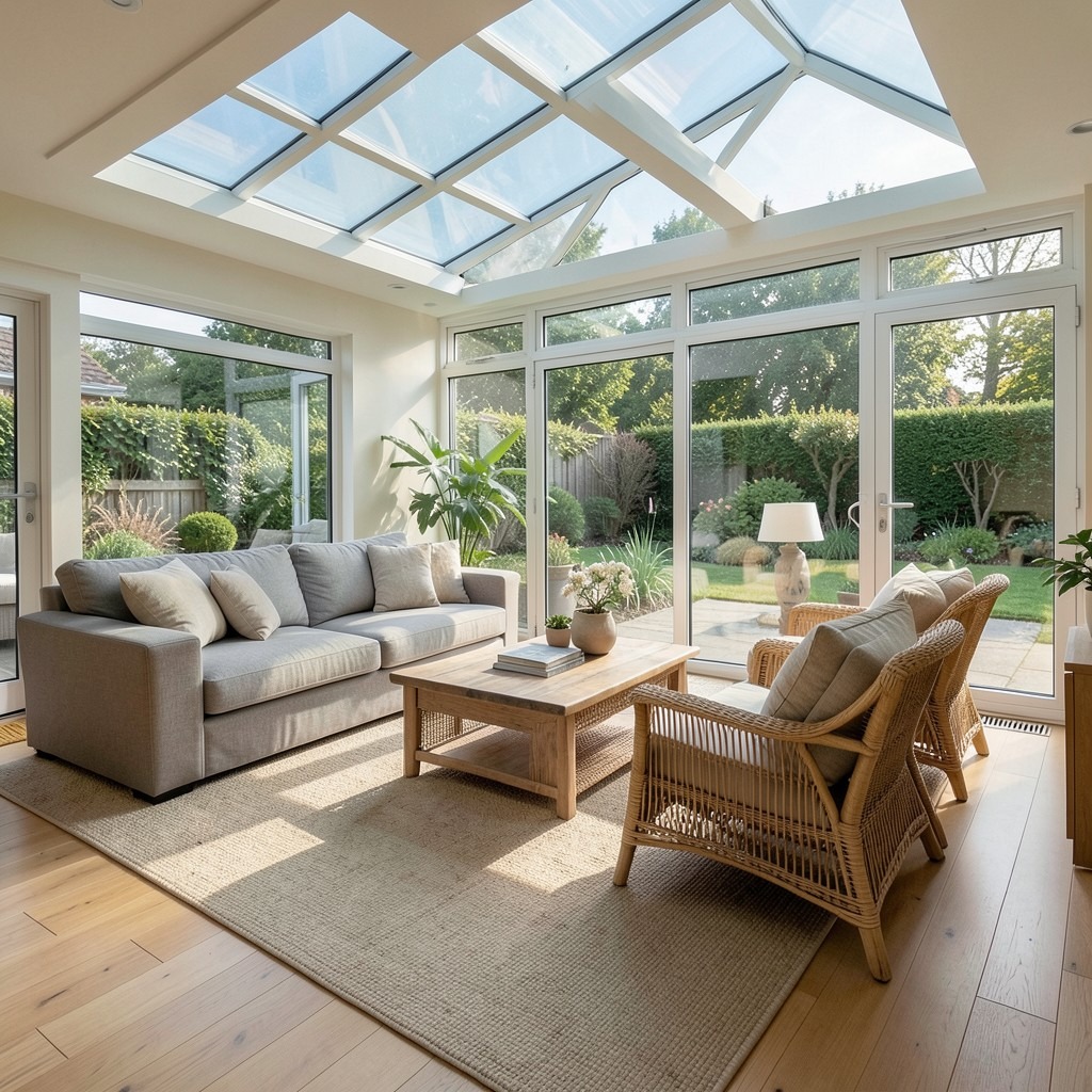
A living room that extends into a glass-walled sunroom — either through a structural extension or through the removal of the wall between an existing conservatory and the main living space — gains both the physical square footage of the sunroom and the quality of light and spatial connection to the garden that the glass enclosure provides. The sunroom-extended living room is a different spatial experience from a living room with a good view: the glass enclosure positions the occupant within a space that is surrounded by the outdoor environment rather than looking at it from behind a single window.
The thermal management of a sunroom-integrated living room is the engineering challenge that the design ambition requires to be resolved before the extension is used as primary living space. An uninsulated glass roof in summer produces solar heat gain that makes the space unusable at peak summer temperatures without mechanical cooling. A double-glazed roof with a solar control coating — which reduces the solar heat gain coefficient without significantly reducing the light transmission — keeps the sunroom within comfortable temperature ranges through most temperate climates without supplementary cooling. The floor heating system that provides the sunroom’s primary winter warmth should be on a zone separate from the main house’s heating circuit, allowing the sunroom’s temperature to be managed independently from the adjacent living room.
The furniture in the sunroom zone of an extended living room should be specified for the thermal cycling that the glass envelope produces — the daily temperature variation between the heated daytime condition and the cooler overnight temperature that a glass structure experiences even when well-insulated. Natural rattan and timber furniture handles this thermal cycling without the expansion and contraction damage that upholstered furniture with dimensional wood frames sometimes suffers under extreme temperature variation. The sunroom zone’s furniture selection is one of the few living room decisions where the material’s practical response to the physical environment genuinely overrides the purely aesthetic selection.
40. A Living Room With an Abstract Art Focal Point
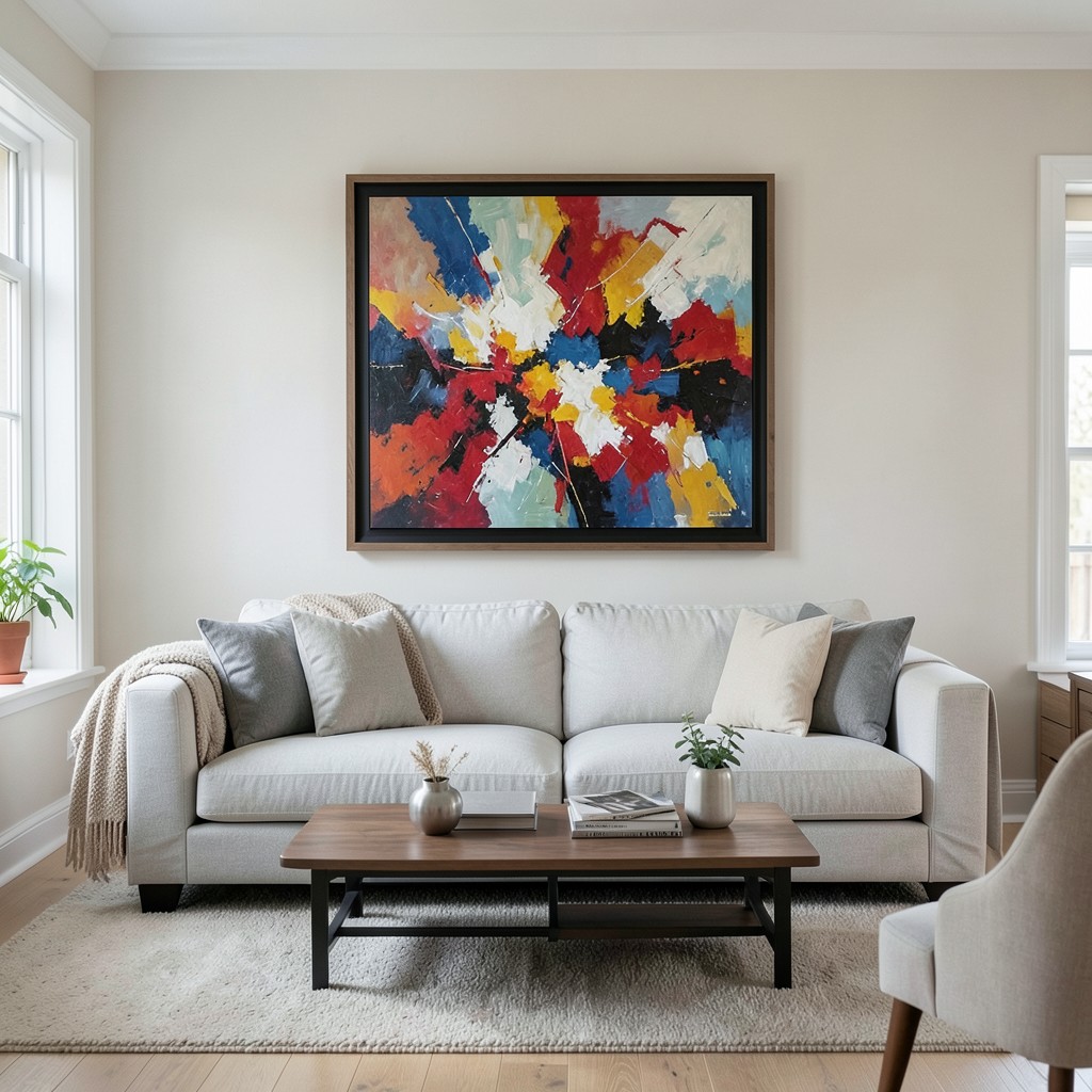
A large-format abstract painting as the living room’s primary focal point — positioned on the wall that the primary seating faces, at a scale that commands the wall surface without leaving awkward unoccupied space around it — provides the room with an atmospheric and intellectual anchor that no other wall treatment generates at the same level of emotional depth. The abstract painting does not describe anything outside itself. Its content is purely the color, the mark, the texture, and the compositional tension of the painted surface, which means the living room that it anchors is a room whose focal point rewards sustained attention in a way that decorative and representational works rarely do after the subject has been identified.
The scale of the focal point painting relative to the wall it occupies is the hanging decision with the most visual consequence. A painting whose width spans at least fifty-five percent of the wall’s width reads as a statement in correct relationship with the space it occupies. A painting smaller than this proportion reads as a picture on a wall rather than as the room’s primary visual element, regardless of the painting’s intrinsic quality. The large-format abstract that fills the primary wall creates the atmosphere of a room organized around a serious aesthetic commitment, and that commitment communicates itself to every person who sits in the seating arrangement facing it.
The framing decision for a large abstract painting in a living room focal point position should be made with an understanding of what the frame adds to or subtracts from the painting’s relationship with the wall and the room. A deep-set float frame in a natural timber or blackened profile lifts the painting from the wall surface and provides the shadow gap between canvas edge and frame inner edge that gallery installations use to present works with spatial independence from their surroundings. No frame at all — a canvas hung directly with its raw edges visible — produces a different quality of material directness that suits paintings whose edge treatment is itself part of the work’s composition.
41. A Living Room With a Vintage Rug as the Starting Point
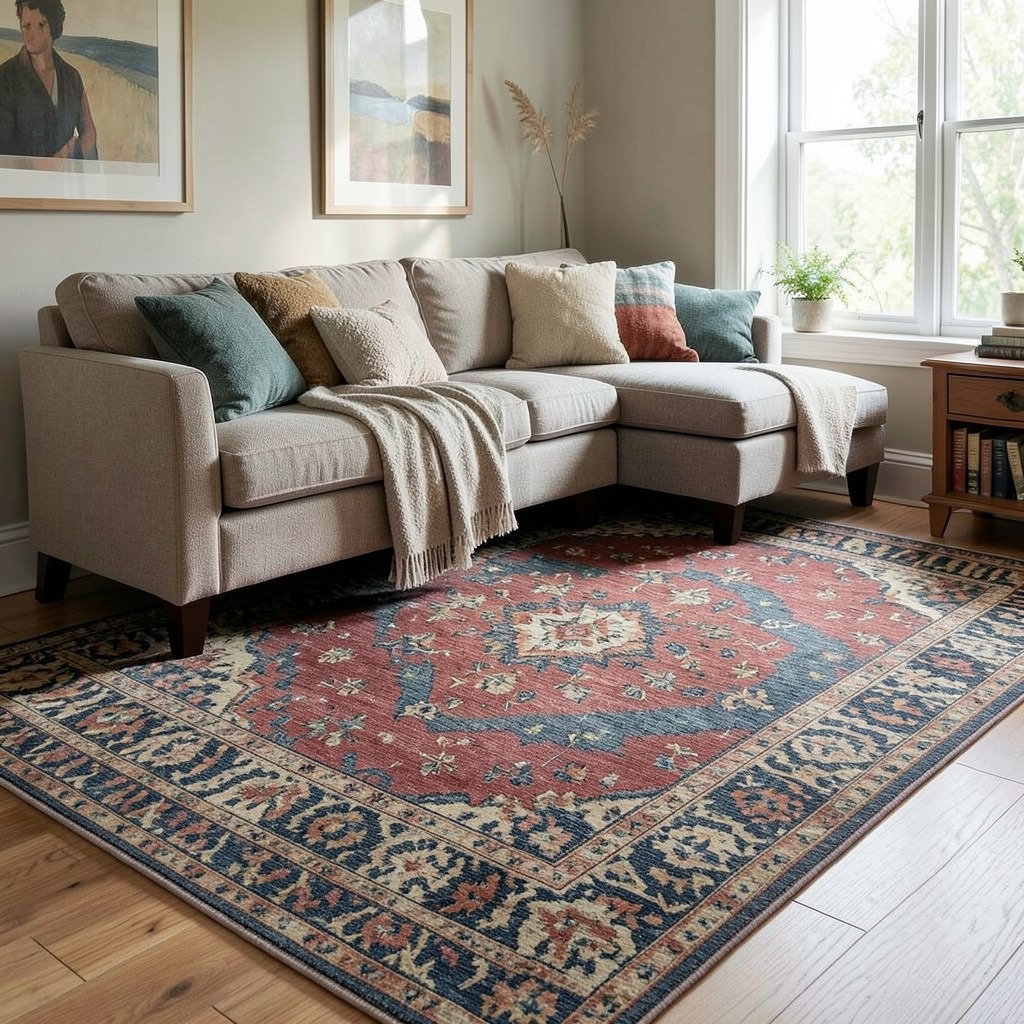
Beginning the living room design with the vintage rug rather than the sofa is the approach that produces the most coherent and the most characterful room, and it is the approach that design professionals use far more frequently than the standard consumer purchase sequence suggests is normal. The vintage rug is the starting point because it is the room’s most complex color and pattern element — its tones, its proportions, and its pattern scale determine the constraints within which every other selection must be made. Starting with the rug gives the room’s design a foundation built on the most demanding and the most specific element rather than a sofa color that all subsequent selections must accommodate.
The vintage rug in a living room accumulates age, use, and repair into a surface that no new rug can replicate regardless of production method. The slight fading of a vegetable-dye wool rug that has been under a window for thirty years, the abrash color variation in a hand-knotted pile where different batches of the same dye produced slightly different tones, the repair stitching visible in the pile where a previous owner restored a worn section — these are the material qualities that make a vintage rug worth its premium over a new production equivalent, and they are the qualities that give the living room floor an authenticity of material history that modern furnishings cannot generate.
The vintage rug’s color palette becomes the living room’s color palette from the moment the rug is positioned in the room. The dominant ground color determines the wall tone direction. The secondary pattern colors determine the cushion, throw, and accessory palette. The rug’s material character — whether its pile reads as warm or cool, dense or airy — determines the sofa fabric direction. This constraint is the rug’s gift to the design process: it removes the paralysis of infinite choice and replaces it with a set of guided decisions that produce a room whose color relationships are as resolved as the rug’s own palette because they were derived from the same source.
42. A Living Room With a Hammered Copper or Brass Accent
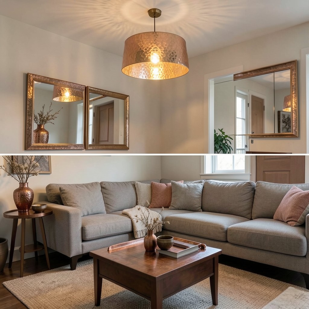
Hammered copper or hammered brass accents in a living room — pendant lights, side table surfaces, mirror frames, vase collections, and door hardware in the specific warm, irregular surface quality of metal worked by hand — provide the room with the material warmth and the artisanal quality that machine-finished metals cannot approach at any degree of technical perfection. The hammered surface is not an imperfection in the metal. It is the record of the making process, and that record is the object’s most distinctive material quality.
The pendant light in hammered brass over a reading corner — a shade formed from hand-worked brass sheet whose surface catches and scatters light in the irregular pattern of its hammer marks — provides the reading light’s functional output and the specific warm, patterned glow on the ceiling above it that the hammered surface’s reflective variation produces. The same light output from a smooth, machine-finished shade would illuminate the same area with the same lumen count but without the ceiling pattern and the material warmth that the hammered surface contributes. Those additional qualities are the value of the artisanal specification over the industrial equivalent.
The collection logic for hammered metal accents in a living room — the principle that determines how many objects and at what scale the material should appear to read as a designed material presence rather than an accumulation of unrelated purchases — requires that the metal appears at a minimum of three different scales within the room. A pendant light at ceiling scale, a side table or tray at furniture scale, and a small vase or bowl at tabletop scale provides the distribution across the room’s spatial layers that makes the material read as a consistent aesthetic thread rather than as individual decorative purchases that happen to share a finish.
43. A Living Room With a Cantilevered Floating Shelf Display
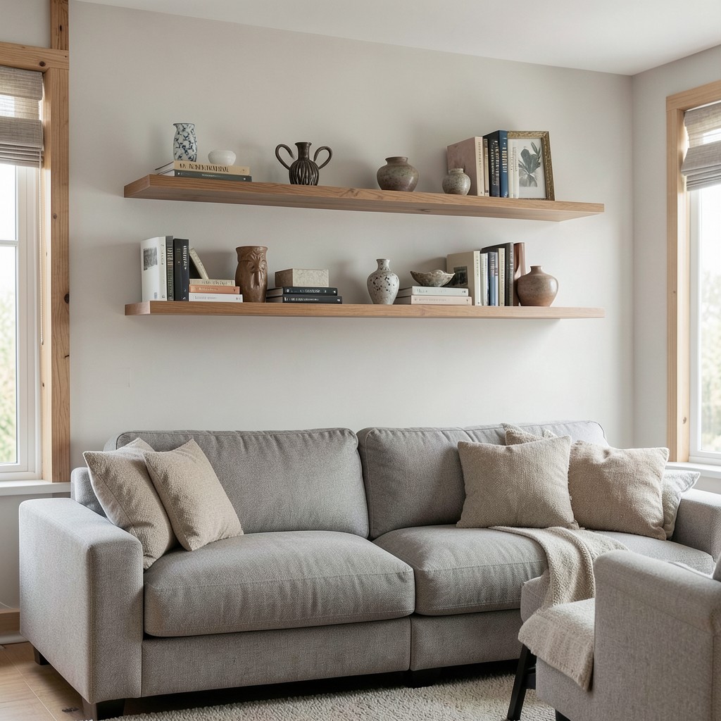
Floating shelves in a living room — shelves whose wall fixings are fully concealed, leaving the shelf surface extending from the wall with no visible support bracket — provide a display surface with the specific quality of architectural cleanness that bracketed shelves cannot match at any bracket design quality. The floating shelf reads as part of the wall rather than as an accessory attached to it, which allows the objects displayed on it to read as displayed rather than stored and makes the wall surface around and below the shelf remain a clean, uninterrupted plane.
The structural requirement for a genuinely floating shelf — one that bears the weight of books, ceramics, and decorative objects without visible deflection — is considerably more demanding than the wall-fixing requirement for a decorative shelf intended for lightweight display only. A floating shelf bearing books must be supported by a steel or hardwood internal spine fixed to the wall’s structural framing — not to the plasterboard alone — with fixings at a minimum of two wall studs and a shelf depth that does not exceed forty centimeters without intermediate support. A shelf that sags under the weight of its displayed objects undermines the entire visual premise of the floating installation, which is the strength of a surface that appears to defy gravity with complete confidence.
The height of floating shelves in a living room should be calibrated to the room’s primary viewing position — the seated position on the sofa — rather than to the standing eye level that most shelf hanging decisions default to. Shelves at a height where their displayed objects are at eye level from the seated position provide the engagement with the display that shelves positioned above standing eye level do not. The highest shelf in a living room floating shelf arrangement should still be accessible from a step stool rather than requiring a ladder, which sets the maximum installation height at approximately two hundred and twenty centimeters from the floor in rooms with standard ceiling heights.
44. A Living Room With a Painted Ceiling and Matching Walls
A living room where the ceiling and walls are painted in the same color — the same tone running continuously from the floor-adjacent skirting board to the ceiling plane without the conventional interruption of a lighter ceiling color — produces the enveloping quality of a room defined by its color rather than by its geometry. The standard domestic room with white ceiling and colored walls has a horizontal boundary at the cornice or the ceiling-wall junction where the color stops and the neutral begins, which defines the room’s color zone as the walls only. When the ceiling matches the walls, the color zone becomes the room’s full volume, and the experience of being inside it changes entirely.
The tone selection for a matched wall-and-ceiling living room requires understanding the ceiling’s contribution to the overall color saturation of the scheme. The ceiling’s larger surface area relative to any individual wall means it carries more of the color’s total volume than a single wall does, which shifts the room’s apparent color saturation upward when the ceiling is included. A mid-tone blue on four walls reads as mid-tone. The same mid-tone blue on four walls and the ceiling reads as deeper, richer, and more saturated because the color now surrounds the room completely rather than framing it from the sides only. The ceiling’s participation amplifies every color, and the selection should be made at a tone below the intended target to account for this amplification.
The cornice or ceiling-wall junction in a matched-color room becomes a detail decision rather than a color boundary. A hard, crisp painted line at the cornice — where the color runs cleanly to the cornice’s outer edge and the cornice itself is painted in the same tone — produces the clean architectural reading. Painting the cornice in the ceiling color rather than the wall color reintroduces the color boundary at the cornice line and partially defeats the enveloping intention of the scheme. For the full enveloping effect, every surface — including the cornice, the ceiling rose, and the picture rail if present — is in the same tone, and the room becomes its color rather than containing it.
45. A Living Room With a Conversation Pit
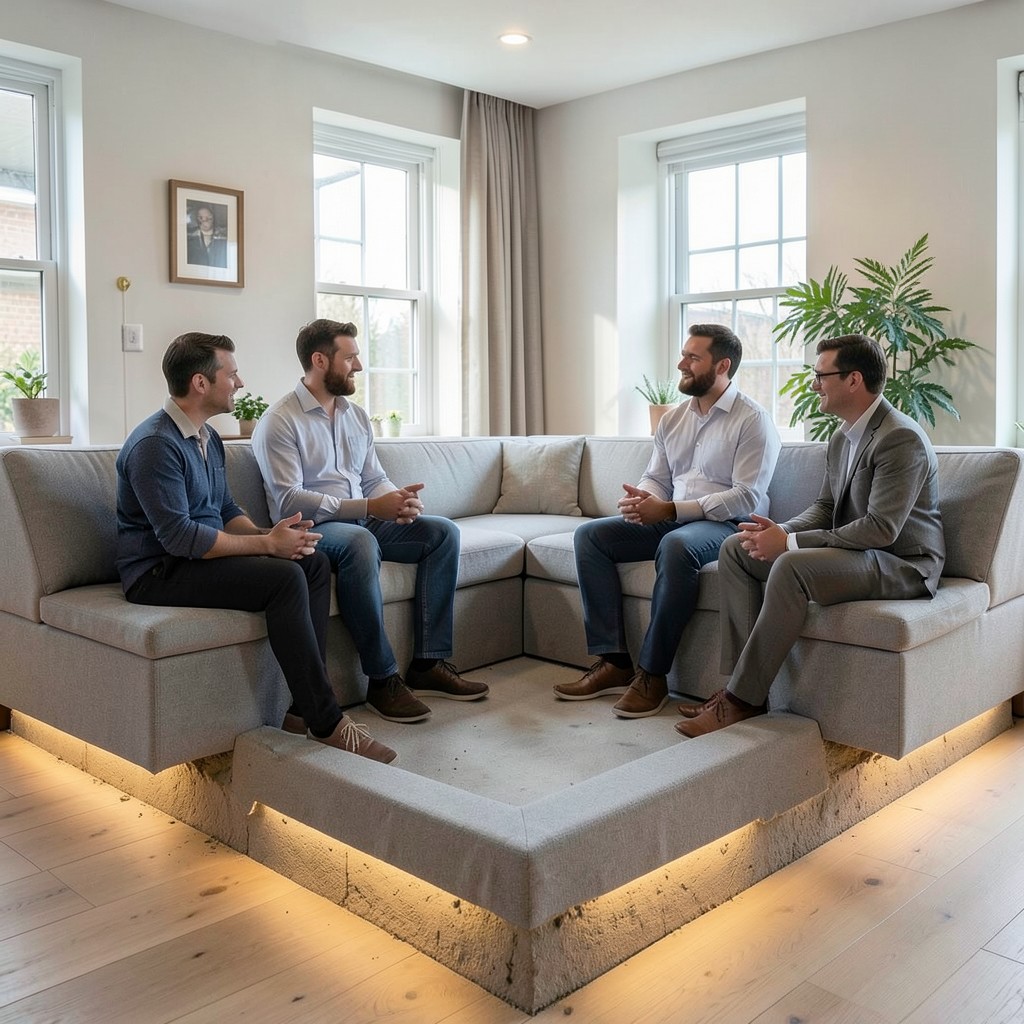
A conversation pit — a recessed or semi-recessed seating area at a lower floor level than the surrounding room, with built-in or surrounding seating that faces inward toward the pit’s center — is the living room design element with the most specific and the most historically loaded social intention of any seating arrangement available. The conversation pit was designed to produce face-to-face, contained, held-by-architecture conversation — the social quality that the conventional sofa-and-chairs arrangement gestures toward without achieving. When the architecture prevents easy departure and positions every occupant facing every other, conversations go deeper and last longer. The conversation pit knows this.
The structural requirement for a genuine conversation pit — a floor depression of thirty to forty-five centimeters below the surrounding floor plane — places this design element firmly in the new-build or major renovation category rather than a standard decorating project. The excavation, the structural reinforcement of the opening’s edges, the waterproofing of the recessed floor in ground-floor applications, and the heating provision for a floor zone that is below the standard floor level and therefore potentially cooler — these are the engineering considerations that distinguish the conversation pit from a furniture arrangement decision and require the input of a structural engineer before any floor is cut.
The seating within the conversation pit — built-in cushioned bench seating around the pit’s perimeter, whose bench height relates to the pit’s depth — provides the contained, face-toward-center quality that is the pit’s defining social feature. The bench cushion specification requires the same dining-bench ergonomic standards: a seat height relative to the pit’s floor level that positions the occupant at a comfortable posture for extended conversation, a cushion depth and firmness that supports the same position for the duration of a long evening, and a fabric specification that handles the daily cleaning demands of the living room’s primary seating in a configuration that cannot be easily removed and taken to the upholstery cleaner.
46. A Living Room With Layered Rugs
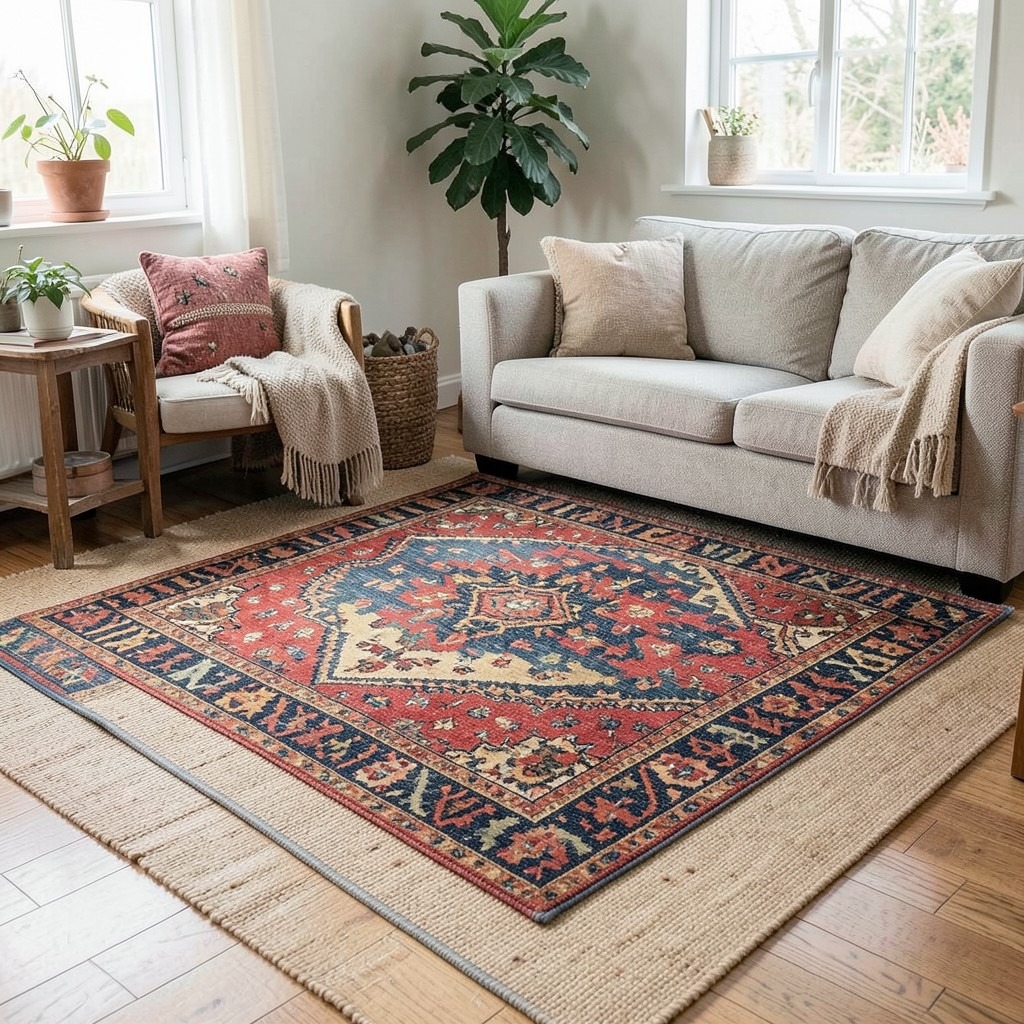
Layering two rugs in a living room — a larger base rug providing the seating zone’s ground plane, with a smaller rug layered over its center — is the textile strategy that produces the greatest floor surface richness of any single-layer rug approach at equivalent cost, and it is the floor treatment most associated with the globally-influenced, collected interior aesthetic that characterizes the best bohemian, eclectic, and maximalist living rooms. The layered rug arrangement is not a trend’s invention — it is the natural result of buying rugs across time and arranging them in the space available, which is what households with genuine textile interest have always done.
The base rug in a layered arrangement should be the larger, more neutral piece — the jute, the natural fiber flatweave, or the low-pile wool in a solid or subtly textured neutral — that establishes the seating zone’s ground plane without competing with the layered piece above it. The layered rug should be the more characterful piece — the vintage kilim, the patterned Persian, the hand-knotted wool in a saturated color — that provides the floor’s visual interest and sits centrally within the base rug’s perimeter with an offset of fifteen to twenty centimeters visible around its edges on at least three sides.
The practical management of layered rugs requires an anti-slip mat between the two layers — not between the base rug and the floor, which the base rug’s own backing typically handles, but between the two rug surfaces, where the upper rug’s tendency to migrate under foot traffic produces the bunched, displaced arrangement that makes layered rugs look careless rather than considered. A thin, open-mesh anti-slip sheet cut to the upper rug’s dimensions and placed between the layers keeps the arrangement aligned without any visible intervention.
47. A Living Room With a Decorative Ceiling Rose and Pendant
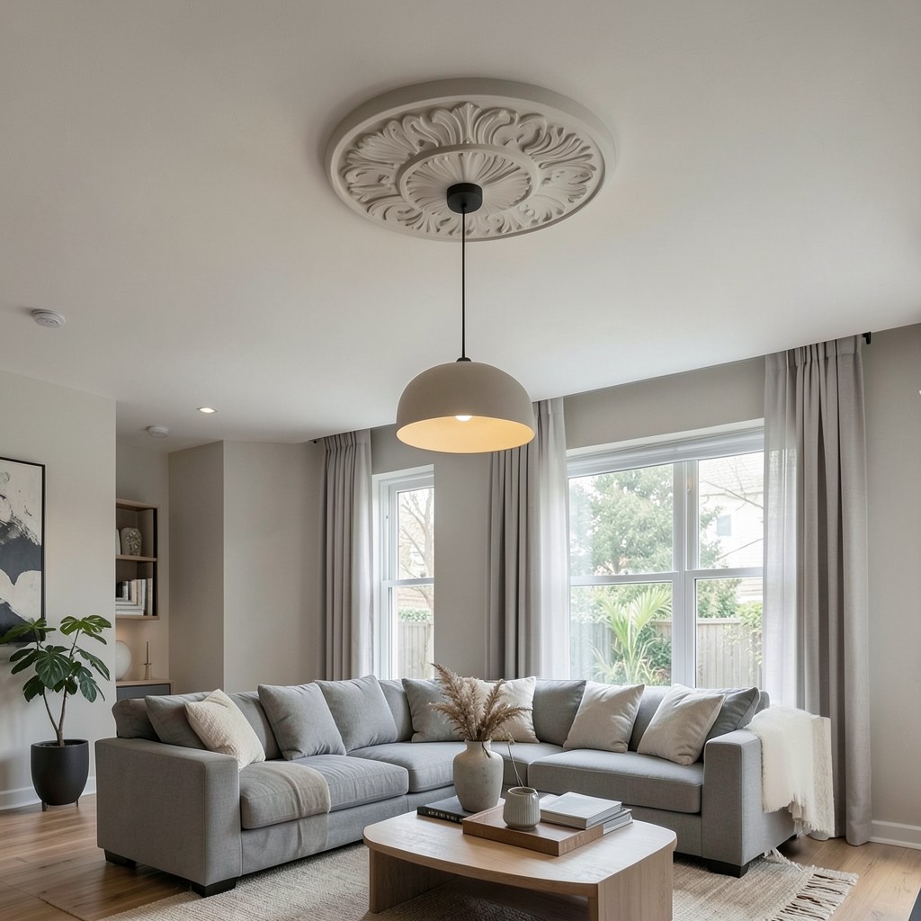
A decorative ceiling rose — the circular plaster ornament at the ceiling’s center from which the pendant fitting is suspended — in combination with a considered pendant light is the architectural detail that most efficiently connects a living room to its building’s design history while providing the practical benefit of a fixed, centered light mounting point with decorative architectural authority. The ceiling rose is not a period-room requirement. It is an architectural punctuation mark that works in contemporary interiors as well as it works in period ones, provided the rose’s profile is appropriate to the room’s design direction.
The ceiling rose profile ranges from the complex acanthus-leaf and egg-and-dart classical ornament of the Georgian and Victorian periods through the simpler geometric forms of the Arts and Crafts and Art Deco periods to the clean circular or oval forms of contemporary decorative plaster that suit modern and minimalist design directions. The contemporary ceiling rose — a smooth disc or a shallow ring in plaster, positioned at the ceiling center, painted in the ceiling tone — provides the architectural authority of a designed ceiling focal point without the period reference that the more elaborate classical profiles carry. This contemporary version suits the living room whose design direction does not reference a specific historical period but whose ceiling would benefit from a designed center element.
The relationship between the ceiling rose and the pendant’s canopy must resolve the visual connection between the rose and the fixture. A pendant whose canopy diameter is smaller than the rose’s outer diameter leaves a gap between the canopy edge and the rose edge that reads as the wrong size at the wrong position. A canopy that matches or slightly exceeds the rose’s inner ring diameter reads as the correctly sized fitting for the rose it occupies — sized to the rose rather than selected generically — and this precision in the relationship between the two elements is the detail that distinguishes a designed installation from an installation that happens to have a rose and a pendant in the same vicinity.
48. A Living Room With a Dedicated Meditation or Yoga Corner
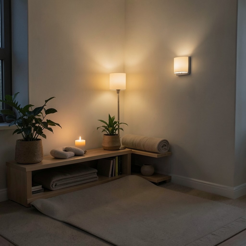
A dedicated meditation or yoga corner within a living room — a defined zone with a floor cushion, a low shelf with objects that support quiet practice, plants, a candle, and the specific quality of organized calm that a space given entirely to inward activity possesses — is the living room feature that most honestly acknowledges that the contemporary household’s relationship with the living room includes the need for mental decompression as a specific designed priority rather than an incidental benefit of general relaxation.
The yoga corner requires a floor area of two meters by two meters at minimum — the standard yoga mat dimensions with sufficient clearance on all sides for extended-arm positions without contacting adjacent furniture. A corner position — where two walls meet at ninety degrees and the zone is bounded on two sides by the architecture rather than by furniture — provides the sense of defined containment that a corner zone creates without a partition wall. A low shelf or a small cabinet in the corner holds the props: the folded mat, the bolster, the eye pillow, and the single ceramic or wooden object that marks this corner as a place of intention rather than an underused area of available floor.
The lighting in a meditation corner must be independently controlled from the main living room circuit — a floor lamp or a wall-mounted uplight specifically for the corner, on its own switch or on the smart home system as a dedicated scene — so that the corner can be lit at the low, warm level appropriate for meditation practice while the rest of the room remains at its standard living room illumination. A corner that requires the entire room to be dimmed before its own atmosphere is correct will not be used as consistently as one whose lighting condition is available independently and immediately.
49. A Living Room With a Scandi Hygge Approach
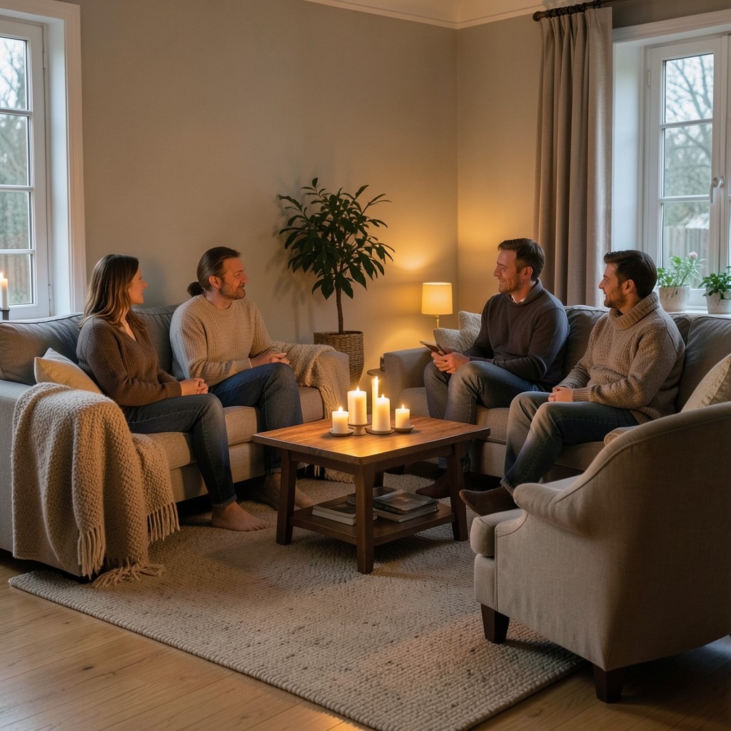
The hygge living room — the Danish and Norwegian concept of cozy, candlelit, socially warm domestic atmosphere applied to the living room as a designed intention rather than an accidental quality — is the most difficult design outcome to specify in material terms because hygge is fundamentally an atmospheric and social condition rather than a furniture collection or a color scheme. A living room with excellent sofas, the right candles, and the perfect wall color is not a hygge living room if it is cold, if the light quality is wrong, or if the social configuration of the seating does not invite the proximity and the facing-each-other arrangement that hygge social gatherings require.
The material foundations of a hygge living room are warmth and softness in every physical surface that the occupant contacts. A wool or chunky-knit throw draped over the sofa arm — not folded, not stored in a basket, but genuinely available for the person who wants it without requiring them to move from their position. A candle or a cluster of candles at table height within the primary seating zone — not at mantelpiece height where their light is above the seated occupant’s eye level, but at coffee table height where the flame is in the peripheral vision of every person in the seating arrangement. A textured, dense rug underfoot that changes the feeling of the room at floor level, which is the level where bare feet and lounging postures engage with the space most directly.
The seating arrangement in a hygge living room draws the seating together rather than distributing it across the room’s available floor area. Two sofas facing each other across a coffee table — seated faces within conversational range rather than across a room — produce the social proximity that hygge gatherings depend on. The armchair positioned at a slight angle to the sofa, close enough to include its occupant in the main conversation, adds a third point to the social geometry without creating the isolated satellite position that an armchair across the room produces. The hygge living room pulls its occupants toward its center rather than distributing them around its perimeter.
50. A Living Room That Works for How You Actually Live
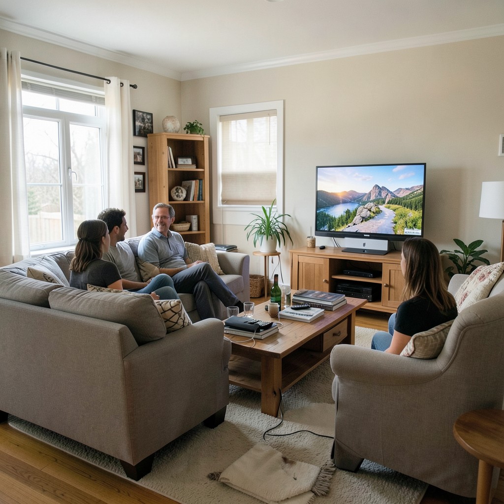
The living room that serves the household most completely is not the one that looks best in a photograph — it is the one that has been designed around the actual, specific, honest account of how the people in the house use the room on a Tuesday afternoon in November when nothing special is happening and the room must simply be a good place to exist. That is the living room design brief that most design guides avoid because it is personal, variable, and resistant to the universal recommendations that make content easier to produce.
Start with a week of honest observation before you make a single purchase. Where do people actually sit? Where does the natural light fall at the time the room is most used? Where does the television need to be for the viewing position that the household actually occupies, not the viewing position the furniture arrangement suggests they should? Where does the clutter land — the books, the remotes, the glasses, the charging cables — and what does that tell you about where the storage needs to be, as opposed to where it currently is? The answers to these questions are the living room brief that no designer can write for you and that determines whether the room you create is genuinely yours or a version of someone else’s ideal.
The best living room design idea is the one that solves the specific problem your living room actually has. Start there, commit fully, and build outward from the one honest improvement toward the room the fifty ideas in this collection made possible for you to imagine. The room that works is always the one that was designed for the life being lived in it — not for the life being photographed.
Leave a Reply