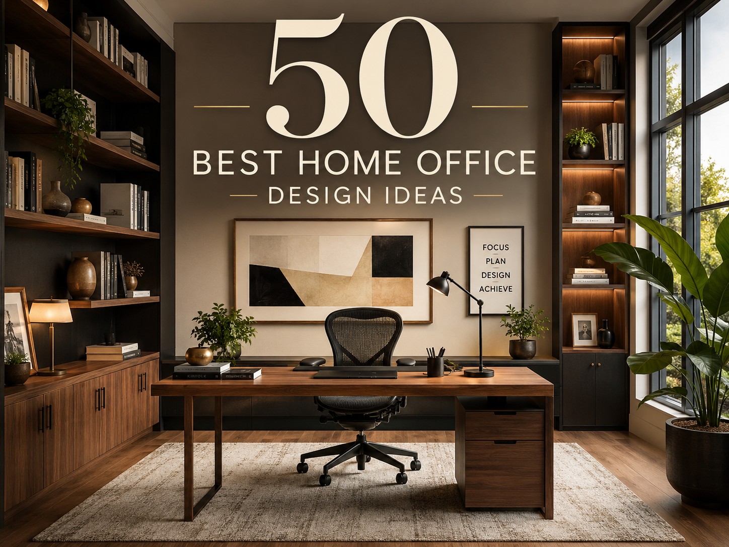
The home office is the room that most people design last and need first. When remote work became the daily reality for millions of households, the spare bedroom with a folding table and a kitchen chair suddenly became the location where careers were built, client meetings were conducted, and the full weight of professional performance rested on a space that was never designed to carry it. Most people responded by making do. They pulled a chair from the dining room for best Home Office Design Ideas, set a laptop on whatever surface was available, and told themselves they would sort it out properly when things settled down. Things have settled down, and the home office still looks exactly the same as it did when it was a temporary arrangement.
The home office deserves better than that — not because having a beautiful workspace is a luxury, but because the quality of the environment where you work directly and measurably affects the quality of the work you produce. This is not motivational poster territory. It is basic environmental psychology: the room’s light quality determines your alertness through the afternoon. The chair’s support quality determines whether you can concentrate through a long session or spend the last two hours of the day managing back pain. The desk’s depth determines whether you feel organized or perpetually cluttered. These are not aesthetic choices — they are functional ones dressed in aesthetic clothing, and treating them as merely decorative is the mistake that produces a home office that looks fine in a photograph and fails in daily use.
What makes home office design genuinely challenging is the overlap problem. The home office must be a professional environment — one where focus is possible, where video calls present a credible background, and where the full concentration that demanding work requires is achievable. It must also be a domestic space — one that does not turn the home into a corporate satellite office, that does not dominate the household’s living space with the aesthetics of a commercial workplace, and that can be switched off at the end of the working day rather than remaining a permanent, visible reminder that the work never stops. Managing those two identities within the same room, often within a modest square footage, is the design problem that the fifty ideas in this collection address from fifty different angles.
Some of these ideas are structural — built-in solutions, room arrangements, and spatial configurations that establish the office’s physical framework. Others are atmospheric — the lighting, the planting, the color choices, and the material selections that determine how the room feels to work in rather than just how it looks. Others still are specifically functional — the ergonomic solutions, the storage approaches, and the technology integrations that address the practical performance requirements of a space used for eight or more hours each working day. All of them are grounded in the understanding that a home office is not just a room with a desk in it. It is a designed environment that either supports your best work or quietly works against it, and the difference between those two outcomes is entirely in the decisions you choose to make about it.
1. A Home Office With a Dedicated Room
The single most important home office decision you will ever make is the one that happens before any furniture is chosen or any color is selected: whether the office occupies a dedicated room with a door that closes, or whether it shares a space with another domestic function. Every other design decision works from this foundation, and the foundation of a dedicated room is stronger than any alternative arrangement by a margin that no amount of design intelligence can close. A closed door changes the acoustics, the focus, the visual separation from household life, and the psychological ability to begin and end the working day with a physical act rather than a mental one.
The room selection for a home office in a house with multiple available rooms requires matching the room’s natural qualities — its light, its noise exposure, its size, and its separation from the most active household circulation routes — against the demands of the work performed in it. A room facing north receives consistent, soft, glare-free light that suits drawing, design, and screen-based work without the contrast changes that direct sunlight produces across the working day. A room at the rear of the house, away from the street, provides the quietest acoustic environment in most residential layouts. A room with sufficient floor area for the desk, storage, and a separate seating area — even a compact armchair for reading work away from the screen — functions as a complete working environment rather than a room with a desk in it.
The door is the detail that most people undervalue when establishing a home office in a dedicated room. A solid-core door — heavier and acoustically more effective than the hollow-core internal doors typical of residential construction — reduces sound transmission between the office and the rest of the household more effectively than any soft furnishing or acoustic treatment applied to the walls. The household member on a video call with a client and the child on the other side of the door both benefit from the sound isolation that a solid door provides, and the investment in a door upgrade is one of the highest-return interventions available in an existing home office setup.
2. A Home Office With a Window Desk Position
Placing the desk directly in front of a window is the home office configuration that most people aspire to and most ergonomic guides caution against, and both positions are correct from their own perspective. The window desk provides natural light, a view that gives the eyes a focal distance change from the screen at regular intervals, and the psychological connection to the outdoor environment that makes a day of interior working tolerable. The ergonomic caution addresses the screen glare that a bright window behind the monitor produces and the eye strain that results from working against a high-contrast background. Both things are true. The solution is not to abandon the window position but to manage it correctly.
A monitor positioned with the window to its side rather than directly behind it receives the natural light without the glare problem that a window-behind-the-screen arrangement creates. The desk positioned perpendicular to the window wall — not facing it and not with the window directly behind — places the light source at ninety degrees to the screen, which provides the benefit of natural light without the direct glare. This positioning also provides the desk occupant with a window view from a slightly turned head position rather than a straight-ahead view that competes with the monitor for visual attention throughout the working day.
The window size and orientation determine the quality of natural light the desk receives and the degree to which direct sunlight becomes a management problem. A north-facing window provides consistent, cool, diffuse light that suits screen work through the full day without seasonal variation in direct sun. A south or west-facing window delivers direct sun across the desk surface at some point in the day, which requires a quality window blind — a cellular shade or a woven wood blind that can be partially deployed to diffuse the direct sun without blocking the view entirely. The difference between good diffuse light and direct sun on a working surface is the difference between a desk position you choose every morning and one you move away from by midday.
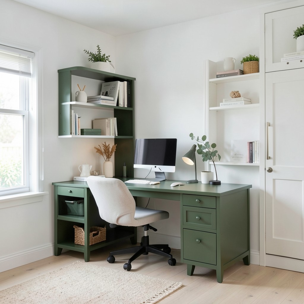
3. A Home Office With Built-In Shelving
Built-in shelving along the full wall of a home office — floor to ceiling, wall to wall, fitted around the door and the window as precisely as a purpose-made piece of furniture — produces a storage and display surface whose capacity and visual impact no freestanding shelf unit approaches at equivalent cost. The built-in shelf is not merely a storage solution. At full wall scale, it is the primary design statement of the room, and the decision about what goes on it — books, reference materials, objects, plants, art — is as much a design decision as any surface treatment applied to the walls themselves.
The shelf depth specification determines whether the built-in serves the home office’s actual storage needs or provides the appearance of storage without the capacity to hold the items the office generates. A standard shelf depth of thirty centimeters holds A4 ring binders and standard book sizes comfortably. A deeper shelf of forty-five centimeters holds larger art books, lever arch files, and the wider format reference materials that certain types of professional work require. The depth should vary by shelf zone — deeper shelves at the lower levels where heavier and larger items are stored, standard depth at eye level and above where the shelf’s visual contribution is as important as its storage function.
The styling of the built-in shelf within a home office context requires more considered approach than a domestic living room bookshelf, because the professional environment demands a level of order that a purely personal collection resists. Grouping books by size, color, or subject category rather than leaving them in the acquisition order they arrived produces a shelf surface that reads as organized from across the room. Mixing books with objects — a plant, a piece of art, a small lamp at a shelf end — produces the visual variation that prevents a wall of books from reading as heavy and library-serious. The balance between organization and personality on a home office shelf is the design decision that most directly communicates the professional character of the person who works behind the desk.
4. A Home Office With Ergonomic Furniture
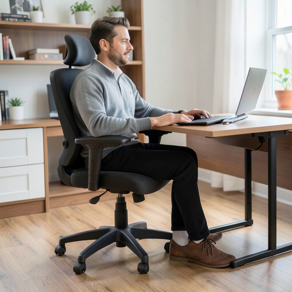
The ergonomic argument for a quality office chair is not about luxury — it is about the physical cost of sitting in a poorly designed chair for eight hours a day, multiplied across every working day. The chair that provides inadequate lumbar support, that places the hips at the wrong height relative to the desk, that does not allow the feet to rest flat on the floor, or that fails to position the arms at the height that keeps the shoulders relaxed — this chair is producing a physical load on the body that accumulates over weeks into chronic discomfort and over months into conditions that require medical attention. That is the real cost of the inexpensive chair, and it is significantly higher than the cost of the better one.
The seat height adjustment range is the first practical variable to assess in any office chair for home use, because the correct seat height — the height at which the hips are at or slightly above the knee level with feet flat on the floor — varies by individual height and by the specific desk height of the home office. A chair with an insufficient height adjustment range for the user’s height is a chair that cannot be set correctly regardless of its other ergonomic features. The adjustment range must cover the user’s specific requirements before any other ergonomic feature is evaluated.
The desk height is the second component of the ergonomic pair, and a chair-height-adjustable-only approach addresses only half of the ergonomic equation. The correct desk height — elbow height when seated, which positions the forearms horizontal and the wrists neutral during typing — falls between sixty-eight and seventy-six centimeters for most adults, with taller users requiring heights at the upper end of this range. A fixed-height desk at the standard production height of seventy-three centimeters suits the middle of the adult height range adequately, but a height-adjustable desk — one that sets precisely at the user’s elbow height in seated position — eliminates the compromise that all fixed-height desks impose on users outside the range it was designed for.
5. A Home Office With a Standing Desk
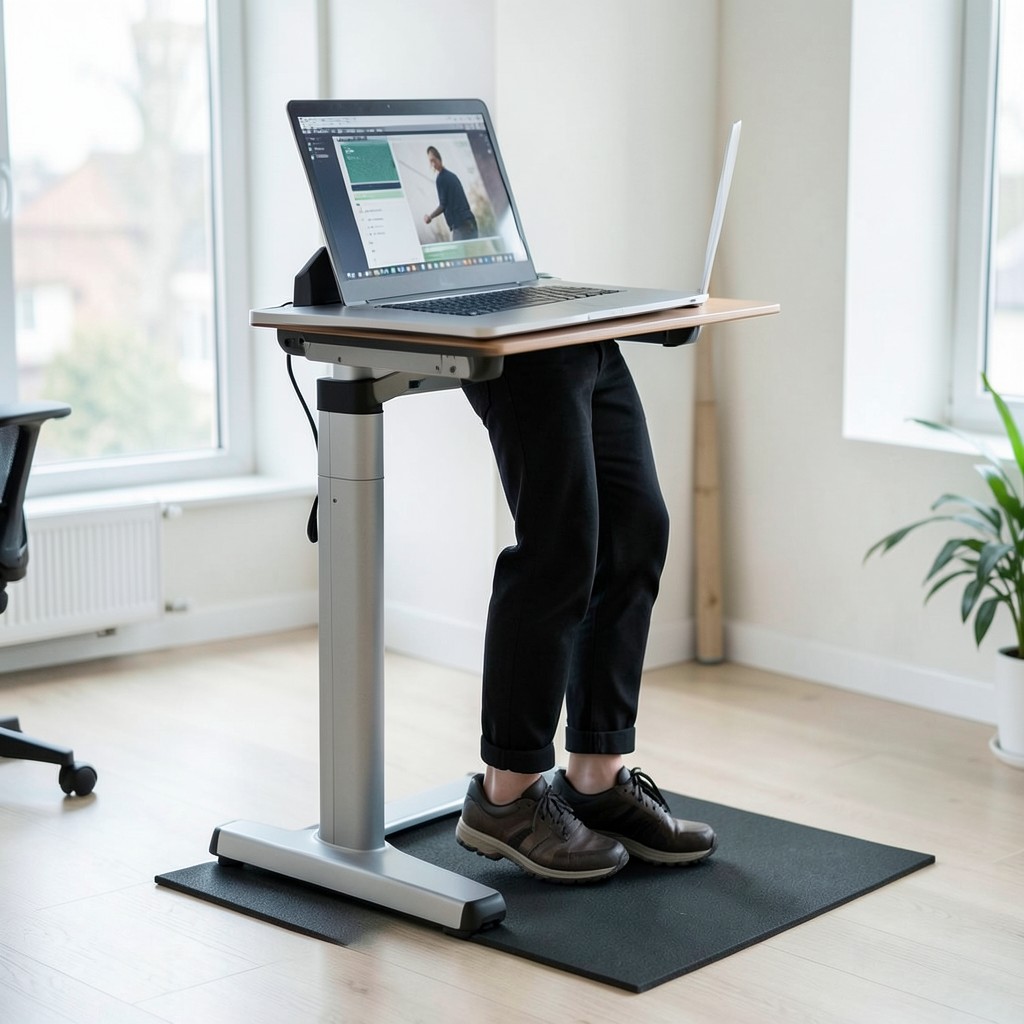
The standing desk arrived in popular consciousness as the antidote to the sedentary working day, and it was adopted with the enthusiasm that any promising health intervention receives before the evidence becomes complicated. The truth about standing desks, established through extensive occupational health research, is more specific than either the enthusiasts or the skeptics acknowledge: prolonged standing is not better than prolonged sitting, and the standing desk’s genuine benefit comes not from standing per se but from the postural variety and movement that the ability to alternate between sitting and standing enables. A standing desk that is used only in its standing position is trading one static posture for another.
The sit-stand desk — an electrically height-adjustable unit that transitions between seated and standing height at the press of a button — is the practical implementation that delivers the postural variety that health research identifies as beneficial. The transition between positions should happen at roughly ninety-minute intervals — the point at which both seated and standing postures have accumulated sufficient static load to benefit from a change. A desk that takes fifteen seconds to transition from sitting to standing height makes this interval-based alternation a practical working habit. A desk that requires manual cranking for two minutes makes it an infrequent novelty.
The anti-fatigue mat is the standing desk accessory that most meaningfully affects the quality of the standing period. Standing on a hard floor surface in office shoes or bare feet produces foot and lower back fatigue within thirty minutes that makes the standing period uncomfortable. An anti-fatigue mat — a rubberized foam surface with sufficient resilience to provide gentle postural micro-movement — significantly extends the comfortable standing period and is the one purchase that standing desk adopters almost universally wish they had made at the same time as the desk itself.
6. A Home Office With Warm Ambient Lighting
The lighting in a home office is doing three distinct jobs simultaneously, and most home office lighting setups address only one of them. The task lighting at the desk provides the illumination for close work. The ambient lighting provides the overall room brightness that prevents the desktop from reading as a high-contrast island of brightness against a dark room, which produces eye fatigue faster than either a consistently bright or consistently dim room. The accent lighting provides the atmospheric depth that makes the room feel designed rather than merely illuminated. Most home offices have only task lighting, which addresses the immediate functional need while creating exactly the eye fatigue conditions that task lighting alone produces.
A layered lighting plan for a home office starts with the ambient layer — a ceiling fixture or multiple ceiling fixtures that provide a baseline room brightness without the harsh, flat illumination of a single overhead fluorescent or LED panel. Recessed ceiling lights in a warm white color temperature — 2700K to 3000K — provide the room’s ambient base without producing the clinical quality of cooler temperature fixtures. The warm temperature at this level is important: a room lit in a warm ambient tone reads as domestic and comfortable rather than commercial and pressured, which affects the working atmosphere in ways that are felt rather than seen.
The desk lamp — the task lighting layer — should be specified at a color temperature slightly cooler than the ambient: 4000K provides the clear, focused light that close work benefits from without the daylight-clinical quality of 5000K or 6500K daylight temperature bulbs. The transition between warm ambient light and slightly cooler task light is imperceptible to the eye but produces a working environment where the desk surface has the clarity of a cool light source while the room behind it has the warmth that makes long working hours tolerable. This temperature mixing is what most well-designed commercial offices use, and it works for the same reasons in a home context.
7. A Home Office With a Gallery Wall
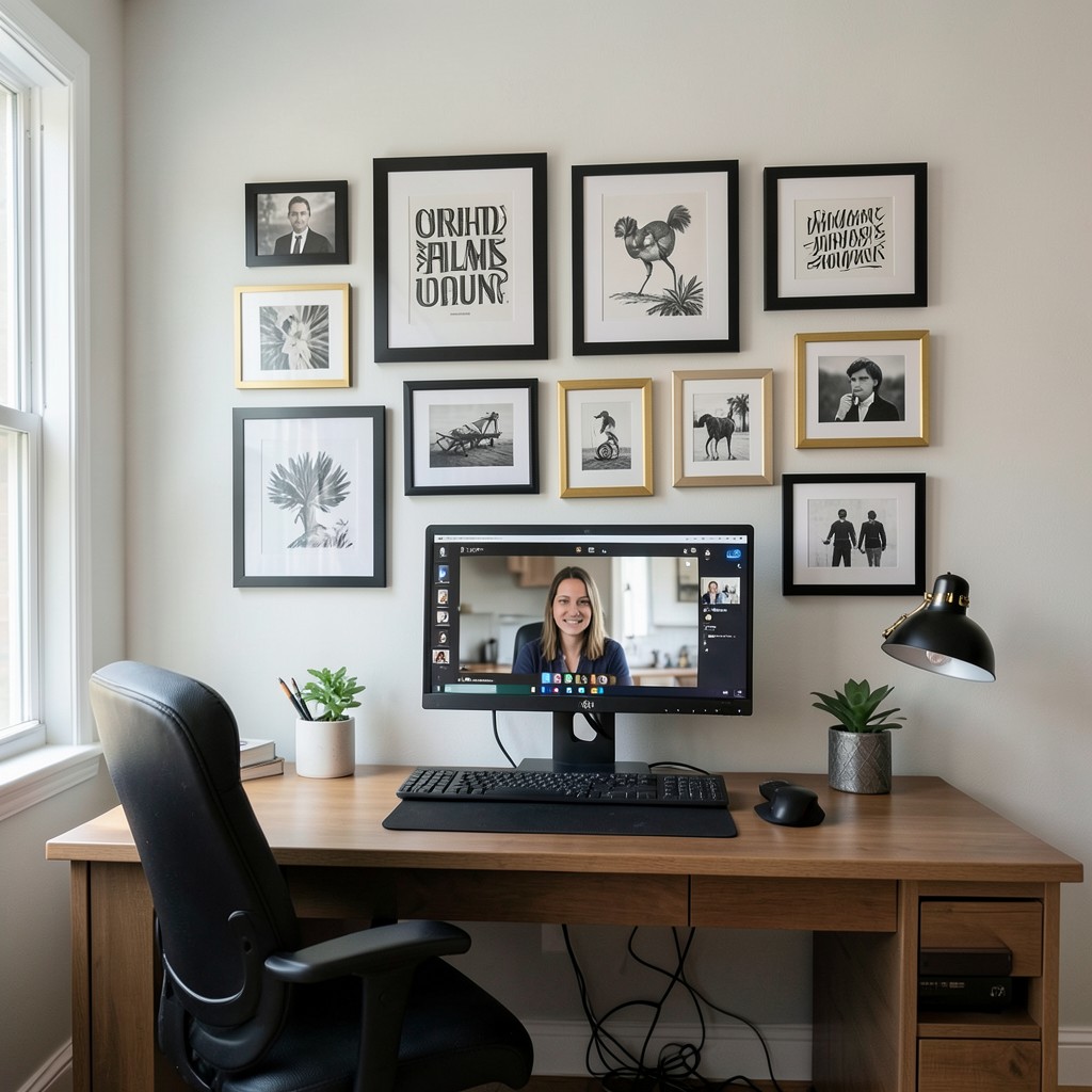
A gallery wall in a home office — a curated collection of art, prints, photographs, and objects arranged on the wall behind the desk or the wall visible during video calls — does two distinct things simultaneously. It transforms the visual quality of the room from an office with art to an office with a considered environment, and it communicates something about the person who works in it to every client and colleague who appears on a video call and sees the wall behind the screen. The gallery wall is the most visible self-expression available in a home office context, and the content of the collection tells the viewer more than any background they could have chosen.
The arrangement of a gallery wall requires resolving the tension between compositional coherence and individual variety — a gallery wall where every piece is the same size and the same frame finish reads as a product display rather than a collection. A gallery wall where every piece is a different size, shape, and finish in an unplanned arrangement reads as accumulated rather than curated. The most effective gallery wall compositions use a limited frame finish — all black, all natural timber, all antique gold — across pieces of varying sizes, which provides the visual coherence that makes the collection read as a composed arrangement while the variation in piece dimensions creates the visual rhythm that holds the eye.
The specific content of the gallery wall for a home office context should include at minimum one piece that communicates something substantive about the work or the person performing it. A writer’s gallery wall with one piece of typographic art in their area of expertise communicates identity and seriousness simultaneously. A designer’s wall with a selection of work samples presented as art communicates capability directly. The gallery wall that consists exclusively of generic print store purchases communicates aesthetic taste without any personal identity, which is a missed opportunity in a space where professional identity is constantly being communicated to clients through the video call background.
8. A Home Office With a Minimalist Aesthetic
A minimalist home office — one desk, one chair, one monitor, one lamp, sufficient storage concealed rather than displayed, and empty wall space treated as the design element it is rather than the available surface it appears to be — produces a working environment where the visual load is reduced to the point where the only thing competing for attention is the work itself. This is not an accident. It is the specific functional argument for minimalism in a working environment that aesthetic arguments for it only partly capture.
The concealed storage approach is the practical foundation of a minimalist home office aesthetic, because a home office generates paper, cables, equipment, reference materials, stationery, and the full range of administrative physical material that accumulates in any working environment regardless of how organized the person producing it intends to be. A minimalist office with no concealed storage is a minimalist office in transition — it looks correct for the first week and then responds to the reality of daily use by becoming cluttered in direct proportion to its storage deficit. Closed cabinetry, drawer units, cable management systems, and document storage integrated into the desk structure allow the working surfaces to remain clear while the working material remains accessible.
The desk surface of a minimalist home office must be clear except for the immediate tools of the current task — monitor, keyboard, mouse, and one notebook if the work requires it. This means that the desk surface specification must be larger than the immediate footprint of those tools, because a desk that is exactly large enough for the equipment leaves no margin for the working surface that actual thinking and working requires. A desk of one hundred and sixty centimeters wide by eighty centimeters deep provides sufficient surface area for a two-monitor setup with clear working space to the side, which is the minimum specification for a minimalist home office desk that functions as a working surface rather than a display plinth.
9. A Home Office With a Plant Wall
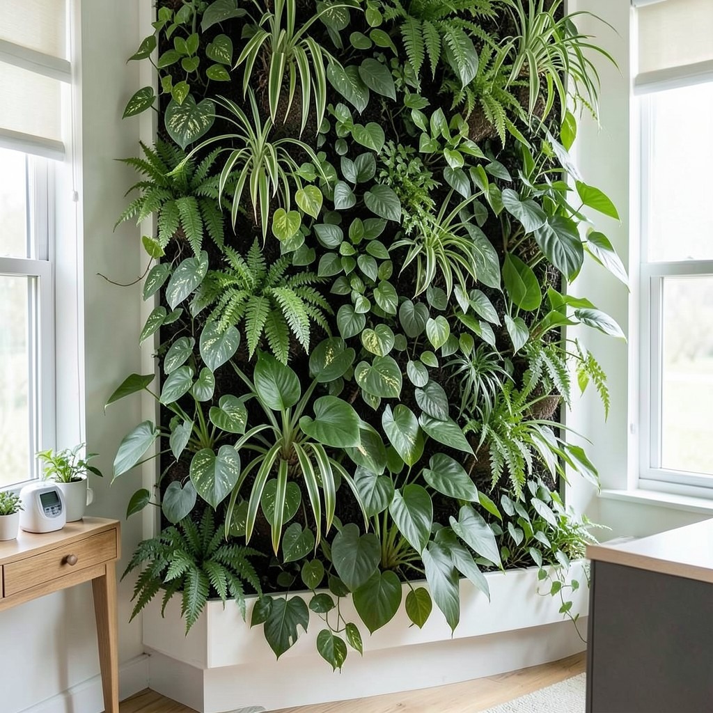
A plant wall in a home office — a vertical surface partially or fully covered with living plant material, either in a modular pocket panel system or in built-in planting troughs with a drip irrigation system — produces an air quality, acoustic, and aesthetic quality in the working environment that no other single element achieves at comparable cost. The acoustic benefit of a densely planted wall surface — the absorption of high-frequency sound that causes the reflected brightness in hard-surfaced rooms that makes long-duration speech perception tiring — is the benefit that most home office plant wall installations produce without the owner realizing it. The room simply sounds better. Conversations feel less effortful. The quality of focus improves without an obvious cause being identifiable.
The plant selection for a home office vertical garden must prioritize species with demonstrated air quality performance alongside the low-light tolerance that most interior wall surfaces require. Pothos, spider plant, peace lily, and heartleaf philodendron all handle the low to medium light conditions of a wall position away from the window, require modest watering frequency, and have documented capacity to absorb the volatile organic compounds that off-gassing furniture, flooring, and adhesives introduce into interior spaces. None of these are exotic or expensive plants — they are widely available, easy to maintain, and perform their environmental function reliably without specialist care.
The irrigation system for a home office plant wall is the infrastructure decision that determines whether the installation remains in the condition that makes it beautiful or declines to the neglected condition that an under-maintained vertical garden reaches faster than any ground-level planting. A drip line system fed from a small header tank that the owner refills weekly delivers water to every pocket on a gravity-fed schedule that requires no electronic components. A more sophisticated automated drip system with a timer and a moisture sensor delivers water in precise quantities on a schedule that requires no manual intervention beyond periodic tank refilling.
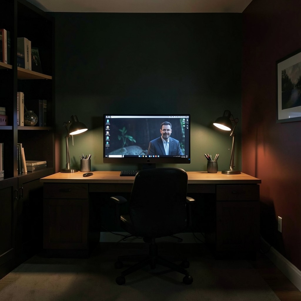
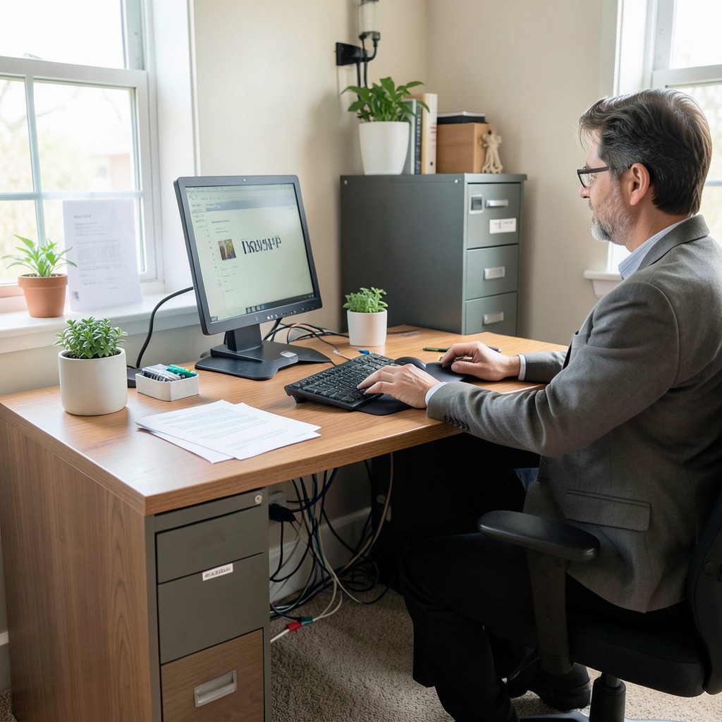
10. A Home Office With a Dedicated Video Call Setup
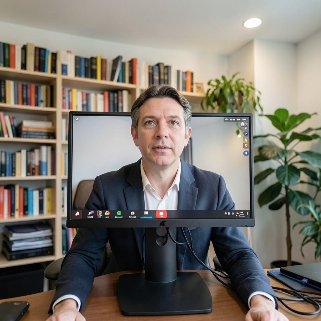
The video call background is the element of home office design that has attracted more retrofit attention than any other since remote work became standard practice, and most of the retrofit solutions — virtual backgrounds, ring lights pointing directly at the face, bookshelves arranged specifically to read well on camera — address the symptom without solving the underlying problem. The underlying problem is that the home office was not designed with any consideration for how it performs as a video call environment, and the difference between a home office designed for that purpose and one retrofitted for it is visible to every person on the other side of the call.
The ideal video call position places the camera at eye level with the face lit from the front — not from above, not from behind, not from a side angle that produces one half of the face in shadow. A monitor at the standard desktop height places the camera below eye level, which produces the unflattering upward-angle shot that makes the ceiling behind the speaker more prominent than their face. Raising the monitor to eye-camera height — on a monitor arm adjusted to the correct position, or on a raised monitor stand — places the camera correctly and changes the quality of the video call from acceptable to professional without any other modification.
The background visible behind the speaker on a video call should be considered as deliberately as the speaker’s face and the camera position. A wall of books reads as learned and engaged. A blank wall reads as careful but characterless. A plant wall reads as calm and considered. A cluttered background of cables, filing, and domestic miscellany reads as disorganized regardless of how organized the person in front of it actually is. The background is read as a proxy for the standard of the person’s working environment, and that proxy reading happens faster and more automatically than any conscious assessment of the person’s actual professional quality.
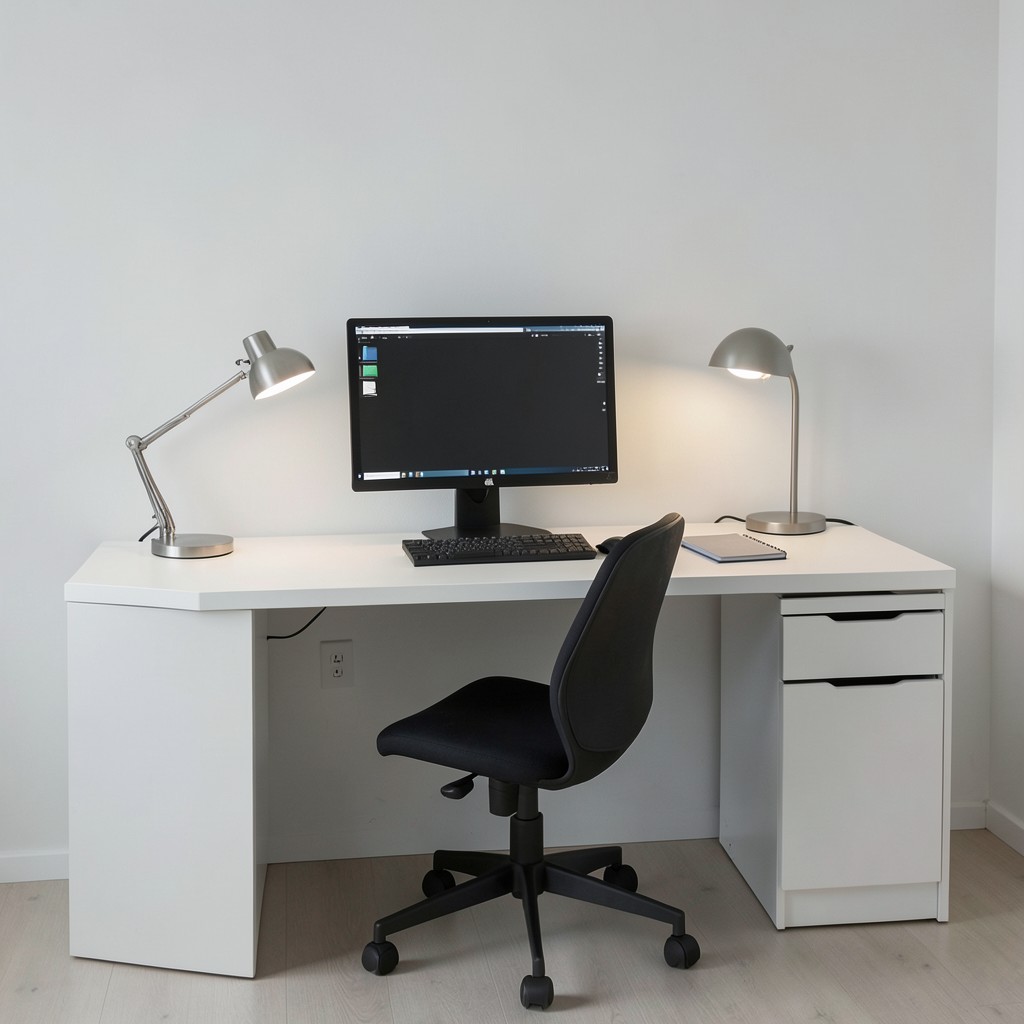
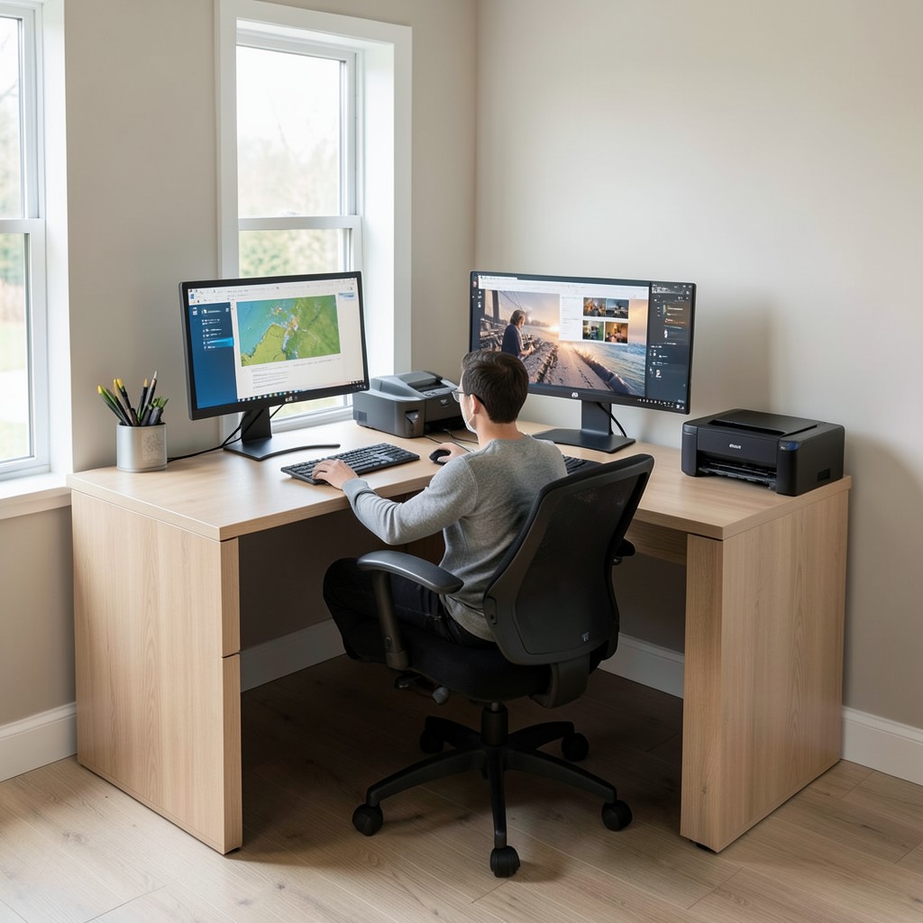
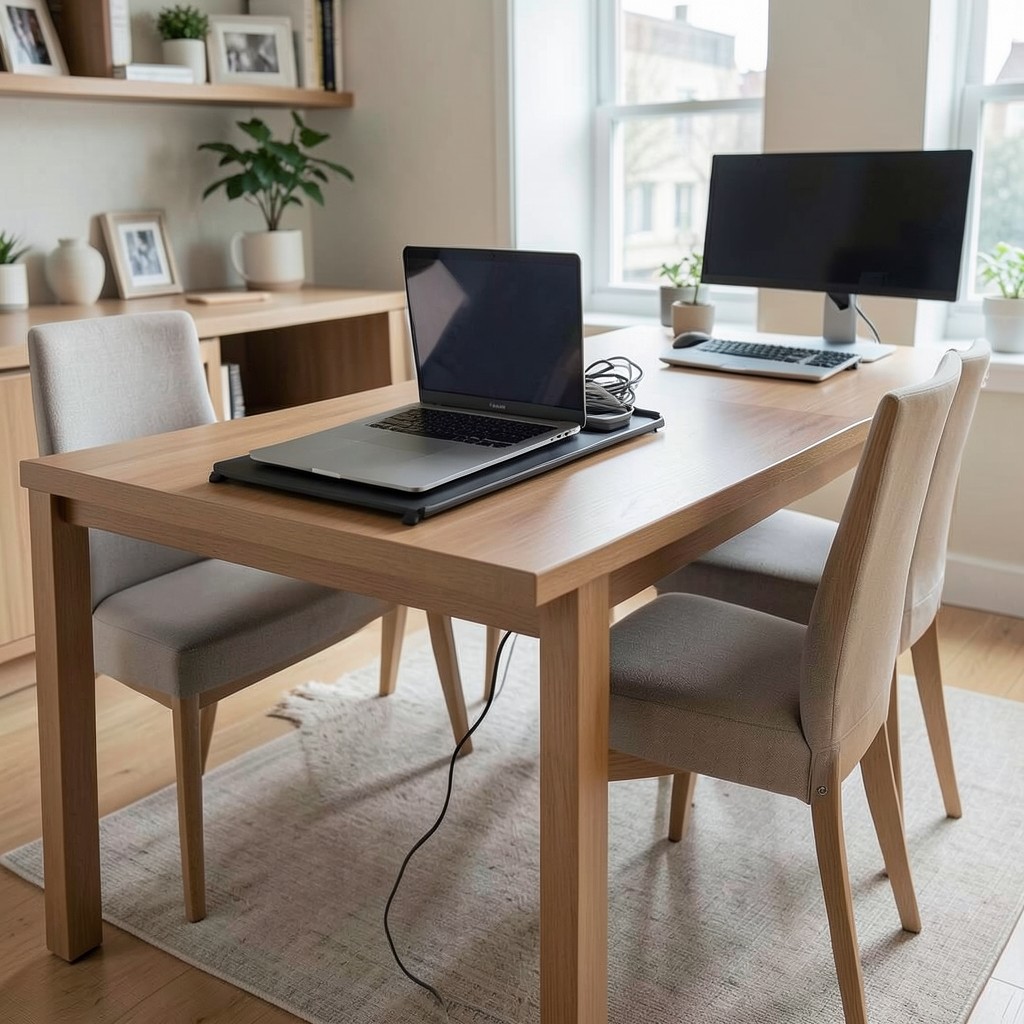
11. A Home Office With a Two-Monitor Setup
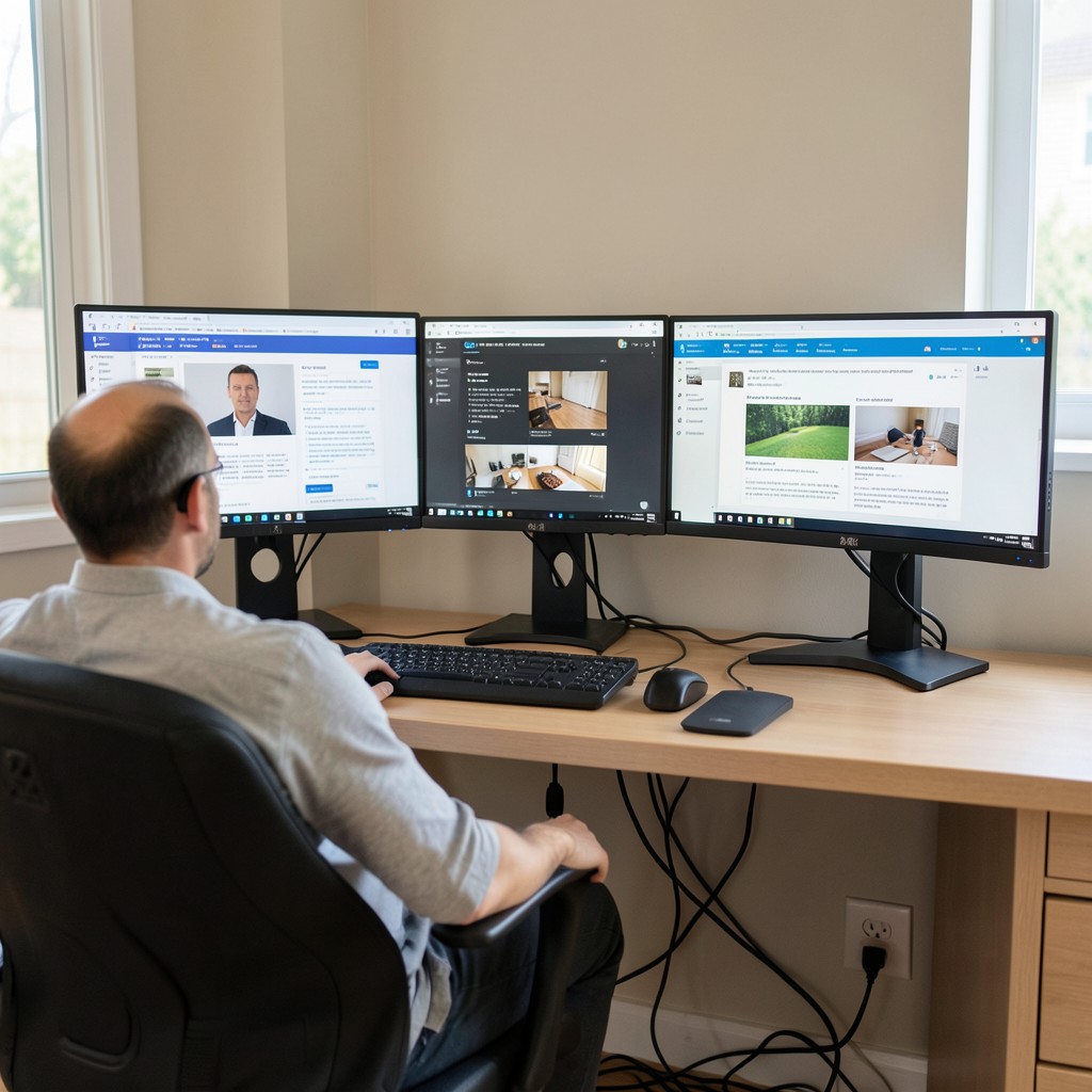
A two-monitor setup in a home office — a primary monitor for the active work and a secondary monitor for reference material, communications, or the secondary applications that would otherwise require constant window switching — is the productivity configuration that most dramatically changes the working experience for anyone whose work involves referencing one source while producing output in another. The difference between a single-monitor setup requiring constant application switching and a two-monitor setup with both sources simultaneously visible is not a marginal improvement. For the right type of work, it is a fundamental change in working pace.
The monitor size and position for a two-monitor home office setup requires more ergonomic consideration than a single monitor arrangement, because the horizontal span of two monitors positioned side by side produces eye and neck movement that, at the wrong scale or angle, produces the fatigue that a poorly arranged dual setup inflicts over a long working day. Two twenty-seven-inch monitors positioned at equal distances from the center of the seated position, angled slightly inward toward the user, produce the most comfortable dual-monitor arrangement for work that uses both screens with roughly equal frequency. A primary and secondary arrangement — where one monitor is used constantly and the other is referenced occasionally — suits a wider left or right angle for the secondary monitor because the neck rotation to view it is an occasional rather than a constant movement.
The single cable management requirement of a two-monitor home office setup — keeping two sets of power cables, two data cables, and the connections to a common USB hub or dock clean and out of the working surface — is the practical problem that most dual monitor users live with rather than solve. A cable spine mounted beneath the desk surface, running from the power outlet at the wall to the monitor positions at the back of the desk, collects and conceals all cable runs in a single managed pathway that eliminates the cable cluster on the floor beneath the desk and the surface tangle behind the monitors that unmanaged dual-monitor setups invariably produce.
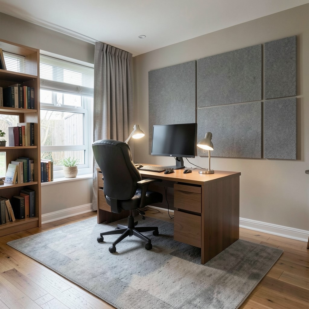
12. A Home Office With Acoustic Treatment
Sound in a home office works against focus in two directions simultaneously: the sound that enters the office from the rest of the household, and the sound that the home office produces and transmits to the rest of the house. Both directions matter, but for different reasons. The incoming sound — household conversation, television, children’s activity — competes directly with the concentration that knowledge work requires. The outgoing sound — particularly the speech of phone and video calls — intrudes on the household’s domestic peace and raises the boundary tension between work life and home life that shared-space working generates.
Hard-surfaced rooms — those with wooden floors, plastered walls, and a minimal soft furnishing presence — produce the reverberant acoustic environment that makes speech perception effortful and that characterizes the harshness of a room where sustained concentration is difficult. The solution is not a studio-quality acoustic installation — it is the addition of the soft, porous surfaces that residential rooms naturally contain in living and bedroom spaces but that stripped-back home offices often lack. A rug covering at least sixty percent of the floor area, a bookshelf with books packed loosely enough to create an uneven sound-absorbing surface, curtains or lined blinds on the window, and upholstered seating collectively reduce the room’s reverberation to the level that makes focused work comfortable.
Purpose-built acoustic panels — fabric-covered mineral wool or open-cell foam panels mounted on the wall behind the desk or on the wall opposite the main sound reflection path — provide additional absorption where the room’s natural soft furnishings are insufficient. The panels do not need to cover the full wall area to be effective — two or four panels of standard acoustic panel dimensions, positioned at the primary reflection points on the wall surfaces, produce a measurable reduction in reverberation time that the room’s occupant feels as a quieter, less fatiguing acoustic environment. The fabric covering the panels can be chosen to contribute to the office’s color palette, which means acoustic panels are simultaneously a functional intervention and a design element.
13. A Home Office With a Dedicated Inspiration Board
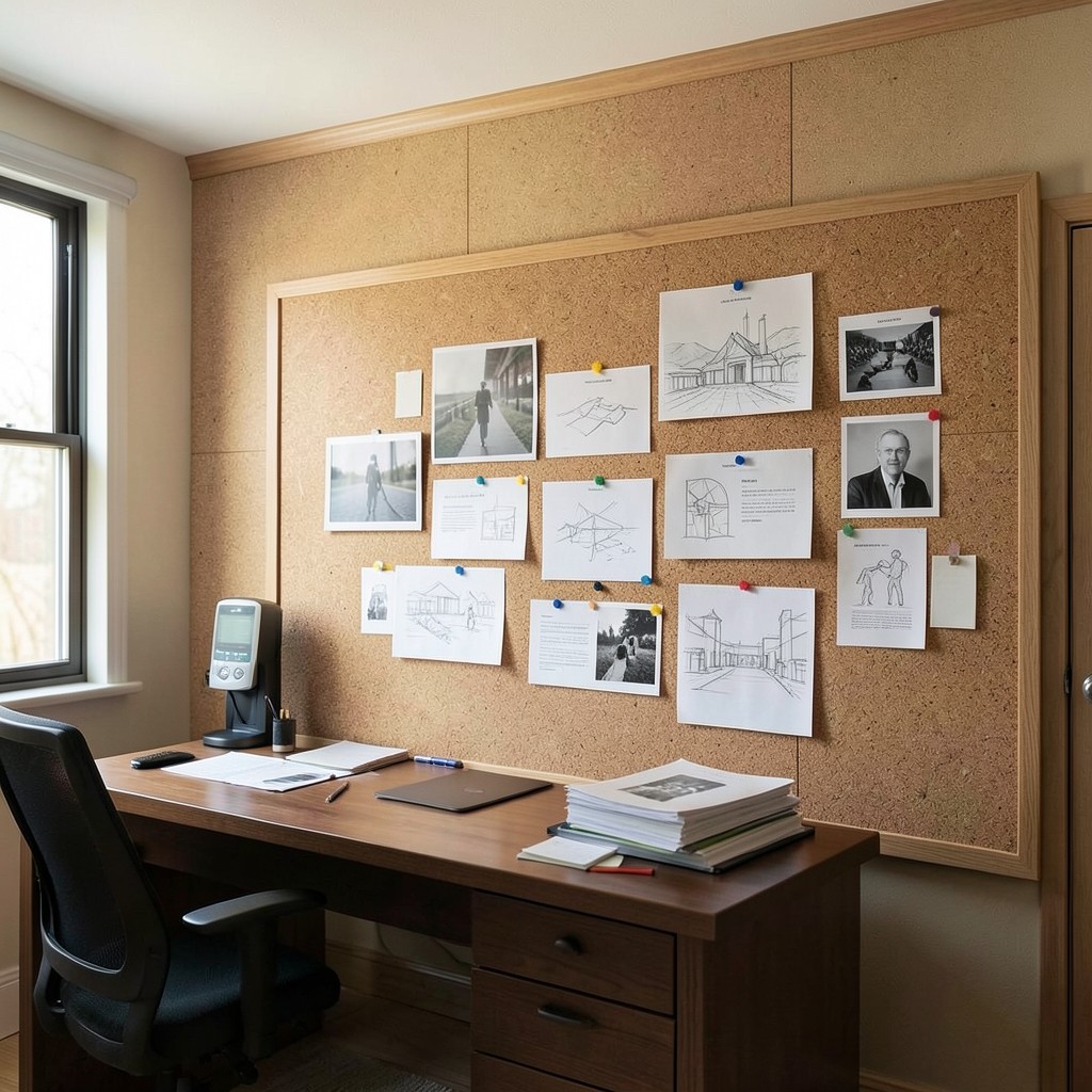
An inspiration board in a home office — a large pinboard, magnetic surface, or wall-mounted panel that holds the visual references, project materials, sketches, notes, and stimulus material that the work process generates — externalizes the working memory of the creative or analytical process in a way that no digital tool fully replaces. The physical act of pinning a reference image to a board, rearranging the materials as the project’s shape becomes clearer, and stepping back to read the board as a visual whole produces a quality of spatial and relational thinking that a screen-based reference management system does not generate.
The size of the inspiration board must be ambitious rather than modest. A small board fills within the first week of active use and then fails to hold the material the project generates, forcing the overflow onto the desk surface or into stacked folders that defeat the board’s organizational purpose. A board that occupies the full wall segment between the desk and the ceiling — using a high-quality cork tile surface finished with a timber frame, or a painted magnetic surface across the same area — provides the capacity for the full span of a project’s visual development without the constraints that a modest board imposes on the process.
The organization system within the inspiration board should be spatial rather than categorical. Pinning related materials near each other in zones on the board rather than in labeled sections produces the visual grouping that reveals relationships between ideas in a way that categorical systems — where materials are sorted by type rather than by relationship — do not. The spatial arrangement is the thinking. A well-composed inspiration board at the end of a project reveals the project’s intellectual development in its physical arrangement in a way that no digital file structure captures.
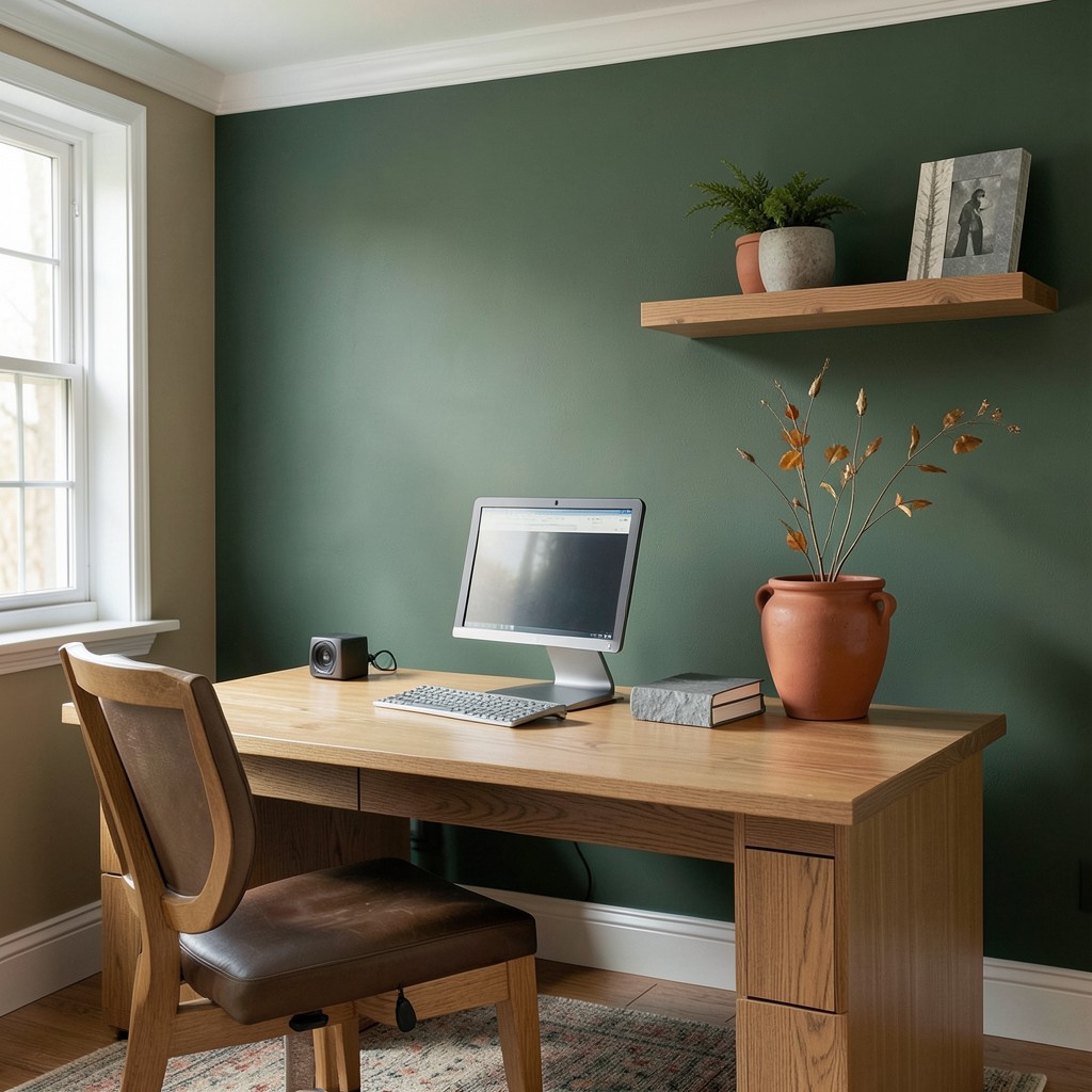
14. A Home Office With Dark, Moody Walls
A home office with dark wall colors — deep charcoal, forest green, navy, or a rich terracotta — is the design choice that most confidently separates the space from the pale neutrals that domestic interiors default to and produces a working environment with a quality of envelopment and focus that light walls do not provide. Dark walls reduce the visual range of the room to its contents — the desk, the monitor, the shelving, the lamp — and focus the eye on the working surface in a way that pale walls, which recede and expand the visual space, never quite achieve.
The counterintuitive quality of a dark home office is that it does not feel smaller than the same room in a pale color. The room’s perceived size changes when dark walls contain it, but the change is toward intimacy and focus rather than constriction — the sensation of the walls being present rather than absent is experienced as enclosure rather than confinement when the room is well lit at the working surface level. A dark room with a well-illuminated desk surface reads as a photography darkroom or a cinema — a space where the darkness is in service of the focus required by the activity within it rather than a product of insufficient light.
The furniture specification for a dark home office must provide sufficient contrast to prevent the room’s contents from disappearing against the dark background. A dark desk against dark walls reads as a single undifferentiated plane. A natural timber desk surface or a white lacquer desk against dark walls reads as a floating work surface against a deep ground — the contrast that makes the desk the visual focus of the room rather than one dark surface among others. The lamp at the desk provides the local light that illuminates the working surface and creates the island of brightness within the dark room that makes the working environment feel specifically designed for concentrated attention.
15. A Home Office With a Floating Desk
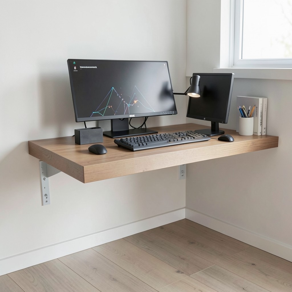
A floating desk — a wall-mounted working surface without legs, supported by wall brackets or a built-in shelf system that allows the floor beneath to remain entirely clear — produces the spatial quality of a clean, open home office floor plane that is the specific benefit that no freestanding desk provides regardless of its size or form. The clear floor beneath a floating desk reads as more space than a floor with desk legs occupying it, even at the same room dimensions, because the unobstructed floor surface reads as continuous and intentional rather than interrupted by structural necessity.
The bracket specification for a floating desk must handle the combination of the desk surface’s own weight, the equipment placed on it — typically a monitor, peripherals, and a desktop computer at twenty to forty kilograms combined — and the dynamic loads of working activity, including the repeated force of typing and the occasional force of rearranging equipment. Wall-mounted floating desks fixed into the wall studs with structural screws at the correct spacing handle these loads without deflection for any standard desk surface thickness of thirty millimeters or more. A floating desk fixed only into plasterboard without stud fixings behind it is a surface that will fail under equipment load within months.
The material of the floating desk surface should be chosen for both its visual contribution to the home office and its resistance to the surface abrasion and marking that daily desk use produces. A solid timber surface of thirty millimeters depth provides the mass that prevents the surface from feeling lightweight under the tactile impression of working, takes the depth of fixing required for monitor arm mounts, and develops a character with age that engineered board surfaces do not. An MDF surface in a lacquer or laminate finish provides a more uniform, easier-to-clean surface at lower cost and suits a home office with a contemporary design direction where the material authenticity of solid timber is not the primary aesthetic consideration.
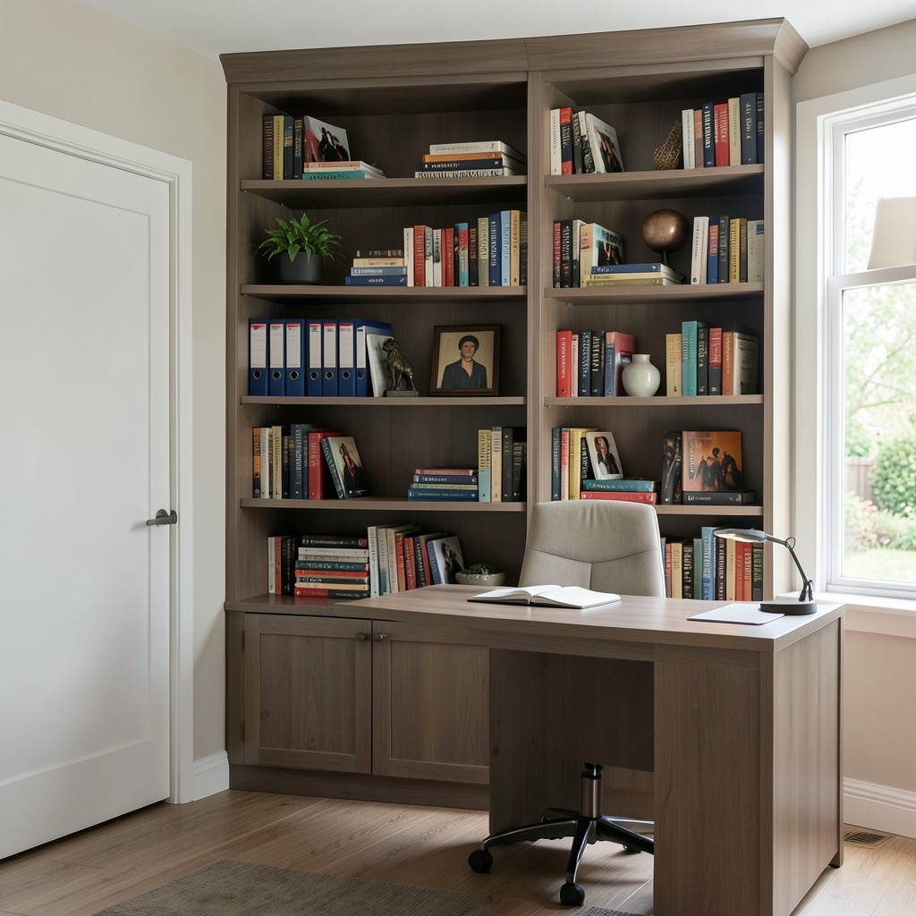
16. A Home Office With a Library Aesthetic
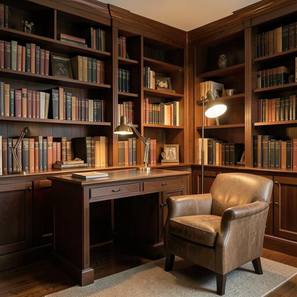
A home office designed as a private library — lined with bookshelves, with a reading chair beside a floor lamp, a library-style task lamp on the desk, and the specific quality of material gravity that a room full of books produces — is the home office that communicates the deepest possible commitment to the intellectual work performed within it. The library aesthetic is not a nostalgic affectation. It is the design direction that most directly serves knowledge work by creating an environment that is materially organized around the tools of that work — books, ideas, references, and the accumulated physical evidence of a mind that reads widely and thinks seriously.
The timber for a library-style built-in bookshelf should be chosen for warmth rather than lightness — the dark, warm tones of walnut, cherry, or oak stained in a mid-amber produce the specific depth that a library shelf requires, where lighter finishes and cooler tones read as contemporary office rather than library. The shelf face should be detailed with a small nosing at the front edge — a profile that gives the shelf front a finished, architectural quality — and the shelf spacing should be irregular across the height of the unit, with taller openings for oversized reference books and standard spacing for most volumes.
The reading chair in a library home office is the element that most clearly distinguishes the space from a conventional office — the chair beside the desk where the screen work happens and the chair away from the desk where reading and thinking happen are two distinct zones within the same room, and the presence of both communicates that the work performed here requires both modes of engagement. A well-chosen armchair in a leather or textured fabric, positioned beside a floor lamp with a warm globe bulb at reading height, provides the alternative working position that prevents the home office from becoming the room where the only available activity is sitting at the screen.
17. A Home Office With Biophilic Design Elements
Biophilic design — the integration of natural materials, natural light, plant life, and natural patterns into the built environment — is not a trend in home office design. It is a response to a body of research demonstrating that human cognitive performance and psychological well-being improve measurably in environments with natural element presence compared to purely artificial environments. The home office is the specific context where this research most directly applies, because it is the interior environment where the performance difference between a biophilically rich and a biophilically absent room has the most direct consequences for the quality and quantity of productive work.
Natural materials on the desk and working surfaces provide the sensory connection to the biological environment that purely synthetic surfaces — glass, plastic, synthetic fabric — do not. A timber desk surface under the hands during working provides a tactile quality that engages the same sensory pathways that contact with natural materials in outdoor environments activates. A stone paperweight, a leather notebook cover, a woolen desk mat — these are not decorative objects. They are sensory nodes in a biophilically designed workspace where the material palette was chosen as intentionally as the color palette.
The natural light quality of the home office determines the depth of biophilic experience the room provides, because daylight — its color temperature change across the day, its direction shift from morning to afternoon, its intensity variation with weather — communicates the outdoor environment’s condition to the room’s occupant in a way that artificial light, however sophisticated, does not. A home office with generous natural light provision reads as connected to the outdoor world even when the windows are closed. One that relies on artificial light through the full working day removes that connection entirely, which is why the room’s window provision — its size, its aspect, and its treatment — is the primary biophilic design decision in any home office.
18. A Home Office With a Murphy Bed Integration
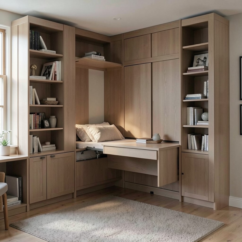
A home office with a Murphy bed — a wall-folding bed integrated into the same cabinetry system as the office desk and shelving, allowing the room to function as a working office through the day and a guest bedroom when visitors require it — is the space efficiency solution that addresses the most common residential space constraint: more rooms are needed than the home contains. The guest bedroom that sits empty for three hundred and sixty days a year occupies precisely the same area as the home office that is used for eight hours each working day, and the Murphy bed integration allows both functions to occupy the same room without either compromising the other.
The cabinetry design for a Murphy bed office integration must keep the bed and the desk in positions that do not require complete clearance of one function to deploy the other. A desk that folds against the cabinetry when the bed folds down, with the desk surface becoming the bedside table surface when the bed is deployed, allows the room to transition between functions without dismantling the office setup. The technology that allows this — precision-balanced counterweight mechanisms that lower the bed smoothly to a horizontal position from a vertical wall cabinet — has advanced significantly from the early Murphy bed systems and the modern mechanism operates with one hand and deploys in under a minute.
The visual quality of a Murphy bed office when the bed is in its folded, wall-mounted position is entirely determined by the cabinetry design that conceals it. A well-designed integrated unit reads as a complete wall of cabinetry — with the desk extending from its center section, shelving on both flanking sides, and the concealed bed occupying the central panel behind a cabinet door with no visible distinction from the surrounding storage panels. The room, when configured for working, gives no indication that it contains a bed except to the person who knows to look for the panel proportions that give the central section’s contents away.
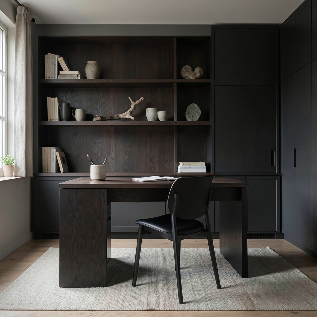
19. A Home Office With a Concrete and Industrial Aesthetic
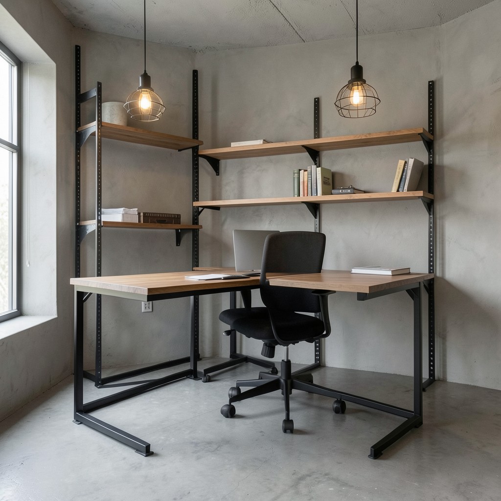
A home office designed in an industrial aesthetic — exposed concrete wall or floor surface, steel desk frame, metal shelving with visible bracket hardware, pendant lights with industrial cage shades, and a material palette that keeps the structural elements visible rather than concealing them — produces a working environment with the specific quality of material directness that suits creative and technical work performed by people who value substance over surface. The industrial office does not pretend its structure is something other than what it is. That honesty reads as confidence.
The concrete wall surface that most home offices achieve is not cast-in-place concrete — it is a concrete effect finish applied to the existing wall substrate. A microcement application — a two-millimeter cement-based coating applied in multiple layers over the existing plaster — produces the visual character of smooth concrete at the cost of a decoration rather than a structural material change. The microcement surface is sealed for moisture resistance and durability and is indistinguishable from real concrete at normal viewing distances, which makes it the accessible version of the industrial material language for home office applications where genuine cast concrete is not structurally possible.
The steel desk frame for an industrial home office — a powder-coated or raw mild steel structure supporting a timber desktop — is the furniture piece that combines the two material languages of the industrial aesthetic most efficiently. The steel is the structure; the timber is the surface. Both are honest about their material identity, and the combination of a warm natural material resting on a precise industrial one produces the aesthetic tension that makes the industrial style more interesting than either material used alone. The steel should be matte-finished rather than polished — polished steel reads as contemporary luxury, while matte or blackened steel reads as the genuine working material that the industrial aesthetic requires.
20. A Home Office With a Dedicated Storage System
The storage system in a home office determines whether the desk can be kept clear, whether working materials are findable when needed, and whether the room reads as organized or as a surface on which organized thinking appears to be temporarily possible before the next project cycle returns it to chaos. The storage problem in a home office is not a willpower problem — it is a system design problem. A person working in a room with insufficient storage cannot maintain a clear desk through consistent effort alone, because the material the work produces has nowhere to go that does not involve the desk surface.
The filing system for paper documents in a home office has been progressively supplanted by digital alternatives for most knowledge workers, but the paper that requires physical retention — contracts, legal documents, financial records, client materials that exist only in printed form — needs a physical storage solution that is both sufficient in capacity and organized enough to allow retrieval without a search. A lateral filing cabinet of two drawers provides capacity for the filing requirements of most home-based professionals, takes up less floor depth than a standard front-opening cabinet of equivalent capacity, and can be specified in a finish — painted steel, timber veneer, or powder-coated metal — that suits the home office’s aesthetic direction rather than communicating corporate facility.
The cable storage system is the component of home office organization that produces the most visible improvement in the desk area’s appearance relative to the effort it requires. Dedicated cable management trunking on the desk surface, combined with velcro cable ties grouping each cable run, a cable spine beneath the desk directing all runs to a single outlet point, and cable labels at each end identifying which cable connects to what — this system eliminates the cable tangle that characterizes most home office desks and produces a working surface where the equipment reads as intended rather than as a tangle of undirected connections.
21. A Home Office With a Warm Scandinavian Design
A Scandinavian-influenced home office — pale timber surfaces, white or light grey walls, linen-effect textile accents, clean functional furniture without ornamental detail, and plant life as the primary decorative element — produces a working environment with the specific quality of calm, organized clarity that Nordic design culture has refined over decades of addressing the challenge of making domestic interiors feel livable through the long, dark northern winter months. The Scandinavian aesthetic is not minimal in the sense of empty — it is minimal in the sense of chosen. Everything present was selected; nothing accumulated.
The pale timber desk — in ash, maple, or pine with a clear oil finish that reveals the grain without yellowing or darkening the wood’s natural tone — is the material foundation of a Scandinavian home office. The lightness of the timber provides the visual warmth that prevents the white walls and grey accents from reading as cold, and the grain of the wood provides the natural texture that the Scandinavian aesthetic requires as its organic counterpoint to the room’s clean, geometric furniture forms. A dark timber desk in the same room reads as heavier and more formal — suitable for other design directions but working against the specific lightness that makes the Scandinavian aesthetic function in a home office context.
The textile layer in a Scandinavian home office — a desk mat in a natural wool or felt, a cushion in the armchair in a textured fabric, a throw for the reading seat in a heavy linen — provides the tactile warmth that the material palette’s relative simplicity requires. Without the textile layer, the Scandinavian home office risks reading as sparse rather than calm — the distinction between these two readings is entirely in the presence or absence of soft, natural materials that give the room a lived-in quality without adding visual noise. Two or three considered textile pieces, chosen in the room’s neutral palette with one muted accent color, provide the warmth without the complexity.
22. A Home Office With a Corner Desk Setup
A corner desk — either an L-shaped unit that spans two walls of the office’s corner, or a purpose-built corner unit filling the ninety-degree angle between walls with a continuous work surface — provides the largest available working surface within the footprint of most residential office spaces and the specific advantage of wrapping the user in working material on two sides rather than one. The corner desk is the furniture configuration for the home office user who runs multiple activities simultaneously and needs the physical surface area to support them without the stacking and clearing that a single-direction desk requires.
The L-shaped desk configuration — two desk sections meeting at a corner — produces a primary working arm and a secondary arm that serves either as an extension of the primary work surface, as the position for a secondary monitor, or as the location for a printer, scanner, or other peripheral equipment that requires accessible positioning without occupying the primary work surface. The decision about which arm faces the window and which runs along the wall should be made with the monitor glare consideration in mind — the monitor on the primary arm should not face a window directly behind it.
The corner desk’s impact on the room’s spatial quality is the dimension most often underweighted in the furniture selection decision. An L-shaped desk that spans two walls fills the corner of the room and directs the user’s attention inward toward the desk’s internal angle, which produces the contained, focused quality that corner seating positions naturally generate. The same desk in the center of the room with space behind it produces a different spatial relationship to the work, with the open room behind the occupant rather than the desk wrapping around them. Both positions work for different psychological working styles — the corner position suits focus and containment, the central position suits movement and the sense of space.
23. A Home Office With a Cozy Reading Nook
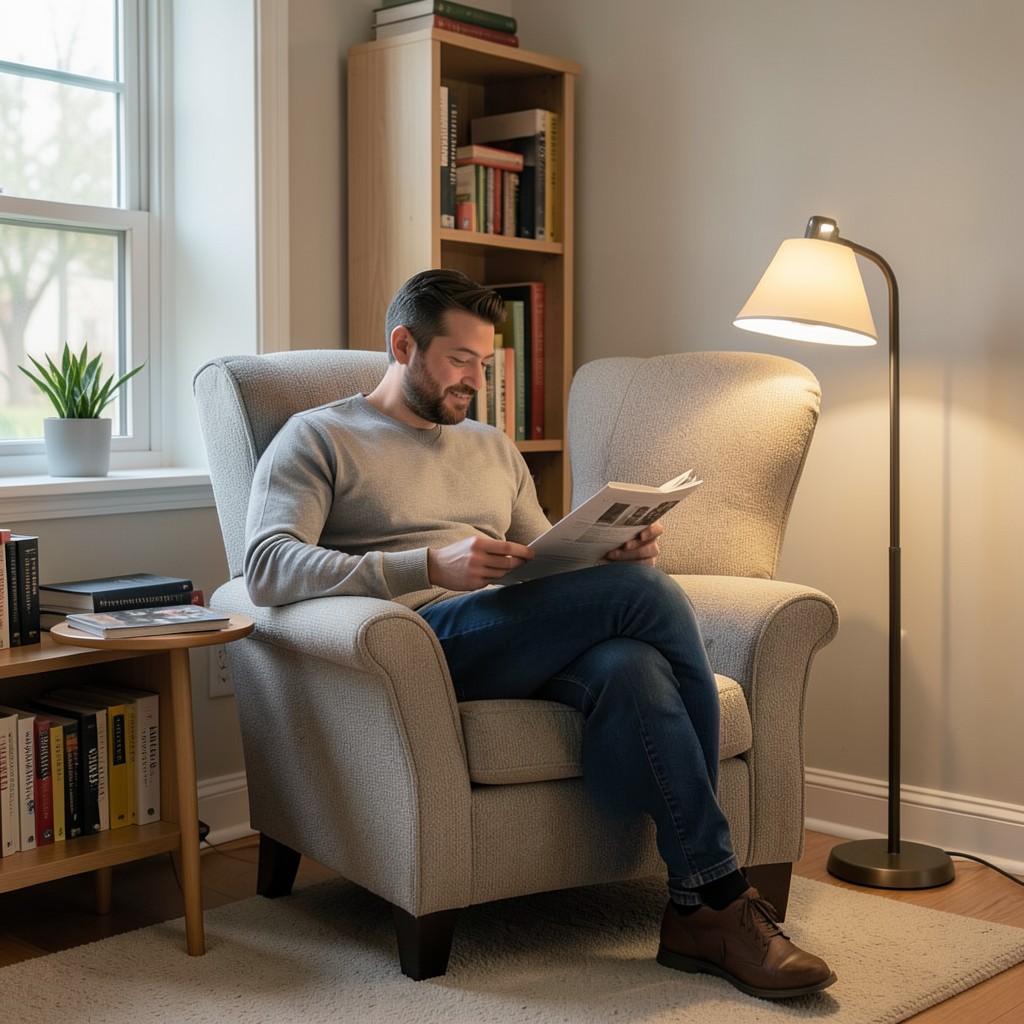
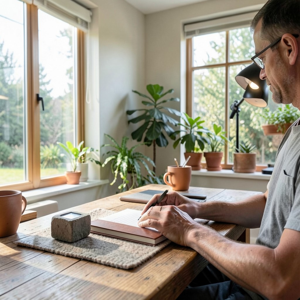
A reading nook within a home office — a dedicated corner with an armchair, a floor lamp, a small side table, and a bookshelf within arm’s reach — provides the alternative working mode that the desk-bound screen working position cannot. Reading, annotating, reviewing printed documents, thinking through a complex problem with a notebook in hand — these are working activities that benefit from a posture and a physical context different from screen-facing sitting, and the home office that provides only one physical working position requires the occupant to perform all modes of knowledge work in the same posture, which is both physically limiting and cognitively suboptimal.
The armchair for a reading nook within a home office must provide the back support that a comfortable reading chair requires — not the fully reclined position of a leisure armchair, but a slightly upright back angle that supports the lumbar region and allows the reader to hold material at a comfortable focal distance without the neck strain that a fully reclined position produces in the lower reading angle it requires. A fireside-style armchair with a slightly high back and padded armrests at a height that allows the reading material to rest on them provides the correct posture. The seat depth should be generous — fifty centimeters minimum — to allow a range of seated positions through a long reading session.
The floor lamp beside the reading nook chair must be positioned to illuminate the reading material from over the shoulder of the reading hand — over the right shoulder for right-handed readers — to avoid the shadow that the reader’s own body casts on the reading surface when the light is positioned in front of and above the reader. A lamp with a directional shade, positioned at a height of one hundred and thirty to one hundred and forty centimeters from the floor at the shade’s lower edge, provides the over-shoulder reading light at the correct angle without producing the reflection glare that a light positioned in front of the reader produces on glossy paper surfaces.
24. A Home Office With Maximized Natural Light
A home office that maximizes its natural light provision — by removing obstacles to the window, specifying window treatments that control rather than block the light, positioning the desk to receive the most light for the longest daily period, and using reflective surfaces strategically to distribute light into the room’s deeper zones — produces the physiological and psychological benefits of daylight exposure across the working day that no artificial lighting system approaches at equivalent quality. Daylight affects alertness, mood, and circadian rhythm regulation in ways that directly influence the capacity for sustained, focused work, and the home office that maximizes its daylight provision is an ergonomic investment at a level most workspace interventions do not reach.
The window treatment for a home office maximum light approach must allow full control across the range from full transparency to full opacity, because the same window that provides valuable diffuse light on an overcast morning produces direct sun glare on the working surface on a clear afternoon. A woven wood roller blind — one that diffuses direct sun to a softer, even light while maintaining the majority of the window’s visible transparency — handles this range more effectively than a fabric roller blind that switches between full transparency and full opacity with no intermediate diffusion quality. The woven wood texture also contributes to the room’s material palette in a way that a plain fabric blind does not.
Light paint colors on the ceiling and the wall adjacent to the window multiply the room’s perceived natural light by reflecting the incoming daylight further into the room’s interior. A ceiling painted in the lightest available value of the room’s wall color — or in a clean, warm white — becomes a secondary light source that distributes daylight reflected from the window surface across the room’s furthest zones. This reflected ceiling light is the most cost-free light quality improvement available in any home office, requiring only a paint decision at the next redecoration cycle rather than any structural or technological intervention.
25. A Home Office With Vintage Furniture
A home office furnished with vintage pieces — a mid-century modern desk, an Eames-era task chair, a wooden filing cabinet from the nineteen-sixties or seventies, and shelving in a period-appropriate style — produces a working environment with the material history and the specific design quality that furniture produced in the period when design culture was most seriously invested in the relationship between form and function possesses. The best vintage office furniture was designed by people who thought deeply about working comfort and working efficiency before ergonomics was a recognized discipline, and the results of that thinking hold up across the decades.
The mid-century modern desk — typically in walnut veneer with tapered legs, a clean flat surface, and integrated drawer storage — combines the material warmth of the post-war American and European design period with the functional simplicity that makes it as appropriate for contemporary home office use as it was when first produced. The tapered leg detail gives the desk a visual lightness that many contemporary desk designs sacrifice for structural simplicity, and the material quality of production-era vintage walnut veneer is frequently higher than equivalent contemporary manufacturing.
The vintage task chair — specifically the typist’s chair and the pedestal-base swivel chair of the mid-century period — offers ergonomic qualities that many contemporary cheaper chairs fail to match because the mechanisms were built to commercial standards for office use rather than to residential price points. A genuine vintage Eames aluminum group chair or a vintage Knoll executive chair in refurbished condition provides the seat and back support of a commercial-quality chair at a price point that contemporary equivalents at the same quality level substantially exceed, because the vintage market values the design history rather than the performance specification.
26. A Home Office With a Dedicated Podcast or Content Studio Corner

A podcast studio corner within a home office — a microphone on an articulating arm, acoustic treatment on the immediate surrounding surfaces, a focused light setup for video recording, and a clean, considered background — is the home office configuration for the professional whose work involves content creation, client communication, or professional broadcasting in addition to the standard knowledge work activities. The studio corner is not a vanity addition. For any professional whose credibility is communicated through audio and video quality, the environment in which that content is produced is as much a professional tool as the computer it is produced on.
The microphone position relative to the studio corner’s acoustic treatment determines the recording quality more directly than the microphone’s own specification. A high-quality microphone in a reverberant, acoustically untreated space records a room sound rather than a voice sound — the recording contains the reflections of the room as prominently as the direct sound of the speaker. Acoustic absorption panels positioned behind and beside the microphone reduce those reflections to the level where the recording contains voice rather than room, which is the quality threshold that separates professional-standard audio from home-recording audio regardless of microphone price.
The lighting for a content studio corner must be designed specifically for the camera rather than for the room’s general illumination needs, because the camera’s exposure characteristics differ from the human eye’s adaptive response to light in ways that produce poor quality video when the lighting is designed only for comfortable room occupation. A key light positioned at forty-five degrees to the subject’s face and slightly elevated — typically a ring light or a soft box LED panel — provides the frontal fill that eliminates facial shadows and produces the even, flattering exposure that professional video requires. A background light at low intensity, illuminating the background elements independently of the subject, creates the depth that separates the subject from the background and prevents the flat, two-dimensional quality of single-source lighting.
27. A Home Office With a Sky Blue Color Scheme
A sky blue home office — walls in a soft, medium-value blue that references the color of an overcast sky rather than a saturated accent blue — produces a working environment with the specific calming quality that blue’s association with sky and water reliably generates, combined with the light-reflective quality of a color that is neither so dark that it absorbs the room’s light nor so pale that it reads as off-white. The sky blue home office is the most frequently cited color choice among creative professionals who have designed their own working environments precisely because it delivers the calm without reducing the energy that focused creative work requires.
The specific blue tone matters more than the general direction. A blue with too much green moves toward the teal territory that reads as dated in many contexts. A blue with too much grey reads as blue-grey and lacks the open quality that sky blue provides. A blue with too much saturation reads as accent-wall rather than room-defining. The correct sky blue for a home office wall sits in the range of fifty to sixty percent saturation and forty-five to fifty-five percent value on a standard color notation scale — warm enough to feel inhabited, cool enough to feel calm, and light enough to maintain the room’s natural light quality.
The furniture and material palette against a sky blue wall must provide the contrast that prevents the room from reading as monochromatic. Natural timber — specifically a warm, medium-toned wood like oak or ash — against a sky blue wall produces the classic Nordic palette that the Scandinavian design tradition has used across decades of residential and office design with consistent results. White trim at the ceiling and skirting levels gives the room its clean boundary within the blue field and prevents the color from reading as uncontained. A single warm-toned textile accent — a terracotta cushion, a burnt orange ceramic object — provides the temperature contrast that activates the cool blue without overwhelming it.
28. A Home Office With Under-Stair Space Integration
A home office carved from the space beneath a staircase — a built-in desk fitted into the triangular volume under the stair treads, with shelving adapted to the reducing height as the stair rises, and lighting integrated into the underside of the stair structure itself — converts one of the most consistently wasted spaces in any two-story residential layout into a genuinely functional compact home office within a footprint that the main living areas of the house barely register as having lost. The under-stair office is the home’s most efficient spatial transformation available without any structural modification.
The desk within an under-stair office must be fitted to the specific geometry of the available volume — the height at the open end of the stair where the ceiling is tallest, the reducing headroom as the stair rises over the desk surface, and the width available between the stair structure and the adjacent wall. A desk surface depth of seventy-five centimeters provides sufficient working area for a monitor and keyboard with surface space beside them, but the available depth varies by stair geometry and must be measured precisely before the desk is built. The headroom at the open end — where the desk user sits — must be at minimum one hundred and ninety centimeters from floor to stair underside for comfortable seated occupation without the ceiling encroachment that lower headroom produces.
The lighting for an under-stair home office requires deliberate provision because the space receives minimal natural light in most stair configurations. LED strip lighting recessed into the stair treads’ underside — running along the stair’s underside and illuminating the desk surface from above — provides the task lighting the space requires without pendant fixtures that the limited headroom precludes. The warm temperature LED strip at 3000K provides the correct ambient warmth for a compact, enclosed working position without the clinical quality of cooler temperature lighting in a space where the close wall and ceiling proximity already produces a slightly contained atmospheric quality.
29. A Home Office With a Nature-Inspired Color Palette
A nature-inspired color palette for a home office — drawing from the colors of the natural environment rather than from the architectural, geometric, or fashion-informed palettes that most interior design sources offer — produces a working environment with a color coherence that is inherently resolved rather than designed toward resolution. Nature’s color combinations work because they have been worked out across millions of years of evolutionary context. The green of a forest floor and the brown of tree bark and the grey of lichen on stone and the warm amber of light through leaves — these colors work together because they have always worked together, and translating them into a home office palette inherits that coherence.
The forest green wall — a deep, slightly muted green that references the color of conifer needles rather than the brightness of summer foliage — is the nature-inspired color that most effectively produces the quality of outdoor environmental calm within an interior working space. The color has sufficient depth to read as designed rather than accidental, and its natural association with the forest environment produces the restorative quality that psychologists of environmental preference consistently associate with natural green exposure. A forest green home office wall paired with natural timber furniture and warm white trim produces a room with the calm authority that most demanding professional work requires as its environmental backdrop.
The earthy accent colors that complete a nature-inspired home office palette — the warm terracotta of dry clay soil, the amber of hardwood in autumn light, the cool slate of river stone — provide the material and color variety that prevents the nature palette from reading as single-note. A terracotta ceramic planter, a slate grey stone on the desk surface used as a paperweight, a timber shelf with an amber oil finish — these are the accent elements that introduce the full range of the natural palette without requiring any decorative objects that exist outside the room’s material vocabulary. Nature’s palette is already complete. The work is in the selection, not the invention.
30. A Home Office With a Japandi Design Direction
Japandi — the design hybrid that merges the functional clarity of Scandinavian design with the wabi-sabi acceptance of natural imperfection that Japanese aesthetics cultivates — produces a home office with a quality of resolved calm that neither design tradition achieves entirely on its own. Scandinavian design’s tendency toward pristine, perfectly finished surfaces meets its counterpoint in Japanese design’s appreciation for the beauty of aged wood, uneven handmade ceramics, and the visible marks of time on material objects. The tension between these two positions produces a room that is organized but not sterile, minimal but not empty.
The furniture palette in a Japandi home office centers on dark, natural timber — a black-stained oak desk, dark walnut shelving, charcoal-finished cabinetry — rather than the pale timber of purely Scandinavian design. The darker tone grounds the room and provides the moody, contemplative quality that the Japanese influence contributes, while the clean, linear forms of the furniture maintain the Scandinavian commitment to functional simplicity. A single organic object — a handmade ceramic pen holder, a rough-edged stone, a piece of driftwood used as a shelf display — introduces the wabi-sabi imperfection element that prevents the Japandi office from sliding into the cold precision of pure minimalism.
The textile layer in a Japandi home office keeps to natural fibers in muted, earthy tones — linen, cotton, and wool in warm beige, sand, and soft sage — because the Japandi palette avoids the saturated accent colors that add energy to other design directions. The restraint of the color palette is the point: a room where every material and every color choice has been made with the same degree of quiet intention produces an environment where the quality of the thinking performed inside it is not competed with by the room’s own visual energy. The office recedes behind the work. That is the Japandi ambition.
31. A Home Office With a Pegboard Wall Organizer
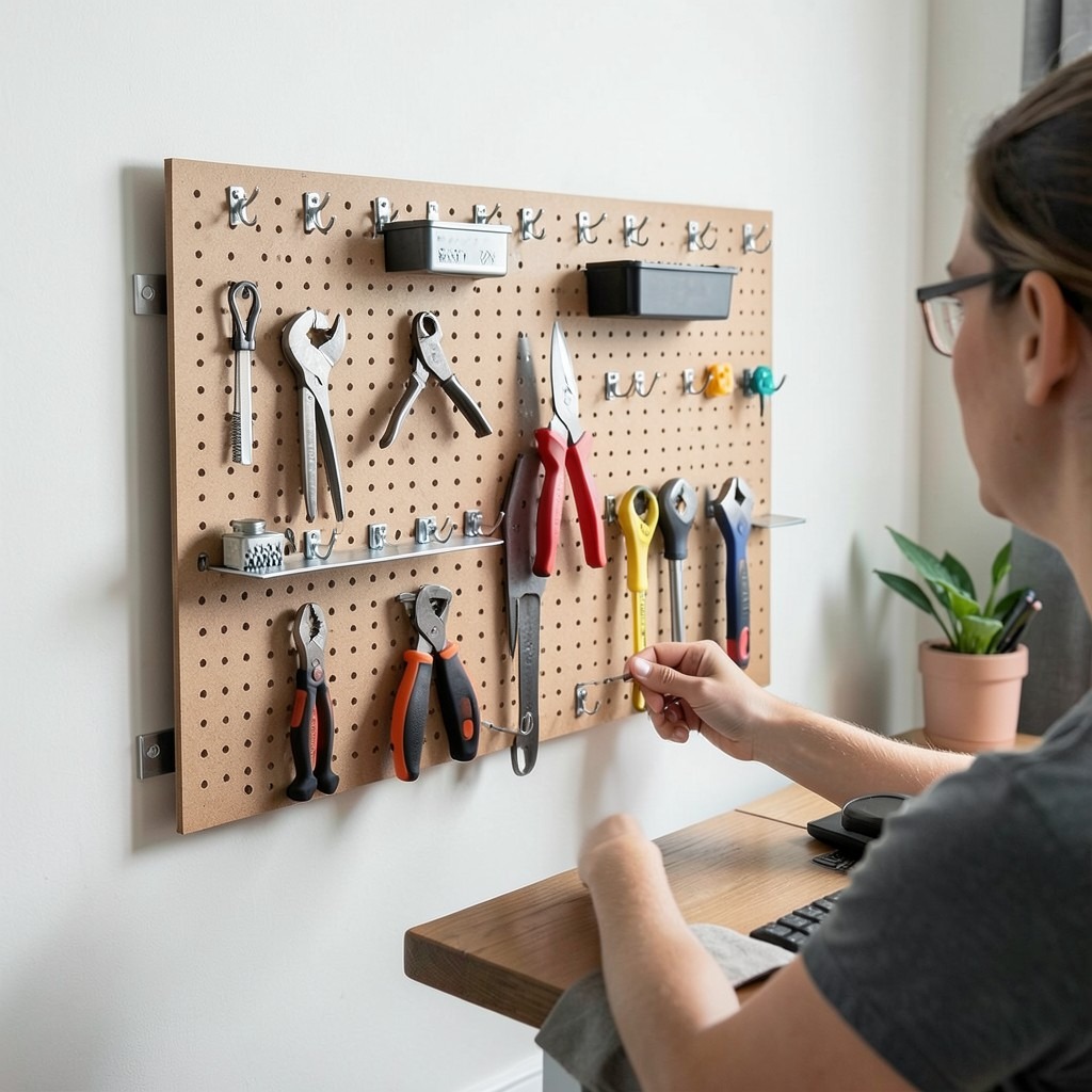
A pegboard wall organizer — a perforated hardboard or powder-coated steel panel mounted to the wall beside or above the desk, fitted with hooks, shelves, bins, and holders arranged in a configuration specific to the user’s actual working tools — provides the visual and physical organization of the active workspace in a format that adapts to changing needs without any additional investment in fixed storage infrastructure. The pegboard is the most honest storage solution in any home office: it keeps the tools of the work visible, accessible, and clearly present rather than buried in drawers where the act of finding them interrupts the working flow.
The pegboard mounting system must hold the panel surface a minimum of fifteen millimeters clear of the wall behind it to allow the hook clips and shelf brackets to engage the perforations from the back. A panel mounted flush to the wall looks cleaner in installation but cannot accept the hook hardware that makes the pegboard functional, which defeats the entire purpose of the installation. Mounting battens or standoff spacers of the correct depth, attached to the wall at the panel’s fixing points, position the panel correctly and allow the full range of pegboard accessories to be used across the entire panel surface.
The arrangement of tools and materials on the pegboard should be driven by frequency of use rather than by visual symmetry — the tools reached for most often should occupy the positions closest to the primary hand and at the most ergonomically accessible height, with less frequently used items positioned further from the center. A pegboard arranged for visual balance rather than working logic looks impressive in a home office photograph and performs less well in the actual working day than one that was arranged specifically for the person who works at the desk beneath it.
32. A Home Office With a Dual-Purpose Desk and Dining Table
A desk that serves as both the home office working surface and the household’s dining table — through either a deliberate design choice that accepts the overlap or a piece of furniture specified to serve both functions at high quality — addresses the most common space constraint in compact apartments and smaller homes where allocating a full room to a home office is not possible. The dual-purpose desk-table is not a compromise if it is selected and set up correctly. It is a space efficiency decision that works when the working configuration and the dining configuration can be established and cleared within a reasonable time.
The table that serves both functions must be sized for the larger of the two requirements. A dining table for four occupants needs at least one hundred and sixty centimeters in length and eighty centimeters in width. A working desk for a two-monitor setup with comfortable lateral working surface needs at least one hundred and sixty centimeters in length and seventy-five centimeters of depth. The overlap in these requirements produces a table specification of one hundred and sixty by eighty centimeters that serves both functions adequately without being optimized for either. The key variable is the surface height — a standard table at seventy-three to seventy-five centimeters serves both dining and desk use within the ergonomic range for most adults.
The management of the work-to-dining transition requires a storage system that allows the working setup to be cleared and returned without the daily friction becoming a reason to avoid using the space for either function. A desktop organizer tray that holds the laptop, cables, and desk accessories as a single unit — sliding off the table surface as one piece rather than requiring individual item removal — reduces the clearance time from ten minutes of scattered retrieval to thirty seconds of tray removal. The desk becomes a dining table. The dining table becomes a desk. The transition is only a problem if the system for managing it was not thought through at the beginning.
33. A Home Office With a Green and White Color Scheme
A green and white home office — clean white walls as the primary field with deep sage or forest green introduced through the desk, the shelving, the soft furnishings, or a single feature wall — produces a working environment that is simultaneously fresh and grounded, the specific combination that most day-long screen workers report as the most comfortable color environment for extended concentration. White keeps the room bright and the light quality high. The green provides the visual resting point and the nature association that makes continuous screen exposure more tolerable.
The specific green tone selected determines whether the scheme reads as contemporary and considered or as a dated accent-color choice. A muted, slightly grey-toned sage green — similar to the color of dried lavender stems or the underside of eucalyptus leaves — reads as current and sophisticated because its grey component desaturates the color below the intensity that accent-color green occupies. A bright, high-saturation green reads as accent-wall rather than considered design direction, and it produces a visual energy in the working environment that is stimulating in short sessions and tiring over a full working day.
The white in a green and white home office must be warm rather than cold. A pure brilliant white — the standard trade paint white that most rental interiors carry — reads as clinical and flat under artificial light, producing a harshness that longer working days amplify into fatigue. An off-white with a warm undertone — Farrow and Ball’s All White, or Dulux’s Timeless, as reference points for the tone rather than prescriptions — reads as white in daylight and warm in artificial light, which produces the comfortable evening working quality that pure white walls consistently fail to provide.
34. A Home Office With a Skylight
A home office with a skylight — a roof window or a light tunnel introducing daylight from above into a room that would otherwise rely entirely on side wall windows or artificial light — provides the quality of overhead natural light that has been associated with productive, creative working environments across centuries of architectural history. The studio skylight, the north-facing roof window of the artist’s atelier, the glazed roof section of the Victorian conservatory-office — each of these design precedents uses overhead light because the quality of light entering from above is consistently diffuse, directionally even, and color-accurate in ways that side-window light is not.
The orientation of a skylight — which direction of the roof slope it is installed on — determines the quality of the light it provides through the day and through the seasons. A north-facing roof slope skylight provides consistent, cool, diffuse light without direct sun at any time of day in the northern hemisphere, which suits screen-based and detail work that requires stable light conditions without glare management. A south-facing skylight provides direct sun for much of the day, which brightens the room significantly but requires a solar-controlled glazing specification or a blind installation to manage the glare and heat gain that direct sun through a roof-mounted glass panel produces.
The light tunnel — a tubular daylighting device that runs a reflective tube from a roof-mounted dome to a ceiling diffuser, carrying daylight from the roof into rooms that cannot accommodate a conventional skylight — provides a cost-effective daylight introduction for home office rooms in the center of a house plan that a conventional skylight would require structural modification to serve. The diffused light from a light tunnel enters the room from a circular ceiling fitting, spreading evenly across the room’s ceiling in a way that reads as a quality overhead light source without the visual drama of a full skylight opening.
35. A Home Office With a Coworking-Inspired Layout
A coworking-inspired home office — one that deliberately borrows the spatial language of well-designed shared working environments, with zones for different working modes, a visual energy that communicates active professional engagement, and a material quality that exceeds the domestic standard — is the home office for professionals who find the domestic atmosphere of a standard home office insufficiently activating for the concentrated, deadline-driven work their careers require. The coworking aesthetic says, clearly and without ambiguity: serious work happens here.
The zoning approach of the coworking layout divides the available space into distinct functional areas — a primary desk zone for focused, screen-based individual work, a secondary seating zone for reading, calls, and thinking away from the screen, and if space permits, a small table configuration for the occasional collaborative meeting that remote workers host at home. Each zone has its own lighting specification, its own furniture character, and its own visual identity within the room’s consistent material palette. The zoning communicates that different modes of work are acknowledged and accommodated, which is the underlying principle of good coworking design at any scale.
The visual energy of a coworking-inspired home office comes from the deliberate inclusion of elements that stimulate rather than calm: a large-format art piece with graphic impact, a full-wall pegboard or whiteboard surface that communicates active ongoing projects, an industrial-style light fixture with the visual authority of a commercial fitting, and the material quality of commercial-grade furniture rather than residential-grade alternatives. The room is not trying to feel like a home in these moments. It is trying to feel like the best version of a professional environment that happens to be located within a home.
36. A Home Office With a White Brick Wall
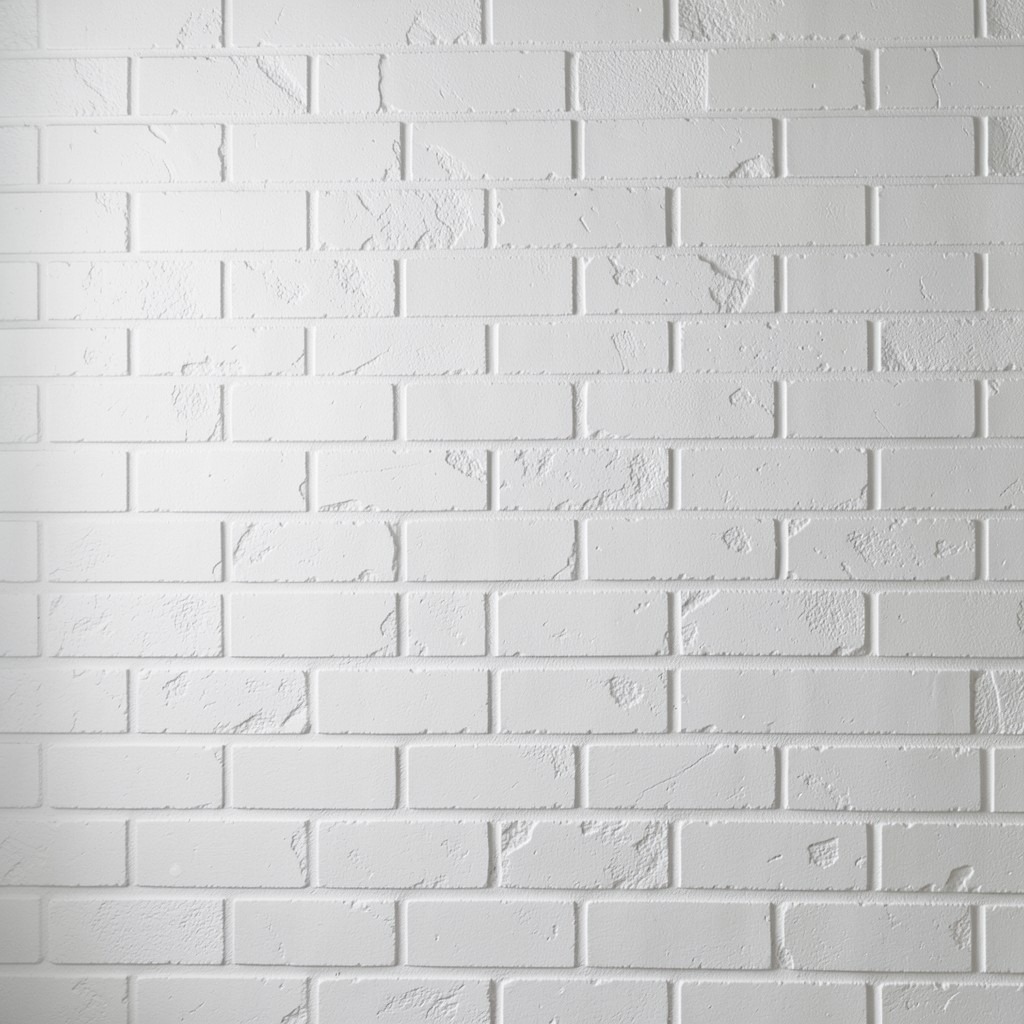
A white-painted brick wall in a home office — either genuine exposed brick painted in a clean white or off-white, or a brick-effect tile or textured panel finish creating the same appearance — provides a surface with the specific combination of texture and neutrality that flat-plastered walls do not possess. The mortar joints and the slight surface irregularity of even a painted brick surface produce a visual depth that a smooth wall in the same color cannot replicate, and that depth makes the wall surface interesting to look at without competing for attention in the way that a patterned or colored wall does.
Genuine exposed brick that has been cleaned, repaired, and sealed before painting receives a paint finish that adheres to the mortar joints and the brick face simultaneously, producing a unified white surface where the texture reads clearly but the material variation of unpainted brick — which can read as busy and distracting — is unified by the single tone applied across it. A masonry primer coat applied before the finish coat ensures the paint penetrates the brick and mortar surfaces rather than sitting on the surface, which prevents the peeling and patchy coverage that unprepared masonry resists.
A brick-effect textured panel — a lightweight composite sheet with a realistic brick surface embossed into it, available in sizes that cover a full wall in two or three pieces — provides the visual quality of a white brick wall in rooms where the structural brick does not exist behind the plaster. The installation is a decoration rather than an exposure of existing material, but the visual result from the working distance of a desk position is sufficient to deliver the texture and depth that the white brick aesthetic provides without the structural work that genuine brick exposure requires.
37. A Home Office With a Modular Furniture System
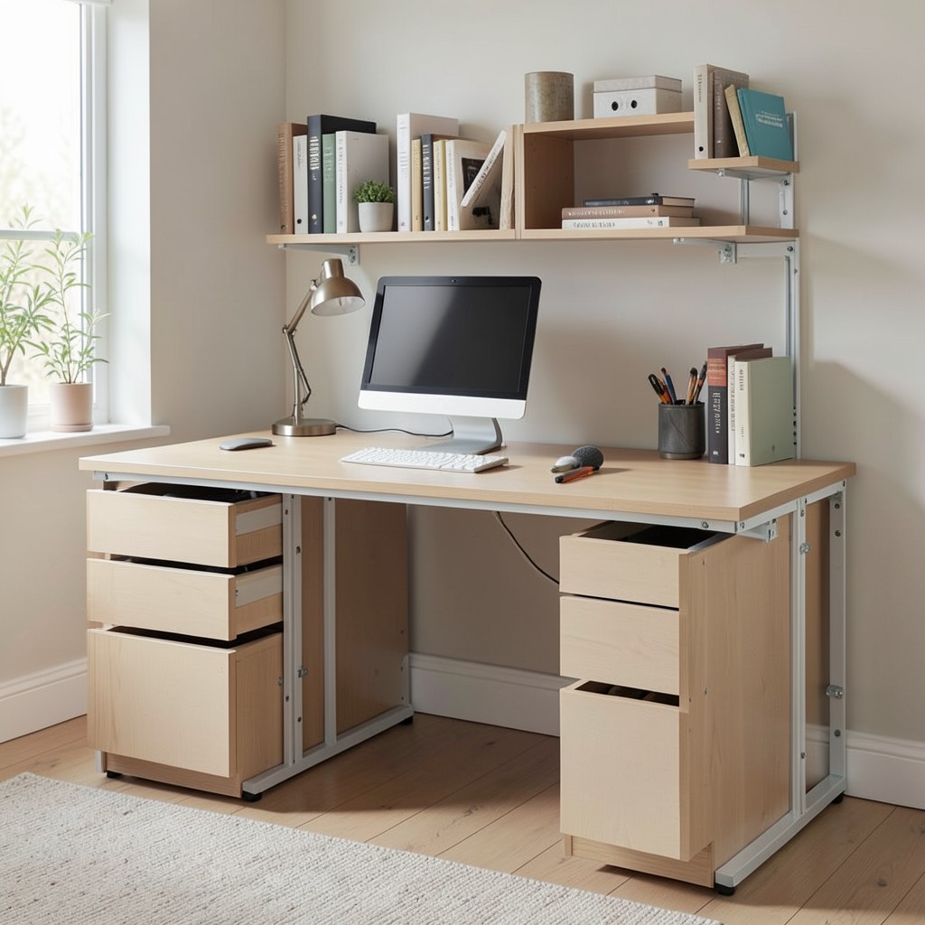
A modular furniture system in a home office — a kit of standardized components, desk surfaces, shelf units, drawer blocks, and cabinet panels that combine and recombine to produce the exact configuration the space and the work require — provides the adaptability that fixed, purpose-built furniture cannot match and the coherence that assorted individual pieces rarely achieve. The modular system is the home office furniture approach that stays correct through the changes that working life generates: a new role with different storage requirements, a change in household members that affects the space available, or a move to a different home with different room dimensions.
The quality of a modular office furniture system is almost entirely determined by the precision of its connecting hardware — the brackets, cam locks, and rail systems that join the individual components into a coherent whole. A system with precisely engineered connectors produces assemblies that are rigid, level, and stable without visible fixings or gaps between components. A system with imprecise hardware produces assemblies that rack, squeak, and develop visible gaps between components over time as the connecting hardware loosens under the micro-movements of daily use. The connecting hardware is not a detail in modular furniture. It is the system’s structural foundation, and its quality deserves the same scrutiny as the visual quality of the components it joins.
The reconfigurability of a modular system should be tested not just at the initial configuration stage but at the reconfiguration stage — the point where the initial setup needs to change and the ease of that change determines whether the system’s adaptability is genuine or theoretical. A system that requires professional assembly tools, complex disassembly sequences, or the replacement of damaged components during reconfiguration is a system whose adaptability is marketed rather than practical. The best modular office furniture systems reconfigure with the same tools and the same straightforward process as the initial assembly, and that symmetry is the test that separates genuine modularity from marketing language.
38. A Home Office With a Chalkboard or Whiteboard Wall
A full-wall chalkboard or whiteboard surface in a home office — an entire wall painted with chalkboard paint or fitted with a magnetic whiteboard panel — converts the room’s largest single surface from a passive backdrop into an active working tool that supports the visual thinking, planning, and project management that knowledge work requires as a constant background activity. The wall is no longer simply present. It is participating in the work.
The chalkboard paint approach applies a dark grey or black surface to the existing wall plaster through a standard paint application process, producing a writing surface across the full wall area without any structural modification. The paint requires light sanding between coats for the smoothest writing surface and a curing period before first use to prevent ghosting — the faint chalk marks that remain visible after erasing on an insufficiently cured surface. The prepared surface handles chalk and chalk markers equally well and wipes clean with a damp cloth, which maintains the wall’s visual quality between working sessions.
The whiteboard approach — a sheet of white-coated steel or a dry-erase painted surface applied to the wall — provides the instant-read visibility of marker writing that chalk’s slightly lower contrast does not match, and its magnetic-receptive surface accepts magnetic markers, document holders, and grid overlays that extend its functional range beyond the basic writing surface. The choice between chalkboard and whiteboard is ultimately a question of preferred working tool — chalk and eraser for a more analog, organic working style, marker and eraser for a cleaner, higher-contrast visual thinking surface. Both serve the core function. Pick the one that matches how you actually think.
39. A Home Office With Hidden Cable Management
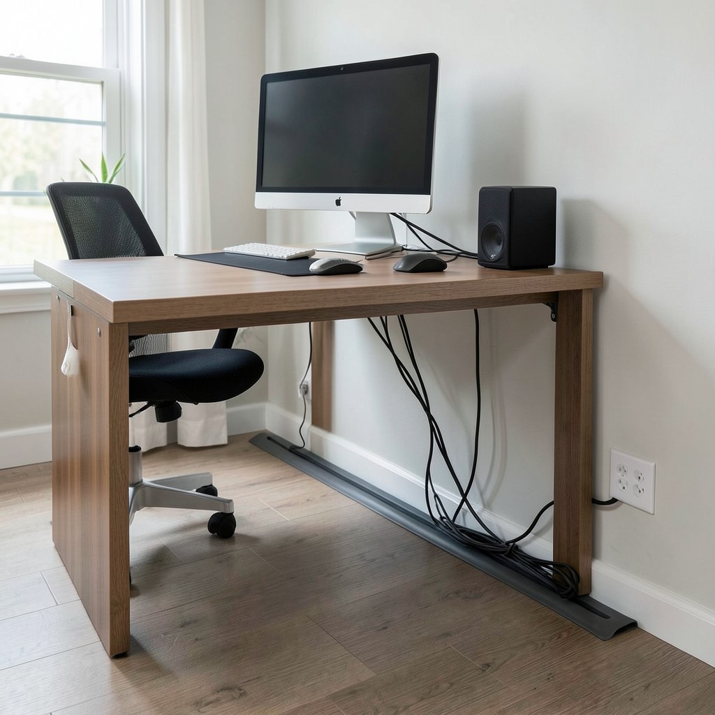
A home office where every cable — power, data, monitor, speaker, peripheral, and charging — is contained within a managed system that keeps all cable runs invisible from the desk’s working surface and the room’s general view is a home office that looks professionally considered rather than technically assembled. Visible cable management is the most immediately noticed indicator of a home office that was set up rather than designed, and the correction requires no specialist skill — only the selection and installation of the correct cable management products in a logical sequence before the equipment is placed.
The cable spine beneath the desk surface — a channeled tray mounted to the underside of the desk that collects all cable runs from the equipment above and directs them to a single outlet point at the back leg or wall — is the primary cable management element and the one installed before any equipment is positioned. The spine is sized to contain the number of cables the desk setup generates, with capacity margin for additional cables as the setup evolves. A spine with insufficient capacity for the actual cable load produces a managed appearance at the front of the desk and a bunched overflow at the point where the spine terminates.
The floor cable cover — a flat PVC or rubber channel fixed to the floor between the desk’s cable outlet point and the wall socket — conceals the final run of cables across the floor surface. This is the cable run that most home office setups leave exposed as a trailing hazard across the floor between the desk and the wall. A floor cable cover of the correct width for the number of cables it contains, in a color matched to the floor surface, produces a flush, barely visible transition from desk to wall that eliminates the trip hazard and the visual disorder of uncovered floor cables simultaneously.
40. A Home Office With a Terracotta Color Palette
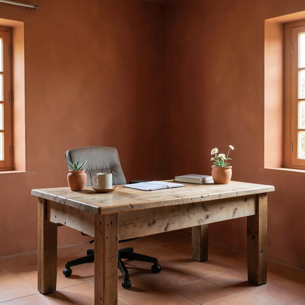
A terracotta home office — the walls in a warm, mid-depth terracotta that references the color of fired clay and sun-baked earth — produces a working environment with the specific warmth and earthen grounding that cooler, more architectural palettes do not provide. Terracotta is the color that feels the most different from a corporate office environment of any residential paint direction, and that distinction is the point: a home office in terracotta communicates clearly that the work performed in it is not being done in a corporate facility, and that communication produces a quality of psychological freedom from the institutional associations of the workplace that more neutral office colors do not.
The terracotta tone must be warm enough to register as color without being so saturated that it reads as accent. A terracotta at fifty to sixty percent saturation — the shade of a well-used Italian terracotta pot rather than a freshly fired bright tile — provides the warmth without the intensity that higher saturation produces. Paired with a natural aged timber desk, terracotta delivers a material harmony that references the natural material combination of clay and wood that Mediterranean domestic architecture has used successfully across centuries. The combination requires no design theory to justify — it works because the materials belong to the same environmental and cultural context.
The natural light quality in a terracotta home office is the variable that most determines the room’s success across the working day. Terracotta in north-facing, low-light conditions reads as heavy and warm-in-the-wrong-way — the color’s warmth accumulates against limited natural light and produces a room that feels dim and enclosed rather than warm and enveloping. Terracotta in a south or east-facing room with generous natural light reads as exactly right — the warm light and the warm wall color amplify each other into the quality of rich, enveloping warmth that makes the room feel like a location chosen for comfort as much as for productivity.
41. A Home Office With a Dedicated Technology Setup
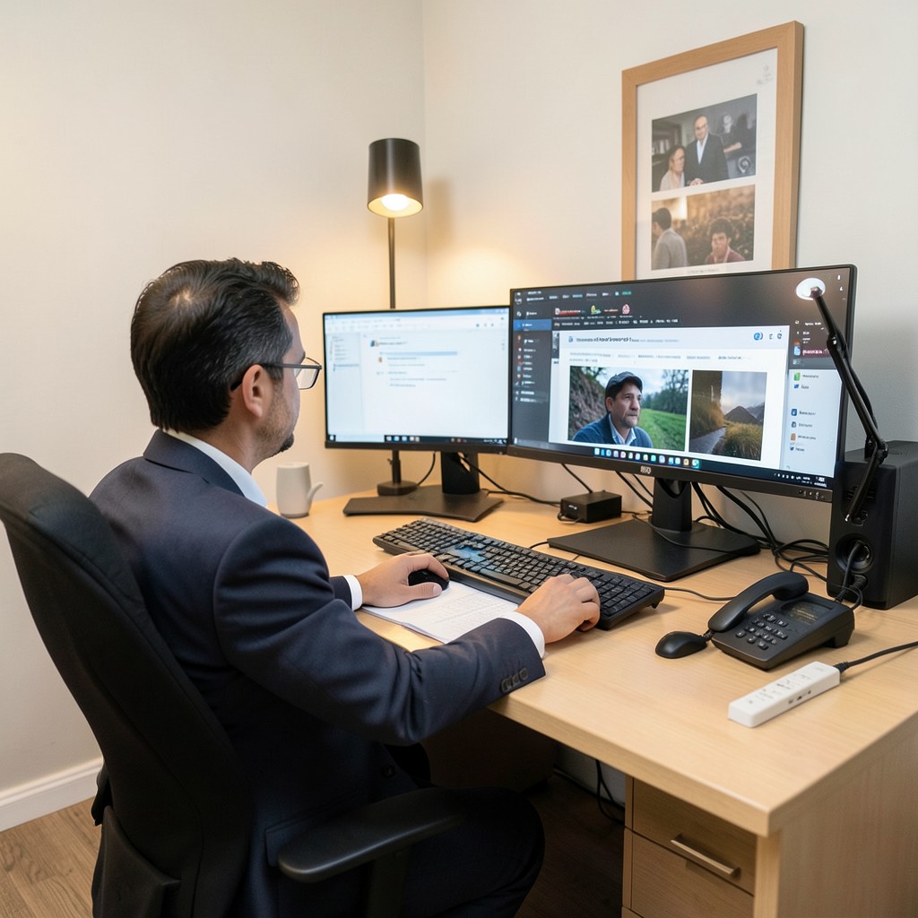
A home office designed around the specific technology requirements of the professional using it — with each piece of hardware positioned for optimal performance and ergonomic access, connected through a managed network with adequate speed and reliability for the work it supports, and integrated with a power management system that handles the load of multiple simultaneous devices without voltage drop or socket competition — is the home office where the technology serves the work rather than constraining it. Most home offices treat technology placement as an afterthought to furniture placement. The professional result comes from reversing that sequence.
The network infrastructure of a home office is the technology component whose quality most directly affects the reliability of the remote work experience, yet it is the component most consistently underspecified relative to the consumer-grade domestic router that provides the household’s general internet connection. A dedicated Wi-Fi access point positioned within the home office — or a wired Ethernet connection from the router to the desk position — provides the connection quality and the bandwidth consistency that video calls, large file transfers, and cloud-based applications require throughout the working day. A domestic router positioned three rooms away, with the signal passing through two or more walls, produces the latency and bandwidth variability that video call quality and cloud application performance translate directly into degraded professional experience.
The power management system for a home office with multiple simultaneous devices — desktop computer, two monitors, a desk lamp, a laptop charger, a USB hub, speakers, and a phone charger — must provide adequate total socket capacity with surge protection built in. A quality surge-protected power strip with sufficient individual socket spacing for the transformer-block power supplies that many devices use, combined with a UPS — uninterruptible power supply — that provides five to ten minutes of battery-backed power through brief outages, protects the equipment and the work in progress from the power quality issues that residential circuits experience during weather events and grid fluctuations.
42. A Home Office With a Boho-Eclectic Aesthetic
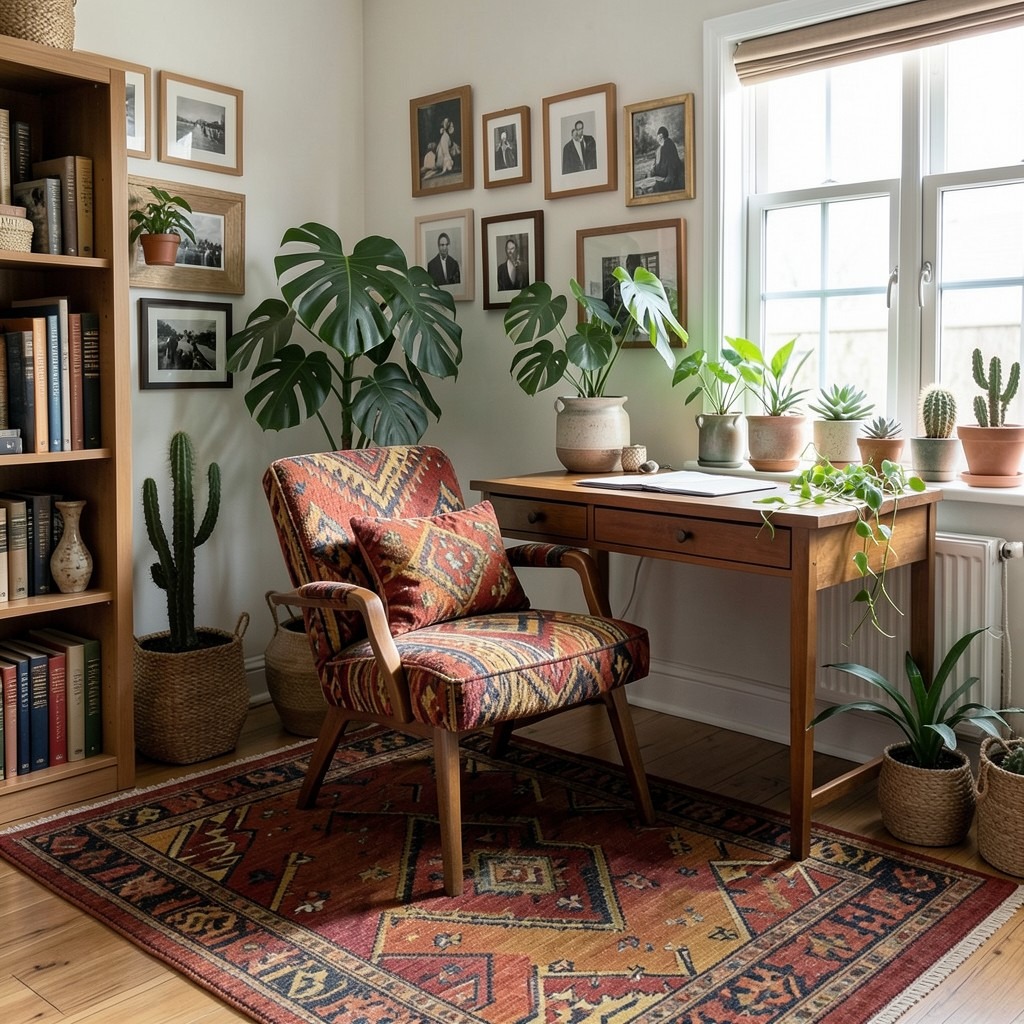
A boho-eclectic home office — layered textiles in warm, saturated tones, a collection of plants in mismatched ceramic and woven containers, a gallery wall of art and personal photographs, vintage and modern furniture pieces in the same room, and an overall quality of accumulated personal culture rather than curated design direction — is the home office that most clearly communicates the personality and the history of the person working in it. The boho-eclectic aesthetic is not a designed style. It is the visual evidence of genuine personal investment in a space over time, and that quality — the specific difficulty of replicating it without the underlying genuine accumulation — is its most compelling characteristic.
The textile foundation of a boho-eclectic home office begins with the rug, which establishes the color palette and the pattern vocabulary that all other soft furnishings should reference. A vintage kilim or a Persian-style rug in warm terracotta, gold, and deep red provides the color anchor for a boho palette with genuine depth. A contemporary geometric rug in the same colors provides the same palette foundation with a cleaner graphic reading. The rug’s pattern and color inform the cushion covers on the reading chair, the fabric of the desk chair, and the general tonal direction of the room — beginning with the rug and working outward ensures the palette coheres through the variety that the boho aesthetic requires.
The plant collection in a boho-eclectic home office should exceed what a minimalist design sensibility would consider adequate and fall just short of what would require daily management. Six to ten plants in varied containers — a large floor-standing monstera beside the bookshelf, a trailing pothos across the desk surface edge, a collection of succulents and cacti on the window sill — provides the lush, green abundance that the boho aesthetic requires without the maintenance intensity of a maximalist collection. The boho plant collection is not curated for botanical rarity. It is accumulated for the quality of living abundance that a household that genuinely likes plants produces naturally.
43. A Home Office With a Creative Brainstorming Wall
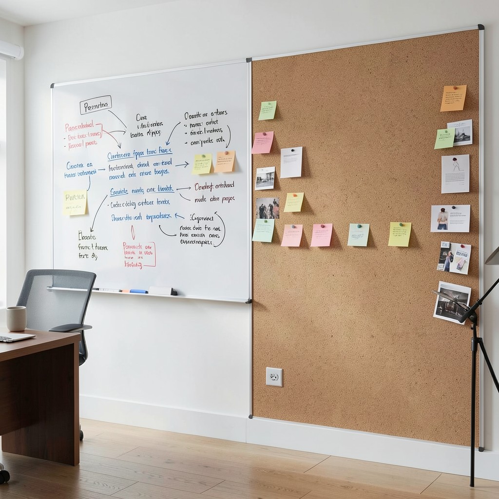
A brainstorming wall in a home office — a large, writable, pinnable surface dedicated specifically to the generation and development of ideas in a physical, spatial format rather than a digital one — is the working tool most missing from the home offices of creative and strategic professionals who have transferred their brainstorming process entirely to digital tools without accounting for what the physical format uniquely provides. The spatial quality of idea organization on a physical surface — the ability to see all elements simultaneously without scrolling, to perceive proximity and grouping relationships in two dimensions, to move a note card from one cluster to another with a physical gesture — produces cognitive work that screen-based tools constrain rather than replicate.
The surface specification for a brainstorming wall combines writability, pinning capacity, and visual clarity in a format that the wall can provide continuously rather than requiring setup and clearance for each session. A combination of whiteboard surface on one half and corkboard on the other — both fitted floor-to-ceiling across the wall’s full width — provides both permanent marker writing and pinned physical material within a single continuous working surface that the room’s occupant can stand in front of and engage with at full physical scale. The scale of the surface matters: the brainstorming wall whose full extent can be seen in peripheral vision from the standing working position is fundamentally more useful than one whose edges require head movement to access.
The material on the brainstorming wall should rotate at project cycle frequency — cleared at the end of each major project and rebuilt fresh for the next — rather than accumulating through multiple projects until the wall becomes a historical record rather than an active working tool. The clearing of the wall at a project’s conclusion is itself a cognitive act: the physical removal of completed project material produces a psychological closure that digital project management tools cannot generate, and the blank wall at the start of a new project communicates the open possibility of that project’s beginning in a way that a screen-based interface does not.
44. A Home Office With Vintage Industrial Lighting
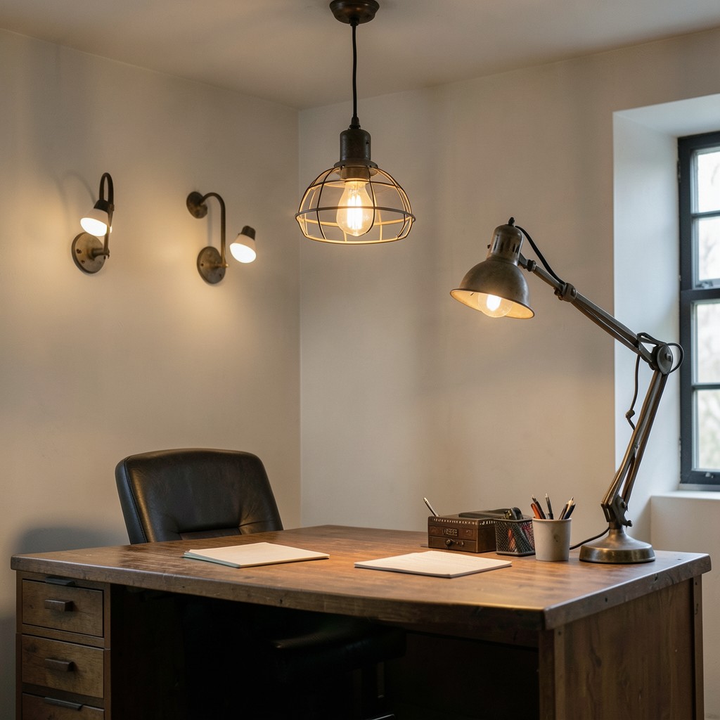
Vintage industrial lighting in a home office — pendant fixtures with metal cage shades, adjustable arm wall sconces with porcelain sockets, a multi-arm ceiling fixture with exposed bulb positions, or a desk lamp with a cast iron base and an articulating arm in aged steel — provides the specific material quality and the warm, directional light character that contemporary lighting products rarely deliver at the same aesthetic authenticity. Industrial vintage lighting worked because it was designed to illuminate working environments — factories, workshops, drafting rooms — and the quality of task illumination it was built to provide translates directly into home office performance.
The pendant fixture with a metal cage shade — one of the most widely reproduced vintage industrial light forms — provides a directional downlight that illuminates the desk surface or the reading chair below it without the diffuse spread of a fabric shade that distributes light at the cost of direction. The cage shade’s open structure allows some light to escape laterally and upward, which prevents the high contrast between the lit surface and the dark ceiling above that fully enclosed pendant shades produce. The filament bulb visible through the cage — a globe or tubular filament LED at 2200K — provides the visual warmth that cage shades were designed to showcase rather than conceal.
The adjustable arm wall sconce — a vintage drafting room or factory floor fitting in a cast or pressed steel construction with a multi-joint arm that positions the head anywhere within a large arc from the wall mounting point — provides the most flexible and most ergonomically correct task lighting position for a home office desk where the ceiling position does not allow a pendant to be placed directly above the working surface. The arm positions the light source precisely at the angle the work requires, adjusts instantly as the task changes, and folds flat against the wall when not in use, which is the functional versatility that no fixed position lighting achieves.
45. A Home Office With a Smart Home Integration
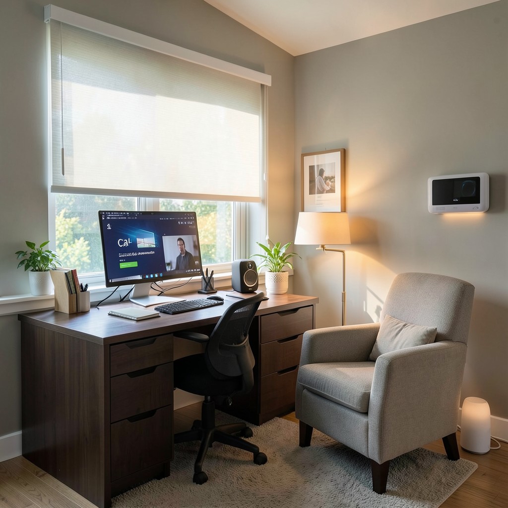
A home office integrated with smart home technology — voice-controlled lighting, a smart thermostat programmed for the working day’s temperature preferences, motorized window blinds that adjust automatically with the sun’s position, and a smart speaker managing the room’s audio and communications — produces a working environment where the environmental management that affects focus and comfort happens in the background rather than requiring constant manual attention. The smart home office is not about technological novelty. It is about the reduction of the low-level environmental management decisions that interrupt working concentration multiple times through each day.
The smart lighting system — individually addressable LED bulbs or fixtures connected to a hub that allows scene programming — allows the home office occupant to switch between pre-programmed lighting scenes that correspond to different working activities with a voice command or a single button press. A “focus” scene delivers the task lighting and ambient light combination optimized for intensive screen work. A “call” scene activates the video call lighting setup at the correct intensity and position. A “reading” scene shifts the primary light to the armchair floor lamp at the warm, low intensity that reading benefits from. These transitions happen instantly and require none of the manual adjustment of multiple individual light sources that an unintegrated lighting system demands.
The automated window blind system — motorized roller blinds with a solar sensor or a programmed schedule that adjusts the blind position in response to the sun’s movement across the day — is the smart home office integration with the most direct impact on working comfort, because glare management is the environmental interruption that most consistently requires attention throughout the working day in a sun-facing home office. A blind that moves itself to the correct diffusion position as the sun tracks across the window eliminates the hourly blind adjustment that every west-facing home office occupant performs manually, and recovers the uninterrupted working time that those small but frequent adjustments cost across a full working day.
46. A Home Office With a Creative Color Blocking Scheme
A color-blocked home office — the room’s walls divided into zones of different colors rather than painted uniformly, with the desk wall in one tone, the adjacent wall in a related tone, and the ceiling in a third coordinated color — produces a spatial quality where each surface reads as a distinct element within the room’s composition rather than as a uniform backdrop to the furniture. Color blocking on walls is the interior design technique that produces the most architectural reading of a painted surface because it uses color to define spatial zones in the way that structural materials use form — not just as surface treatment but as spatial organization.
The color relationships in a home office color blocking scheme must be internally consistent — a palette that works as a group across all four surfaces simultaneously. A warm terracotta desk wall, a cream side wall, and a muted sage ceiling produce a warm palette that works because all three tones are drawn from the warm-neutral range that shares the yellow-red-green undertone family. Mixing colors from different undertone families — a warm terracotta wall against a cool blue-grey ceiling — produces a surface palette that looks tested and unresolved in a way that a consistently warm or consistently cool scheme does not.
The ceiling color in a color-blocked home office is the boldest individual decision and the one with the most dramatic spatial consequence. A ceiling painted in a color — rather than in the standard trade white that most residential ceilings carry — lowers the perceived ceiling height and produces a sense of enclosure that affects the room’s atmosphere at a visceral level. A mid-dark ceiling over a pale-walled room reads as a canopy, producing a sheltered, contained quality that suits the concentrated working environment of a home office. The ceiling color should be one to two values darker than the wall color to read as the darker overhead plane that produces the canopy effect rather than reading as an arbitrarily colored fifth surface.
47. A Home Office With a Compact Printer and Scanner Station
A dedicated printer and scanner station within a home office — a compact unit or a purpose-built alcove housing the printer, a small stock of paper and consumables, and a scan tray for document processing — removes the working surface clutter that printing and scanning equipment produces when positioned on the primary desk surface and creates a specific workflow zone for document management tasks that the desk’s primary screen work position is not optimally configured for. The physical separation of document processing from screen work reflects the actual cognitive separation between these two modes of working.
The printer and scanner station location should be accessible from the desk chair without requiring the occupant to stand — within a rolling chair’s reach, at a height that allows the printer’s paper tray to be loaded and the scanner’s lid to be operated from a seated position. A printer positioned on a compact side table or on a dedicated printer shelf at desk height to one side of the main desk configuration provides this accessibility without occupying the primary desk surface. The paper supply — a ream or two in a drawer below the printer or in a wall-mounted paper holder beside it — maintains the printing workflow without the floor-level paper stack that most home offices produce when paper storage was not considered alongside printer placement.
The cable connection from the printer to the desk’s computer, or the wireless network configuration that eliminates that cable run, should be confirmed and tested before the station’s final position is set. A printer positioned at the optimal workflow distance from the desk but with a cable that cannot reach the computer, or in a wireless dead zone that produces the failed print jobs and reconnection attempts that insufficiently tested wireless printer setups generate, defeats the entire purpose of the organized workflow that the dedicated station was designed to produce.
48. A Home Office With a Home Library Corner
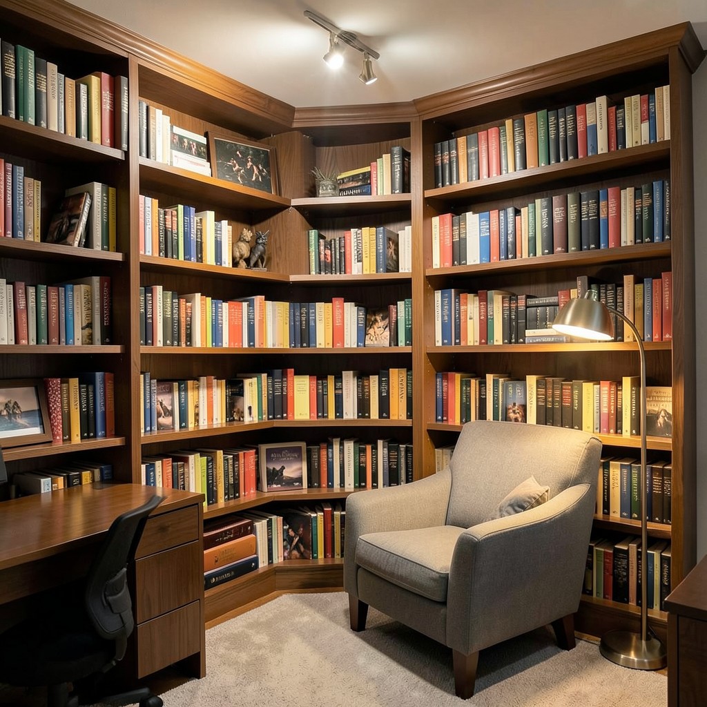
A home library corner within a home office — a specific section of the room furnished with floor-to-ceiling bookshelves, a dedicated armchair, and a lighting arrangement that serves both book browsing and comfortable reading — creates a spatial subzone within the office where the household’s reading material is organized and accessible in a way that enriches both the working environment and the household’s reading culture simultaneously. The library corner in a home office is not decorative shelving. It is a curated resource that the office’s occupant uses as a reference, a stimulus, and a retreat within the working day.
The book organization system within a home library corner should be driven by how the books are actually used rather than by the visual logic that photographic styling applies. Books organized by color look extraordinary in photographs and frustrate the person who needs to find a specific volume quickly, because color is not a retrieval cue that most readers use instinctively. Books organized by subject — with the subjects most relevant to the professional work at the most accessible shelf positions and the personal reading collection organized separately — produce a library corner where the working function and the pleasure function of the collection are both served without the retrieval inefficiency of purely visual organization.
The light within the library corner must serve both the task of reading book spines while browsing the shelves and the sustained task of reading a book from the armchair. A ceiling-mounted light directed at the shelves provides the browsing illumination that makes individual titles readable without requiring the room’s general light to be positioned for that specific task. The floor lamp beside the armchair provides the independent reading light that isolates the armchair zone from the desk zone visually and functionally, creating the specific atmosphere of a separate reading space that the library corner’s physical arrangement defines.
49. A Home Office With a Soundproofing Solution
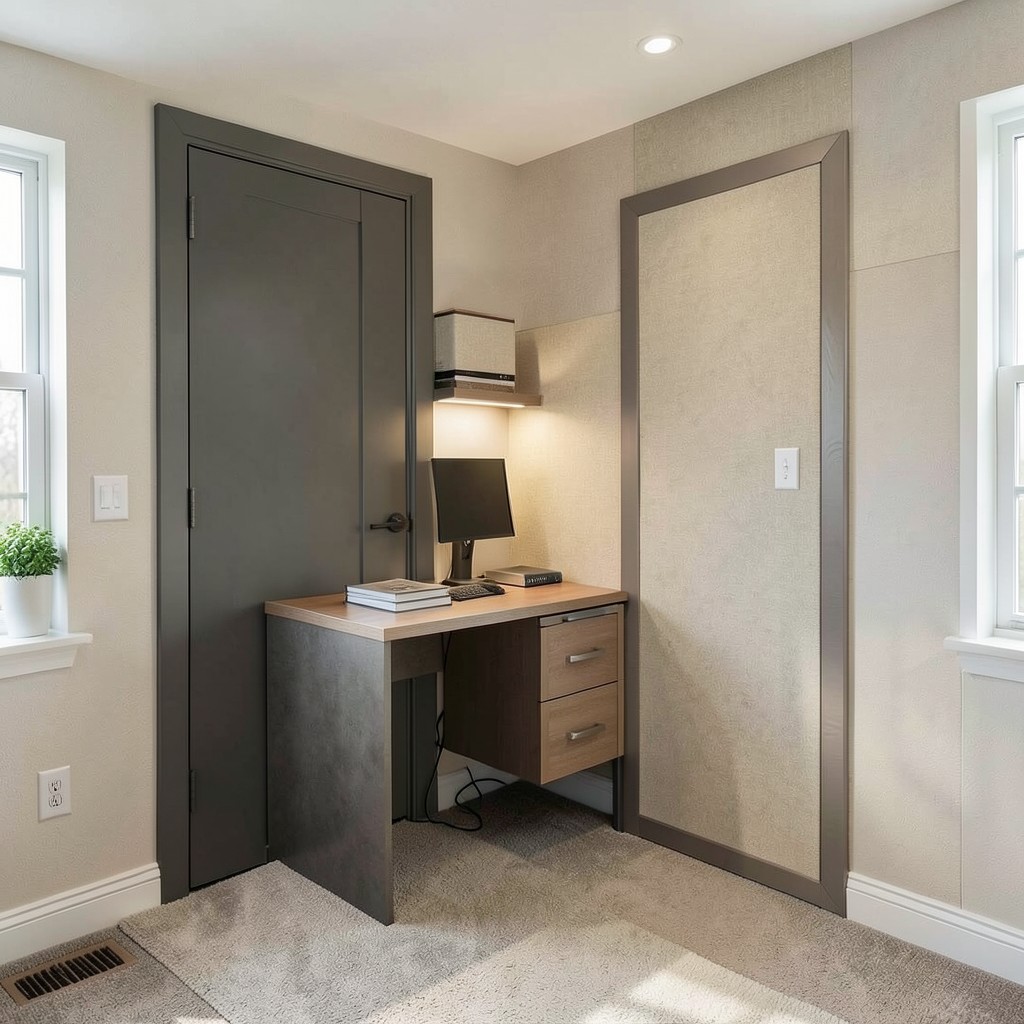
A properly soundproofed home office — one where the acoustic boundary between the working space and the domestic spaces surrounding it functions in both directions effectively — is the home office infrastructure investment that most directly affects the professional quality of the work environment for anyone in a household with children, pets, a working partner, or the general level of domestic activity that makes a standard interior door insufficient as an acoustic separator. The home office where external sound intrudes constantly is not a professional environment regardless of its visual quality, and the acoustic investment is justified by the same logic as any other professional tool purchase.
The acoustic door seal — a combination of a solid-core door, perimeter foam compression seals on all four edges, and a threshold seal at the floor that drops automatically when the door closes — is the most impactful single acoustic intervention available in an existing home office where wall treatment is not structurally possible. The acoustic path through a standard hollow-core door with no perimeter sealing is so much larger than the acoustic path through the walls that the walls’ acoustic performance is largely irrelevant until the door is addressed. A properly sealed solid-core door reduces the acoustic transmission between rooms by a margin that wall treatment alone cannot achieve.
The mass-loaded vinyl panel — a heavy, flexible acoustic barrier available in rolls that can be fixed to walls, ceilings, or the inside of door surfaces — provides the acoustic mass that increases a surface’s sound transmission loss without the structural modification that adding mass through building materials requires. A layer of mass-loaded vinyl installed on the home office side of the party wall with the adjacent room — fixed behind a new layer of plasterboard for the cleanest installation, or simply hung as a wall treatment and faced with a fabric panel — adds the acoustic mass that standard plasterboard partition walls lack and produces a measurable improvement in the low-frequency sound isolation that most domestic noise sources generate.
50. A Home Office Designed as Your Best Work Environment
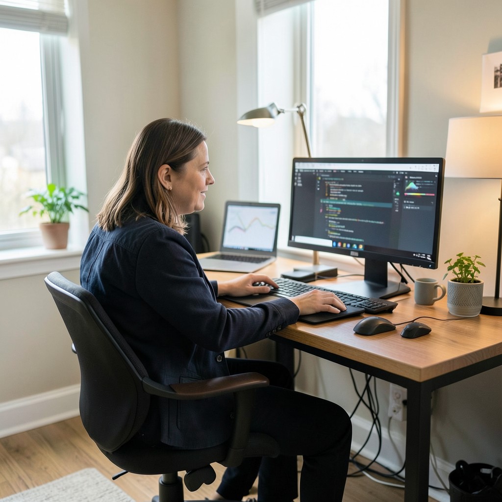
The home office that makes your best work possible is not the one with the most expensive furniture, the most sophisticated technology, or the most photographed aesthetic direction. It is the one where every decision was made with genuine understanding of how you work, what you need from your environment to perform at your highest level, and what specific conditions — light, temperature, acoustic quality, surface organization, visual stimulus — support or undermine your specific working style. That understanding is not available in any design guide. It comes from paying attention to your own working experience with the same analytical intention you would apply to any other professional problem.
Start with the honest audit. Sit at your current home office setup and identify the three things that most consistently interrupt or undermine your working concentration — not the things that look wrong, but the things that feel wrong through a full working day. The chair that makes your back hurt after three hours. The glare that forces you to angle the monitor away from the window. The noise from the rest of the house that breaks your concentration during calls. The disorganized cable situation that produces a low-level visual irritation across the entire working day. Each of these has a specific solution, and addressing the three biggest friction points first produces a better working environment faster than any comprehensive redesign that addresses every element simultaneously.
The home office at its best is the room where your most demanding professional work happens in conditions that are not working against you. The room should be invisible to the work — its light, its temperature, its acoustic quality, and its organization should be so well matched to what the work requires that the environment stops registering as a variable and the work itself becomes the only thing present. When a room disappears behind the activity it was designed for, the design succeeded. Pick one idea from this collection, implement it this week, and build from there — the home office you need is already within reach of the decisions you have not yet made.
Leave a Reply