
The wall is the surface you live with most intimately, and most people treat it as the surface they think about least. Every room in a house has at least four of them. They frame every conversation, hold every piece of furniture in visual relationship, and define the atmosphere of the space more completely than the floor beneath your feet or the ceiling above your head — because the wall is what the eye meets at eye level, across the full sweep of the room, in every direction you turn. And yet the default decision for walls in most homes is the same paint color applied to all four surfaces, chosen from a shortlist of safe neutrals that the hardware store has positioned at the front of the display for precisely the demographic most likely to need a wall color and least likely to want to think hard about it.
That default is not neutral. It is a choice made by not making a choice, and it produces rooms whose walls contribute nothing — no warmth, no atmosphere, no character, no design distinction — and whose occupants wonder why the room never quite feels finished regardless of the furniture and the accessories arranged within it. The walls are why. A room whose walls were designed rather than painted in a hurry produces a fundamentally different spatial experience from the same room whose walls were given a coat of magnolia and left to serve as background. The difference is not subtle. It is the difference between a room and an interior.
The wall design decisions available in a standard domestic room span a range wider than most homeowners have explored. The paint choice alone — when made with confidence rather than caution — covers an enormous territory: the single accent wall in a saturated tone that anchors one end of the room, the all-four-walls color commitment that creates an immersive atmosphere rather than a decorated box, the half-height two-tone treatment that adds architectural scale to a room that was built without any. Beyond paint, the options extend through wallpaper, paneling, tile, stone, plaster textures, fabric, timber, mirror, metal, and the full range of applied surface treatments whose material character provides what paint alone cannot deliver.
The wall’s design relationship with the room’s other surfaces is the context that every wall design decision must begin from. A wall treatment that works in isolation — beautiful in the showroom, stunning in the catalog photograph — may work against the room it is installed in if the ceiling height, the floor material, the furniture scale, or the natural light quality of the specific room does not support the treatment’s requirements. A dark, deeply textured Wall Design Ideas covering needs a room with adequate ceiling height to avoid oppression. A light, reflective wall finish needs a room with sufficient furniture weight to prevent the space from feeling empty rather than airy. These are the specific conditions that the room provides and that the wall design must respond to.
The season changes how your walls feel, too — and it is worth acknowledging that dimension honestly. The wall color that feels perfect in summer home design, carrying the bright and breezy quality of a room flooded with long afternoon light, may feel thin and cold in the low-light months of winter interior design when the same paint reads differently under artificial light with no sun reinforcement. The best wall treatments — the ones whose investment is justified over the years of occupancy that a domestic interior represents — work across the full seasonal range, contributing their character to the room’s atmosphere in February as effectively as they do in July.
1. A Bold Accent Wall in a Saturated Color
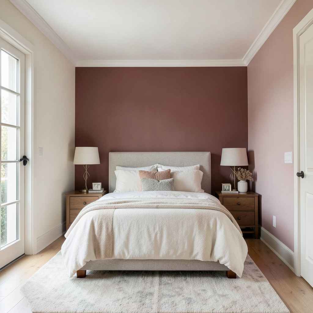
The accent wall is simultaneously the most popular and the most misunderstood wall design concept in residential interiors, and the misunderstanding begins with the word itself. An accent is not a timid gesture. An accent in music is a note struck harder than the surrounding notes — it stands out because of force, not because of difference alone. The accent wall in interior design follows the same principle: it must be committed enough to actually read as an accent rather than as a wall that was painted a slightly different color because the homeowner ran out of confidence before they ran out of paint.
The color choice for an accent wall must be bold enough to produce an actual tonal relationship with the room’s other surfaces rather than a minor variation on them. A deep terracotta accent wall in a room whose other walls are a pale warm cream creates the thermal contrast that makes both colors perform better — the cream appears cooler and lighter against the terracotta, and the terracotta appears richer and warmer against the cream. This mutual enhancement is the principle that makes the accent wall worth doing. A mid-toned dusty rose on a wall across from other walls in a slightly different mid-toned dusty rose is not an accent wall. It is a decorating decision made without conviction.
The accent wall’s position in the room determines what it frames and what it does to the room’s perceived proportions. The wall behind the bed in a cozy bedroom design is the natural accent position — the headboard sits against it, the eye meets it first when entering the room, and the color frames the bed as the room’s focal element. The wall behind the sofa in a summer living room decor scheme performs the same framing function for the seating. The end wall of a hallway — the surface the eye travels toward the full length of the corridor to meet — is the accent position that most dramatically demonstrates the power of a single bold color decision.
2. A Shiplap Wood Panel Wall
Shiplap on a wall does something that very few other wall treatments can claim: it makes the room feel as though it belongs somewhere specific rather than existing in the generic territory of the standard painted wall. The overlapping boards with their characteristic shadow line, the slight reveal between each course, the direction of the run — horizontal for width, vertical for height — all contribute to a wall surface whose material character speaks directly to the architectural traditions of the farmhouse home decor and the coastal home design aesthetics that have made shiplap one of the defining wall treatments of contemporary residential renovation culture.
The installation of shiplap on a wall surface uses either genuine tongue-and-groove timber boards in a square-edge or rebated profile, or the shiplap-profile MDF panel boards that provide the same visual result at a lower cost and a faster installation rate. The genuine timber board provides the natural color variation, the grain character, and the slight dimensional irregularity that makes the wall read as a material rather than as a pattern. The MDF board provides the perfect flatness and the completely consistent profile that some design directions prefer, and it accepts paint in a way that unprimed raw timber requires more preparation to achieve.
The paint treatment of a shiplap wall is the decision that most determines the treatment’s design register. White-painted shiplap — the classic beach house interiors specification — reads as bright, clean, and architecturally simple. The same profile in a deep charcoal reads as sophisticated and contemporary, suiting the modern home design direction whose wall treatments are bold enough to work against pale ceilings and natural timber floors. Unpainted, natural-finish shiplap in a pale-toned timber — ash, maple, light oak — reads as the Scandinavian home interior aesthetic at its most material-honest, and it suits the spring home refresh or the breezy home interiors direction whose palette is natural, light, and consistently warm.
3. A Venetian Plaster Wall Finish
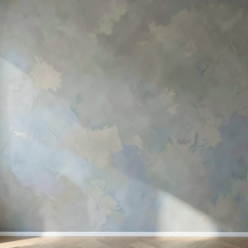
Venetian plaster is the wall finish that most people admire in photographs and most people apply incorrectly in practice, and the gap between the photographs and the practice comes down to one thing: the technique. Venetian plaster is not a product that produces a beautiful result simply by being spread on a wall. It is a craft finish whose quality depends entirely on the plasterer’s skill in the multi-coat application, the burnishing sequence, and the final polishing that produces the characteristic depth and luminosity of a correctly finished surface. The material is the vehicle; the technique is the result.
The depth of a correct Venetian plaster finish — the quality of looking into the surface rather than at it, the way light appears to travel through several layers of material before returning to the eye — comes from the application of multiple thin coats in slightly varying tones, each coat burnished before the next is applied, so that the final surface contains the color variation of several overlapping layers rather than the flat opacity of a single coat. A two-coat Venetian plaster application burnished between coats and polished at the end provides adequate depth for a wall in a residential interior. A three-coat application with a final wax polish provides the depth quality that the most refined luxury home interior applications achieve.
The color selection for Venetian plaster works differently from standard paint selection because the plaster’s translucency means the color reads differently from different viewing angles and under different lighting conditions. A mid-warm grey plaster shifts toward taupe in morning side light and toward soft blue in the even light of a north-facing room — the same material produces different experiences in different light conditions throughout the day. This shifting quality is the Venetian plaster wall’s most distinctive contribution to a room’s atmosphere, and it is the quality that makes the finish worth the investment over a standard paint application in any room where the wall surface is prominent and the light quality is rich.
4. A Brick Wall Exposed or Faux Brick
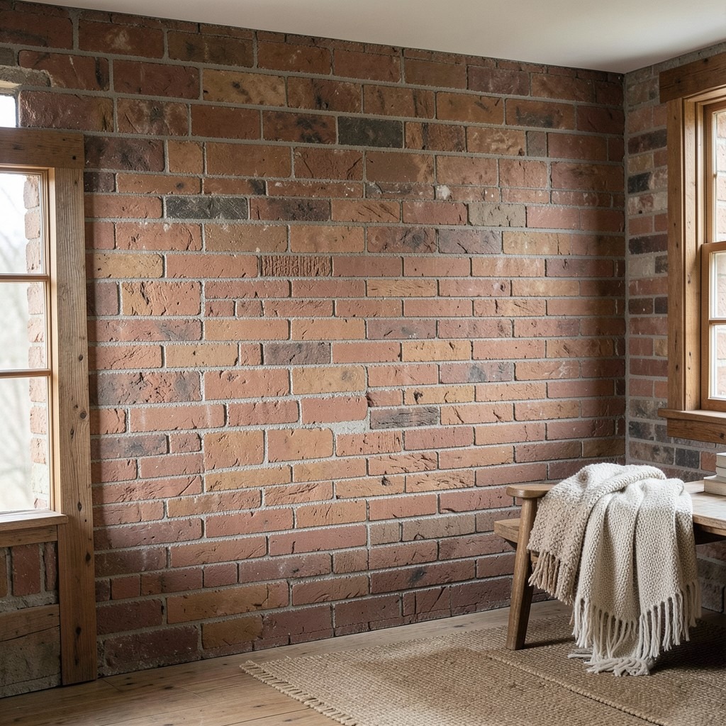
An exposed brick wall carries a specific material authority that no other wall treatment approaches in terms of texture, color depth, and the specific quality of permanence that a masonry wall provides. The mortar joints, the color variation between individual bricks from different firing positions in the kiln, the slight surface relief of a handmade brick’s face — these are the elements that combine to produce the wall whose material character is irreducibly specific to that particular wall, in that particular building, made from those particular bricks. A brick wall is not a surface treatment. It is the building expressing itself.
The industrial home design direction finds in exposed brick its most natural and most historically honest wall material — the Victorian factory, the converted warehouse, the Victorian terrace whose internal partition was always brick beneath the plaster that was applied for the standard domestic finish. Removing the plaster from an original brick wall in a period building requires the acceptance that the brick surface revealed may not be the perfectly pointed, evenly colored surface that the imagination supplies. Original brickwork may carry the remains of previous plaster adhesion, the staining of decades of absorption, and the pointing degradation that interior masonry without a weather exposure function accumulates over a century of occupancy.
The faux brick panel — a lightweight manufactured panel with a molded brick-pattern face, applied to the wall surface like a large tile — provides the brick aesthetic in spaces where the genuine article either does not exist or cannot be created without major demolition. The quality range among faux brick products is wide, and the selection must be made in person rather than from a photograph, because the close-range viewing of the material surface reveals the difference between a convincing cast texture and a flat, plastic-looking one far more honestly than any catalog image. The rustic home decor or mountain cabin decor direction that uses faux brick in a room whose other materials are genuine — reclaimed timber, natural stone accessories, wool textiles — produces the specific design environment where the faux brick’s quality is supported by the authenticity around it.
5. A Wallpaper Feature Wall

A wallpapered feature wall — a single wall covered in a patterned, textured, or illustrated wallpaper while the room’s other walls remain in a plain paint treatment — is the wall design decision that most efficiently introduces pattern, color complexity, and surface interest to a room without the cost or the commitment of papering four walls. The feature wallpaper wall is also the most frequently over-specified wall treatment in residential interiors, because the temptation to select the most visually dramatic paper available and apply it to the most prominent wall regardless of the room’s scale, its other surfaces, or its design direction, produces rooms whose wallpaper fights with everything around it rather than leading the room’s composition.
The wallpaper selection for a feature wall must begin with the room’s existing palette rather than with the wallpaper catalog’s front page. The paper’s dominant color should relate to the room’s existing tones — either drawing out a color that appears in the textiles or flooring in a more saturated version, or providing the contrast that the room’s palette needs without departing from its temperature range. A floral home decor wallpaper in a warm botanical palette — terracotta, sage, ochre — works on a feature wall in a room whose existing textiles and furniture carry those same tones in less saturated versions. The wallpaper reads as an intensification of the room’s existing color story rather than as an interruption of it.
The botanical and jungle-inspired home decor wallpaper directions — large-scale tropical leaves, dense botanical illustrations, oversized fern fronds — suit the feature wall application in rooms with adequate ceiling height because the large pattern scale requires vertical space to complete its repeat without the truncation that a low ceiling imposes on the pattern’s full composition. A tropical wallpaper whose leaf motifs are two hundred millimeters tall reads as a dramatic, immersive surface in a room with standard ceiling height. The same paper in a room with a low ceiling reads as a surface where the pattern is fighting the ceiling and losing. Matching the pattern scale to the wall’s available height is the specification discipline that most wallpaper feature wall decisions skip.
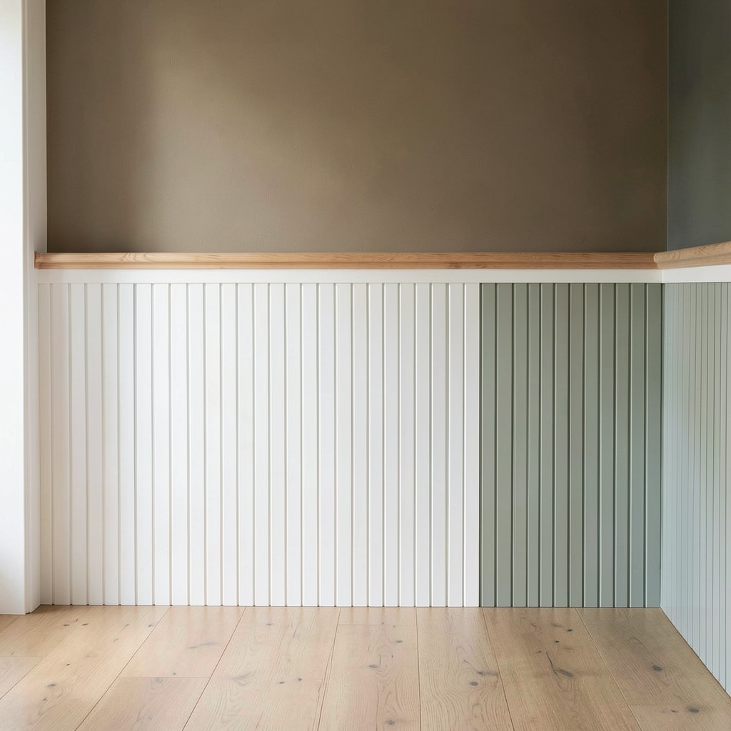
6. A Wainscoting and Panel Molding Wall

Wainscoting — the timber or painted panel treatment applied to the lower portion of a wall, typically from the skirting board to a dado rail height of approximately ninety to one hundred centimeters — is the wall design detail whose presence in a room communicates architectural intention more directly than almost any other single surface treatment, because wainscoting is not a decorative addition to a standard wall. It is the articulation of the wall’s surface into distinct zones, and that articulation is the difference between a wall that was built and a wall that was designed.
The traditional wainscoting of the Georgian and Victorian interior used raised and fielded timber panels — a frame of timber moldings surrounding a recessed central panel — in a paint-grade MDF or solid timber construction. The panel arrangement, the molding profile scale, and the overall wainscoting height all derive from the proportional conventions of the period whose interior tradition the room belongs to. A Georgian room with inadequately scaled moldings or a wainscoting height inconsistent with the room’s cornice profile reads as an approximation of the period rather than as its expression, and the investment in period-correct proportions produces a result whose quality rewards the research that the correct specification requires.
The contemporary wainscoting panel — a flat panel arrangement in MDF with a shadow gap or a minimal molding profile rather than the raised-and-fielded classical detail — suits the minimalist home design and the Scandinavian home interior directions whose wall treatments carry architectural order without period reference. A flat-panel contemporary wainscoting in a pale grey-green below a slightly lighter warm white wall above produces the two-tone wall treatment whose tonal division at dado rail height is one of the most consistently successful wall color strategies in residential interiors. The elegant home styling quality of a dining room with full-height panel moldings from skirting to picture rail — the wall surface organized in a complete architectural program from floor to ceiling — is the version of this idea whose ambition matches the room’s most formal occasion.
7. A Gallery Wall Arrangement
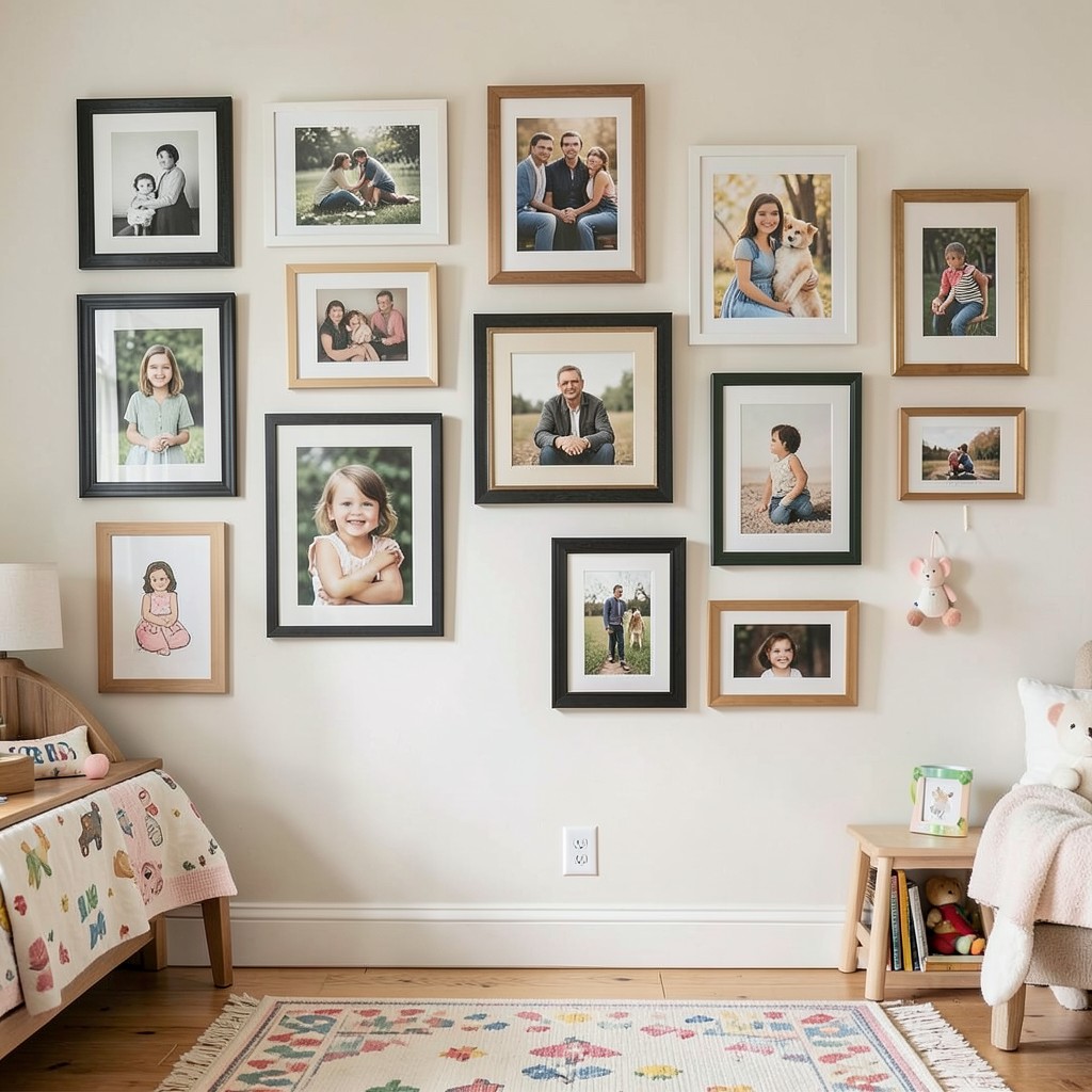
A gallery wall — the arrangement of multiple framed artworks, photographs, prints, or objects on a single wall surface in a composition that reads as a unified installation rather than as a collection of individual items — is the wall design approach that most directly expresses the household’s specific history, taste, and personality, and it is the approach that most easily becomes visually chaotic when the composition is assembled without a governing principle. The gallery wall is not a collection displayed on a wall. It is a composition made from a collection, and the distinction between the two determines whether the wall reads as a designed installation or as a crowded surface whose occupants keep adding things without an exit strategy.
The governing principle of a successful gallery wall can be a format consistency — all frames in the same material and color regardless of the image within them — or a tonal consistency — all images in a similar color palette regardless of their frame style — or a thematic consistency — all images drawn from the same subject, the same period, the same medium. Any of these principles provides the compositional cohesion that allows a diverse collection to read as a unified installation rather than as an accumulation of individual choices made on different occasions with no reference to one another.
The arrangement method for a gallery wall — the process of testing compositions on the floor before committing to the wall, using paper templates to mark positions before driving nails, beginning with the largest piece and working outward rather than filling from one corner — is the practical process that separates a successful installation from a wall full of misaligned holes. A bohemian kids room decor gallery wall whose arrangement is deliberately loose and asymmetric earns its informality through intentional composition rather than through the absence of composition. The fall home decorating moment — when the gallery wall receives new seasonal additions alongside the permanent pieces — is the moment the governing principle proves its value: new pieces either belong immediately within the established language, or they reveal that the wall never had a governing principle at all.
8. A Limewash Paint Wall

Limewash paint — a water-diluted slaked lime paint applied to walls in thin, overlapping layers with a wide brush that leaves the marks of each pass visible in the finished surface — produces a wall finish whose organic depth, color variation, and material fragility are the direct opposite of the flat, uniform opacity of modern latex paint, and it is the finish that has replaced Venetian plaster as the most sought-after artisanal wall treatment in contemporary residential interiors. The limewash wall is warm and irregular in a way that suggests the wall has lived rather than been decorated, and that quality is increasingly what the warmth-seeking domestic interior wants from its surfaces.
The application of limewash paint is more forgiving than Venetian plaster and more demanding than standard emulsion — it requires the wall surface to be porous enough to absorb the lime wash rather than repelling it, which means new plasterboard walls need a base coat of specialist primer rather than the standard PVA sealer that closes the surface’s porosity. Applied with a wide, natural-bristle brush in a cross-hatching technique whose brush marks are left visible rather than worked out, the limewash builds up in overlapping translucent layers whose color depth increases with each additional coat while maintaining the surface irregularity that is the finish’s defining quality.
The earthy home design direction — the palette of raw plasters, natural clay renders, warm ochres, and dusty terracottas that has characterized the most influential interior directions of the current decade — finds in limewash its most natural and most materially honest wall finish. A limewash wall in a warm stone tone, slightly darker at the corners where the lime wash was applied more thickly and the absorption more concentrated, produces the specific aged quality of a room whose walls feel as though the building produced them rather than a decorator applied them. This is the peaceful home decor quality that the limewash finish delivers better than any other wall treatment.
9. A Stone Veneer Accent Wall

A stone veneer wall — natural stone cut to a thin panel or split in thin sections and applied to the wall surface using stone adhesive and grout, producing the full visual and tactile character of a stone wall without the structural load of solid masonry — brings the material weight and the geological depth of natural stone into the domestic interior at an installation complexity that DIY installation handles competently at the smaller scale. The stone veneer wall does not pretend to be a structural stone wall. It is a stone surface, and the material quality of that surface — the color variation of natural mineral deposits, the texture of split or sawn stone faces, the thermal mass of the material itself — is genuine regardless of the thinness of the section.
The earthy home design and stone and wood home design directions find their most direct material expression in the stone veneer wall, whose geological color palette — the warm beiges and ochres of limestone, the cool greys of slate, the deep charcoals and amber veining of quartzite — provides the room’s most grounded and most enduring color reference. Stone does not fade, does not wear, and does not go out of style, because its color and texture are not a fashion choice. They are the record of the earth’s mineral composition at the point of the stone’s origin, and that specificity is part of what makes a stone wall feel permanent in a way that painted surfaces do not.
The desert home styling direction — the interior palette of warm sandstone, pale limestone, terracotta, and natural plaster that responds to the warm, arid landscape of high desert living — finds in the natural stone veneer wall its primary material anchor. A living room whose fireplace wall is clad in split-face travertine from floor to ceiling, the stone’s warm honey-cream tones warming the entire room’s palette from the focal wall outward, produces the specific quality of a room whose material story begins with the earth rather than with the paint chart.
10. A Reclaimed Wood Plank Wall

A wall clad in reclaimed timber boards — old barn wood, salvaged factory shelving, deconstructed packing cases, or architectural salvage timber cleaned and applied to the wall surface in a horizontal or vertical run — is the wall treatment that most directly brings the warm, worn, irreplaceable quality of material with a prior life into the domestic interior. The reclaimed plank wall is not an approximation of aged timber. It is aged timber, and the difference between the genuine article and the new timber stained to appear old is visible to any eye that has spent time in the presence of both.
The color range of reclaimed timber is determined by the species, the original use, the weathering history, and the specific conditions of the timber’s previous service. Old barn board in grey-weathered cedar produces the silver-grey surface that no amount of weathering powder on new timber replicates with complete accuracy. Reclaimed factory floorboard in worn pine carries the compressed patina of decades of foot traffic in a surface whose color depth and grain compaction new timber cannot match. The specific character of the material — the history it carries in its surface — is the design quality that makes the reclaimed plank wall worth the sourcing effort and the higher cost per square meter that salvaged material commands over new boarding.
The rustic home office ideas wall — a single wall behind the desk clad in reclaimed barn board in varying widths and tones, the irregularity of the boards’ dimensions and surfaces providing the visual texture that the office’s functional furnishings lack — is the wall treatment that most directly improves the working atmosphere of a home office space. The rough warmth of the timber behind the desk provides the visual counterweight to the screen’s digital surface, and the wall’s material character grounds the workspace in the physical world in a way that painted surfaces and acoustic panels simply do not achieve at the same atmospheric depth.
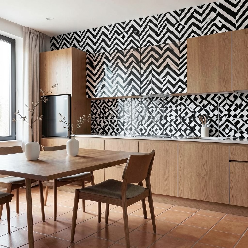
11. A Tiled Feature Wall

A tiled wall in a domestic interior beyond the bathroom or kitchen — a living room wall, a dining room wall, an entry hall feature, a fireplace surround — is the wall design decision that most confidently crosses the boundary between the utilitarian application of tile as a practical surface and the deliberate application of tile as an architectural wall material whose color, pattern, and texture are the primary design intention. Tile on a non-wet-area wall is not unusual in the global domestic design tradition — the Moroccan zellige wall, the Portuguese azulejo interior, the Spanish ceramic panel — and the contemporary residential interior that adopts this tradition produces a wall whose material character no paint treatment can provide.
The encaustic cement tile — a handmade tile whose pigmented cement face contains the pattern within the tile body rather than as an applied glaze, producing a slightly matte, deeply colored surface whose geometric pattern reads as a designed composition across the full wall field — is the tiled wall treatment that most suits the bohemian home styling and the earthy home design directions. An encaustic tile feature wall in a dining room or a kitchen — the tiles covering the wall behind the dining table or above the kitchen counter in a dense geometric pattern of terracotta, cobalt, and cream — produces the material richness that no other wall surface provides in those color relationships and at that pattern density.
The large-format porcelain tile in a stone-effect finish — marble-look, slate-effect, or travertine-pattern in slabs of one thousand by three hundred millimeters or larger — provides the contemporary wall tile treatment whose scale and surface quality suit the luxury master bedroom design or the minimalist dining room whose wall surface requires the material quality of stone without the weight and the structural implications of natural stone cladding. The large format reduces the visible joint pattern to a minimum, and the stone-effect surface provides the color variation and the mineral depth that a uniform paint surface cannot replicate.
12. A Chalkboard Paint Wall
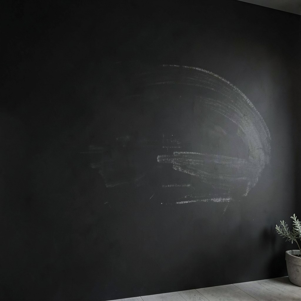
A chalkboard paint wall — a wall surface coated in the specialized paint that accepts chalk marking and wipes clean with a damp cloth, converting the wall into a functional writing and drawing surface — is the wall treatment most commonly consigned to children’s rooms and kitchens, which are the right contexts for it but not the only ones where its specific combination of functional character and flat matte surface produces a useful design result. The chalkboard wall in a home office or a creative workspace provides the large-scale thinking surface that professional creative environments use as their primary ideation tool, and the wall’s functional character in this context produces a working atmosphere that the painted wall cannot provide.
The deep matte black of chalkboard paint has a specific aesthetic quality beyond its functional one — the flat, light-absorbing surface in a deep near-black tone produces the contemporary wall treatment that the minimalist home design or the industrial home design direction adopts for its specific non-reflective, color-absorbing quality rather than for its chalk-accepting function. A chalkboard-painted wall in a kitchen used as a menu board, a shopping list surface, and an occasional surface for drawings and notes integrates the functional and the decorative in a wall treatment whose daily use keeps it alive rather than static. The wall that can be written on is the wall that changes every week, and that temporal quality is part of its design contribution.
The practical preparation for a chalkboard paint wall requires the same surface smoothness as any dark matte paint application — imperfections are amplified by the flat finish and the dark tone — plus the specific curing and conditioning step that the first chalk application requires to prevent ghost marks from the initial use from becoming permanently visible in the surface. Conditioning the wall by rubbing the side of a chalk piece across the entire surface and then erasing it before the first use fills the surface’s microscopic porosity and prevents the first marks from penetrating deeper into the paint film than subsequent marks do.
13. A Macramé Wall Hanging Display

A macramé wall hanging — a hand-knotted textile of natural cotton, jute, or hemp cord suspended from a timber dowel, branch, or metal rod and mounted on the wall as an artwork-scale textile installation — is the wall treatment most directly associated with the bohemian home styling direction, and it earns that association through the specific combination of natural material warmth, handmade character, and the soft textural quality that no rigid wall surface provides. The macramé wall hanging is the wall’s equivalent of a textile thrown over furniture — it softens, warms, and personalizes in a way that the wall’s hard surface alone cannot.
The scale of a macramé wall hanging must be resolved in relationship to the wall it occupies and the furniture below it — a hanging whose width spans approximately two thirds of the sofa below it or two thirds of the headboard behind it reads as correctly scaled for those positions, providing the visual anchor that the furniture grouping needs without overwhelming the wall. A hanging too small for the wall reads as a craft object displayed on the wall rather than as a wall treatment; a hanging too large for the wall’s available width fights the room’s proportional relationships and produces the visual crowding that the soft material’s warmth was intended to prevent.
The bohemian kids room decor bedroom wall whose oversized macramé forms the canopy effect above the bed — a large knotted panel hanging behind and above the headboard, its fringe falling toward the pillows — produces the specific quality of a room that a child experiences as a personal, handmade environment rather than as a decorated space. The natural cotton fiber’s warmth, the irregular rhythm of the knots, and the specific character of a made object whose production was visible in every inch of its material combine to produce a wall treatment that no manufactured product replicates. This is the wall design that a parent makes for a child, and that origin is part of what the room communicates.
14. A Mirror Wall or Large Mirror Feature

A wall fitted with a large mirror — or a composition of multiple mirrors arranged to create a substantial reflective field — is the wall design tool that most efficiently addresses the two most common spatial complaints in domestic interiors: the room that feels too small and the room that feels too dark. The mirror multiplies the apparent width of the room by reflecting its opposite wall and extending the space visually beyond its physical boundary. The mirror doubles the room’s light by reflecting every light source and every window back into the space. These are not illusions in the pejorative sense — they are genuine improvements to the room’s spatial quality delivered through optical principles that have been used in domestic interiors for centuries.
The placement of the mirror wall or large mirror feature determines which spatial quality it most directly addresses. A floor-to-ceiling mirror on the wall at the end of a narrow hallway — reflecting the full length of the corridor back to the viewer at the entry — doubles the hall’s apparent length and produces the Scandinavian hallway design quality of a long, light-filled approach to the house’s interior. The same mirror on a side wall reflects the hallway’s width and the window or door openings on the opposite wall, multiplying the available light rather than extending the linear dimension. The choice between these positions is a choice between which spatial quality most needs the mirror’s contribution in that specific space.
The mirror wall in a dining room — a full wall of mirror behind the dining table, reflecting the table setting, the pendant light above it, and the faces of the people gathered at it — is the wall treatment of the traditional brasserie and the intimate private dining room that the luxury home interior adopts for its specific quality of making the room appear populated and lively even when it is not in use. The reflected pendant doubles in apparent number, the reflected table setting doubles in apparent abundance, and the room reads as a more significant gathering space than its physical dimensions alone would support.
15. A Concrete Effect Wall

A concrete effect wall — achieved through either a genuine micro-cement or concrete overlay applied to the wall surface, or a specialist paint system that replicates the visual character of polished concrete at a fraction of the application complexity — is the wall treatment that most directly imports the industrial home design aesthetic into the domestic interior without the structural implications of genuine poured concrete. The concrete wall’s grey, slightly matte, mineral surface quality reads as neither warm nor cool in isolation — it is a surface that takes its atmospheric character from the materials and light sources surrounding it, which makes it one of the most versatile neutral wall treatments in contemporary residential design.
The micro-cement wall overlay — a two-component cement-based product applied by trowel in two to three millimeter total thickness over any prepared substrate — produces a genuinely concrete-like surface whose color and texture range from the very pale, almost white troweled finish of a polished application through the mid-grey of a standard application to the deep charcoal of a pigmented dark specification. The troweling technique leaves directional marks in the surface whose scale and density determine the surface’s visual texture — a finely worked surface reads as close to polished and smooth, while a more openly troweled finish reads as raw and industrial.
The modern kitchen ideas direction that adopts the micro-cement wall as the primary surface treatment — covering the kitchen walls from worktop to ceiling in a continuous concrete-grey field whose material continuity makes the kitchen read as a single architectural gesture rather than a composition of individual surface decisions — produces the specific quality of a kitchen that belongs to the contemporary home ideas category rather than to the standard domestic kitchen specification. The micro-cement wall’s resistance to moisture and its wipeability in the kitchen context provides the practical performance that the aesthetic ambition requires.
16. A Fabric-Upholstered Wall Panel

A wall panel upholstered in fabric — a timber-framed panel covered in a stretched textile surface and fixed to the wall as an applied feature — is the wall treatment that brings the acoustic absorption, the tactile warmth, and the material richness of textile into the wall plane in a form that can be installed, moved, and replaced without permanent alteration to the wall surface beneath it. The upholstered wall panel is the wall design solution for the rental property, the listed building, and the indecisive homeowner equally — it provides the design commitment of a fully treated wall without the permanence that paint or plaster requires.
The fabric selection for an upholstered wall panel must account for the wall’s visual conditions differently from the same fabric used for curtaining or cushioning — the flat, stretched application on the wall plane emphasizes the fabric’s weave structure, its surface texture, and its color in a way that the gathered, folded, or piled application of the same fabric does not. A bouclé or heavy weave fabric whose looped or knotted texture produces tactile interest reads as a wall surface treatment with genuine three-dimensionality. A smooth, tightly woven fabric whose surface is flat reads as a colored wall panel rather than as a textile wall — still valid, but a different design register.
The luxury master bedroom design context where the upholstered wall panel performs most compellingly is the headboard wall — a full-width panel behind the bed, upholstered in a deep-toned velvet or a soft, napped fabric that absorbs the bedside lamp’s light and provides the acoustic softness that the bedroom’s relaxed, quiet atmosphere requires. This is the wall treatment that the hotel suite uses for the same reason — the upholstered headboard wall converts the bedroom from a room with a bed in it to a room whose design intention was the bed’s specific comfort and enclosure. The cozy bedroom design quality this creates is not incidental. It is the purpose of the treatment.
17. A Hand-Painted Mural Wall

A hand-painted mural on a wall — an artwork applied directly to the plaster or painted surface by an artist using the full scale of the wall as the canvas — is the wall design decision that most completely eliminates the possibility of the room existing anywhere else, in any other form, in any other home. The mural wall is site-specific by definition, and site-specificity is one of the most valuable qualities an interior can have. A room with a mural is a room that could not be transplanted elsewhere without losing its defining characteristic, and that rootedness to its specific setting is the quality that makes the mural wall the most personally committed wall treatment in this collection.
The scale of the hand-painted mural is the design condition that most separates the residential mural from the framed artwork it superficially resembles. A mural that occupies the full wall surface — from skirting to ceiling, from corner to corner — changes the room’s spatial experience because the artwork is no longer an object within the room. It is the room’s boundary, and the boundary of a room is the element that most fundamentally defines the space. A bedroom wall painted with a nocturnal forest scene in deep greens and black with the moon at ceiling height converts the room from a bedroom with decorated walls into a room that exists inside a painted forest, and the distinction between those two experiences is felt rather than described.
The commissioning process requires an artist whose specific style — whether botanical illustration, abstract expression, figurative narrative, or geometric pattern — matches the room’s design direction and the household’s genuine sensibility rather than the most popular mural trend at the time of the commission. The tropical home design living room whose mural depicts an oversized botanical composition of palm leaves and tropical blooms in saturated color, painted from floor to ceiling across the room’s longest wall, produces the total environment of the jungle-inspired home decor direction rather than simply referencing it through accessories and textiles.
18. A Herringbone Wood Block Wall

A wall clad in timber blocks or strips arranged in the herringbone pattern — the forty-five-degree alternating diagonal arrangement whose directional shift at each course produces the characteristic V-within-V visual rhythm — is the wall treatment that combines the natural warmth of timber with the geometric complexity of a designed pattern in a surface whose visual interest increases rather than decreases with close inspection. The herringbone wall reads from across the room as a warm, textured surface with directional energy. From close range, the individual pieces reveal their wood grain, their slight color variation, and the precision of the angle cuts at every joint.
The material for a herringbone wall can range from solid hardwood strip at full depth — producing a wall of real structural mass and genuine material quality — through engineered timber veneer applied over MDF backing — producing the timber appearance at reduced depth and cost — to the reclaimed timber block interpretation, where short pieces of reclaimed floorboard or parquet in varying tones are arranged in the herringbone at a slightly irregular scale that the reclaimed material’s dimensional variation produces without calculation. The reclaimed herringbone wall is the version most consistent with the earthy home design and rustic home decor directions, while the uniform engineered strip herringbone suits the Scandinavian home interior and the contemporary home ideas palette.
The wall position for a herringbone timber treatment should be selected for the visual impact that the pattern’s directional energy provides rather than for the simple reason of wanting a feature wall. A herringbone wall behind a dining table reads as a backdrop whose geometry is animated by the candlelight and the conversation below it. A herringbone wall at the end of a hallway receives the full-length viewing distance that allows the pattern’s geometry to resolve completely — the eye has enough distance to read both the individual pieces and the composed field simultaneously. That dual scale reading is what makes the herringbone pattern genuinely rewarding rather than merely decorative.
19. A Botanical Wallpaper Wall

A botanical wallpaper — a paper whose design uses botanical illustration, oversized leaf forms, garden-inspired interiors motifs, or floral home decor patterns as its primary visual element — is the wall treatment that most directly connects the interior to the natural world from which domestic design has drawn its most enduring ornamental language, and it is the wallpaper category whose range spans the most extreme design territory: from the delicate, museum-quality botanical engravings of the historical illustration tradition to the oversized, graphic leaf compositions of contemporary surface design, with every degree of scale, color intensity, and illustrative style between those poles.
The scale of the botanical motif determines the wallpaper’s relationship with the room’s spatial perception. Large-format botanical patterns — palm fronds at near-life scale, banana leaves at half-scale, oversized peonies whose single flower heads span thirty centimeters of the paper’s surface — produce the immersive, environmental quality that the jungle-inspired home decor and tropical home design directions pursue at their most committed. The room feels inhabited by the botanical elements rather than decorated with them, and that distinction — between a room that contains plants and a room that exists within a botanical environment — is the specific spatial quality that oversized botanical wallpaper provides at its best.
Small-scale botanical prints — the repeat of small wild flowers, the tossed meadow pattern of scattered botanical specimens, the delicate allover of fine fern fronds — provide the botanical wallpaper quality at a visual density that suits smaller rooms and lower ceilings because the pattern’s small scale does not overwhelm the available wall surface. A spring bedroom decor refresh using a small-scale botanical print in soft sage, pale cream, and warm blush on a single feature wall behind the bed produces the garden-inspired interiors quality of a room that is bringing the outside spring season indoors — the specific wall treatment that changes the bedroom’s seasonal atmosphere most directly from the winter interior design palette to the fresh, plant-adjacent quality of spring.
20. A Paneled Wall With Integrated Shelving

A wall that combines applied panel moldings with integrated shelving — the panel arrangement providing the architectural organization of the wall surface while the shelving units occupy specific panel fields as built-in storage within the wall’s decorative program — is the wall design approach that most efficiently converts a flat wall into an architectural element, a storage system, and a display surface simultaneously, and whose integrated character produces the quality of a room that was designed rather than furnished, because the shelving belongs to the wall rather than standing in front of it.
The integration of shelving within a paneled wall requires the panel arrangement to account for the shelving unit’s dimensions from the initial layout — the shelf bays defined by the panel moldings, the fixed shelves at heights determined by the items to be displayed, and the solid panel fields between the shelf bays providing the visual continuity that makes the wall read as a single composed surface rather than as a bookcase with decorative trim around it. A sitting room whose entire chimney breast wall — from flanking alcoves to central fireplace — is organized in this combined panel-and-shelving treatment produces the traditional home interiors quality of a room whose walls were designed as complete architectural compositions rather than as paint surfaces waiting for furniture to stand in front of them.
The contemporary version of the paneled wall with integrated shelving replaces the classical molding profiles with shadow gaps, slim metal strips, and flat panel divisions in a material vocabulary that suits the minimalist dining room or the modern home design sitting room equally well. In this version, the shelving is held within the wall by concealed bracket systems whose fixings are hidden behind the shelf faces, and the result — shelves that appear to float within the wall’s flat paneled surface without visible support — is the contemporary wall treatment that most elegantly combines function and spatial quality in a single architectural gesture.
21. A Mosaic Tile Wall

A mosaic tile wall — small glass, ceramic, stone, or metal tesserae arranged in a pattern, a composition, or a continuous field whose individual elements combine to produce a surface of color, light reflection, and texture that no large-format tile or paint treatment can replicate — is the wall treatment with the deepest historical precedent in the decorative arts, stretching from Byzantine church interiors through the Islamic geometric tradition through the Catalan Art Nouveau mosaic of Gaudí’s Barcelona to the contemporary glass mosaic kitchen splashback of the standard residential renovation. The mosaic wall has never left the building. Its applications have simply changed with the rooms and the cultures that needed it most.
The glass mosaic wall — individual glass tesserae in a color range from the palest pale to the deepest saturated jewel tone, arranged in a running bond or a diagonal grid on a mesh backing that simplifies installation — is the mosaic material that most directly imports the light-reflecting quality of genuine Byzantine mosaic into the domestic interior. The glass tesserae reflect light from their slightly irregular surfaces in directions that flat tile and paint do not, and the wall that catches the morning light through a window opposite it shifts in its apparent color and luminosity as the light angle changes across the room. This is the mosaic wall’s defining quality: it is never the same surface twice in the same day.
The farmhouse bathroom decor or the coastal home design bathroom whose shower enclosure is tiled in a handmade ceramic mosaic in ocean blues, sandy neutrals, and sea-glass greens produces the complete material environment of a bathroom that references its landscape without illustration or representation — the material’s color and texture are the reference, carried through the room’s primary surface without a single figurative motif. The tactile quality of the handmade ceramic mosaic, whose slight surface irregularity is felt by the hand as well as seen by the eye, adds the physical dimension that the bathroom — a room entered in the body’s most direct relationship with the physical environment — rewards more than any other domestic space.
22. A Grasscloth Wallcovering Wall

Grasscloth wallcovering — a natural woven material made from grasses, sea grasses, jute, sisal, or other plant fibers adhered to a paper backing and applied to walls as a wallcovering — is the wall treatment that produces the most consistent quality of warmth and natural material character across the widest range of interior design directions, from the coastal home design and beach house interiors palette through the relaxed home design and warm home decor ideas context to the earthy home design direction whose entire material philosophy grasscloth embodies. It is not a trendy material. It is a material with the kind of enduring relevance that comes from being genuinely good rather than from being currently fashionable.
The weave variation of grasscloth products — from the tight, fine weave of premium sea grass at near-paper smoothness through the open, chunky weave of chunky jute that reads as almost rope-like from across the room — provides the material range within the grasscloth category that allows specification to respond to the room’s design requirements. A fine-weave grasscloth in a pale natural tone produces the wall quality closest to a warm, textured paint — the material’s identity is present but quiet. A heavy, open-weave grasscloth in a deep caramel or forest green produces a wall of strong material presence whose texture and color are the dominant design contribution.
The practical limitation of natural grasscloth is its vulnerability to moisture and humidity — the plant-fiber material is damaged by sustained contact with water, which restricts its appropriate application to rooms without high humidity fluctuation. The bedroom, the living room, the dining room, the hallway, and the study are all appropriate grasscloth rooms; the kitchen, the bathroom, and the laundry are not. Manufacturers offer synthetic grasscloth alternatives — woven textile products that replicate the visual character of natural fiber grasscloth with significantly improved moisture resistance — for applications where the grasscloth aesthetic is desired but the room’s conditions exclude the genuine natural material.
23. A Striped Wall Painting Technique

A striped wall — painted in alternating bands of two colors or two tones of the same color, running either vertically or horizontally across the full wall surface — is the wall treatment that most directly and most cost-effectively uses paint to alter the room’s perceived proportions, and it is one of the few wall design techniques whose primary function is architectural rather than decorative. Vertical stripes increase the apparent height of the wall they occupy by directing the eye upward along the lines. Horizontal stripes increase the apparent width by directing the eye laterally along them. These effects are not subtle on a correctly scaled stripe, and they are the specific wall design tool for rooms whose dimensions need optical correction rather than decoration.
The stripe width determines the treatment’s register — whether it reads as pattern or as architectural articulation. Narrow stripes of twenty-five to fifty millimeters produce a pattern-forward wall whose rhythm is visually active and whose decorative character dominates its spatial contribution. Wide stripes of three hundred millimeters or more produce a wall whose tone blocks are large enough to read as architectural zones rather than as pattern, and whose proportional effect on the room’s perceived dimensions is more directly spatial. The traditional regency stripe — tall, narrow bands in a high-contrast pairing of a deep tone and a pale tone — occupies the middle ground between pattern and architecture, and it produces the traditional home interiors quality of a wall that is simultaneously decorated and organized.
The tonal stripe — two values of the same color family rather than two contrasting colors — is the stripe treatment that suits the contemporary home ideas and Scandinavian home interior directions whose wall palette is restrained and whose design language values subtlety over contrast. A wall painted in alternating bands of deep sage and pale sage produces a stripe visible in the room’s oblique light but reading as a unified color field from directly opposite, and the stripe’s presence reveals itself differently depending on where the viewer stands in the room. This responsive quality — the surface that changes character with viewing position — is the design sophistication of the tonal stripe that the high-contrast version does not provide.
24. A Rattan or Wicker Panel Wall

A wall panel in rattan or wicker — the woven plant material whose geometric or natural weave pattern provides both the texture and the light filtration quality of a natural fiber screen — is the wall treatment that most directly imports the warm, organic material character of tropical home design and beach house interiors into the domestic wall surface in a format that provides both visual and tactile warmth simultaneously. Rattan does not merely look warm. It feels warm when touched, and a wall panel that invites touch — whose surface rewards the hand as well as the eye — produces the specific quality of a domestic interior that engages the body rather than only the visual sense.
The rattan panel wall works most naturally as a feature wall application — a single wall in a bedroom, a dining room, or a sitting area clad in woven rattan panels whose warm honey tones provide the room’s primary material note. The panel format allows the rattan’s woven surface to be presented flat against the wall with a consistent gap revealing the wall color behind it through the weave’s open areas, and this light-passing quality gives the rattan wall panel its specific visual depth: the dark background showing through the pale fiber, the weave casting its own micro-shadow in direct light, the panel’s overall tone shifting between the fiber’s color and the void’s color depending on the viewing angle and the light source.
The bamboo home interiors and garden-inspired interiors design directions find in rattan the natural material companion to bamboo flooring, cotton textiles, and ceramic accessories whose collective material palette produces the organic, plant-derived interior environment that the tropical home design and breezy home interiors aesthetics pursue. A bedroom with a rattan panel feature wall, bamboo flooring, linen curtains, and ceramic bedside lighting produces the total material environment of a room that exists in sensory relationship with the natural world rather than in opposition to it.
25. A Limewashed Brick Wall

A limewashed brick wall — the specific treatment where lime wash is applied over existing brick to create a semi-transparent white or tinted coating that partially obscures the brick’s surface while allowing its texture and color to read through the wash layer — is the wall treatment that most elegantly resolves the tension between the brick wall’s industrial material character and the warm, organic domestic atmosphere that many homes need from the same surface. The limewashed brick is not a white painted brick wall. The brick is still visible. The wall’s material identity is still brick, but filtered through the lime wash’s translucent white in a surface that reads as simultaneously masonry and luminous.
The application technique for limewashing brick requires a diluted lime wash — mixed to approximately the consistency of full-fat milk rather than the thicker cream consistency of a wall application — applied with a wide stiff brush in a scrubbing motion that works the lime into the brick surface’s texture and mortar joints rather than coating the surface in a continuous film. The dilution ratio determines the degree of coverage: a more diluted wash allows more of the original brick color and texture to read through the final surface, while a less diluted wash provides a more opaque, whiter result that approaches the painted brick appearance while retaining the textural depth that the lime wash’s transparency over the brick’s relief provides.
The farmhouse home decor or coastal home design interior whose original brick wall receives a limewash treatment as part of a seasonal home makeover — converting the raw red-orange of an exposed Victorian brick wall into the softer, more neutral surface that the room’s evolved color scheme requires — gains both a practical surface improvement and a material quality that the original brick’s color alone did not provide. The limewashed brick wall in a kitchen with pale linen window treatments, warm timber shelving, and ceramic accessories produces the specific quality of a room whose materials are all natural, all imperfect, and all better for it.
26. A Living Plant Wall

A living plant wall — a vertical garden system installed on an interior wall surface, supporting a planted grid of growing plants whose foliage covers the wall face in a continuously living surface — is the wall treatment that most fundamentally changes the experience of the room it occupies, because a living wall is not a wall treatment in the static sense. It is a wall treatment that breathes, that grows, that changes with the seasons, and that responds to the light quality and the humidity of the room in ways that the room itself becomes part of. The living wall is not decoration. It is an ecosystem on a vertical surface.
The plant selection for an interior living wall must begin with the room’s light conditions because the available light is the constraint that determines the plant palette more completely than any other factor. A living wall in a bright, south-facing room can support a wide range of species including flowering plants, trailing vines, and small-leaf herbs. A living wall in a north-facing or internally positioned room requires the shade-tolerant species — pothos, ferns, certain peperomias, and the Zanzibar gem — whose physiological adaptation to low light allows them to sustain the growth and vigor that the wall’s planted surface requires for visual health.
The garden-inspired interiors bedroom whose headboard wall is a living plant wall — a grid of shade-tolerant ferns, trailing pothos, and heart-leaf philodendrons installed in a modular pocket system with integrated drip irrigation — produces the specific quality of sleeping with your head at the base of a garden rather than against a painted surface. The humidity benefit of the living wall in a bedroom — the transpiration from the plants’ leaf surfaces adding moisture to the room’s air and improving the sleep environment’s respiratory comfort — is the practical contribution that makes the living plant wall in the bedroom more than an aesthetic decision.
27. A Textured Paint Wall

A textured paint wall — a wall surface finished in a paint application that produces a three-dimensional surface quality rather than the flat opacity of standard emulsion — covers the range from the subtly granular surface of a fine aggregate paint through the pronounced relief of a dragged or combed finish to the deeply sculptural surface of a knife-applied thick plaster paint in bold impasto strokes. The textured paint wall is the wall design approach that adds visual depth and shadow quality to the wall surface without the commitment of a applied material treatment, and its range of techniques allows almost any degree of surface complexity from the barely perceptible to the strongly tactile.
The sand texture paint — emulsion mixed with fine sand aggregate or a purpose-manufactured sand texture paint product — produces the slightly gritty, granular surface that reads from a distance as a warm, matte wall but rewards close inspection with the mineral texture of a surface that catches light along its tiny irregular peaks. This is the most widely used textured paint treatment in residential interiors precisely because its subtlety suits the broadest range of design directions — the farmhouse home decor kitchen, the warm home decor ideas bedroom, the contemporary home ideas dining room, and the coastal home design sitting room all accept the sand texture paint’s understated material quality without the treatment competing with the room’s other design elements.
The heavy impasto paint technique — applying a thick, slow-drying wall paint with a broad palette knife in directional strokes that leave bold surface relief — produces the wall treatment closest to a sculptural surface without the structural commitment of applied plaster. The finish reads from across the room as a deeply textured wall with a specific directionality — the tool marks running consistently in one direction across the wall’s face — and it produces the strongest shadow pattern of any paint-based wall treatment when the wall receives raking light from a window or lamp positioned at an oblique angle to the surface.
28. A Full-Wall Bookcase

A full-wall bookcase — floor-to-ceiling shelving units covering an entire wall surface from one side to the other in a continuous storage and display installation — is the wall treatment that most directly converts the room it occupies from a living space with storage in it to a room whose entire character is defined by what it contains. The full-wall bookcase is not furniture arranged against a wall. It is the wall itself, redesigned as the medium for the household’s intellectual and cultural life, and the distinction between those two descriptions is felt in every minute spent in the room the bookcase inhabits.
The design of a full-wall bookcase must resolve the tension between the uniform grid — where every shelf bay is identical in dimension and position, producing the clean, organized character of a library — and the varied grid — where shelf heights are adjusted to accommodate the specific dimensions of the books, objects, and art the shelves will hold, producing the more organic, accumulated quality of a collection that has grown rather than been installed. The uniform grid produces the minimalist home design quality of a bookcase whose order is architectural rather than personal. The varied grid produces the rustic home office ideas quality of a bookcase whose disorder is evidence of genuine use rather than stylistic arrangement.
The paint color of the bookcase — whether it matches the wall color to read as built-in architecture, contrasts with the wall to read as a freestanding installation, or is painted in the room’s accent color to read as a feature — is the decision that most determines the bookcase wall’s design register. A bookcase painted floor-to-ceiling in the same deep tone as the room’s accent wall — a deep navy, a forest green, a rich burgundy — and then filled with books whose spines are edited for tonal consistency produces the bookcase wall of the luxury home interior whose library quality is a designed environment rather than a practical storage solution.
29. A Stucco Wall Finish

Stucco applied to an interior wall carries the weight of centuries in its material character, and that weight is not metaphorical — it is the actual physical density of a lime or cement-based plaster coat whose mass gives the wall a thermal presence and a surface depth that no lightweight cladding system provides. The color of stucco derives from the pigments mixed into the base material rather than from a paint layer applied over a neutral surface, which means the color is within the wall rather than on it, and the difference between a pigmented stucco and a painted wall is the difference between a material with intrinsic color and a surface that was colored after the fact.
The desert home styling interior finds in stucco its most naturally appropriate wall finish — the warm, sandy plaster surfaces of Southwestern American and North African architecture are stucco walls whose color reads as an extension of the landscape surrounding the building rather than as a design decision made independent of it. A stucco wall in a warm ochre or pale terracotta in a sitting room with arched openings, low timber furniture, and hand-woven textiles produces the specific quality of a room whose every element belongs to the same material tradition and whose overall character is therefore coherent rather than assembled.
The application of a fine stucco wall finish requires a skilled plasterer working in multiple thin coats, each coat scraped or troweled to the surface condition required before the next is applied. The final polished stucco surface — rubbed smooth with a steel trowel in the manner of marmorino, the traditional Venetian polished stucco — achieves the specific combination of surface smoothness and color depth that transforms a plaster wall into a material surface whose quality is unmistakable at first sight. This is not a weekend DIY project, and the cost of skilled application is the cost the result requires.
30. A Fluted Wall Panel Design
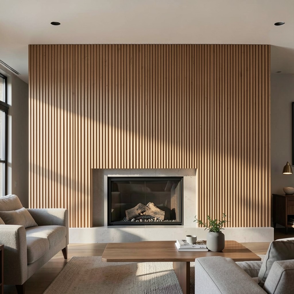
Fluted panels — vertical grooved surfaces whose parallel channel profile casts shadow lines across the wall face and produces the three-dimensional quality of a wall that has been carved rather than applied — are the wall treatment that contemporary interior design has adopted most widely across every design direction, and the reason for that universal adoption is the fluted panel’s specific combination of material depth and formal restraint. The fluting reads as architectural without referencing a specific historical period, as textured without being decorative, and as warm when executed in timber without being rustic. It is the wall treatment with the widest range of compatible design contexts available.
The timber fluted panel — vertical grooves routed or machined into an MDF or solid timber sheet, stained or painted to the required finish and fixed to the wall surface on a batten framework — provides the domestic fluted wall treatment that suits the modern home design direction, the Scandinavian home interior, and the contemporary home ideas living room equally. The groove depth and the rib width between grooves determine the panel’s visual shadow pattern: deeper grooves with narrow ribs produce a more strongly shadowed surface whose vertical lines read as bold from across the room, while shallow grooves with wide ribs produce a subtler texture whose character becomes apparent only in raking light.
The fireplace wall whose entire surround from floor to ceiling is covered in fluted timber panels — the grate and mantel expressed as a carved opening within the continuous fluted field — is the contemporary wall treatment that the luxury home interior and the chic home decor direction have both adopted as the focal wall solution whose material quality and geometric precision suit the design ambitions of the best residential interiors being built and renovated. The fluted fireplace wall requires no additional decoration — no artwork, no accessories, no mirror above the mantel — because the fluted surface itself provides the visual interest that the room’s focal wall requires from every viewing angle.
31. A Black and White Graphic Wall
A black and white graphic wall — a wall surface whose treatment relies entirely on the contrast between the two tones to produce its pattern, composition, or architectural effect — is the wall design approach that most directly removes color from the design conversation and forces the composition to perform on geometry, scale, and contrast alone. That removal of color is not a limitation. It is a discipline, and the design that performs on black and white alone carries a clarity and a confidence that color-dependent treatments cannot replicate because the color is doing some of the work for them.
The geometric black and white wall — painted in a bold repeating pattern of chevrons, diamonds, hexagons, or a graphic grid — produces the wall treatment most associated with the bold maximalist residential interior whose design commitment to pattern and contrast is its defining quality. The pattern’s scale must be calibrated for the wall’s dimensions: a pattern repeat whose width spans approximately one tenth of the wall’s total width reads as correctly scaled for the standing viewing distance of a standard domestic room, producing the tile-like quality of a composed surface rather than the chaotic density of a pattern too small for its field or the graphic boldness of a pattern too large for its wall.
The black and white wall in a minimalist dining room or a contemporary home ideas kitchen achieves the graphic quality of the patterned wall without the color commitment that a chromatic pattern requires, which makes the black and white graphic wall the choice for rooms whose other surfaces already carry the color. A kitchen with warm timber cabinetry, terracotta floor tiles, and a bold black and white geometric splashback wall produces the specific quality of a room whose surface contrasts are dramatic without being discordant, because the black and white pattern holds the room’s stronger colors in a neutral framework that allows them to coexist without competition.
32. A Recessed Niche Wall
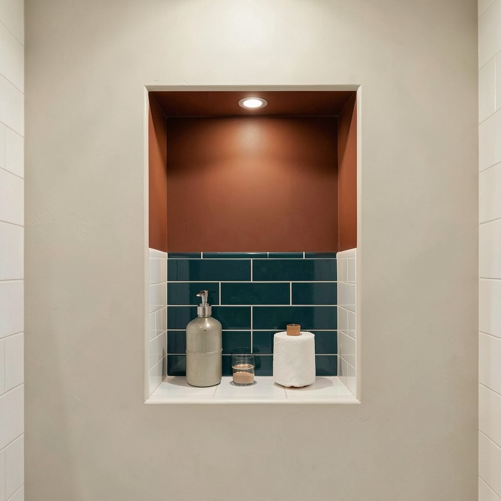
A recessed wall niche — an opening cut or formed into the wall surface to create a shallow recess of defined dimensions, typically used for display, lighting, or architectural accent — is the wall design approach that produces architectural depth in a flat wall without applying any surface material at all. The niche operates through absence: the removal of wall material creates the shadow and the depth that provide the visual interest, and the objects or light placed within the niche receive the specific quality of framed display that a wall plane interruption uniquely provides. Nothing else frames an object as directly as the architecture of the wall itself.
The painted niche interior — a niche whose back wall and sides are painted in a contrasting accent color while the surrounding wall surface remains in its field color — is the technique that converts the niche from an architectural detail into a designed color moment. A niche painted in a deep terracotta within a pale plaster wall produces the warm home decor ideas quality of a display space whose color frames the object within it before the object’s own character begins to work. The contrast between the niche interior’s tone and the wall field’s tone is the composition tool, and the object within the niche is positioned within a color composition rather than merely placed on a shelf.
The bathroom niche — the recessed shelf within the shower enclosure, tiled to match or contrast with the surrounding wall, holding the practical objects of the shower routine in an architectural display — is the most functionally motivated niche application and the one whose design quality most directly rewards careful specification. A farmhouse bathroom decor shower niche in a contrasting tile — white subway tile on the shower walls and a deep teal mosaic within the niche — produces the specific quality of a bathroom detail that was designed rather than built to code. That distinction is visible in every shower taken beneath it.
33. A Metallic Foil Wallpaper Wall

A metallic foil wallpaper — a wallcovering whose surface includes a metallic element, whether the full-foil reflective surface of a mirror-finish paper or the partial metallic overprint of a pattern whose metallic details shimmer against a matte ground — is the wall treatment that most dramatically changes the quality of light in the room it occupies. The metallic foil wall is not a static surface. It is a light-responsive surface, and the distinction between those two conditions produces a room that behaves differently at noon, at dusk, and under artificial light in the evening — the same wall producing different visual qualities at each hour of the day.
The full metallic foil wallpaper — a reflective surface in gold, silver, copper, or bronze whose entire face is the metallic finish — is the most intensely reflective wall treatment available at standard installation complexity, and its application requires the same precision of surface preparation that any mirror-quality reflective surface demands: imperfections in the wall substrate are reflected and multiplied by the foil rather than concealed beneath it. The elegant home styling and luxury home interior directions that use full metallic foil papers treat the preparation stage with the same seriousness as the selection and installation stage, because the two are inseparable in producing the result.
The partial metallic wallpaper — a design whose pattern elements are printed in metallic ink against a non-reflective ground — provides the light-responsive quality of metallic foil at a more restrained level whose design register suits rooms where the metallic quality needs to contribute atmosphere rather than dominate the surface. A holiday home styling dining room whose wallpaper carries a botanical design in deep green with gold metallic leaf and stem details reflects the candlelight of the dinner table in the specific, scattered quality of a surface whose shine is distributed through the pattern rather than concentrated across the entire wall face.
34. A Beadboard Wainscoting Wall
Beadboard wainscoting — the tongue-and-groove timber boarding with its characteristic narrow bead profile, applied to the lower section of the wall from skirting to dado rail — is the wall treatment whose specific domestic warmth is most directly connected to the architectural traditions of the American farmhouse, the English cottage, and the Scandinavian cabin interior. The beadboard’s narrow vertical boards, the slight shadow of the bead groove between each, and the horizontal termination of the dado rail that caps the wainscoting at mid-wall height, produce the specific quality of a wall that was built by hand from natural materials, and that quality communicates itself to anyone who stands within the room without requiring articulation.
The paint treatment of beadboard wainscoting determines the visual separation between the wainscoted lower wall and the upper wall above it, and the relationship between those two zones is the key design decision of the beadboard wall. White beadboard below a warm mid-tone above — the classic farmhouse home decor combination — produces the bright lower wall that bounces light from the floor upward while the warmer upper wall provides the color that defines the room’s palette. White beadboard below a dark, saturated upper wall — the more contemporary application — produces the graphic contrast that suits the bold interior whose design commitment extends to the wall treatment’s tonal range.
The Scandinavian hallway design application of painted beadboard wainscoting — pale grey or sage green boards below, white plaster above, a simple timber dado rail at the junction — produces the specific atmospheric quality of a hallway that feels considered, finished, and warm without requiring any furniture or accessories to achieve that quality. The wall treatment alone carries the hall’s character, which is the test of a wall design that genuinely works: remove everything from the room and the wall still reads as designed rather than as a surface waiting for decoration to arrive.
35. A Decorative Plaster Relief Wall

A decorative plaster relief wall — a wall surface whose face is modeled in low relief using a sculpted plaster application, producing three-dimensional forms that cast shadow and provide physical depth in the wall plane — is the wall treatment at the intersection of craft and architecture, and it is the most directly handmade of any wall treatment in this collection. The plaster relief wall is not a product applied to a wall. It is a wall whose surface was made by someone’s hands in a process that cannot be replicated by machine or accelerated beyond the pace that the material’s setting time allows.
The geometric relief — repeating three-dimensional forms in a grid, a honeycomb, a scallop pattern, or a concentric diamond arrangement — provides the decorative plaster relief wall at its most formally structured and its most architecturally resolved. The pattern logic of a geometric relief is self-evident: the grid provides the organizational principle, the depth of the relief provides the shadow quality, and the light falling across the surface from the room’s windows or lamps provides the animated, changing quality that flat pattern cannot achieve. A geometric plaster relief wall in a pale warm white, illuminated by raking light from a pendant lamp positioned close to the wall surface, reads as a different surface at every hour of the day as the light source’s angle changes.
The organic relief — free-form botanical, wave, or cloud forms modeled across the wall’s surface in a composition that responds to the wall’s specific proportions — provides the plaster relief wall at its most expressive and its most site-specific. A bathroom or bedroom whose feature wall carries a hand-modeled plaster relief of botanical forms — leaves and stems emerging from the wall surface in low relief across the full wall face — produces the garden-inspired interiors or floral home decor quality of a room whose wall surface is itself growing, and the organic character of the hand-modeled forms prevents the design from reading as mechanical or repetitive regardless of the visual density of the composition.
36. A Paneled Wall With Picture Rail

A paneled wall with an integrated picture rail — the horizontal timber or plaster rail fixed to the wall at approximately two hundred to two hundred and fifty millimeters below the ceiling, from which artworks, mirrors, and objects are suspended on hooks and chains rather than fixed directly to the wall with nails or screws — is the wall design solution that most elegantly addresses the specific domestic problem of the household whose art collection changes regularly and whose wall treatment must accommodate that change without accumulating a palimpsest of holes and patches that records every previous hanging position.
The picture rail system allows artworks to be repositioned, swapped, and replaced without touching the wall surface below the rail, and the hanging chain or rod provides the visible suspension element that the traditional home interiors direction treats as a designed feature rather than a functional necessity. A picture rail in a white-painted timber profile against a dark wall — the chain or rod in aged brass, the artwork hanging below in a gilded or ebonized frame — produces the traditional picture hanging quality that the Victorian and Edwardian interior used with complete confidence and that the contemporary interior adopts as a historical reference whose elegance the picture hook-and-wire system installed at random nail positions cannot match.
The spring home refresh moment — when the winter interior design artworks are replaced with the lighter, fresher compositions that the seasonal shift requires — is the moment the picture rail proves its value most directly. A single afternoon repositioning the suspended artworks, swapping stored pieces in and out of the rotation, and adjusting the hanging heights to accommodate the new arrangement costs nothing, leaves the wall surface intact, and produces the seasonal home makeover quality of a room whose art collection is as responsive to the year’s changing light and mood as the textiles and the plants that change alongside it.
37. A Raw Plaster Wall

A raw plaster wall — the grey, matte, slightly aggregate-textured surface of unpainted gypsum or lime plaster left in its natural cured state without any paint, wallpaper, or surface treatment applied over it — is the wall treatment that most directly challenges the assumption that a wall surface must be finished to be designed, and whose specific material character is achievable only by withholding the final step in the standard decorating process rather than by adding any additional material or technique. The raw plaster wall is a wall that stopped before it was painted, and the point where it stopped is the point where its design quality resides.
The gypsum finish plaster in its natural cured state produces the pale, cool grey surface with a slightly granular texture that reads in natural light as a warm stone color despite its grey mineral composition. The warmth comes from the slight cream undertone of the gypsum base and the ambient reflected color of the room’s other surfaces, and it is a warmth that shifts with the light rather than remaining fixed at the color the paint chart specified. This responsive quality — the surface that responds to its light environment rather than presenting a fixed color regardless of conditions — is the raw plaster wall’s most distinctive and most photographically compelling characteristic.
The minimalist home design direction and the earthy home design context find in the raw plaster wall the material expression of their shared commitment to the honest, unadorned surface. A bedroom whose walls are raw plaster, whose floor is unsealed concrete, whose furniture is in natural oak and linen, and whose only color comes from the textiles and the plants produces the specific quality of a room whose material program was decided from a position of genuine aesthetic philosophy rather than from the standard choices of the decorating industry. That conviction is felt in the room even by visitors who cannot articulate its source.
38. A Hand-Blocked Print Wall

A hand-blocked print wall — a wall surface whose pattern was applied by pressing carved wooden printing blocks loaded with paint onto the plaster surface in a repeating arrangement, producing the characteristic slight registration variation and color irregularity that mechanical printing cannot replicate — is the wall treatment that most directly connects the domestic interior to the textile printing traditions of the Indian, English, and Japanese block-printing crafts whose centuries-long development produced the pattern libraries that the best contemporary block-print wallpapers draw from. The hand-blocked wall is neither wallpaper nor paint alone. It is the wall surface as a textile, printed at architectural scale.
The process of hand-blocking a wall pattern requires the carved timber or linoleum block, the paint loaded onto the block’s surface at a consistent depth, and the systematic application of the block to the wall at measured intervals whose precision determines the pattern’s registration quality. A slight variation in alignment between adjacent blocks — the kind of imprecision that the hand produces at the scale of a full wall — produces the charming registration shift that identifies the hand-blocked surface as made rather than manufactured, and that shift is the design quality being pursued rather than the error being tolerated.
The bohemian home styling sitting room or the traditional home interiors bedroom whose walls are hand-blocked in a sprig pattern — a repeating small flower or leaf motif at a scale of fifty to one hundred millimeters — produces the wall quality of a William Morris-influenced interior whose pattern density and manual application process are both part of the surface’s character. The color selection for a hand-blocked wall must account for the paint’s behavior on plaster — its absorption rate, its spreading quality at the block’s pressure, and the color shift between wet application and dry result — conditions that a test board on the actual wall surface establishes before the full application begins.
39. A Concrete Block or Breeze Block Wall

A concrete block wall — exposed standard hollow concrete blocks or the more refined architectural concrete masonry units laid in a running bond with exposed mortar joints — is the wall treatment that the modernist architectural tradition adopted as a primary interior surface material and that the residential interior is only now beginning to treat as a designed choice rather than a construction element visible because the budget did not extend to plastering over it. The concrete block wall in a domestic interior reads as industrial home design at its most direct and most material-honest, and the buildings that carry it with the most conviction are the ones whose entire architectural program was conceived with the exposed block as a feature rather than a default.
The standard concrete hollow block — two hundred by four hundred millimeters in face dimension, laid in a running bond with flush-pointed mortar joints — provides the wall surface whose scale is correctly proportioned for a domestic room’s height and whose texture, the slightly granular, slightly porous surface of cast concrete aggregate, is consistent and architecturally neutral in a way that allows the wall’s material character to provide the room’s texture without its color providing a strong direction. A white-painted concrete block wall reads as the coastal home design or minimalist home design version of the treatment — the painting normalizes the material’s industrial identity while retaining its texture. An unpainted natural grey block wall reads as harder, more specifically industrial, and suits the studio, the workshop, and the urban loft conversion more naturally than the standard domestic bedroom.
The decorative breeze block — a hollow concrete block whose face is cast with an open geometric pattern, traditionally used for screen walls and ventilated enclosures in mid-century tropical architecture — is the wall element that converts the concrete block’s industrial character into the ornamental. The open geometric face of the decorative breeze block casts shadow pattern on the wall surface behind it and filters light through its openings in a way that reads as both screen and surface simultaneously. A feature wall of decorative breeze blocks in a contemporary living room or a tropical home design exterior-adjacent space produces the mid-century aesthetic quality of a building that treated the breeze block as architecture rather than as a material specification.
40. A Woven Textile Wall Panel

A woven textile wall panel — a large-format hand-woven fabric piece mounted on the wall as a textile artwork rather than as a wallcovering, its woven structure providing both the pattern and the texture of the hanging — is the wall treatment that most directly imports the warmth, the acoustic softness, and the handmade character of the textile arts tradition into the domestic wall plane at a scale that matches the room’s architectural dimensions. The woven wall panel occupies the territory between the gallery artwork and the wall treatment, and its refusal to sit neatly in either category is part of its design authority.
The large-format tapestry — a traditionally woven piece in wool, cotton, or mixed fiber whose image or pattern is formed by the weft yarn’s color rather than by post-weaving printing — is the woven wall panel at its most historically grounded and its most materially specific. The tapestry’s woven image has a quality of depth and surface complexity that printed fabric approximates but never equals, because the pattern in a tapestry is structural — it is the fabric — rather than an image applied to an existing surface. The mountain cabin decor or traditional home interiors context where a large figurative tapestry covers the chimney breast wall from mantel to ceiling provides the room with a wall treatment whose cultural and material authority is more than decorative.
The contemporary woven panel — abstract, textural, composed of natural fiber in a structural weave that produces its visual interest through the interplay of material rather than through pattern — is the woven wall treatment that suits the warm home decor ideas and the Scandinavian home interior directions equally. A large woven panel in natural undyed wool, linen, and cotton in a loose, open weave that reveals the layering of the warp and weft threads in a three-dimensional composition of varying fiber types and textures, hung centrally on the wall behind a mid-century sofa, provides the room’s primary visual anchor in a material whose warmth, texture, and handmade quality give the room a depth of sensory character that no framed print provides at the same scale.
41. A Half-Wall Color Block Treatment

A half-wall color block treatment — the application of a bold color to the lower half of the wall surface, with the upper half in a contrasting or complementary tone, the boundary between the two zones marked either by a painted line, a dado molding, or a deliberate color shift at a defined horizontal height — is the wall design approach that most directly addresses the proportional character of the room by using color to redefine the wall’s visual zones and their relationship to the ceiling above and the floor below. The color block wall is not a two-tone wall. It is a proportional instrument applied to the wall plane.
The position of the color boundary between the lower and upper zones determines the room’s perceived proportions more directly than the color selection itself. A boundary at one third of the wall height — approximately eighty centimeters from the floor — produces the dado rail proportion of the traditional domestic interior, where the lower zone’s color grounds the room and the upper zone’s lighter tone opens the room toward the ceiling. A boundary at two thirds of the wall height — approximately one hundred and sixty centimeters — inverts this traditional logic, positioning the bolder color overhead and the lighter color below, which produces the more contemporary, more unexpected quality of a room whose weight is at the top rather than at the bottom.
The summer living room decor context where a half-wall color block treatment performs its most atmospheric contribution is the room whose seasonal refresh uses the color boundary to shift the room between the warm, grounded palette of fall home decorating — the lower two thirds in a deep terracotta and the upper third in a warm cream — and the lighter, brighter register of the summer home design direction, where the same wall is repainted with the boundary at a higher position and the lower zone in a pale sage rather than a deep terracotta. The paint cost of this seasonal shift is minimal. The atmospheric change is significant.
42. A Concrete Render Feature Wall

A concrete render wall — a wet-applied cement-sand render troweled onto the wall surface and finished to the specific texture required by the design, from the smooth, close-troweled surface of a polished render through the sandy, brushed texture of a scraped render to the rough, aggregate-revealing surface of an exposed aggregate finish — is the wall treatment that provides the heaviest, most material-specific wall surface of any wet-applied finish available in the domestic interior. The concrete render wall feels structural even when applied as a thin coat over a lightweight wall substrate, because the material’s mineral density gives it a physical presence that paint and paper cannot approach.
The smooth troweled render in a grey-white tone — achieved with a cement-lime render mix troweled in two coats to a tight, close surface and sealed with a clear matte penetrating sealer — produces the interior wall quality most associated with the contemporary home ideas and modern kitchen ideas directions whose material palette prioritizes mineral surfaces, pale tones, and the specific flatness of a surface that contains its own color rather than receiving it from a paint layer. A kitchen whose splashback and upper walls are in smooth white render — the render surface sealed against moisture and food splatter — produces the material-consistent quality of a kitchen that reads as a single architectural material environment rather than as a composition of different surface products.
The exposed aggregate render — applied in a coarser mix containing small stone aggregate and then brushed or washed before the surface sets to reveal the aggregate in the render matrix — produces the rougher, more textured wall surface of the rustic home decor and stone and wood home design directions. The aggregate’s color and size determines the surface’s visual character: a cream-colored gravel aggregate in a sandy render produces a warm, pebbly surface that reads as natural and organic. A dark granite chip aggregate in a grey render produces the cooler, more contemporary surface that the industrial home design direction prefers.
43. A Pressed Metal Panel Wall

A pressed metal wall panel — decorative sheet metal embossed with a geometric or botanical pattern, applied to the wall surface in a field of repeating panels — is the wall treatment whose history in the domestic interior begins in the same Victorian and Edwardian period that produced the pressed tin ceiling, and whose current residential application follows the same design logic: a machine-manufactured ornamental surface whose pattern density and metallic material character produce the warm, decoratively rich wall quality of a period interior at a cost and an installation complexity that traditional plasterwork cannot match.
The pressed metal wall panel in a dining room or sitting room — applied as a full feature wall treatment from skirting to picture rail in an overall botanical or geometric pattern and painted in a satin finish whose color relates to the room’s palette — produces the chic home decor quality of a room whose walls carry the richness of a historically decorated surface without the expense of the decorative plaster tradition whose aesthetic the pressed metal references. The paint finish applied over the metal embossing must be in a satin or semi-gloss sheen rather than a flat matte, because the sheen’s slight reflectivity follows the embossed surface’s relief and emphasizes the three-dimensional quality of the pattern rather than flattening it.
The industrial home design dining space or the contemporary pub-restaurant conversion that lines a wall in unpainted galvanized pressed metal — the zinc surface’s natural silver-grey tone and its slight irregularity providing the room’s material character without any applied color — produces the specific quality of a room whose design decision was the material itself rather than a color or pattern applied to it. The decision to leave the metal in its natural finish requires confidence in the material’s own character and in the surrounding room’s ability to provide the warmth that the metal alone does not supply.
44. A Patterned Ceramic Wall

A wall tiled in patterned ceramic — hand-painted, screen-printed, or relief-decorated ceramic tiles whose pattern reads across multiple tiles to produce the large-scale composition of a tiled wall rather than the repeat of an individual tile — is the wall treatment that most directly connects the domestic interior to the long tradition of the decorated ceramic wall in the Islamic, Mediterranean, and East Asian architectural traditions. The patterned ceramic wall is not new. The specific pattern and the specific room are new. The material’s relationship with the wall it covers goes back to a tradition of surface decoration whose accumulated knowledge of how pattern behaves on fired clay at architectural scale is part of what makes a well-executed ceramic wall feel authoritative.
The Moroccan zellige tile — a hand-cut, hand-glazed ceramic tile in the specific irregular square format of the North African zellige tradition, laid in geometric patterns whose color variation within each tile produces the characteristic shimmer of a zellige field — is the patterned ceramic wall treatment most widely adopted by the contemporary residential interior across the full range of design directions. The zellige tile suits the earthy home design direction, the bohemian home styling context, the Mediterranean-influenced coastal home design scheme, and the luxury master bedroom design application with equal appropriateness, because the material’s richness and its geometric versatility allow it to inhabit different design contexts without changing its identity.
The Spanish encaustic tile — the cement-bodied tile with a colored cement surface whose pattern is inlaid rather than applied — provides the patterned ceramic wall in the floor-tile tradition translated to the vertical surface, and its use on a dining room or kitchen wall behind the dining table or above the kitchen counter brings the bold geometric or floral pattern that these tiles traditionally carry into the room’s most prominent wall position. A wall of Spanish encaustic tiles in a cobalt and terracotta geometric repeat — covering the wall behind the kitchen range from worktop to ceiling — produces the fall kitchen decor or the summer home design kitchen accent that most directly turns a functional wall zone into the room’s most memorable visual feature.
45. A Driftwood and Natural Element Wall

A wall composed of driftwood pieces, natural branches, dried botanicals, or other organic materials arranged and fixed to the wall surface in a composition that reads as both art installation and wall treatment — is the wall design approach that most completely crosses the boundary between interior decoration and natural material art, and whose specific character is impossible to replicate because the raw materials of its composition are irreducibly individual. No two pieces of driftwood are identical. No two arrangements of the same material produce the same composition. The natural element wall is the most site-specific and the most personal wall treatment in this collection.
The driftwood wall — pieces of sea-weathered timber in varying sizes, their surfaces silver-grey and smooth from water abrasion, arranged horizontally or in a mosaic-like composition across the wall face — produces the beach house interiors and coastal outdoor living space aesthetic at its most direct and most material-honest. The driftwood is not a reference to the sea. It is from the sea, and that origin is written in every piece’s smooth surface, its bleached color, and the specific forms that water creates in timber over the time it takes to produce the material’s characteristic appearance. A sitting room wall composed entirely of collected driftwood pieces — each one fixed to a backing board and then the backing board fixed to the wall — produces a room whose character is more connected to its coastal context than any paint color or coastal motif could achieve.
The botanical wall composition — dried large-leaf palm fronds, preserved moss panels, dried banksia and protea stems, and seed heads arranged in a loose, garden-inspired interiors composition across the wall surface — produces the wall equivalent of the pressed botanical collection whose tradition is both scientific and aesthetic simultaneously. The botanical wall’s color is the palette of dried plant material: the tawny golds, the faded greens, the pale greys of dried foliage and seeds whose color has been fixed by the drying process at whatever point in the plant’s seasonal cycle the harvesting occurred.
46. A Japandi-Inspired Neutral Wall

A Japandi wall — the specific combination of Japanese wabi-sabi surface philosophy and Scandinavian home interior restraint applied to the wall treatment — produces a wall surface whose design quality lies entirely in what it does not do rather than in any applied decoration or material richness. The Japandi wall does not perform. It provides. It provides the neutral, warm, perfectly finished surface that the room’s carefully selected objects, its natural light, and its negative space require as a background whose quality is as intentional as any element placed in front of it.
The tonal palette of a Japandi wall spans the range from the palest warm white through the soft greiges and warm greys whose undertones are always warm — never cool, never blue-grey, never the cold grey of a surface that reads as concrete rather than as plaster — to the deeper tones of warm taupe and natural linen that the Japandi interior uses for its more intimate spaces. The warm undertone is non-negotiable in this application: the Japandi interior’s atmospheric quality depends on the specific warmth of its palette, and a wall color whose undertone shifts into the cool range under the room’s light conditions reads as inconsistent with the design philosophy it is attempting to express.
The surface quality of the Japandi wall matters as much as its color — the texture of a fine sand plaster, the slight warmth of a bare Japanese plaster in a clay-pigmented finish, or the smooth consistency of a high-quality matte emulsion in the correct tone provide the specific quality of a wall that reads as considered at close range as well as from across the room. The Japandi interior’s peaceful home decor quality does not come from simplicity alone. It comes from the standard of execution at every scale of detail, and the wall surface is the most detailed element in the room precisely because it is the one whose quality is measured across its entire area simultaneously.
47. A Chalk-Effect Textured Paint Wall
A chalk-effect paint wall — a wall finished in the specific ultra-matte, slightly porous paint surface whose powdery quality is the defining characteristic of the chalk paint tradition — produces the wall treatment most associated with the warm, slightly worn, domestic atmosphere of the country interior whose surfaces are soft rather than hard, absorbed rather than reflective, and whose material quality communicates comfort rather than precision. The chalk paint wall is not a technical achievement. It is an atmospheric one, and the atmosphere it produces is the specific quality of rooms that have been lived in warmly for a long time.
The color range where chalk paint performs its strongest atmospheric work is the mid-tone range of warm earth colors — the dusty sage, the faded terracotta, the washed ochre, the warm stone — whose powdery surface quality is amplified by the chalk paint’s matte finish in a way that the same colors in a standard emulsion cannot achieve. The chalk paint surface absorbs light rather than reflecting it, which means the colors read as warmer and deeper than their chip card values suggest, and the room painted in chalk paint mid-tones has a quality of enveloping warmth that the same room in standard emulsion lacks. The winter home decor context where this quality is most valued — the sitting room whose walls are painted in a warm dusty sage chalk paint, the candlelight absorbed rather than reflected from the matte surface — produces the seasonal warmth that the winter interior requires.
The practical advantage of chalk paint’s adhesive quality — its ability to bond to most surfaces without primer, including timber, ceramic tile, and previously painted wall surfaces — makes it the wall treatment renovation choice for the fast seasonal home makeover whose timeline does not allow for the standard preparation sequence. A room repainted in chalk paint over existing latex in a complementary tone, without sanding or priming, produces the relaxed home design update that a weekend’s work can deliver without compromising the surface quality that the chalk paint’s specific atmospheric contribution requires.
48. A Trellis or Grid Pattern Wall
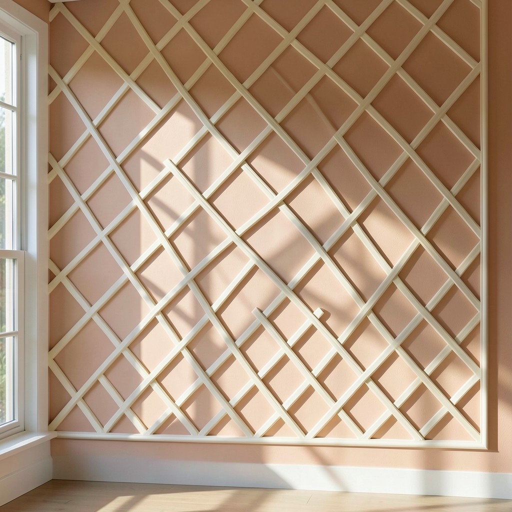
A trellis pattern applied to the wall surface — the diamond grid of the traditional garden trellis rendered in paint, applied molding, or three-dimensional relief — is the wall treatment that most directly imports the garden vocabulary of the outdoor growing structure into the domestic interior in an ornamental form whose geometric logic and natural associations produce the garden-inspired interiors aesthetic at its most architecturally specific. The trellis wall does not illustrate the garden. It references the garden’s structural language, and that reference is more resonant than illustration because it uses the garden’s form rather than its image.
The painted trellis wall — a diamond grid painted onto the wall surface using painter’s tape, a ruler, and two tones of paint whose contrast determines the pattern’s visual strength — is the most accessible version of the trellis wall treatment and the one whose result most rewards the precision of the masking rather than the complexity of the technique. A trellis diamond grid in a warm cream on a pale terracotta wall produces the summer home design quality of a room whose wall treatment references the garden structure without the artifice of a botanical illustration. A grid in white on a deep botanical green produces the greenhouse aesthetic of the tropical home design or jungle-inspired home decor direction at its most graphically bold.
The three-dimensional trellis wall — applied molding strips fixed to the wall in the diamond grid arrangement, the raised profile casting shadow lines that give the trellis its depth — produces the wall treatment that changes character with the room’s light conditions rather than presenting a fixed printed pattern. The morning sun through the east window rakes across the molding’s face and produces a shadow grid on the wall surface between the molding strips. The shadow changes scale and density across the day as the light source moves, and the wall’s pattern is therefore partly designed and partly produced by the light that inhabits the room.
49. A Ombre Gradient Wall

An ombre gradient wall — a wall surface where the color transitions gradually from one tone at the base to a different tone at the top, the transition occurring through the wall’s full height in a continuous blend rather than at a defined boundary — is the wall treatment that produces the most atmospheric quality of any paint-based technique available, and whose result changes the room’s spatial experience rather than merely its decorative surface. The gradient wall draws the eye upward along its blended surface, and the eye’s movement up the wall is the spatial experience of height — a room with an ombre wall feels taller than it is because the wall treatment is directing the eye’s natural upward travel rather than interrupting it.
The color selection for an ombre gradient wall must account for the way the two endpoint tones relate across the full range of their intermediate blends — not just at the dark base and the pale top but at every value step between them. Two colors that are complementary at each extreme may produce a muddy, greyed midpoint where they overlap if their hue positions on the color wheel produce grey when mixed rather than the clear intermediate hue that a successful gradient requires. A gradient within a single color family — from the most saturated version at the base through progressively lighter values toward white or near-white at the top — is the most reliably successful gradient approach because the midpoint colors are simply lighter versions of the same hue rather than mixed combinations of two different colors.
The spring bedroom decor or the airy home interiors context where the ombre gradient wall produces its most compelling atmospheric contribution is the bedroom whose floor-to-ceiling gradient moves from the grounded tone of a warm blush or a soft terracotta at the skirting board through the increasingly pale and luminous values of the same color family toward the near-white that meets the ceiling — the wall color becoming the color of morning light at the point where it meets the pale ceiling above it.
50. A Wall That Tells the Room’s Story

The wall design that works is not the one that was selected because it was popular, because it photographed well, or because it solved an aesthetic problem without first asking what the room’s actual design condition required. The wall treatment that endures — across the changes in furniture, the seasonal decorating shifts, the household’s evolving sensory preferences — is the one that was chosen in honest response to what the specific wall, in the specific room, in the specific home, at the specific moment of the household’s life, actually needed.
Every wall in every room has a primary design condition that should govern the treatment decision before any aesthetic preference is consulted. The dark, north-facing room needs a pale, reflective wall that multiplies the limited natural light rather than a deep, atmospheric treatment that compounds the darkness with atmosphere when the room needs luminance. The acoustically harsh, hard-surfaced room needs a soft, absorptive wall material rather than another hard surface added to the existing sound-reflective environment. The rental property needs a temporary, reversible wall treatment that performs at a high level within the constraints that permanent alteration prohibits. The family home’s most-used room needs a wall treatment whose maintenance requirement is honest about how much cleaning a family wall actually receives. These are the conditions that the room provides and that the design must respond to before any other consideration enters the conversation.
Build your wall design decision from the room outward. Let the room’s conditions, its proportions, its light quality, its existing materials, and its intended atmosphere determine the treatment direction before the catalog or the mood board is consulted. The wall that responds to its room with that discipline — whether it ends up as a bold painted accent, a hand-applied limewash, a tiled surface, a paneled architecture, or a raw plaster left in its natural cured state — will always produce a more genuinely successful result than the wall whose treatment was selected from the most appealing option in the most recent design publication and applied to the room as though the room’s specific conditions were irrelevant to the outcome. Give the wall what the room needs, not what the mood board requested, and the room will reward that decision every day you live within it.
Leave a Reply