
The bedroom is the one room in your home that exists entirely for you. Not for guests, not for showing off, not for the approval of anyone who might walk through the front door. It is the room you return to at the end of every day and wake up in at the beginning of every morning, which means the quality of its design accumulates over your life in a way that no other room’s design does. Get a living room wrong and you feel it a few hours a week. Get a bedroom wrong and you feel it every single day.
Most bedroom design advice misses this. It focuses on style categories — minimalist, bohemian, coastal, traditional — as though picking the right label solves the design problem. It does not. The label is the last decision, not the first. The first decision is understanding what you actually need the room to do: how much light you want in the morning, whether you read or watch or simply sleep, whether the room functions as a solitary retreat or a shared space that must accommodate two people with different needs and different ideas about what a good bedroom feels like.
What separates a bedroom that truly works from one that simply looks good in photographs is how it feels to be inside it at different moments — on a Sunday morning when there is no reason to get up, at eleven at night when the day has been long, at three in the morning when the room is dark and you either feel held by the space or vaguely unsettled by it. Those are the hours the bedroom earns its design, and those are the conditions every idea in this collection has been chosen to address.
These fifty bedroom design ideas cover the full range of what makes a bedroom succeed. Some address the architectural bones of the room — ceiling treatments, wall configurations, window proportions. Others address the material and sensory layer — the textiles, the lighting quality, the surfaces that your hands and eyes encounter constantly. Others still address the organizational logic of the room, because a beautiful bedroom that has no system for how things are stored and retrieved becomes a room you feel vaguely ashamed of within a week of moving in, regardless of how well you chose the paint color.
You will find ideas here that push against what most bedroom design looks like. Bedrooms with no overhead lighting. Bedrooms without a headboard. Bedrooms where the storage is the design rather than hidden behind it. Not every idea belongs in every bedroom — but understanding why each idea works makes you sharper about the decisions that apply to yours.
Read these ideas as a toolkit, not a checklist. Your bedroom does not need all fifty to be excellent. It needs the right ten for the specific room, the specific person, and the specific life being lived inside it. The goal of this collection is to help you find those ten — and understand them well enough to execute them without compromise.
1. A Bed Without a Headboard
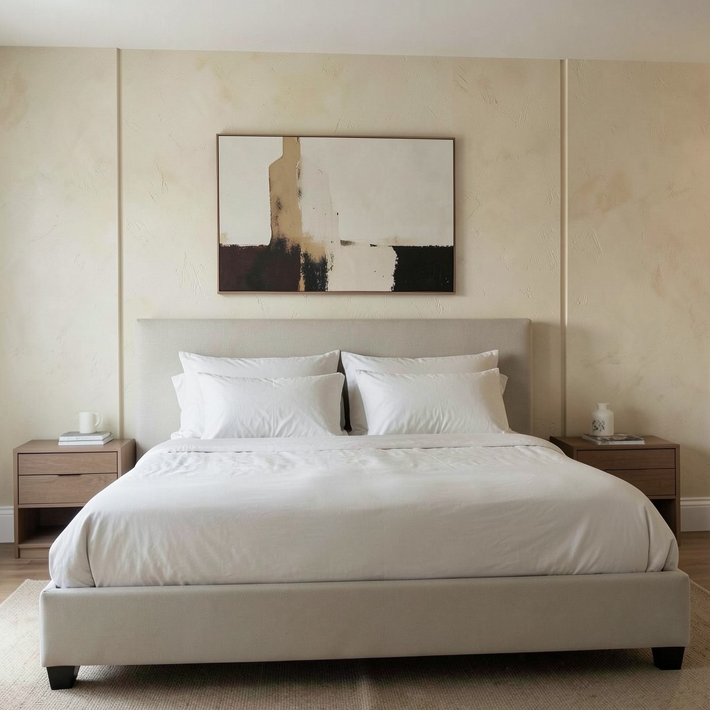
The headboard is so standard in bedroom design that its absence reads almost as a mistake to most people. That assumption is worth questioning. A bed without a headboard — pushed against a wall, flanked by low nightstands, with the wall behind it doing the visual work — creates a bedroom that feels less furnished and more architectural. The bed becomes a platform rather than a piece of furniture. The room reads wider and calmer because there is no tall vertical element demanding attention at the primary focal point.
The wall behind a headboard-free bed becomes the design opportunity the headboard was blocking. A single large artwork hung low and centered behind the bed position reads with a clarity it would not have competing with a padded or carved headboard frame. A section of limewash plaster or textured wallpaper behind the bed, running floor to ceiling on that wall only, creates an accent wall that is genuinely architectural rather than cosmetically applied. The wall does the job the headboard was doing, but with more material depth and far more design flexibility.
The practical consideration is that some people need something to lean against when sitting up in bed. A large, firm bolster pillow placed against the wall solves this completely without introducing the permanence of an upholstered headboard. For those who actively read or work in bed for extended periods, a floor-to-ceiling cushioned panel on the wall is a cleaner solution — it looks like an architectural detail rather than furniture and provides back support across the full width of the bed rather than just the headboard’s frame. The absence of a headboard is not a deprivation. It is a reframe of what the wall behind the bed is actually for.
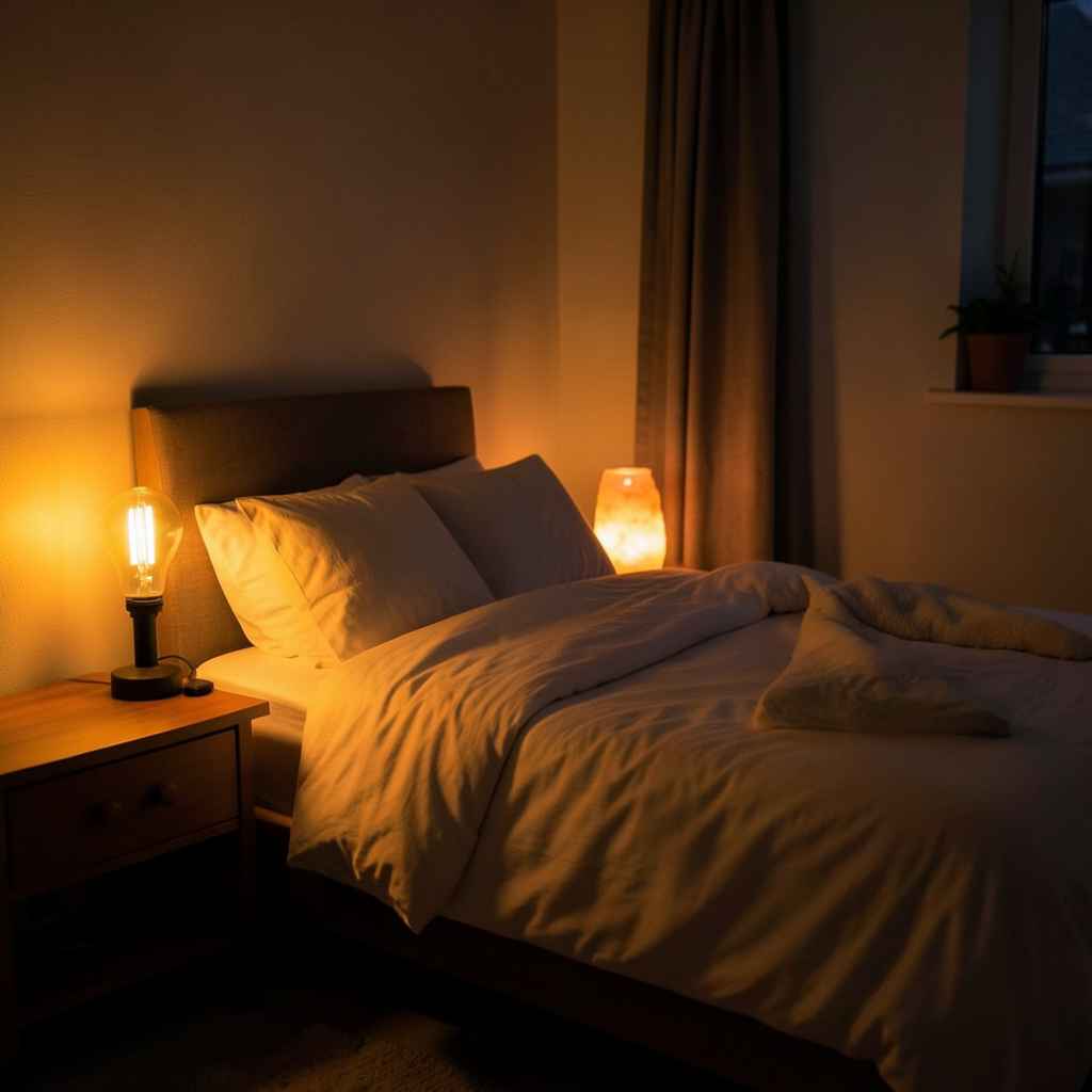
2. Layered Lighting With No Overhead Fixture
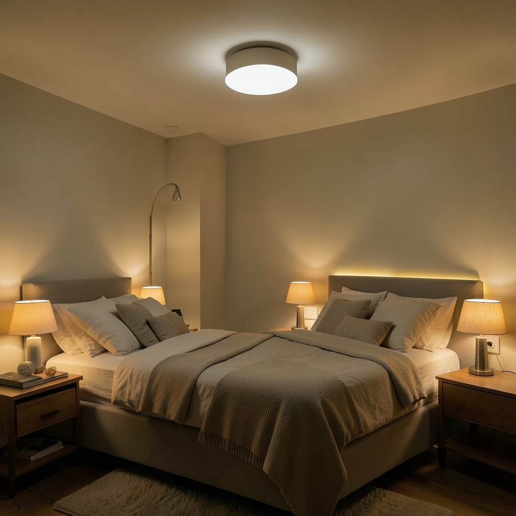
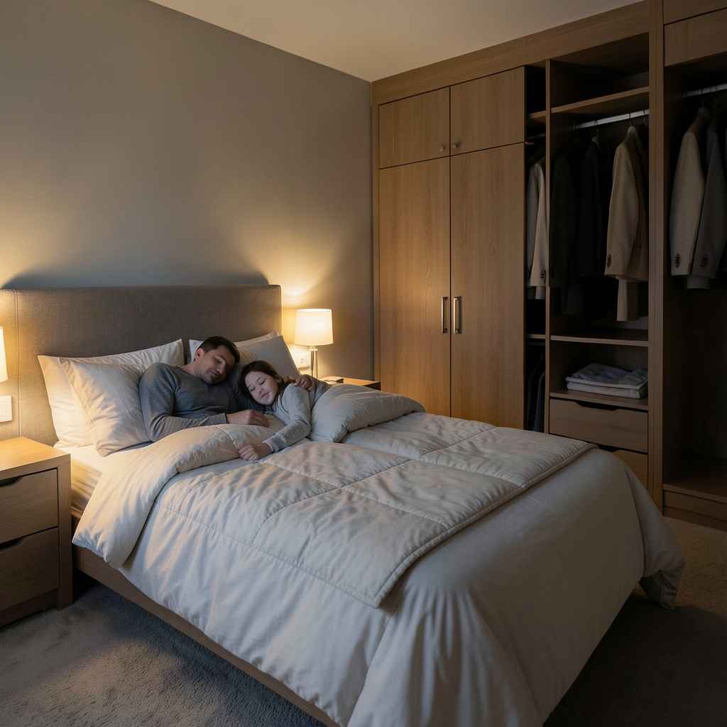
Most bedrooms have a central ceiling light. Most people with good bedrooms never turn it on. The overhead fixture — usually a flush-mount or semi-flush in the center of the ceiling — produces a flat, even light that is unflattering, harsh, and completely wrong for a room designed around rest. Eliminating it entirely, or installing it and committing to never using it, forces you to build a real lighting scheme from the ground up. That scheme, when done well, produces a bedroom that feels more like a retreat than any paint color or furniture choice can achieve on its own.
Layered bedroom lighting typically works across three sources: bedside reading lights, low ambient sources like table lamps or floor lamps positioned to bounce light off walls and ceilings, and a dim, warm source at floor level — a low lamp or a light strip behind furniture — that provides enough illumination to move through the room at night without activating anything brighter. Each source sits on its own switch or dimmer, which means you can compose the room’s light for reading, for winding down, or for the middle of the night without ever reaching a level of brightness that signals to your body that it should be awake.
The specific warmth of the bulbs in a bedroom matters more than in any other room because the light is always close — bedside lamps are within arm’s reach, floor lamps are at seated eye level. Bulbs in the range of 2200K to 2700K produce a golden warmth that the body reads as evening light. Anything above 3000K starts to read as office lighting, which is the wrong signal for a room whose purpose is deceleration. Choose the warmth of each source as carefully as you choose the color of the walls around it.
3. Ceiling-to-Floor Curtains
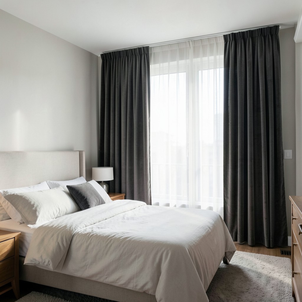
Curtains hung at the correct height change a bedroom more dramatically than almost any furniture decision. The correct height is not the window frame. It is the ceiling. Curtains that begin at ceiling height and fall all the way to the floor — or break slightly on it — make the windows look taller, make the ceilings feel higher, and give the bedroom a softness and verticality that curtains hung at the window frame cannot approach. The difference between the two is the difference between a room that was dressed and a room that was designed.
The width of the curtain panels matters as much as the height. Panels that barely cover the window when drawn make the window look narrow and the room look underdressed. Panels that extend eighteen to twenty-four inches on either side of the window frame, hanging flat against the wall when open, make the window look substantially wider. More importantly, they allow the full window to remain uncovered during the day without the curtain panel blocking any light — the fabric sits entirely to the side of the glass, and the window breathes. That detail is what separates a thoughtfully chosen curtain arrangement from one that was simply installed without considering the physics of light.
Fabric weight and opacity determine the room’s relationship to morning light, which has real consequences for how you sleep. Sheer linen lets light filter through while obscuring the view from outside — beautiful in a room that does not need to be dark for sleep. A lined linen or cotton drape blocks most light and creates a genuine blackout effect without the clinical quality of actual blackout blinds. Velvet curtains block light completely, add significant acoustic dampening — useful in urban bedrooms where noise is as disruptive as light — and introduce a richness of surface that no other fabric achieves at any comparable price per yard.
4. A Reading Nook Built Into the Bedroom
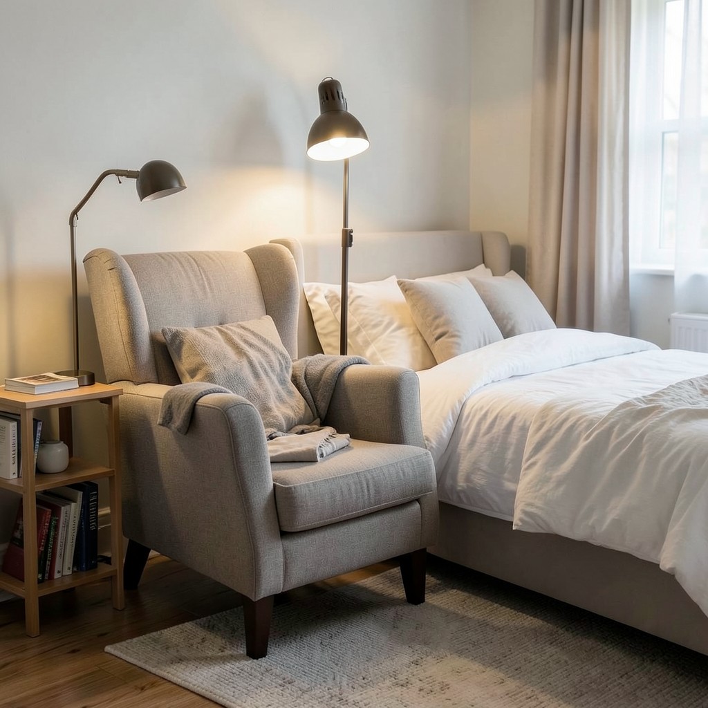
A dedicated reading corner inside the bedroom — armchair, floor lamp, side table, small bookshelf within reach — solves the problem that most bedrooms never address: the bed is doing too many jobs. When the bed is the only seating in the room, it becomes the place where you read, scroll, watch, talk on the phone, and eventually try to sleep — and the brain never fully associates it with rest alone. A reading corner gives reading and winding down a separate physical location, which allows the bed to exist for sleep and intimacy rather than serving as a multi-use platform.
The chair is the central decision. An armchair that is too firm encourages good posture but does not invite long reading sessions. One that is too soft pulls you into a position your back will object to after forty minutes. The right chair for a bedroom reading nook has a medium-firm seat, generous arm support, and a high enough back to rest your head against when you look up from the page. Scale matters in a bedroom where space is often limited — a slimmer, taller chair takes less floor space and reads as more intentional than a deep, wide lounge chair that dominates the corner it sits in.
The lamp beside the chair is where most reading nooks fall short. A floor lamp that positions the light source above and slightly behind the reader — angled down over the shoulder — eliminates shadows on the page and reduces eye strain. A lamp positioned in front of or to the side of the reader creates glare and shadow simultaneously. Get the lamp height and angle right, and the reading corner becomes the most used spot in the bedroom. Get it wrong, and the beautiful chair becomes a place where clothes get draped at the end of the day.
5. Warm Wood Bed Frame
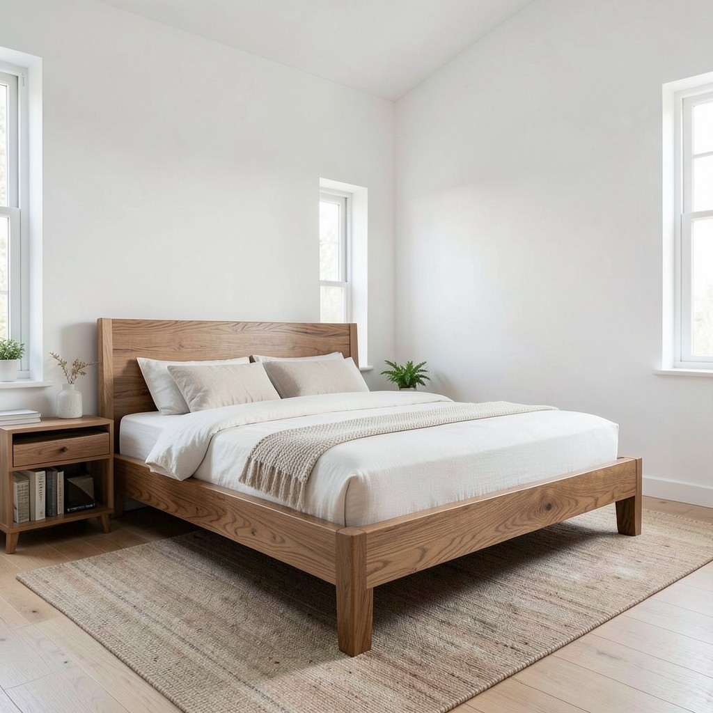
A bed frame in natural wood — solid oak, walnut, or ash, in a profile that sits close to the floor and uses the grain as its primary design element — grounds a bedroom in material warmth that upholstered frames and metal frames rarely achieve. Wood carries temperature. Not literal temperature, but the visual and tactile warmth that makes a bedroom feel inhabited rather than staged. A walnut bed frame in a room with white walls and linen bedding produces a combination that feels complete in a way that is difficult to analyze but immediately felt when you walk into the room.
The profile of the frame determines how the bed reads within the room. A low-platform frame with minimal leg height brings the sleeping surface close to the floor, which makes the ceiling feel higher in comparison and gives the room a grounded, calm quality. A higher frame — legs raising the sleeping surface to standard mattress height or above — shows more floor beneath the bed, which can make the room feel larger or feel cluttered depending entirely on what is stored or left under it. Low frames are more forgiving spatially and tend to read as more contemporary. Higher frames work better in rooms with tall ceilings where the additional height does not diminish the ceiling-to-floor proportion.
Wood grain selection is the detail that most furniture buyers skip over quickly and most designers think about carefully. Straight-grained oak has a quiet, almost meditative quality — it adds warmth without demanding attention, which suits bedrooms where the textiles and lighting are the primary design elements. Figured walnut with swirling grain patterns becomes a statement piece — the bed frame is the room’s most visually active element, and everything else should be quieter around it. Know which role the bed is playing in your room before selecting the timber, because the grain choice determines the frame’s personality more than the wood species does.
6. Statement Wallpaper on a Single Wall
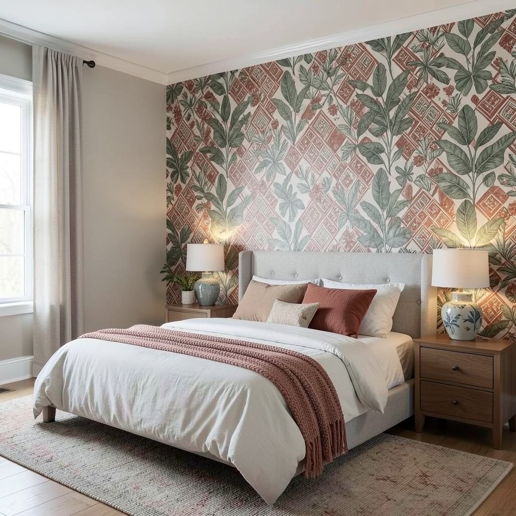
One wall in a bedroom covered in a bold, considered wallpaper pattern — botanical, geometric, hand-painted in large scale, or textural in a way that paint cannot replicate — changes the room’s personality without requiring any other significant design investment. The wall behind the bed is the natural candidate because it is the first surface you see when you walk into the room and the one you face every morning when you open your eyes. That position earns design attention.
The pattern scale must match the room size. A large-format botanical print — oversized leaves, broad repeats — works in a room with at least nine-foot ceilings and a queen or king bed that can hold its own against the pattern’s scale. The same print in a small bedroom with an eight-foot ceiling overwhelms the room and makes it feel like the walls are closing in. A medium-scale geometric or a fine-repeat pattern works across a wider range of room sizes because the eye resolves it as texture rather than individual motifs, which reads as richness rather than busyness.
Color within the wallpaper should echo at least one element already present in the room. A botanical wallpaper with warm terracotta and sage tones needs those colors reflected — however quietly — in the bedding, the rug, or a ceramic piece on the nightstand. Without that echo, the wallpaper reads as imported from a different design direction rather than native to the room it occupies. The echo does not need to be strong. A throw cushion that picks up the terracotta, a nightstand lamp base in a ceramic glaze that carries the sage, and the connection is made.
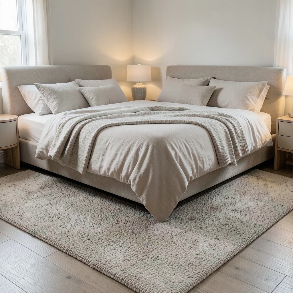
7. Linen Bedding and the Case Against Cotton Percale

Linen bedding has a texture and weight that cotton cannot replicate, and for a bedroom designed around genuine rest, that difference matters beyond aesthetics. Fresh linen has a slight roughness that softens with every wash without ever losing the crispness that makes it feel clean. It breathes better than most cotton weaves, which matters for warm sleepers and for climates where the temperature inside the bedroom fluctuates across the night. It wrinkles, always — and that wrinkle is not a design flaw but the visual evidence that a real person sleeps there.
The color of linen bedding shapes the bedroom’s tone more than any paint color because the bed occupies the visual center of the room. White linen reads as clean and expansive but shows every mark and requires frequent washing to maintain its quality. Off-white and oatmeal tones have the same brightness with more warmth and far more forgiveness for normal use. Stone, mushroom, and warm grey linens produce a bedroom that reads as restful and considered without requiring anything else in the room to carry the design weight. Deep tones — charcoal, navy, forest green — are for bedrooms with strong natural light and high ceilings; in a smaller room without good light, dark bedding can make the center of the room feel heavy.
Layering is what takes a well-chosen linen duvet cover from good to exceptional. A flat sheet in a complementary tone beneath the duvet, a light cotton waffle blanket folded at the foot of the bed, two Euro shales behind two standard pillows — this layering produces the kind of bed that reads as both deliberate and genuinely comfortable. It is the visual language of a bed that gets slept in and remade well, which is the exact feeling a bedroom should communicate.
8. Woven Rattan or Cane Furniture
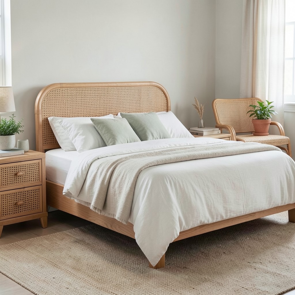
Rattan and cane furniture in a bedroom introduces a material that carries both lightness and warmth simultaneously — a combination most bedroom furniture fails to achieve. Solid wood is warm but heavy. Upholstered furniture is warm but visually dense. Metal furniture is light but cold. Rattan and cane are woven from natural plant material, which means they allow light to pass partially through their structure rather than blocking it entirely. A rattan headboard, bedside table, or accent chair adds presence to the room without adding visual mass, and that quality of lightness is exactly what most bedrooms need more of.
The style range of rattan furniture is wider than its reputation suggests. Mid-century rattan with clean lines and minimal weave sits comfortably in contemporary bedrooms without reading as bohemian or tropical. Natural rattan left in its organic tone works in rooms built around earth materials — linen, terracotta, raw wood, unglazed ceramics. Painted rattan in white or a muted sage reads as more refined and suits bedrooms with a softer, more curated design direction. The material is flexible enough to work across multiple styles because its primary quality is textural rather than stylistic.
The practical durability of rattan and cane in a bedroom is excellent. Neither material softens or stains the way upholstery does, both are lightweight enough to move easily when cleaning beneath them, and both improve with age rather than deteriorating as synthetic materials do. The one maintenance note: rattan in rooms with very low humidity can dry out and become brittle over time. A light application of linseed oil once a year prevents this and keeps the material supple. That is a minor commitment for furniture that genuinely ages well.
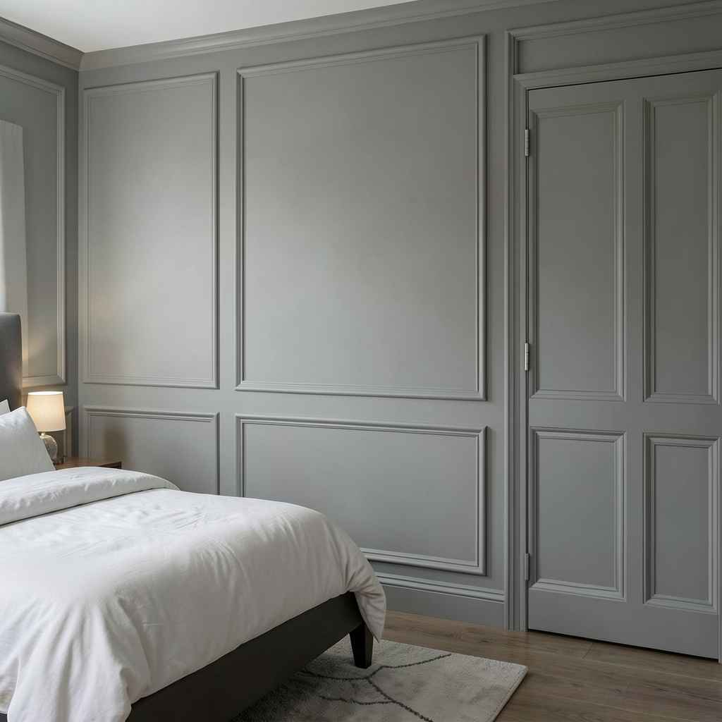
9. Architectural Crown Molding and Ceiling Details
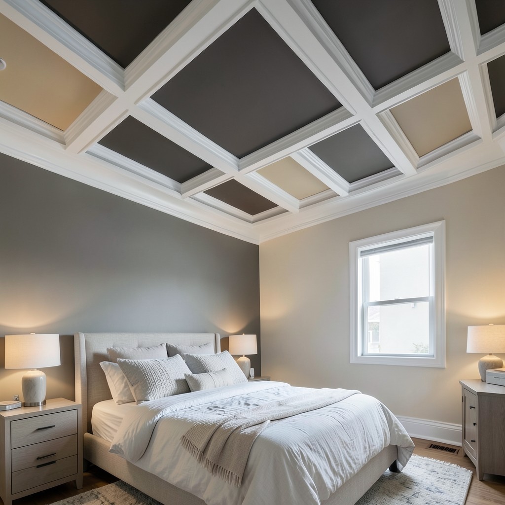
A bedroom ceiling that does something — coffered panels, deep crown molding, a central medallion, a painted contrast tone inside a plaster frame — elevates the room from a decorated box to a composed architectural space. The ceiling is the one surface in a bedroom that no furniture covers, no artwork hangs on, and no textile softens. It is pure room — and treating it as a design opportunity rather than a blank overhead surface changes the quality of the space in a way that is felt even by people who cannot articulate why the room feels different.
Crown molding at the junction of the ceiling and wall adds a depth and shadow line that makes the ceiling feel intentionally finished rather than simply painted. The scale of the molding should match the room’s ceiling height — a deep, multi-layered crown at twelve feet reads as appropriately grand; the same profile at eight feet is overpowering and makes the ceiling feel lower rather than taller. A simple single-piece molding at eight feet adds the finish without the drama, and that restraint is usually the right call in standard residential bedrooms.
A coffered ceiling — a grid of recessed panels framed by intersecting beams — is the most architecturally ambitious ceiling treatment available in a bedroom and the most rewarding when the room’s proportions support it. In a bedroom with a ceiling height of nine feet or more, a coffered design adds rhythm, depth, and formality that transforms the room’s character from the top down. The recesses within the coffer are opportunities for a contrasting paint tone — a warm putty inside a white coffer frame, or a deep charcoal inside a natural wood frame — that adds color and depth without the commitment of painting an entire wall.
10. Integrated Bedside Storage With No Freestanding Nightstand
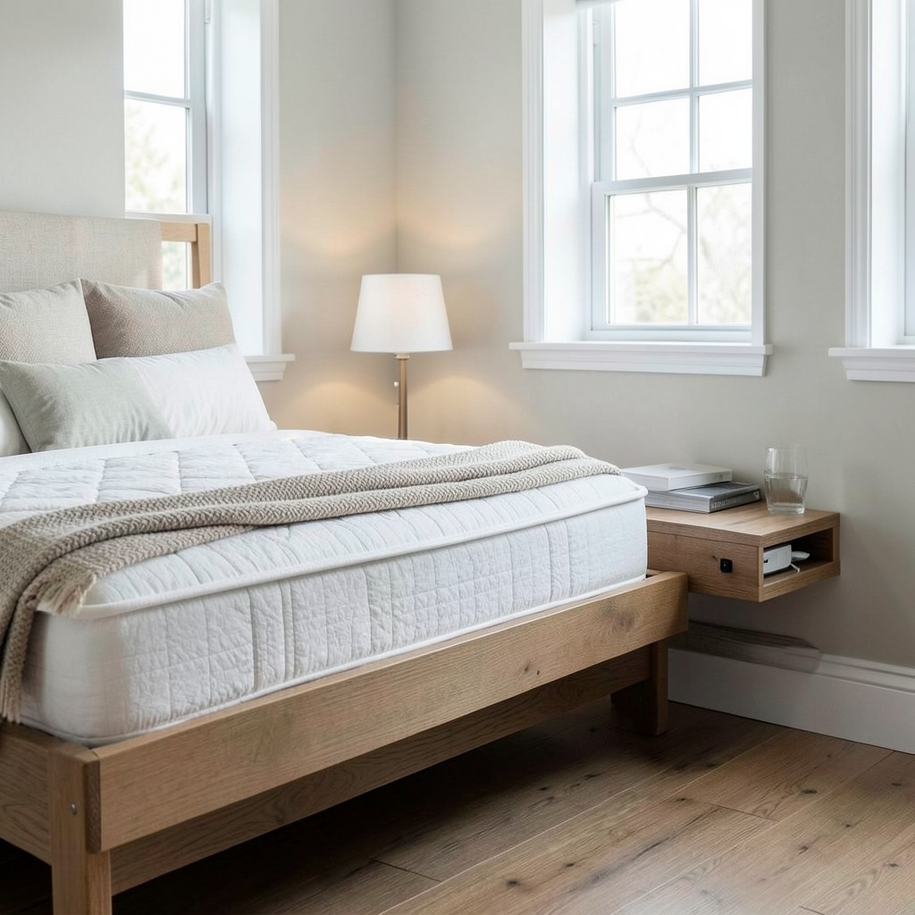
Bedside tables are one of those bedroom furnishings that most people select without interrogating whether they are actually the best solution for their specific needs. A shelf built into the wall at the correct height — or a floating ledge wide enough to hold a lamp, a book, and a glass of water — eliminates the visual bulk of a freestanding nightstand, keeps the floor beneath it clear, and can be positioned at the exact height that suits the specific mattress and sleeping preference of the person using it. That precision is impossible with a standard freestanding piece.
The wall-mounted option has a practical advantage in smaller bedrooms where every square foot of floor space matters. A floating shelf twenty-four inches wide and twelve inches deep, positioned at mattress height or slightly above, takes zero floor space. The floor beneath it stays clear, which makes the room feel larger and cleaning easier. If the shelf is constructed with a small lip, a drawer built into its underside, or a charging station routed into its surface for cable management, it does the job of a nightstand more efficiently than most actual nightstands do.
The design language of the integrated shelf should match the room’s other fixed elements rather than its furniture. If the bedroom has white-painted millwork on the windows and door frames, the bedside shelf in the same white reads as built-in rather than added-in. If the room uses natural wood for the bed frame and flooring, a shelf in matching timber continues that material story to the wall. The shelf should look as though it was always there — as though the room would be architecturally incomplete without it. That sense of belonging is the standard for any built-in element in a well-designed bedroom.
11. Japandi Style Bedroom
Japandi — the blending of Japanese minimalism with Scandinavian warmth — produces bedrooms that are the most genuinely restful design direction available. Not because minimalism is inherently peaceful, but because Japandi as a philosophy asks you to keep only what is functional and beautiful simultaneously, and to treat those two qualities as inseparable rather than competing. A lamp in a Japandi bedroom is beautiful because it is well-made and does its job with precision. A textile is functional because it is warm, and beautiful because its texture and weight are honestly what they appear to be. Nothing performs. Everything belongs.
The material palette of a Japandi bedroom is narrow and deliberate. Warm natural wood — particularly in matte or oiled rather than lacquered finishes — is the primary warm tone. Linen and cotton in undyed or lightly tinted natural colors provide the textile warmth. Ceramic pieces in earthy, uneven glazes add the human imperfection that keeps the minimalism from reading as cold. Stone or concrete in small doses — a bedside surface, a lamp base — grounds the palette in natural weight. Together, these materials produce a room that feels like it was assembled by someone who understood exactly what they wanted rather than someone who was trying to achieve a look.
The discipline of Japandi is harder than it appears. The temptation is to add — a decorative pillow here, a framed print there — and the additions accumulate until the bedroom has the furniture of a Japandi room but the density of a more decorative one. The editing is the work. Every time you consider adding an element to a Japandi bedroom, the question is not whether it is beautiful but whether the room is better with it than without it. More often than not, the room is better without it, and having the confidence to leave a surface bare is the design skill that Japandi demands most.
12. A Bedroom Gallery Wall
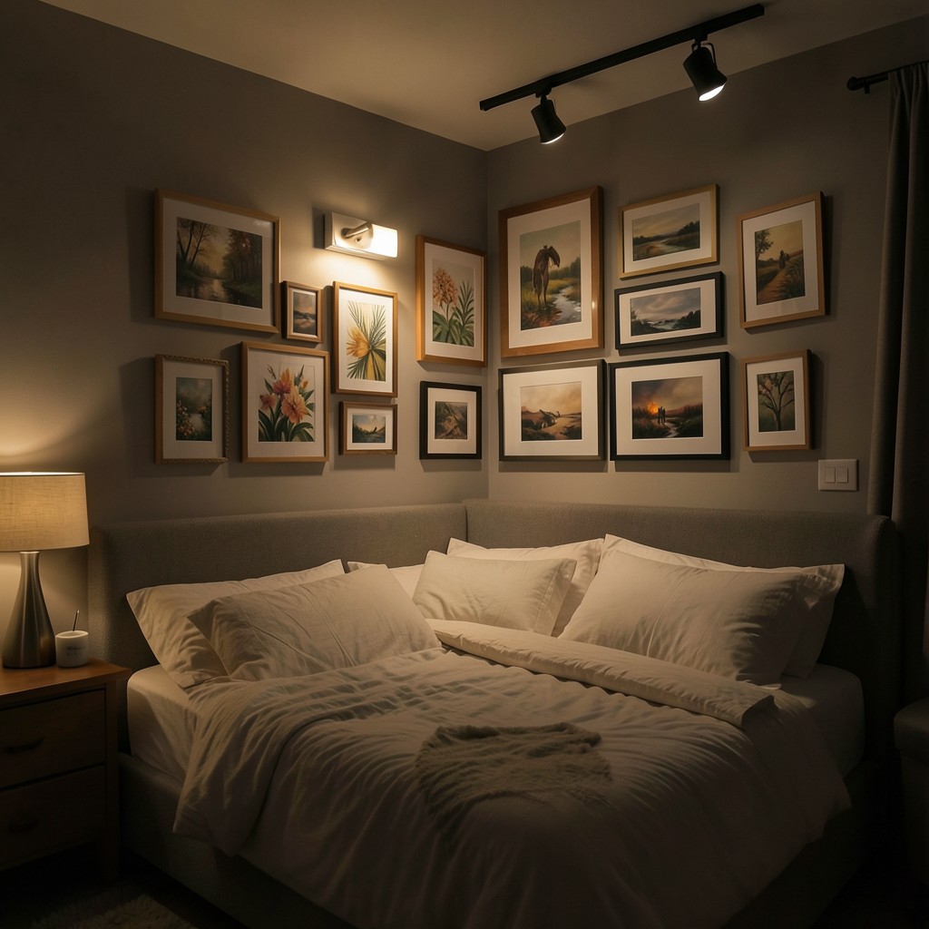
A gallery wall in a bedroom is a different proposition from one in a hallway or living room. The bedroom gallery is seen from one primary position — lying in bed — which changes everything about how it should be composed. Heights that look correct when viewed standing in front of them often feel too high or too low from a reclined position. Artwork that reads as cohesive from across a room can feel visually busy at the close-range distance of a bedroom wall above or beside the bed. Designing a bedroom gallery wall requires thinking from the pillow outward.
The composition that works best in a bedroom leans toward organic groupings rather than the grid arrangements that look clean in living spaces. A grid gallery wall is precise and ordered — qualities that read as lively and energetic in a social room and as slightly tense in a room designed for rest. An organic arrangement where frames cluster naturally, overlap slightly in visual proximity, and vary in size across the group produces a wall that reads as collected rather than installed. The frames do not need to match. The artwork does not need to share a medium or era. What needs to connect them is color — a thread of warm tone or a consistent sense of scale running through the selection.
Lighting a gallery wall in a bedroom is the detail that separates an excellent execution from a merely good one. A picture light mounted on the wall above the central piece, or a small spotlight on an adjustable ceiling track directed at the arrangement, lifts the artwork off the wall and gives it an evening presence that ambient room light alone cannot achieve. At night, with the room’s other lighting sources dimmed, a lit gallery wall creates a quiet focal point that holds the room together without demanding active attention.
13. Floating Bed Platform
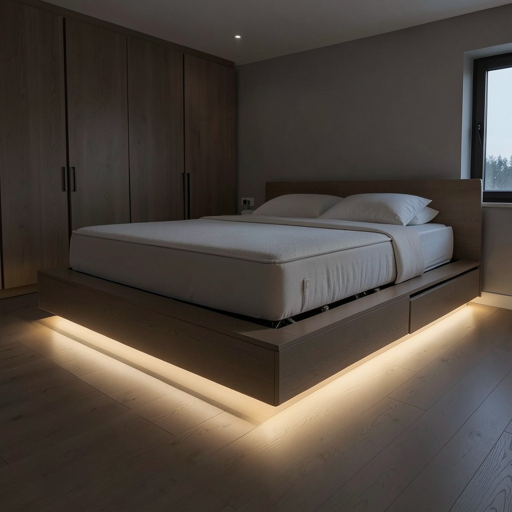
A platform bed where the base extends beyond the mattress footprint — creating a border of exposed surface on all sides — produces a bedroom centerpiece that reads as architecture rather than furniture. The platform is not just a base for the mattress; it is a plinth that elevates the sleeping area and gives the bed a permanence and gravity that standard bed frames do not possess. When the platform is built from the same material as the room’s other fixed elements — matching the floor tone, or constructed from the same wood as the built-in wardrobes — the bed becomes part of the room’s structure rather than a movable object within it.
The design possibilities within the platform format are wider than the basic version suggests. A platform with a recessed toe-kick at its base — a four-inch shadow gap between the platform base and the floor — makes the entire structure appear to float, particularly when a low-level LED strip inside the recess throws light along the floor surface. That floating effect at night is one of the most atmospheric details available in bedroom design, and it requires no special technology — just a correctly designed platform base and a warm LED strip on a dimmer.
Storage integrated into the platform base is the practical layer that makes the format genuinely useful rather than purely sculptural. Drawers built into the platform sides access from the end of the bed rather than the long face, which keeps the visual profile clean and allows the platform perimeter to read as uninterrupted. Hydraulic lift mechanisms on the mattress base, which raise the entire sleeping surface to reveal storage beneath, are an option in platform beds with sufficient structural depth. Both approaches provide the storage that most bedrooms desperately need without compromising the visual clean lines that make the platform format worth building in the first place.
14. A Bedroom With Exposed Wooden Ceiling Beams
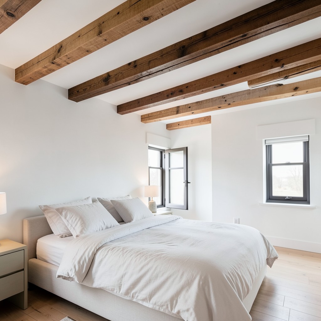
A bedroom with exposed ceiling beams has a quality that is difficult to manufacture through any other design means — the sense that the room has structure, that something real is happening above you, that the shelter is not just implied but visible. That quality is part of what makes rustic or farmhouse bedrooms feel so settled, but exposed beams are not exclusively a rustic element. In a contemporary bedroom with white walls, linen bedding, and minimal furniture, a set of clean-profiled oak beams running across the ceiling introduces warmth and architectural interest without any traditional connotation.
The spacing of the beams determines how the ceiling reads as a whole. Beams spaced close together — eighteen to twenty-four inches apart — create a dense, rhythmic pattern overhead that dominates the room and suits lower ceiling heights where the beams add depth without reducing the perceived volume significantly. Wider spacing — thirty-six to forty-eight inches — produces a more open, architectural rhythm that suits rooms with higher ceilings and a more contemporary direction. In most residential bedrooms, three to four beams running the length of the ceiling is the right number — enough to create the overhead structure without so many that the ceiling becomes visually busy.
The finish of the beams shifts the bedroom’s emotional register more than any other single variable. Dark, stained beams against a white ceiling produce maximum contrast and the strongest traditional character. Natural, oiled beams at their own wood tone against a matching or slightly contrasting ceiling read as warm and contemporary without any period reference. Whitewashed or pickled beams against a white ceiling produce a tonal layering that reads as Scandinavian and suits bedrooms built around pale, natural materials. Pick the finish that matches the bedroom’s direction, not the finish that looks most like beams in photographs.
15. Velvet Upholstered Headboard
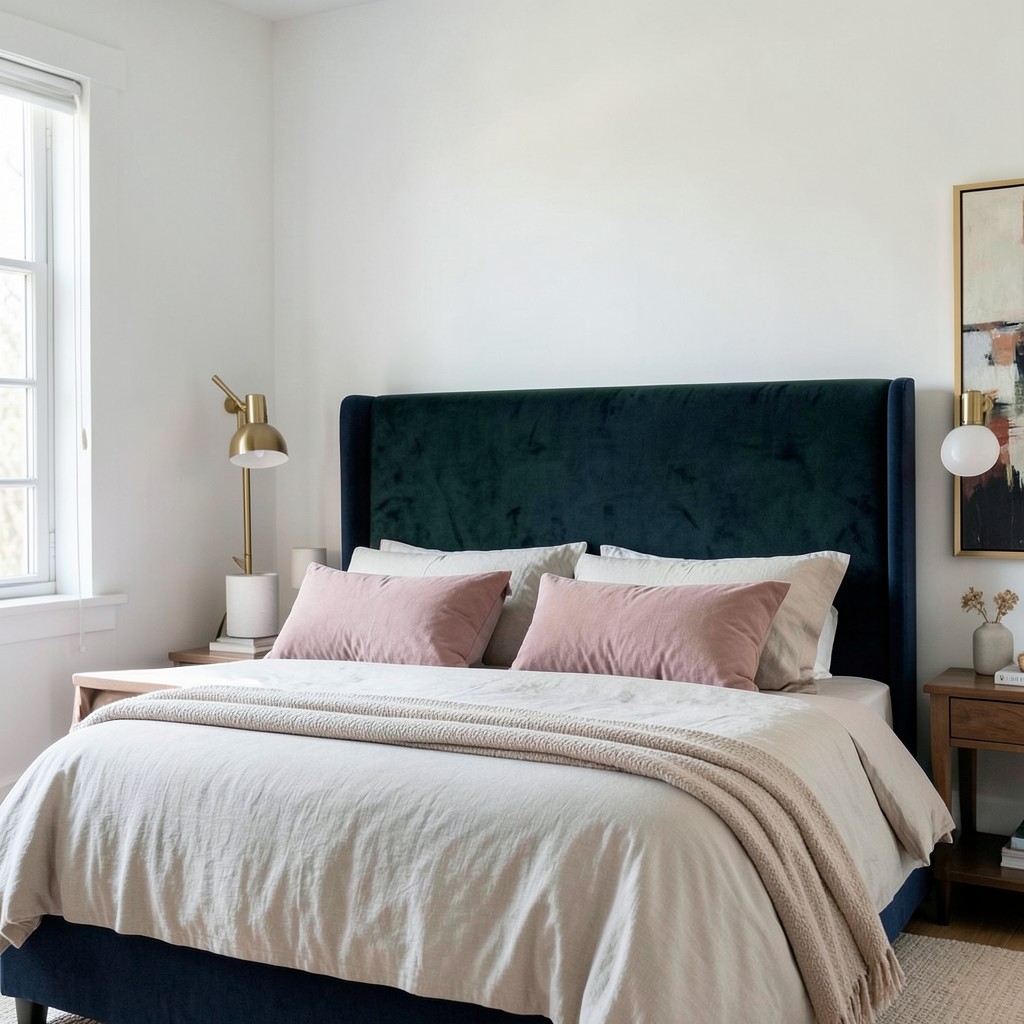
A velvet headboard is the single furniture decision most likely to change the feeling of an entire bedroom. The material is dense enough to dampen sound, which makes the sleeping area acoustically quieter than the room around it. The pile reflects light differently across its surface depending on direction — running your hand across velvet changes its tone, and that same quality means a velvet headboard catches the room’s changing light across the day and reads differently at morning, afternoon, and evening. No flat-surfaced headboard does this.
The color of the velvet headboard sets the bedroom’s emotional key. Dusty rose velvet against white walls and pale linen reads as soft and romantic without being saccharine — the dustiness in the tone prevents it from reading as pink in the conventional sense. Forest green velvet introduces a richness and depth that anchors the bedroom without darkening it, particularly in rooms that receive strong natural light. Midnight blue velvet against warm white walls and brass bedside hardware is arguably the most resolved bedroom combination available — the contrast between the deep blue and the warm tones creates a visual tension that reads as sophisticated rather than cold.
The headboard height affects the room’s proportions more than people account for. A headboard that rises to the ceiling — or close to it — makes the bed read as a room within a room and works particularly well in bedrooms with high ceilings where the sleeping area needs vertical definition. A headboard at a standard forty-eight inches sits comfortably within the wall without dominating it, which suits rooms where the wall behind the bed carries other design elements like artwork or an accent wall treatment. The headboard height is not just a furniture decision — it is a spatial one.
16. Botanical and Nature-Inspired Bedroom
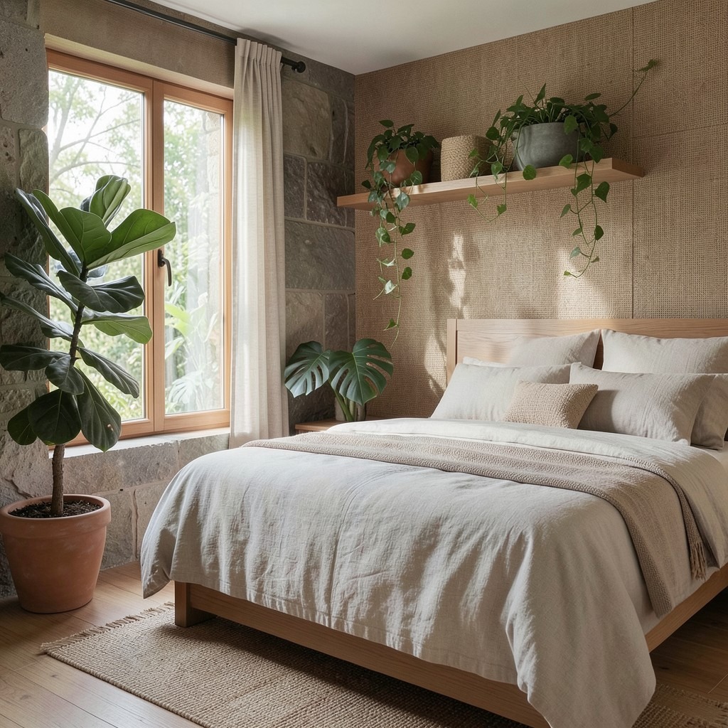
A bedroom designed around nature — not in the superficial sense of adding a plant or two, but in the genuine sense of bringing natural materials, organic forms, and living elements into the room’s design fabric — produces a restorative quality that manufactured materials and geometric forms cannot replicate. The human nervous system responds to natural elements in measurable ways, which means a bedroom built around botanical and organic references is not an aesthetic preference but a sleep environment decision.
Living plants in a bedroom are the most direct expression of this direction. Large-leaf plants — a fiddle-leaf fig in a terracotta pot beside the window, a monstera on a low stand in the corner, a trailing pothos on a high shelf whose vines reach toward the light — introduce scale, color, and life to corners and surfaces that furniture cannot occupy. The plants also add oxygen and humidity to the air, both of which improve sleep quality in bedrooms that run dry from heating systems or air conditioning. The design argument and the physiological argument point in the same direction.
The material palette for a nature-inspired bedroom is built from undyed linen and cotton, solid natural wood, raw or burnished terracotta in ceramics and tile, unfinished stone surfaces, and grass cloth or woven sea grass wallcovering. None of these materials are manufactured to look like something else. Each is honest about what it is and where it came from. That honesty — the quality of looking at something and understanding its origin — is what the botanical bedroom communicates at a subliminal level, and it is what produces the sense of calm that more decorated bedrooms, however beautiful, do not always deliver.
17. Mirrored Wardrobe Doors
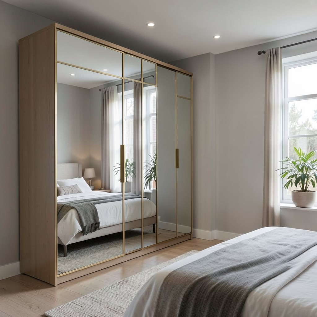
Mirrored wardrobe doors in a bedroom do two things at once — they expand the room visually by doubling every light source and every view within the space, and they eliminate the need for a separate full-length mirror, which in a small bedroom can mean recovering floor space that makes a meaningful difference to how the room functions and feels. The practical and aesthetic arguments reinforce each other, which is the hallmark of a good design decision.
The placement of the mirrored wardrobe relative to the room’s light sources determines how effectively the mirrors expand the space. A mirrored wardrobe positioned opposite a window reflects the exterior light and view back into the room, effectively creating the impression of a second window on that wall. The same wardrobe positioned perpendicular to the window reflects the wall beside the window rather than the window itself, which provides less visual expansion. Angling the wardrobe position during the layout planning stage — even a few degrees off the standard perpendicular-to-bed position — can significantly change how much light the mirrors capture and redirect.
Frame style on mirrored wardrobe doors prevents them from reading as purely utilitarian. A simple thin brass frame around each mirror panel introduces a decorative quality that makes the wardrobe read as a considered piece rather than a functional installation. Dark-framed mirrors suit contemporary bedrooms where the frame reads as architectural. Frameless mirrors are the most spatially expansive option but require precise installation to look intentional rather than like a wall of glass. The frame choice does not affect the mirror’s functional performance — it determines whether the wardrobe reads as a furniture element or a utility.
18. A Bedroom Rug That Anchors the Space
The rug in a bedroom does its job almost invisibly — until you walk across a cold floor at five in the morning, or stand beside a bed whose visual proportions feel vaguely wrong without the anchoring layer beneath it, and you understand exactly what the rug was providing. A bedroom without a rug is a bedroom that lacks warmth at floor level, which is a type of warmth that ceiling lighting and radiators cannot supply. The rug connects the bed to the floor, defines the sleeping zone within the larger room, and provides the first and last textural sensation of every day.
Size is where most bedroom rug decisions fail. A rug that fits only under the bed and nothing beyond it looks like a placeholder rather than a design element — the bed floats on its own island of pattern while the rest of the floor remains unrelated. The correct size for a bedroom rug depends on the bed dimensions, but as a working principle: the rug should extend at least twenty-four inches beyond the sides of the bed and at least eighteen inches beyond the foot. That extension gives each person on either side a generous landing surface when they rise, and it gives the bed’s visual footprint a foundation proportionate to its size.
The rug material in a bedroom rewards softness over durability in a way that rugs in other rooms do not. A bedroom rug does not face the foot traffic that a living room or hallway rug does. Wool pile, hand-tufted cotton, or a flat-woven wool-cotton blend all provide the warmth and texture that the bedroom floor needs without requiring the abrasion resistance that harder-use rooms demand. A high-pile wool rug beneath bare feet in the morning is a sensory experience that synthetic fibers approximate but do not match — and in a room where sensory quality matters to the quality of rest, that difference is worth the additional cost.
19. Built-In Wardrobes Floor to Ceiling

Floor-to-ceiling built-in wardrobes use the full vertical height of the bedroom’s walls, which increases storage volume by forty to sixty percent compared with standard wardrobe units that stop at seven feet regardless of the room’s actual ceiling height. That additional volume absorbs the seasonal storage, the out-of-rotation clothing, the bedding overflow, and the items that would otherwise occupy underbed storage, top shelves of freestanding furniture, or extra drawers elsewhere in the room. A bedroom with a genuinely sufficient wardrobe stops needing storage solutions everywhere else.
The visual impact of floor-to-ceiling built-ins is as significant as the functional one. When the wardrobe doors run the full height of the wall — from floor to ceiling, with no gap at the top and no visible baseboard interrupting the bottom — the wall reads as a single continuous surface. In a painted finish that matches the walls, the wardrobes disappear and the room feels larger because one wall appears to have no furniture against it at all. In a contrasting finish or natural wood, the wardrobe wall becomes the room’s primary design statement — an entire wall of texture and material presence that functions as a backdrop for the bed and the room’s other elements.
The internal organization of built-in wardrobes is the layer that most homeowners leave entirely to the installer’s standard configuration and regret within six months. Standard hanging rails and three shelves work for some wardrobes and are wrong for almost all of them. Before finalizing the internal layout, inventory the actual clothing, accessories, and storage items going into the wardrobe — the number of hanging items, whether they are full-length or waist-length, the volume of folded items, the shoe collection, the bag storage requirement. Build the interior around that inventory rather than around a standard template, and the wardrobe works from the first day.
20. The Monochromatic Bedroom
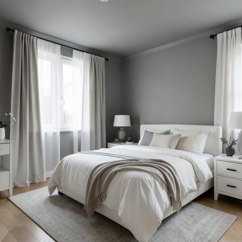
A bedroom built around a single color — walls, bedding, curtains, and major furniture pieces in variations of the same hue — produces a spatial effect that polychromatic rooms cannot achieve. The eye has nothing to jump between, so it settles into the room rather than moving across it. That settling quality is precisely what rest requires, and a monochromatic bedroom delivers it through color theory rather than through any particular material or furniture choice.
The critical distinction in monochromatic bedroom design is that “same color” does not mean “same tone.” A monochromatic bedroom built around warm grey uses five or six different values of grey — a deeper tone on the ceiling to prevent the room from feeling top-heavy, a mid-tone on the walls, lighter linens on the bed, near-white curtains, and deep charcoal accents in smaller objects. The variation in value across these surfaces creates depth and visual interest without ever introducing a contrasting hue. The room feels layered because the tones are working in concert rather than competing.
White is the color most often executed monochromatically and most often done badly. An all-white bedroom with no tonal variation — flat white walls, white bedding, white curtains, white furniture — reads as a hospital room rather than a calm retreat. A well-executed monochromatic white bedroom uses warm white, cool white, cream, ivory, off-white, and natural linen in a carefully sequenced layering that produces a room with more warmth and depth than many more colorful bedrooms achieve. The difference between the two is entirely in the specificity of the tone selection, and that specificity requires looking at actual samples together in the actual room rather than making choices from catalog photographs.
21. Acoustic Treatment Through Soft Furnishings
Sound is the most overlooked design element in bedroom planning, and the most consequential for sleep quality. A bedroom with hard floors, bare walls, uncovered windows, and minimal soft furnishings reflects sound rather than absorbing it — every movement, every noise from outside, every sound from adjacent rooms arrives in the sleeping area at close to its full volume. Soft furnishings absorb sound at the point of contact, which means a bedroom with generous textile use is acoustically quieter than one with identical dimensions and wall construction but fewer soft surfaces.
The ceiling is the largest sound-reflective surface in most bedrooms, and it is also the one that most interventions ignore. A fabric canopy over the bed — whether a traditional four-poster arrangement or a modern floating canopy of linen panels hung from a ceiling-mounted track — absorbs sound above the sleeping area specifically and creates an acoustic enclosure around the bed that is separate from the room’s general acoustics. The result is a sleeping zone that is perceptibly quieter than the room around it, which has a direct effect on how quickly the body reaches the deep stages of sleep.
Upholstered headboards, heavy curtains, a high-pile rug, upholstered benches, and fabric-covered walls — any combination of these increases the bedroom’s acoustic absorption. The cumulative effect of multiple soft surfaces is not additive but multiplicative; each additional soft surface reduces the reverberant energy available for the next hard surface to reflect. A bedroom that feels quiet is one where sound has multiple opportunities to be absorbed before it reaches the sleeping ear, and achieving that requires thinking about every surface in the room rather than any single intervention.
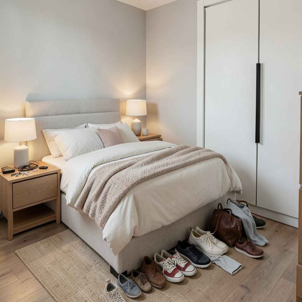
22. Under-Bed Storage Done Right

The space under a bed is the most underused storage volume in most bedrooms, and also the most misused when it is used at all. The typical approach is to push things under the bed in boxes or bags, where they become inaccessible, forgotten, and eventually a source of dust and disorder that undermines the bedroom’s sense of calm. Done correctly, under-bed storage is a designed system — purpose-built, proportioned to the available clearance, and organized so that everything stored there can be retrieved without moving the bed or emptying the storage to find what you need.
The clearance height determines what kind of storage is possible. Beds with less than eight inches of clearance suit only low-profile storage boxes on rollers. Eight to twelve inches allows for hinged storage containers that fit standard categories: extra bedding, seasonal clothing, spare pillows. Beds with fourteen inches or more of clearance beneath them can accommodate proper drawer units — either integrated into the bed frame design or as freestanding rolling drawers that slot underneath. Drawer storage under a bed is the best available option because drawers provide full access without requiring the entire contents to be moved, and they keep what is stored out of sight and out of dust.
The organizational principle for under-bed storage is category consistency — one type of item per container or drawer, clearly identified. Extra bedding in one drawer, seasonal clothing in another, spare towels in a third. When every container has a category and every category has a container, you stop treating under-bed storage as a residual overflow zone and start treating it as a legitimate part of the bedroom’s storage architecture. That shift in how the storage is managed changes how the bedroom feels, because the tidiness of the room above the bed is dependent on the organization of the space beneath it.
23. Arched Doorways and Alcoves
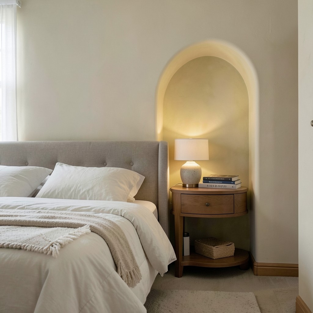
An arched opening in a bedroom — whether it is the primary doorway, a closet entrance, or an alcove cut into the wall — introduces a softness to the room’s geometry that rectangular openings cannot provide. The arch is one of those architectural elements that reads as simultaneously strong and gentle: strong because its structural logic is self-evident, gentle because the curve takes the hard corner away from what is otherwise a rectilinear room. In a bedroom, that gentleness matters because the room’s purpose is deceleration, and a room full of right angles carries an implicit tension that soft curves relieve.
An arched alcove beside the bed is the most intimate expression of this element. A recess in the wall — cut to the dimensions of a bedside table or shelf, with an arched top — creates a dedicated space for the lamp, book, and nightly objects that feels built specifically for sleep. The alcove frames those objects rather than simply supporting them, and the framing produces a sense of considered care that elevates the bedside experience from a functional cluster of items to something with genuine design presence. Lime-plastering the inside of the alcove in a slightly different tone than the wall amplifies this effect considerably.
The practical consideration is structural. Arched openings that penetrate a load-bearing wall require structural assessment and potentially steel header installation, which adds cost and complexity. Arched openings in partition walls are straightforward — the arch is cut into non-structural material and requires only a curved timber former to maintain its shape during plastering. For existing bedrooms where cutting into a wall is not viable, a curved cabinet or a freestanding arched room divider can suggest the arch form without requiring any structural work. The suggestion of the arch, done well, carries most of the psychological benefit of the real thing.
24. Deep, Dark Paint Colors
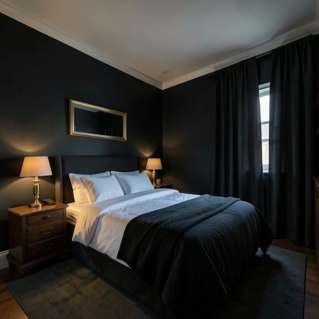
Painting a bedroom in a deep, dark color — a near-black charcoal, a rich aubergine, a forest green so dark it borders on black in low light — produces a room that feels more intimate than any light color can achieve. Dark walls absorb light rather than reflecting it, which means the light sources in the room become more prominent and the space shrinks perceptually — not unpleasantly, but in the way a room that wraps around you rather than expanding away from you creates a sense of being held. That quality is what makes a dark bedroom feel safe and deeply restful rather than merely stylish.
The practical objection to dark bedroom walls is always that they make the room feel smaller. This is only true when the rest of the room fights against the dark color. Dark walls with dark bedding, dark curtains, and minimal light sources produce a room that feels oppressive. Dark walls with bright white bedding, good warm lighting, and brass hardware against the dark surface produce a room that feels dramatic and intimate simultaneously. The contrast within the dark room is what determines whether the darkness works. Treat the bedding and major soft furnishings as the light sources within the palette, and the dark walls become the backdrop against which everything else glows.
Ceiling treatment with dark walls requires a decision. Painting the ceiling the same dark color as the walls produces a fully enveloping room that maximizes the cocooning effect — appropriate for bedrooms where sleep and rest are the primary purposes. A white or light-toned ceiling above dark walls creates a contrast that keeps the room from feeling completely enclosed and suits bedrooms where the dark walls are a statement rather than a complete environment. Neither is wrong. The choice is about how far you want to commit to the darkness and whether you want a room that completely absorbs you or one that simply surrounds you in color while maintaining an open sky above.
25. Pendant Lights as Bedside Lighting
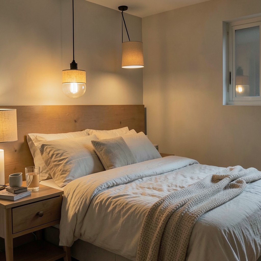
Replacing bedside table lamps with pendant lights hung from the ceiling at bedside position frees the nightstand surface completely, which transforms how the bedside area looks and functions. A nightstand that previously carried a lamp base, a shade, and a cord now has its entire surface available for books, ceramics, a glass of water, and the few personal objects that make a bedside feel genuinely inhabited rather than staged. The pendant does the lighting job from above rather than beside, which changes the light’s quality and direction in ways that suit reading and winding down.
The pendant height above the mattress surface determines its usefulness as reading light. Pendants hung too high — ceiling height minus a few inches — produce ambient light but no focused reading illumination. Pendants positioned at roughly twenty-four to thirty inches above the mattress surface, with the bulb directed toward the bed rather than diffusing outward, provide reading-quality light without a table lamp’s footprint. Adjustable-cord pendants that can be raised or lowered as needed are the most practical version of this arrangement, particularly in shared bedrooms where two people have different reading habits and different preferences for how close the light source sits.
The pendant’s shade or globe material affects the bedroom’s atmosphere as much as its functional light quality. A fabric drum shade in a warm linen diffuses light broadly and softly — beautiful ambient light, marginal reading light. A clear glass globe exposes the bulb and produces a point-source light with strong visual character — best with a decorative filament bulb that makes the exposed source an asset rather than a liability. An opaque shade with a downward-opening base produces focused directional light — the strongest reading option but the least atmospheric. The right choice depends on which function the pendant is primarily serving and which quality of light the bedroom needs most at the bedside position.
26. A Bedroom With No Television
The argument for a television-free bedroom is not about moral restriction — it is about what the room is for. A bedroom with a television is a room with two competing purposes: sleep and entertainment. Those purposes require different physical conditions, different light levels, different states of mind, and different relationships with time. The television pulls toward stimulation and wakefulness. The bedroom’s purpose pulls toward calm and rest. When you give both an equal claim on the same room, the stimulation usually wins, and the bedroom slowly stops being a place where you actually rest well.
The design benefit of a television-free bedroom is that the wall opposite the bed — the primary focal point of the room — becomes available for something better. A large piece of artwork hung at the correct height for viewing from the bed. A beautifully designed built-in wardrobe whose doors are the room’s most refined surface. A section of richly textured wallpaper that gives the eye something beautiful and calming to rest on. All of these improve the bedroom’s quality of environment more than a screen framed in black plastic ever could.
The counterargument — that some people wind down effectively with television — is real. Not every person or every household can or should remove a television from the bedroom. But if the television is present, it should be designed into the room rather than placed in it. A cabinet that conceals the screen when not in use, or a television mounted above a fireplace in a suite-style bedroom where the sleep and viewing areas are physically separated, acknowledges the functional reality without surrendering the room’s identity entirely to the screen.
27. Textured Limewash Walls
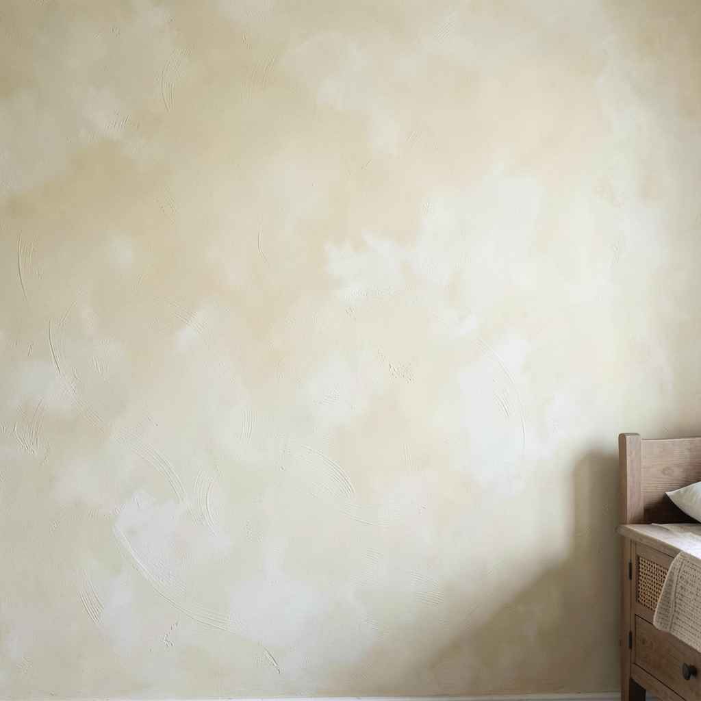
Limewash paint produces a wall surface that no conventional paint replicates — it sinks into the substrate rather than coating it, which means the texture and variation are built into the surface rather than sitting on top of it. The result is a wall that looks as though it has been there for a long time, carrying the kind of depth and variation that new materials rarely possess. In a bedroom, that quality of settled age produces an atmosphere of calm that flat-painted walls with their uniform color and reflective sheen cannot generate.
The application technique determines the character of the finish. A single-coat limewash applied generously and manipulated while wet with a wide brush in circular motions produces a soft, cloud-like variation across the surface. Multiple coats — each allowed to dry before the next is applied — build more depth and more tonal range, with the lighter upper coats catching light differently from the darker layers beneath. Color choice in limewash is different from conventional paint because the final appearance changes as the paint dries and cures; what looks dark when wet will lighten considerably in its fully cured state, and a skilled applicator accounts for this shift during the color selection process.
The material quality of limewash is naturally breathable, which matters in bedrooms where humidity from body heat and breathing can build up in enclosed spaces. A breathable wall finish allows moisture vapor to pass through the wall rather than trapping it at the surface, which reduces the conditions that lead to condensation and mildew over time. In older homes with solid masonry walls, limewash is the historically correct finish and works with the building’s moisture management rather than against it. In modern homes with standard drywall, the breathability benefit is less critical, but the visual character remains fully intact.
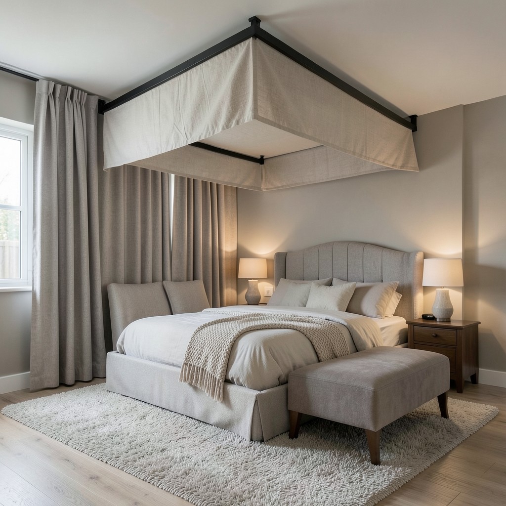
28. A Canopy Bed
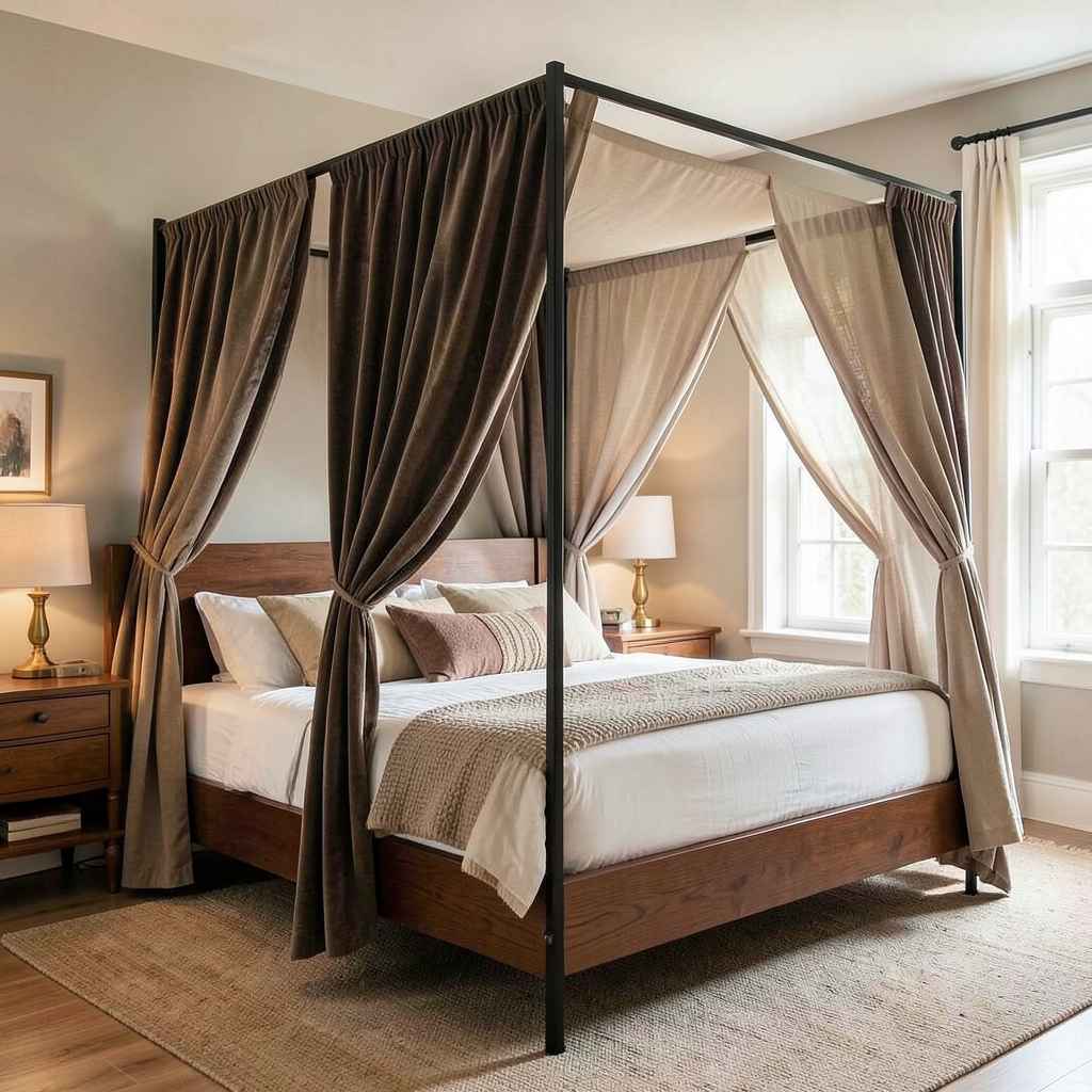
A canopy bed — four posts rising above the mattress level and connected by a frame overhead — creates a room within a room. The sleeping area becomes its own defined space, sheltered from above and marked at its corners, which produces a sense of enclosure and protection that is primal rather than merely decorative. Children intuitively understand why canopy beds feel special. Adults who dismiss the format as theatrical are missing the genuine psychological function that the canopy serves: it shrinks the sleeping zone to a human-scaled shelter within whatever size room surrounds it.
The fabric treatment of the canopy determines its visual weight and the bedroom’s atmosphere. Heavy velvet or brocade draped from the frame creates maximum enclosure and maximum visual weight — theatrical, opulent, and suited to large bedrooms where the canopy’s mass is proportionate to the room’s volume. Sheer linen panels hanging from the frame create a gauzy enclosure that filters light and suggests privacy without blocking it — lighter, more contemporary, and functional in bedrooms of any size. A minimal steel frame with no fabric at all — just the structural canopy overhead, without any hanging panels — creates the spatial suggestion of the enclosed sleeping zone without any visual heaviness.
Hardware matters more in a canopy bed than in most furniture because the posts and overhead frame are the most visible elements of the piece. Thick, turned wooden posts in a dark stain read as traditional. Slender steel posts in a matte black finish read as architectural and contemporary. Brass posts in a burnished finish produce a warmth and richness that suits bedrooms built around warm materials throughout. The frame is the bed’s primary design statement, and its material and profile set the character of the entire sleeping zone.
29. A Bedroom Fireplace
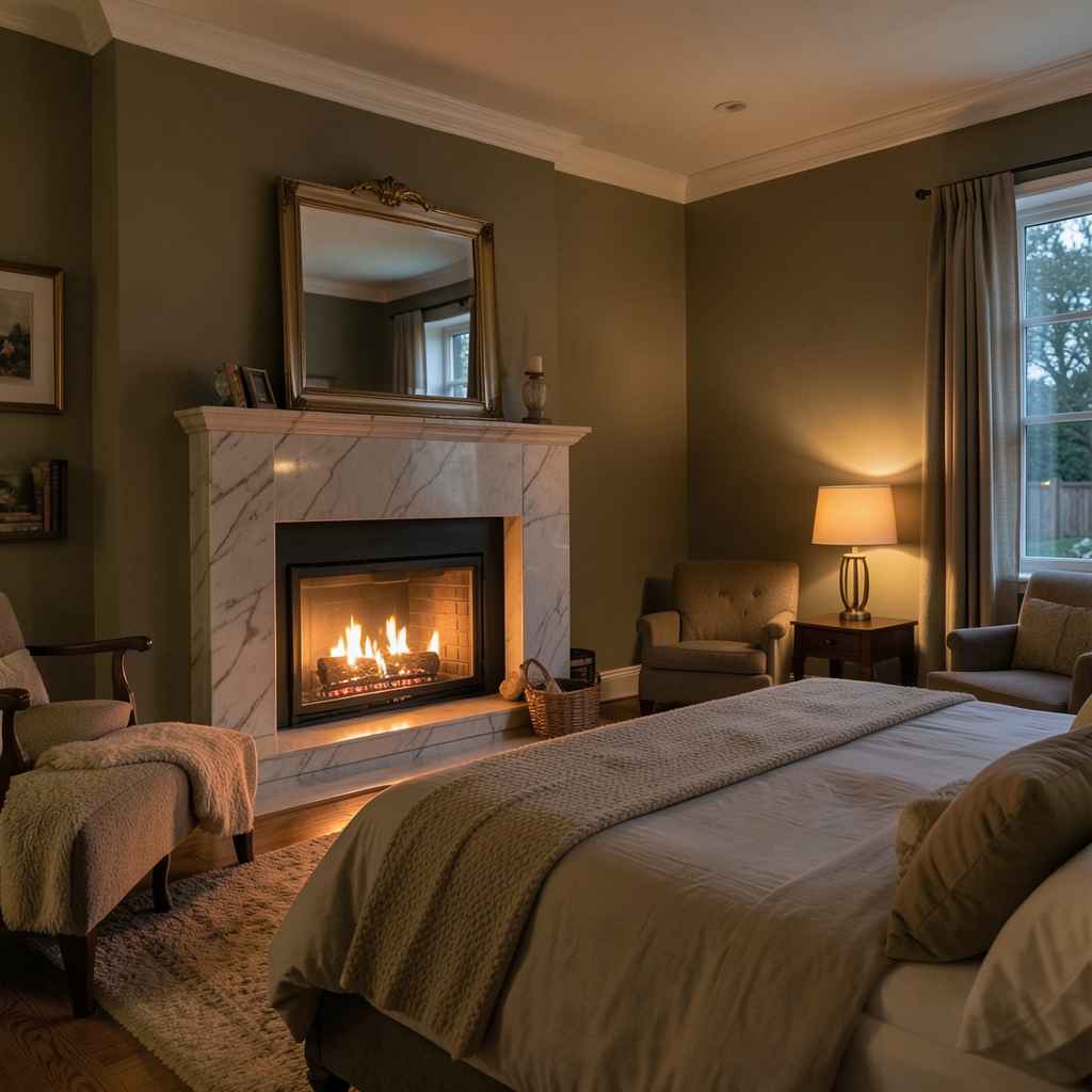
A fireplace in a bedroom changes the room’s fundamental character. It is not primarily a heat source — it is a light source, a focal point, and a reason to be in the room when sleep is not the immediate purpose. A bedroom with a fireplace has a purpose and a presence that no other design element can substitute for; it is the one feature that makes a bedroom feel like a private retreat rather than simply a private room. The distinction matters more than it sounds.
The scale of the fireplace surround should match the bedroom’s proportions and the wall it occupies. A large marble surround with an overmantel mirror suits a bedroom with ceiling height above ten feet and a bed substantial enough to hold its own against the fireplace’s visual presence. A smaller, simpler surround — a cast iron insert with minimal wood or stone framing — suits a standard bedroom ceiling height and adds warmth without overwhelming the room. The mistake is choosing a surround that is too small for the wall it occupies; an undersized fireplace in a large wall looks apologetic rather than considered.
Gas fires and bio-ethanol alternatives have made bedroom fireplaces practical in rooms where a traditional flued installation is impossible. A bio-ethanol burner set into a designed surround produces real flame without any flue requirement — the combustion is clean enough that no extraction is needed in a well-ventilated room. The visual effect of real flame in a bedroom at night, with no other light source competing, is something no electric alternative replicates regardless of how sophisticated the flame simulation. If a bedroom fireplace is possible, it is one of the most lasting and rewarding investments a bedroom design can make.
30. Strategic Mirror Placement
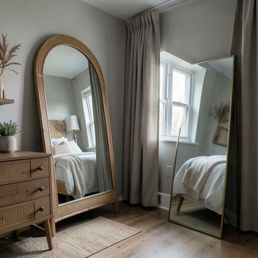
A mirror in a bedroom positioned without thought about what it reflects is a mirror doing half its job. Most bedrooms have a mirror somewhere — on the wardrobe door, above a dresser, leaning against a wall — and most of those mirrors are placed for the practical purpose of checking one’s appearance rather than for the spatial and light-expanding purpose a well-placed mirror serves. Both functions are real. The question is whether the mirror is working for the room as well as for the person standing in front of it.
The most powerful mirror placement in a bedroom is across from, or at an angle to, the primary window. A mirror that captures the window’s light and redirects it into the darker parts of the room effectively doubles the brightness of that light source without any electrical intervention. In a bedroom that is naturally dark — north-facing, overlooked, or simply without generous window area — a large floor mirror or a wall mirror positioned to capture and reflect the available daylight is the most impactful change possible without structural work.
The mirror frame is the design element that connects the piece to the bedroom’s material language. An arched mirror in an organic rattan or cane frame suits bedrooms built around natural materials and soft forms. A large rectangular mirror in a thin brass frame reads as refined and contemporary and suits bedrooms where the design is precise and tailored. An unframed leaning mirror — a full-length glass panel simply leaning against the wall — has a casual, unfussy quality that suits more relaxed bedroom directions. The frame is not decoration around the mirror — it is the mirror’s design identity within the room.
31. A Bedroom Office Corner
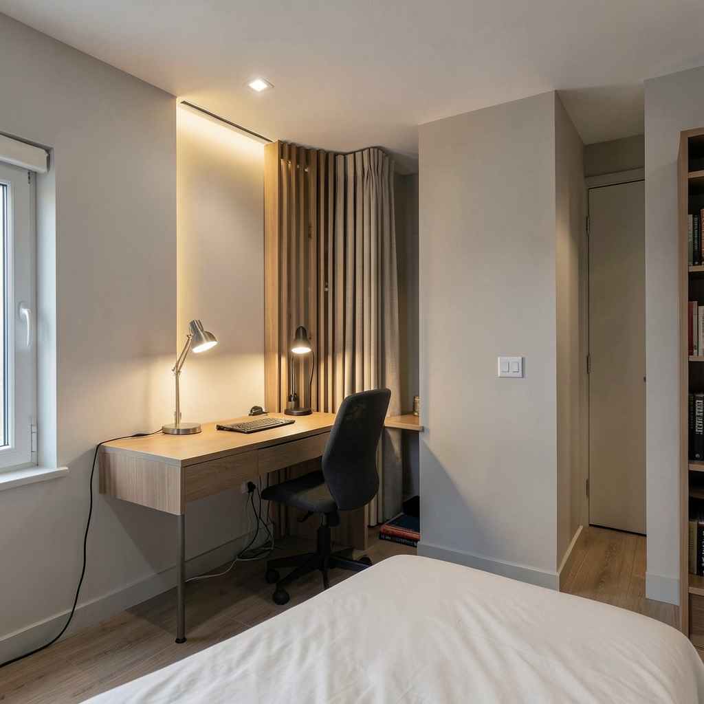
Working from a bedroom is a reality for many people, and the design failure most bedroom offices share is that they look like a bedroom that also has a desk in it rather than a bedroom with an intentionally designed work corner. The distinction is everything. A desk pushed into a spare corner with a basic chair and a power strip draped to the floor does not say a considered decision was made. A built-in desk alcove with proper task lighting, managed cables, a chair sized to the space, and a clear visual boundary between the work area and the sleeping area says this bedroom was designed for a full life, not just for sleep.
The visual separation between the work zone and the sleep zone is the design challenge that makes bedroom offices difficult. A screen — a slatted wood partition, a curtain on a ceiling track, a bookshelf positioned perpendicular to the wall — creates a physical and psychological boundary between the two functions. When the workday ends and the screen is closed or the curtain drawn, the desk disappears from the bedroom’s sightlines. The sleeping area becomes a sleeping area again rather than a room that is also trying to be an office. That boundary does not need to be total to be effective — even a partial visual separation is enough to signal to the brain that the working context is behind you.
The desk itself should be the smallest surface that genuinely meets your working needs. A desk that is too large turns the bedroom office corner into a workspace that dominates rather than occupies its corner — and domination is the opposite of what a bedroom office should do. A wall-mounted fold-down desk that closes flat when not in use is the most spatially disciplined option and the right choice for bedrooms where the office function is secondary to the sleeping function. It disappears when you do not need it, and a bedroom that does not look like an office at night is a bedroom where your body actually believes it is time to sleep.
32. A Bedroom With Warm Amber Lighting
The color of light in a bedroom at night is not a decorative preference — it is a physiological one. The body’s sleep signals are governed in part by light exposure, and warm amber light in the range of 1800K to 2400K tells the nervous system that the day is ending in a way that cooler, bluer light simply does not. A bedroom lit entirely in warm amber at nighttime is not just more atmospheric than one lit with standard bulbs — it is a room that supports sleep onset rather than delaying it. The design and the biology point in exactly the same direction.
Achieving genuine amber warmth requires choosing bulbs deliberately rather than accepting whatever comes in a standard lamp. Edison-style filament bulbs in a clear glass produce amber light at around 2200K and have a visual warmth that tinted or frosted bulbs approximate but do not match. Salt lamp accessories — a small Himalayan salt lamp as a secondary light source beside the bed — produce light at around 2000K with a distinctly orange quality that reads as almost firelight. Neither source is sufficient as the room’s only light layer, but both contribute to a light environment that evening genuinely benefits from.
Dimmer switches are the operational tool that makes warm bedroom lighting work across different hours and activities. The same amber lamp at full output is appropriate for dressing or reading. At thirty percent output, it provides just enough light to move safely through the room without any sharp mental activation. At ten percent, it reads as nearly extinguished — a gentle acknowledgment that the room is still occupied without broadcasting that fact to any surface in the space. That range of control, on a simple single-circuit dimmer, transforms the bedroom’s evening experience more than any other single intervention at comparable cost.
33. Exposed Brick Feature Wall
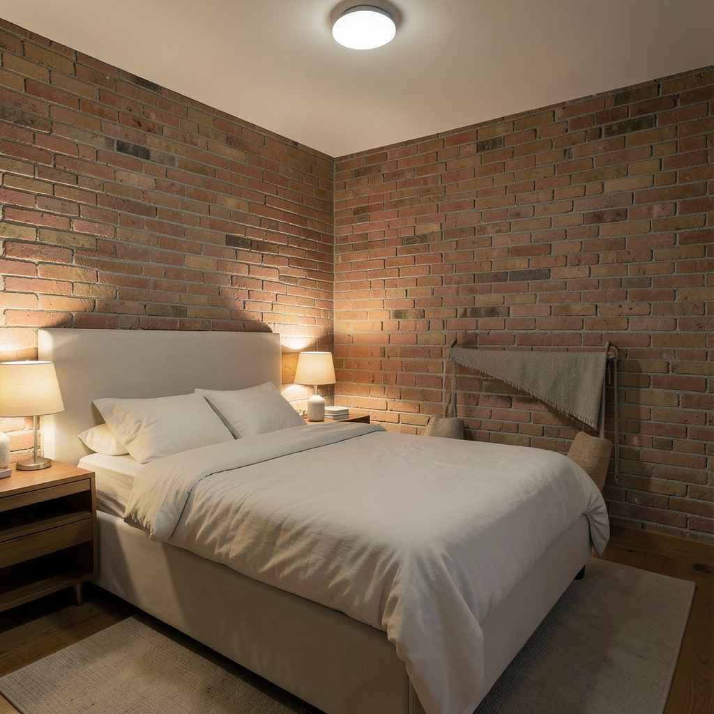
An exposed brick wall in a bedroom carries a quality that no applied texture fully captures — the genuine material history of a surface that predates the room’s current life. Where the kitchen version of this idea tends toward raw industrialism, the bedroom version is softer. Brick in a sleeping space benefits from limewash or a light whitewash that tones down the raw redness and introduces a warmer, more muted character. The texture remains; the color softens; the wall reads as old and considered rather than unfinished.
The position of the exposed brick wall within the bedroom determines its design role. Behind the bed, it functions as a textural headboard — an entire wall of material depth behind the sleeping area that no upholstered or painted surface provides. Beside the bed, on a side wall, it creates a warm backdrop for the nightstand and lamp arrangement and frames the sleeping zone without commanding its center. A brick wall on the wall opposite the bed — the wall the sleeper faces — is the most visually present option and suits bedrooms where the brick is in good condition with compelling color and texture variation.
The light treatment of a brick wall is its most underappreciated design variable. A single bulb downlighter positioned close to the brick surface produces a grazing light that throws every surface variation into sharp relief — the mortar joints become deep shadow lines, the individual brick faces catch light at their own angles, and the wall reads as dimensional rather than flat. That grazing effect is spectacular at evening and requires nothing more than correct fixture placement. A standard overhead light positioned at center ceiling provides even illumination that flattens the brick surface and removes most of the texture that makes the material worth having.
34. Scandi-Inspired Minimal Bedroom
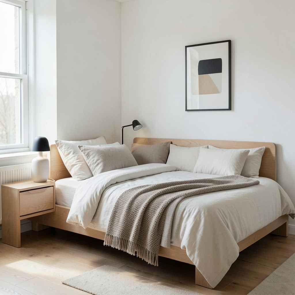
Scandinavian minimalism in a bedroom does not mean the absence of warmth — it means warmth achieved through material quality rather than material quantity. A Scandi bedroom uses fewer objects than most design directions, but every object present is of genuine quality: a well-made ceramic lamp base, a hand-stitched linen duvet, a solid ash bed frame with precise joinery, a wool throw blanket in a natural undyed tone. The room looks spare but feels rich, and the richness comes entirely from the quality of what remains after everything unnecessary has been removed.
The palette is the most identifiable quality of Scandi bedroom design. Whites that lean warm rather than cool — towards cream and ivory rather than blue-white — prevent the minimalism from reading as clinical. Natural wood in a light, blonde tone introduces warmth without any color statement. Stone grey and warm mushroom tones in textiles add depth while staying within the palette’s narrow tonal range. Black appears as a controlled accent — a single matte black lamp, a thin black frame on a single piece of artwork — and reads as punctuation rather than presence. Together, these tones create a room that is technically minimal but visually complete.
Functional design is the philosophical underpinning of the Scandi direction, and in a bedroom it means every object earns its place by doing something well. A lamp is beautiful because it is perfectly proportioned and produces exactly the right light quality. A blanket is on the bed because it is genuinely needed and genuinely comfortable. A book is on the nightstand because it is being read, not because the nightstand looked bare without something on it. The discipline of only keeping what is used and only placing what is beautiful produces a bedroom that feels intentional down to its last detail — and that intentionality is what makes the Scandi bedroom feel so unmistakably considered.
35. A Bedroom With a Dedicated Reading Wall
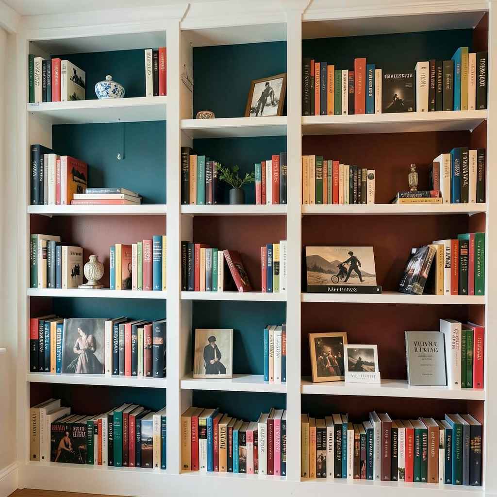
A wall lined with bookshelves — full height, the full width of one bedroom wall — changes the room’s identity more profoundly than almost any other single design decision. The bed becomes a sleeping space inside a library rather than a sleeping space inside a bedroom. The books introduce color, texture, scale variation, and the visual richness of accumulated reading across a life. No wallpaper, no artwork arrangement, and no architectural treatment produces the same quality of warmth as a wall of books, and the books do it entirely as a byproduct of their primary function.
The shelf design matters for how the wall reads as a whole. Shelves with visible back panels in a contrasting color — a deep teal or warm rust behind white-painted shelves, for instance — turn the bookshelf wall into a piece of architecture with its own depth and color. Open shelves without back panels show the wall color behind the books, which produces a looser, more casual reading wall that suits bedrooms with a relaxed direction. Adjustable shelves are preferable to fixed ones because reading collections change in scale and format, and a shelf system that cannot adapt to oversized art books or collections of paperbacks becomes a constraint rather than a storage solution.
The approach to organizing and displaying books on a bedroom reading wall is itself a design decision. Books arranged strictly by spine color produce a wall that reads as graphic and art-directed — beautiful but slightly impersonal. Books arranged by subject with personal objects woven between them — a small ceramic piece between two sections, a framed photograph leaning against the spines — produce a wall that reads as genuinely inhabited and collected over time. The latter approach is harder to maintain as the collection grows but rewards the effort with a warmth and personality that the former never quite achieves.
36. A Bedroom Designed for Two Different Sleep Preferences
Two people sharing a bedroom rarely have identical sleep requirements, and the bedrooms that acknowledge this honestly are more functional and more restful than those designed as though both occupants have identical needs. One person runs warm; the other sleeps cold. One reads until midnight; the other needs full darkness by ten. One wakes at five and needs to dress quietly; the other sleeps until eight and finds early light disruptive. Designing for these differences rather than defaulting to a single set of conditions is one of the most genuinely useful things a shared bedroom can do.
The bedding solution is the most practical starting point. Two separate duvets — each in the occupant’s preferred weight and warmth rating — on a shared bed eliminates the ongoing negotiation over blanket territory. The bed looks slightly different from a hotel presentation, but it functions correctly for both people, which matters more than conventional styling. Separate lighting controls on each bedside, each on its own switch or dimmer, allow one person to read while the other sleeps in darkness. These are not luxury refinements — they are functional decisions that reduce the daily friction of sharing a sleep environment.
The wardrobe arrangement in a shared bedroom should give each person their own section rather than pooling the combined clothing into a shared system. Two wardrobes — even if one is smaller — produce a bedroom organization where each person can locate, select, and store their clothing without disrupting the other’s section. In bedrooms where a single built-in wardrobe is the only option, a hard internal division between the two halves with separate hanging rails, shelf heights, and drawer organizations suits two people’s different storage logics. The wardrobe is used twice daily by two people — making it work for both of them simultaneously is a design requirement, not an option.
37. Warm Terracotta Color Palette

Terracotta has been used as a residential wall color for centuries across Mediterranean and Middle Eastern architecture, and its persistence is not sentiment — it is the fact that the color works in a way that cannot be explained entirely by current trends. Terracotta sits at the intersection of orange, brown, and red, with enough depth to read as a serious color and enough warmth to make any room it occupies feel like it holds heat even when the temperature is identical to a cooler-toned room. In a bedroom, that perceived warmth translates directly into a sense of comfort and enclosure that paler colors cannot generate.
The range within the terracotta family is wider than the single word suggests. A pale, sandy terracotta — closer to a blush with brown undertones — reads as nearly neutral in certain lights and suits bedrooms that want warmth without commitment. A mid-range true terracotta with a burnt orange quality is the most recognizable and the most confident version of the palette. A deep, dark terracotta that borders on rust or dried clay reads as grounding and rich and suits bedrooms where the color is meant to be the room’s dominant quality. Each version works; each produces a different bedroom; and the choice should be based on the room’s light conditions before anything else.
Pairing materials with terracotta walls is where the palette either becomes a room or remains a paint choice. Unglazed terracotta tiles on the floor — the same color family as the walls — produce a tonal continuity that reads as deeply organic and suited to bedrooms with an earthy, natural direction. White or off-white bedding and curtains provide the contrast that prevents the warmth from becoming heaviness. Natural wood, woven rattan, and raw linen all sit within the terracotta palette’s material language. Brass hardware in an aged, warm tone amplifies the palette’s Mediterranean quality. Together these elements produce a bedroom that feels as though it belongs somewhere sun-warmed and quiet.
38. Concealed Storage Behind Paneled Walls
A bedroom wall with floor-to-ceiling paneling — all painted in the same tone, all with the same profile — that conceals doors to wardrobes, a bathroom, or storage alcoves behind the panel faces is one of the most resolved design solutions available in a bedroom. The wall reads as architecture. The storage reads as invisible. The room feels clean and complete without any visual evidence of the organizational layer operating behind the surfaces. That quality of hidden function is what the best bedroom design achieves — everything you need, none of it visible.
The panel profile determines the style direction. Flat, simple panels with shadow gap reveals read as contemporary and architectural — the wall appears precise and considered, and the concealed doors blend completely when their reveals match the panel reveals exactly. More decorative paneling with raised or recessed moulding profiles reads as traditional and suits bedrooms with a more formal or period-influenced direction. Both work, and both conceal equally well — the choice is purely about which design language the bedroom is speaking in.
The practical requirement for concealed door panels is precision in the door fitting and hinge selection. A standard hinged door with a visible frame gap at its edges gives itself away regardless of how well the panel face matches the surrounding wall. Push-to-open mechanisms with no visible hardware, or recessed finger pulls that sit flush when the door is closed, are the mechanisms that keep the wall reading as continuous. The hardware budget here is worth spending on — a low-quality push-open mechanism will loosen over time and reveal the door edge through misalignment. The concealment only works for as long as the mechanism maintains its precision, and maintaining that precision requires hardware that was built to do so.
39. A Bedroom With an En Suite Bathroom Connection
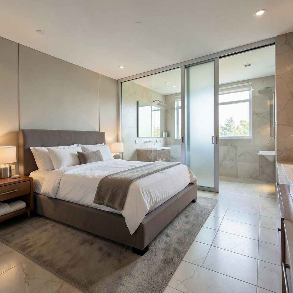
The relationship between a bedroom and its en suite is a design opportunity that most renovations treat as purely plumbing rather than spatial planning. An en suite bathroom that is accessible through a wide, frameless opening — or through a glazed internal window that borrows light between the two spaces — extends the bedroom’s sense of space and luxury without requiring any additional square footage. The two rooms read as a connected suite rather than a bedroom with a bathroom attached, and that continuity produces a quality of finish associated with hotel environments that residential bedrooms rarely achieve.
The internal window between bedroom and bathroom is the detail that most transforms this connection. A fixed glass panel — or a sliding panel that can be opened or closed for privacy — set into the wall between the two rooms allows natural light from the bathroom’s exterior window to reach the bedroom interior when the bedroom itself has limited window area. It also creates a visual depth between the two spaces that makes both feel larger than they are. The glass should be clear rather than frosted if the privacy context allows — frosted glass reduces the light transfer and the spatial depth that make the feature worth having.
The flooring decision at the transition between bedroom and bathroom affects the quality of the connection. A single continuous material running from the bedroom through the bathroom opening and across the bathroom floor produces a suite that reads as one designed entity. Different flooring in each space — the standard approach, with carpet in the bedroom and tile in the bathroom — reasserts the room boundary that the wide opening was trying to dissolve. Where underfloor heating is present in the bathroom, running the same tile continuously from bathroom to bedroom threshold eliminates the cold-floor experience that makes barefoot movement between the two rooms unpleasant at night.
40. Organic and Curved Furniture Forms
A bedroom furnished exclusively with rectilinear pieces — square bed frame, rectangular nightstand, boxy wardrobe — has a particular kind of tension in it that goes unnoticed until you replace one of those pieces with something curved and feel the room exhale. Organic furniture forms — a bed frame with a gently curved headboard, a nightstand with a rounded base, a bench at the foot of the bed with a slightly bowed front edge — introduce a softness to the bedroom’s geometry that the room’s purpose actually requires. Hard angles are for productivity spaces. Soft curves belong in rooms designed for rest.
The scale of the curve matters. A headboard with a subtle arc — rising gently at the center and falling at the outer edges — adds softness without theatricality. A dramatically sculpted headboard in an organic freeform shape makes a strong visual statement and suits bedrooms where the bed is the design centerpiece and everything else defers to it. The difference between a subtle curve and a dramatic one is not better or worse — it is quieter versus louder, and both deserve a considered choice rather than an accidental one.
Mixing curved and rectilinear elements is where most bedrooms end up, and managing that mixture well is the skill. Curved soft furnishings — a round pouf at the foot of the bed, an arched floor mirror, a circular bedside table — sit naturally alongside a rectilinear bed frame because the contrast between the organic and the geometric creates visual tension that reads as design rather than accident. The key is ensuring the curved elements are concentrated enough to read as a choice. One rounded piece in a room of rectangles looks like an outlier. Three or four rounded pieces in a room of rectangles looks like a considered conversation between two geometric languages.
41. A Bedroom With No Clutter Policy
The design principle that makes the most immediate difference in a bedroom’s quality has nothing to do with color, furniture, or lighting — it is the decision to treat horizontal surfaces as designed elements rather than storage opportunities. Every surface in a bedroom that does not have a specific, curated purpose becomes a landing zone for whatever is in a person’s hands when they enter the room. Keys, charging cables, loose change, receipts, half-read magazines — these items accumulate on nightstands, dressers, and windowsills until the bedroom stops feeling like a retreat and starts feeling like a room that is always slightly behind.
The design response is not tidiness as a personal discipline — it is removing the surfaces that invite accumulation and replacing them with storage systems that make putting things away easier than leaving them out. A nightstand with a drawer puts the book and phone charger out of sight when not in use without requiring any effort beyond closing a drawer. A dresser with closed doors keeps the top surface available for the one lamp and one intentional object that make the piece a designed element rather than a clutter collection point. The bedroom’s calm is not maintained by willpower — it is designed into the room by making tidiness the path of least resistance.
The hardest surface to manage in a bedroom is the floor beside the bed. Shoes, discarded clothing, and bags tend to accumulate in the zone between the bed and the wardrobe because the bedroom routine produces these items at moments when reaching the wardrobe feels like more effort than it actually is. A low bench or a single hook positioned at exactly the point where clothing tends to land — between the door and the wardrobe — gives those items a designed home that requires no more effort than dropping them. The hook or bench does not solve the problem through design alone; it redirects the natural behavior toward an outcome that the room can absorb without looking disordered.
42. A Platform Bed With Built-In Side Tables
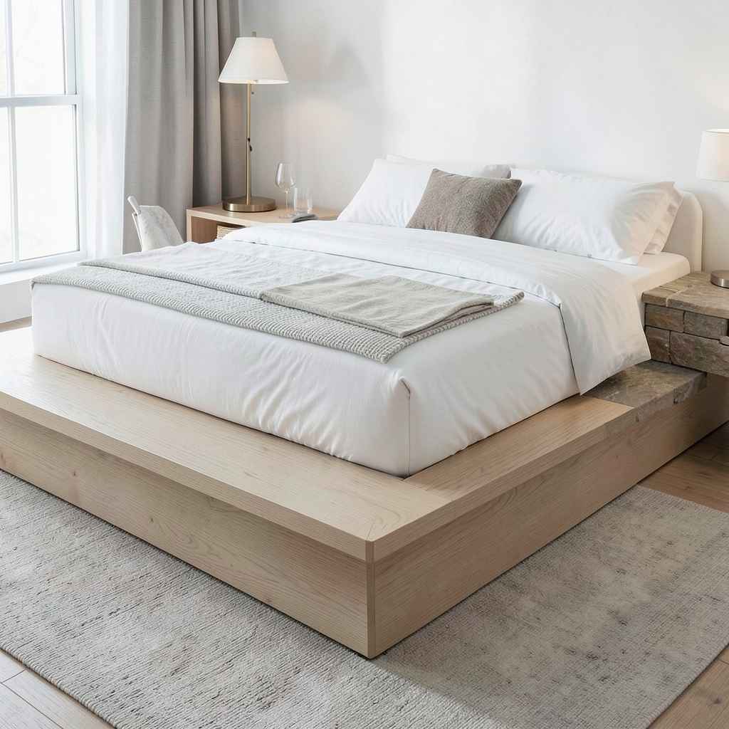
A bed platform that extends to form integrated bedside surfaces on each side — the platform width widening at the head of the bed to create a shelf or ledge rather than terminating flush with the mattress edge — eliminates the gap between the bed and the nightstand that conventional bedroom furniture always produces. That gap is visually minor but spatially significant: it is the space where the lamp cord runs, where the phone falls when dropped, and where the floor is most visible beneath the bed. Closing that gap by extending the platform produces a bedroom piece that reads as a single architectural object rather than a bed surrounded by furniture.
The integrated surface height is the functional detail that determines how well the arrangement works in practice. A surface flush with the mattress top — at the same level as the sleeping surface — reads as a natural extension of the bed and suits people who use the bedside surface for books and glasses rather than lamps. A surface two to four inches below the mattress top reads as a dedicated ledge rather than a continuation of the sleeping surface — psychologically distinct from the bed, which makes it a more natural home for a lamp and a drinking glass. Neither is wrong; the choice depends on how distinctly you want the bedside function separated from the sleeping surface.
Material continuity across the platform and integrated surfaces is what makes the piece read as designed rather than fabricated. A platform in solid white oak where the integrated bedside surfaces carry the same grain direction and the same oiled finish as the rest of the platform reads as a single object made with intent. Introducing a different material at the bedside surface — a stone insert, a contrasting wood species — adds visual interest at the cost of the seamless quality that the integrated format is valued for. The integrated platform works best when it commits to material consistency, and the material it commits to should be the bedroom’s primary surface material.
43. Texture Through Wall Paneling
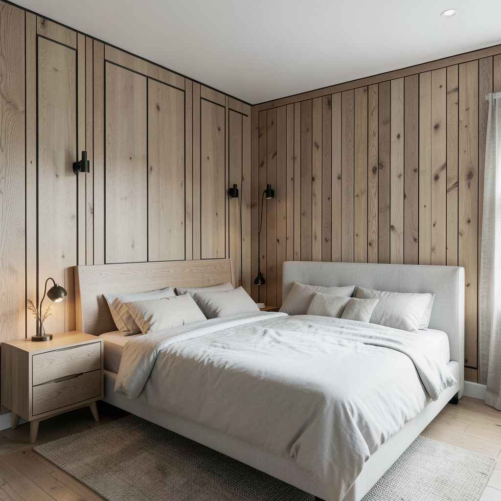
A bedroom wall treated with paneling — whether Shaker-profile painted MDF, natural oak veneer in a vertical strip pattern, or thick plaster-over-timber battens — introduces a surface depth that flat-painted drywall simply cannot produce. The panel casts a shadow at its edge. The reveal between panels creates a fine dark line that adds rhythm to the wall. The material of the panel, whatever it is, has a presence that paint applied to a flat surface does not. In a room where the walls are the dominant surface area and the materials on them directly affect how the space feels to inhabit, paneling is the most architecturally efficient way to add quality.
The style of panel profile determines the bedroom’s design direction decisively. Classic Shaker paneling — a recessed square or rectangular panel within a flat-faced frame — reads as transitional and suits bedrooms where the design bridges traditional and contemporary directions. Vertical batten paneling — narrow strips of timber or MDF spaced evenly across the wall with a reveal between each — reads as more contemporary and suits bedrooms with clean, modern furniture profiles. A full-height plank panel in wide natural wood boards reads as warm and rustic and suits bedrooms built around organic materials and a relaxed design direction.
The decision about which walls to panel is as important as the panel design itself. Paneling all four walls in a bedroom produces an enveloping quality that can read as either rich or oppressive depending on the ceiling height and the panel color. Paneling a single wall — the one behind the bed — produces a focused accent that frames the sleeping area without changing the room’s overall character. Paneling two walls, typically the wall behind the bed and one adjacent wall, produces a corner of the room that reads as architecturally composed and gives the bedroom a sense of defined structure without fully enclosing it.
44. A Bedroom With High Contrast Black and White
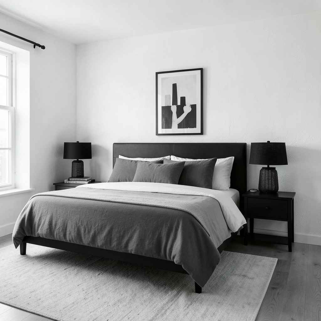
Black and white as a bedroom palette is a commitment that most people back away from because they associate it with the visual energy of graphic design rather than the calm of a sleeping room. That association is worth questioning, because a black and white bedroom executed with the right material weights and the right balance between the two tones is not energetic at all — it is one of the most composed and settled design directions available. The key is proportion. The key is always proportion.
White should carry approximately seventy to eighty percent of the room’s surface area — walls, ceiling, and the bulk of the bedding — with black appearing as accent and grounding detail rather than as a competing tone. Matte black hardware, a black bed frame in a slender profile, a single black lamp, a black-framed artwork or two — these are the applications that give the room its edge without pulling the palette toward graphic tension. When black begins to appear on large surfaces — a full wall, the wardrobe doors, the curtains — the balance tips and the bedroom starts to feel like a design statement rather than a place to sleep.
Texture is what prevents black and white from reading as cold. A white textured plaster wall has a warmth that a white gloss-painted wall does not. A black woven rattan lamp base has a warmth that a black lacquered surface does not. The goal is for every surface in the palette to carry material honesty — the white is warm white linen, warm white plaster, warm white cotton; the black is matte black ceramic, natural black-stained timber, hand-thrown black clay. Materials that have been chosen for their surface quality rather than their color alone keep the palette from feeling like a photographic negative and make it feel like a room that was built with care.
45. A Bedroom Designed for Morning Light

Most bedroom design thinks about night — about darkness, about privacy, about rest. The morning is an afterthought. But the quality of a bedroom’s morning light — how it enters, how it moves across the room as the hour progresses, what it illuminates and at what angle — has as much to do with how the bedroom feels in daily life as any evening consideration. A bedroom that wakes you gently with soft, warm, eastern light filtering through sheer linen curtains is a bedroom you want to get out of bed in. A bedroom that receives harsh direct light at seven in the morning and has no gentle filtering layer is a bedroom you want to escape.
Managing morning light begins with the window treatment — specifically, the first layer of treatment closest to the glass. Sheer linen or cotton voile hung close to the window frame filters direct light while allowing the room to brighten progressively as the sun rises. The sheer absorbs the sharpness of direct sunlight and distributes it evenly across the room rather than casting a single intense beam across the bed. The room brightens, which signals to the body that the day is beginning, but the light is diffuse enough that the transition from sleep is gradual rather than abrupt.
Secondary considerations — mirror placement that captures morning light and redirects it to darker corners, a light wall color on the surface opposite the window that maximizes reflectance, the absence of heavy dark furniture in the light’s path — build a morning light environment that the first treatment layer initiates. A bedroom designed for morning light is not just more pleasant to wake up in. It supports better sleep quality because the body’s natural light-based circadian signals are honored rather than blocked, and a bedroom that supports the body’s biology rather than fighting it is a bedroom doing its most important job correctly.
46. Soft Sculpture and Textile Art on Walls
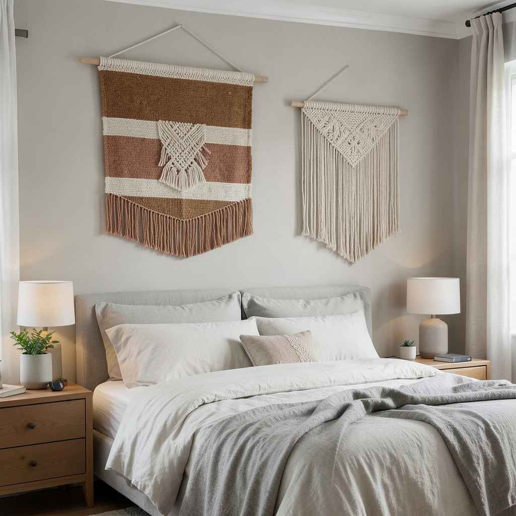
Hanging textiles — a large woven wall hanging, a macramé panel in a natural cotton cord, a piece of hand-embroidered fabric mounted on a linen backing — bring a material quality to bedroom walls that framed artwork does not. Where a framed print or photograph is a flat surface behind glass, a textile wall piece is a three-dimensional object with genuine physical presence. It casts shadow at its edges. The surface catches light differently across the day. The material has weight and texture that the eye reads as physically real rather than visually recorded, and that realness is exactly what a bedroom wall benefits from.
Scale is the variable that determines whether a textile piece succeeds as the bedroom’s primary wall element. A small woven piece on a large bedroom wall reads as a decorative touch rather than a design decision — it fills the wall insufficiently and the visual gap around it makes it look lost. A large-format piece — wide enough to span at least two-thirds of the wall it occupies — reads as genuine wall architecture and holds the room’s attention with the confidence that a major artwork demands. When in doubt about size, go larger. A textile piece that is slightly too large for a wall is far more compelling than one that is slightly too small.
The color palette of a textile wall piece should connect to the bedroom’s overall direction rather than introduce an entirely new palette. A bedroom built around warm earth tones benefits from a woven piece in undyed natural cotton, warm rust, or aged ochre that deepens the existing palette rather than competing with it. A bedroom in a cool, muted palette benefits from a textile piece that carries the same restraint — natural linen tones, soft grey, quiet warm white. The textile should feel native to the room rather than imported from a different design context, and achieving that sense of belonging is entirely about palette coordination.
47. A Bedroom With a Sitting Area
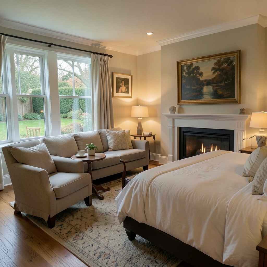
A bedroom large enough to include a sitting area — a pair of chairs and a small table, or a sofa positioned to face a fireplace or window — becomes a private suite rather than simply a sleeping room. The presence of seating that is not the bed gives the bedroom a range of uses that changes how much time you want to spend in it. A comfortable chair by the window is a place for the morning coffee ritual before the rest of the house wakes up. A small sofa at the foot of the bed is where the last hour of the evening is spent before sleep. These moments, accumulated over years, are what people mean when they describe a bedroom as their favorite room in the house.
The seating arrangement should face something worth looking at. A sitting area that faces a blank wall is less restful than one positioned to face a window, a fireplace, or the garden. The orientation of the seating is not just a spatial decision — it determines what the room offers beyond sleeping, and a sitting area that looks out at something genuine makes the bedroom worth inhabiting in a way that no arrangement facing a wall achieves. Where the bedroom’s layout makes window-facing seating impossible, a fireplace or a large, beautifully framed artwork provides the visual anchor that a view would otherwise supply.
The scale of the sitting area furniture must leave generous circulation space between the seating and the bed. A bedroom sitting area where you must navigate sideways between chair and bed does not feel like a suite — it feels like a room with too much furniture. At minimum, thirty-six inches of clear circulation between the seating arrangement and the nearest bed corner keeps both zones readable as separate areas within the same room. At forty-eight inches, the two zones feel genuinely independent of each other, and the bedroom reads as a suite where the sleeping and sitting areas coexist comfortably rather than competing for the same floor.
48. Biophilic Elements Beyond Just Plants
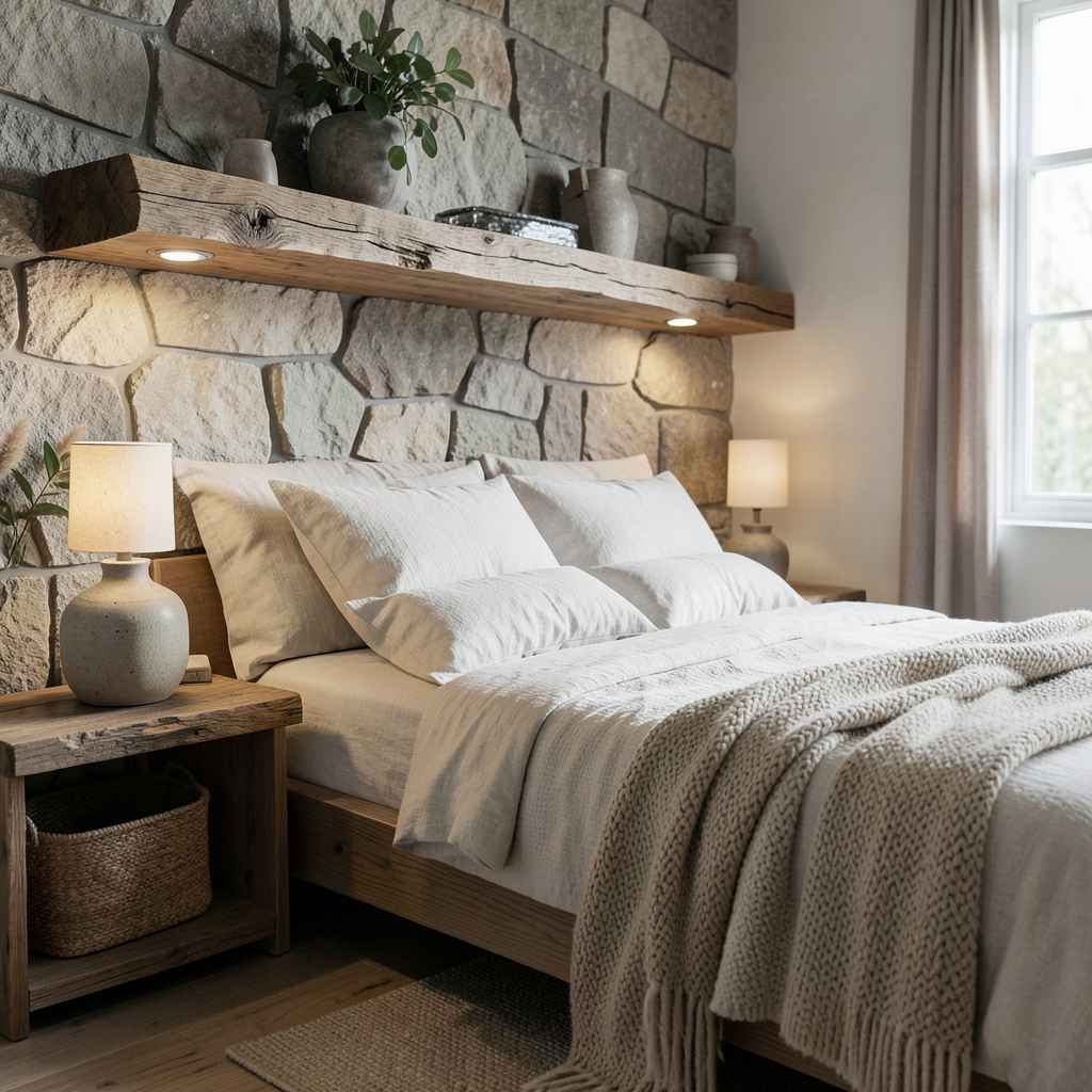
Biophilic design in a bedroom extends far beyond placing a fiddle-leaf fig in the corner. The principle is that the bedroom should reference the natural world in its materials, forms, light quality, and spatial experience — not just through living plants but through the broader material vocabulary of the natural environment. Stone, wood, water sounds, organic pattern, raw texture, natural light variation — all of these are biophilic inputs, and a bedroom that incorporates several of them simultaneously produces a restorative quality that individual elements alone do not generate.
Natural stone — even in small doses, as a lamp base, a decorative object, or a single slab serving as a bedside surface — introduces a material that carries geological time and the visual complexity of something formed by natural processes rather than manufactured. A raw edge timber shelf, a hand-thrown ceramic vase, a wool blanket with visible texture in its weave — each of these materials has a quality of natural origin that manufactured alternatives approximate but do not match. The cumulative effect of multiple natural materials in a bedroom is a room that the body recognizes as safe and settled, which is precisely the physiological state that rest requires.
Water sound is the biophilic element most frequently overlooked in bedroom design. A small tabletop water feature — not decorative, but genuinely producing the sound of moving water at a low level — provides acoustic masking for urban noise and introduces the specific frequency range that the human nervous system associates with natural, safe environments. The sound of flowing water evolved as a signal of a safe campsite: near water, far from threat. That evolutionary reading still operates, and a bedroom where the background sound includes moving water is a bedroom where the body relaxes slightly more readily than one with silence or ambient urban noise.
49. A Bedroom With a Dramatic Ceiling Treatment
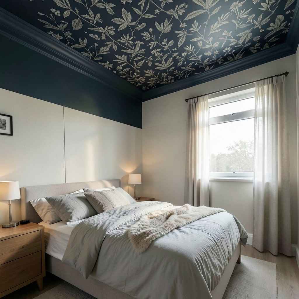
The ceiling in most bedrooms is the largest unused surface in the room. It sits overhead at the most visible angle from the bed — the angle of the sleeping position — and in most bedrooms it does absolutely nothing. A dramatic ceiling treatment — a deep color, a wallpapered surface, a stenciled pattern, a fabric canopy, an architectural coffer — turns the one surface that every person in the bedroom stares at while falling asleep into the room’s most considered element. That inversion of standard design priority is the single most underused opportunity in bedroom design.
A dark painted ceiling in a bedroom with light walls is the most accessible version of the dramatic ceiling treatment and the one that produces the most immediate spatial effect. The ceiling reads as lower — intentionally so — which creates a sense of overhead weight that is not oppressive but sheltering. The room becomes more intimate without changing its floor dimensions at all. A deep navy, a forest green, a charcoal — any of these on the ceiling above a light-walled bedroom produces a room that feels as though the sky has been brought indoors and made personal.
Wallpaper applied to the ceiling — particularly a botanical or geometric pattern with the scale calibrated for the viewing distance of a person lying in bed — produces a bedroom with a decorative ceiling that reads as genuinely designed rather than accidentally interesting. The pattern should be calm enough to look at while falling asleep: dense small-scale patterns create visual busyness that works against rest. A large-scale botanical in a muted colorway, or a simple geometric in two tones close in value, produces a ceiling that is interesting to look at without stimulating the mind — which is precisely the quality a bedroom ceiling should possess.
50. A Bedroom Designed to Last
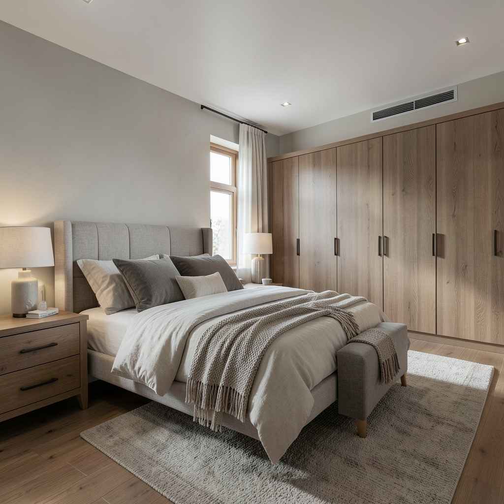
The best bedroom design decisions are not the ones that look best in photographs taken the week the renovation completes — they are the ones that still feel right five, ten, and twenty years later. That durability requires choosing materials and forms that age well rather than materials that simply look current. Natural wood develops patina. Good linen softens with every wash. Solid stone counters and surfaces deepen over time. A bedroom built around materials that improve with age is a bedroom that earns its design value across years rather than spending it in a season.
The furniture scale and proportion should be right for the room first and fashionable second. A bed frame sized correctly for the room’s dimensions and ceiling height will still feel correctly proportioned when the trend it represents has passed. The same frame sized to look impressive in a showroom context but slightly too large for the actual bedroom will feel wrong long after the trend that made it appealing has moved on. Proportion is the quality that does not date; style is the layer that does. Get the proportion right and the style layer can be refreshed through textiles and accessories — the elements of a bedroom that are genuinely replaceable.
The single quality that separates a bedroom designed to last from one that was designed for a moment is how it treats the relationship between function and beauty. A bedroom where every element is beautiful but nothing quite works — where the lighting is atmospheric but insufficient for reading, where the wardrobe is stunning but organizationally wrong, where the bedding is gorgeous but too warm for the climate — is a bedroom that gradually generates low-level friction across daily life. That friction accumulates. A bedroom where function and beauty operate at the same level, where every decision serves both simultaneously, is a bedroom that the body and the mind both want to return to — and that quality, sustained across years, is what great bedroom design actually means.
Leave a Reply